The Design Commission has approved the Modera Morrison, a 7-story building designed by SERA Architects for Mill Creek Residential Trust. The project will include 247 units. 175 vehicular parking spaces are proposed in two levels of below grade parking. 384 bicycle parking spaces are proposed.
The building will be subject to the city’s inclusionary housing rules, which require the provision of affordable housing or the payment of a fee-in-lieu.
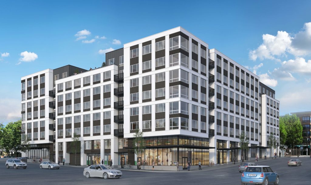
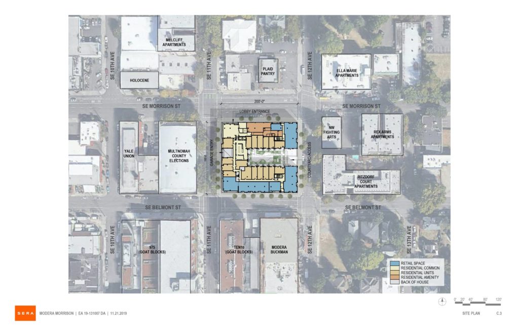
The project site is a full block at 1120 SE Morrison St, bound by SE Morrison, 12th, Belmont, and 11th. The site is currently occupied by a single story warehouse, parts of which date back to 1906.
One block to the south of the Modera Morrison site is the under-construction Modera Buckman. Other buildings recently completed, under construction or proposed on the lower Belmont / Morrison corridor include the Goat Blocks and the Goat Blocks 888 building, Alder.9, Modera Belmont, Grand Belmont and the 12-story building adjacent to the Weatherly.
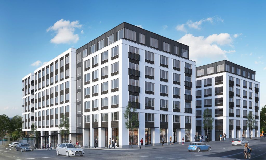
The building will be arranged in a U-shaped plan, with an east-facing courtyard that meets the ground at SE 12th Ave. Parking would be accessed from SE 11th Ave, one story below the first floor level. Ground floor retail would be located along the SE Belmont St, 12th Ave and Morrison St frontages. A double height residential lobby would be located at the corner of SE 11th Ave and Morrison St.
The primary material proposed for the Modera Morrison is stucco. Other materials proposed include standing seam metal panel, ribbed metal panel, vinyl windows, aluminum storefront glazing, steel canopies and steel balconies.
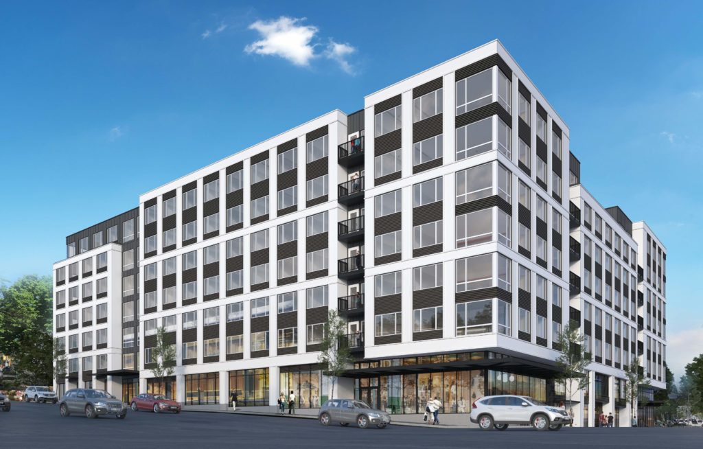
The Modera Morrison was approved by a unanimous vote of the Design Commission at the project’s first hearing, held on November 21st, 2019. The project had previously received Design Advice on May 16th, 2019 and July 18th, 2019.
In the Final Findings and Decision by the Design Commission the project was praised for the way in which the massing of the full block, 7 story building is broken down:
The proposed building will provide 247 residential units and over 10,000 square feet of ground floor retail space in a close-in area at the edge of the Central City Plan District, well served by transit on all four surrounding streets. The proposed building, which occupies the full block breaks down its perceived mass through volumetric changes with a significant massing break at the east courtyard facing the residential portion of the Buckman neighborhood. At the ground level, back-of-house uses are minimized, and active uses surround a substantial majority of the street level which will provide additional retail options for the larger neighborhood. The Commission found that the project’s strength is in the public realm but also appreciated that the building responds to its context through massing shifts and a finer level of detail than previously presented
Building permits will need to be obtained before construction of the Modera Morrison can begin.
Drawings
Plan | Site 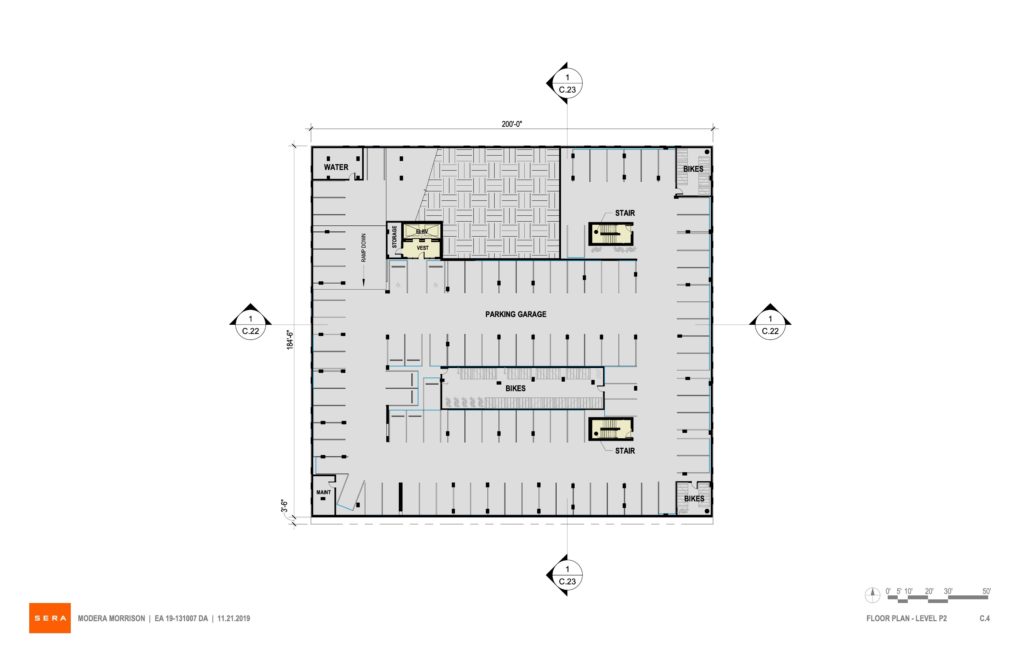
Plan | Level P2 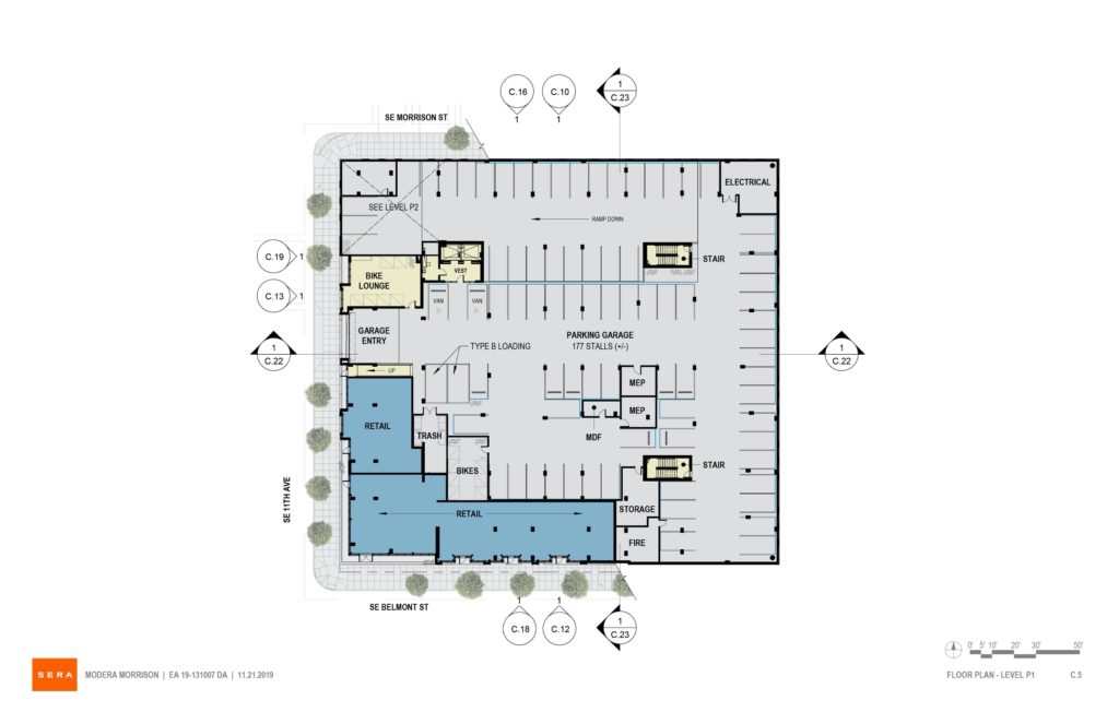
Plan | Level P1 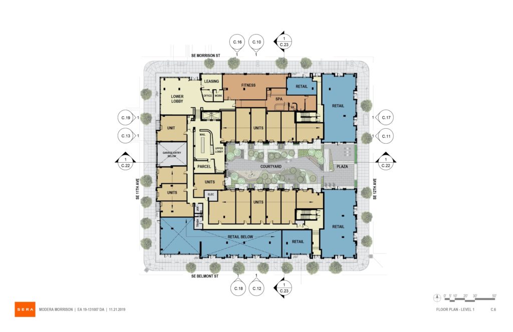
Plan | Level 1 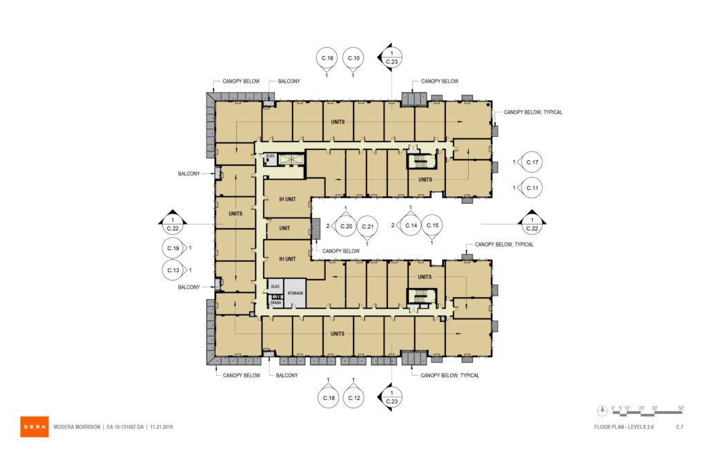
Plan | Levels 2-6 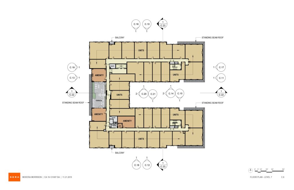
Plan | Level 7 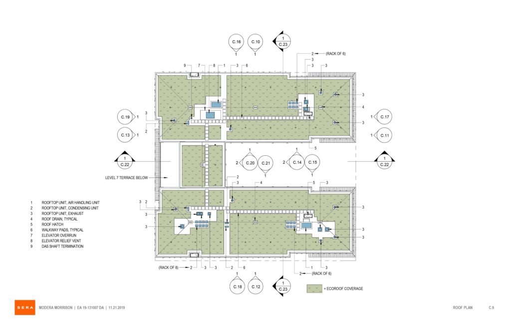
Plan | Roof 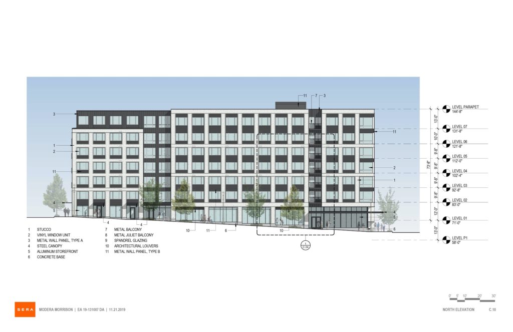
Elevation | North (SE Morrison) 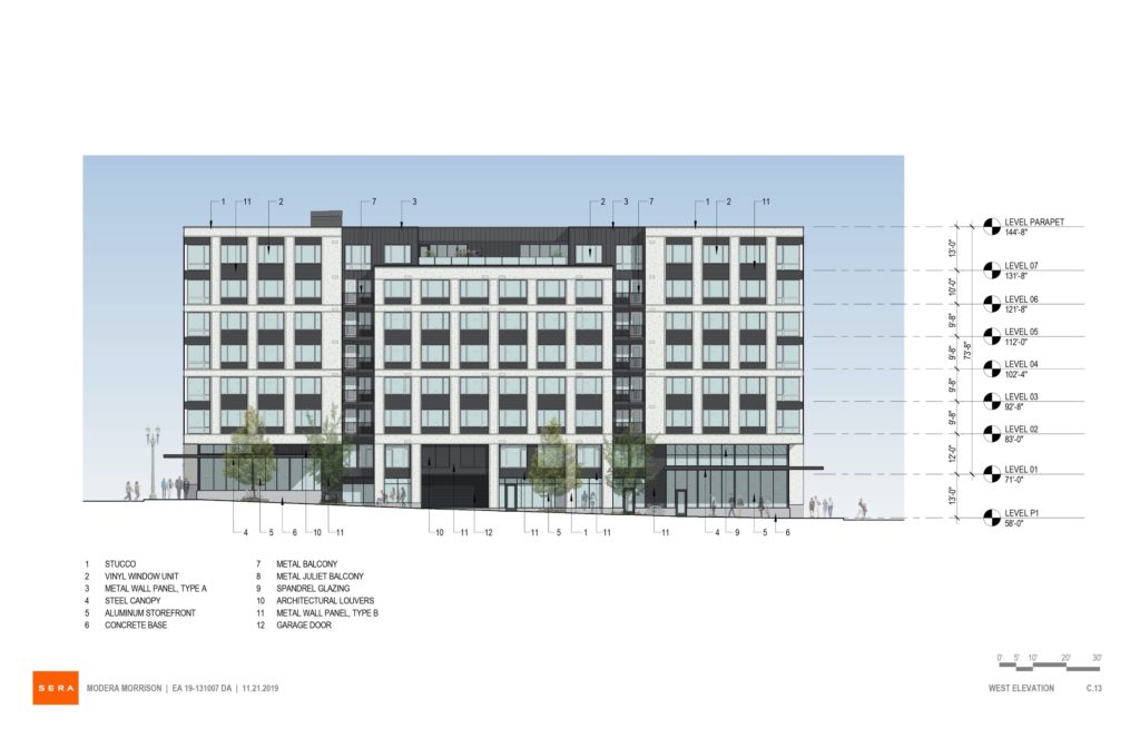
Elevation | West ( 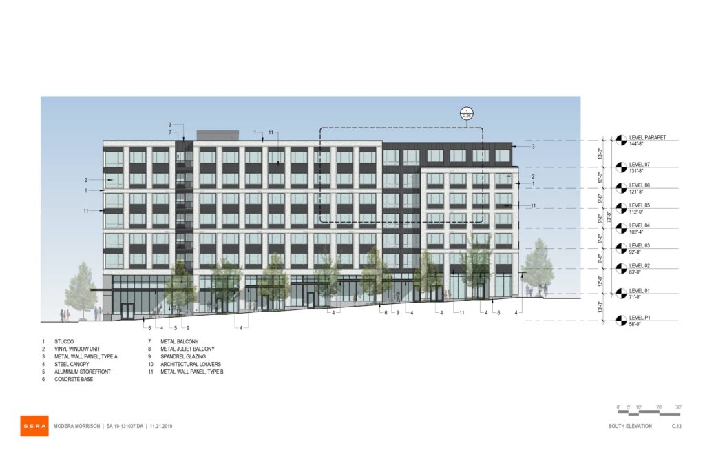
Elevation | South (SE Belmont) 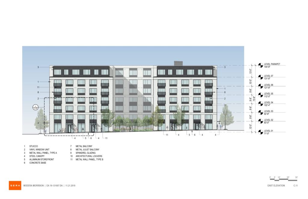
Elevation | East (SE 12th) 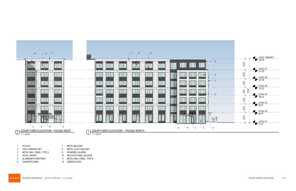
Elevations | Courtyard 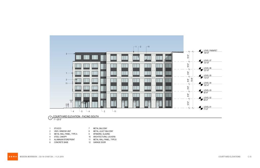
Elevation | Courtyard 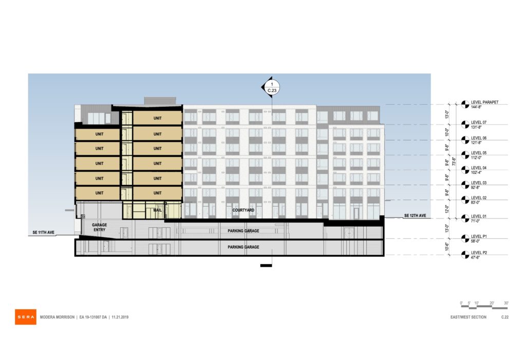
Section 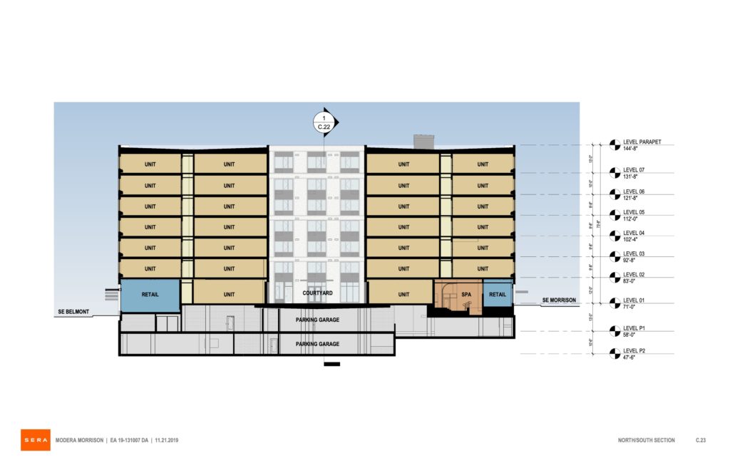
Section
ugly bulky boring
The main problem is that it is a full-block project. If this were cut back to a quarter-block footprint, we might consider it to be a nice addition to a neighborhood in transition.
sim city
this is a nice addition to the city
its all looking the same! My thbinking that an “addition” would be something different…..
Maybe not the prettiest thing on earth, but it’s not ugly either. It’ll be a lot better than what’s there now, believe me.
architects are skimping on anything remotely creative because n o one looks up from their phones anymore so why make anything visually aesthetic?
No. DEVELOPERS (most of them) are skimping on anything remotely creative because it’s slightly (and often not-so-slightly) more expensive and “risky”. Architects WANT to design the coolest, most beautiful shit we can. We definitely haven’t given up, and if we did, it wouldn’t be for some bullshit reason like this.
the evidence is clear …..i see it around me
Evidence of what?
the evidence of MEDIOCRACY
It is no crime to pay less for design when you are providing affordable housing. This building looks fine. Portlanders can be so insufferable.
Not from Portland…. been around the country and world and most American cities including Portland get the short end of their design stick when it comes to good design. Most everything that’s being built right now is mediocre at best. SIM City.
Most developers are out of state carpet baggers….they build crap for as much profit as they can wring out of it then leave and go back to their out of state mega mansions. They don’t care what garbage they have left behind, they dont live here so why should they care. Look at Division, its now a narrow canyon of cardboard coffins set on their ends. Flat faces with zero visual interest and zero green space. An enormous wind tunnel.
There is no pride in creating human compatible design…just take the money and run. Ask why the general public hates developers and has zero respect for architects…just look down the flat faced canyon of Division they created and you will know why.
RDY, you seem to have some inside information that I do not have. I had thought that most developments in Portland were the product of local, or at least, regional, developers, but I have no evidence on which to base this opinion. I had also thought that most developers, like most people who create things, took some pride in their handiwork. Based on your comments, you appear to have researched the question and found otherwise. Please share your research and I will revise my understanding.
Also, I have a different impression of Division Street than you. To me, it seems vibrant, human-scale, mostly tree lined and interesting, but I’m open to seeing it differently. As you see it, is the street a problem because new construction is mostly four and five stories high? Is it that the city has not bought some of the private lots along the street and turned them into parks? Is it that single household dwellings have not been built along the thoroughfare? Specifically, what are the characteristics of the newly built Division that make it bad? In the early ’80s I lived nearby on SE 29th Avenue and Clinton St. Then, there were virtually no restaurants on the street, few apartments, few businesses, many vacant lots, and many cars zipping through. I want to know how today’s Division is worse than the Division of 35 years ago.
Finally, I did not know that most of the public hates developers and disrespects architects. This may well be true, but I haven’t come across any surveys that show this. You appear to have. Or, it may be that the people you talk with share these feelings and that you are convinced that these feelings are representative of the public in general. And you may be right. I honestly, do not know what most Portlanders think about these two groups and whether whatever they think is fair or not. Please point me to your evidence. Cheers!
Does it really matter what it looks like? This is just some 5+1 infill project in a part of town that has a bunch of these. The point is just get it done and add more housing to the market.
That area used to be so cool, now it’s just another Pearl District. Who is running the City of Portland, or right, Californians!
I live in this neighborhood and pass this site on a daily basis. Buckman is many things, but a new Pearl it is not. We’re nowhere near close to anything like that. A lot of the new housing going up on inner Belmont is mostly replacing empty lots; in this case, it’s replacing a far uglier building that is definitely passed its prime. I personally will enjoy walking by this new building much more than the façade of a neglected building that has no relationship whatsoeve to the street, plays host to a homeless camp on the 11th avenue side, and is frequently covered in graffiti.
Amen. Sure this building lacks some flare but it will be a massive improvement over the current warehouse and vagrant gathering place. CEID is most definitely not the Pearl but providing reasonable housing for many more people will help the Central Eastside Industrial District and its sister neighborhood Buckman reach a critical mass in residents that will lead to a greatly increased street retail scene. The good times are just starting.
Linus you are so misguided…
So are you….
I would like to address PT’s comment of 20 February as it seems to represent a common criticism of recent Portland development. As I understand it, PT’s claim is that Portland’s recent built environment is uninspired and mediocre compared to other places. I’m not sure this criticism is wrong, but I want to understand it more concretely.
What will help me understand it better, are contrasting examples. I would like critics to identify specific projects they see as representative of recent Portland development and contrast these with projects from elsewhere that they see as superior. To make for a fair comparison, I propose three apples-to-apple guidelines: 1) The buildings are of like nature, e.g., we are not comparing a court house in one place with an apartment building in another. 2) The costs of construction and living standards of the urban areas of the contrasting buildings should be similar, and 3) the comparisons should reflect comparable building codes. These guidelines are not arbitrary. Architects and developers design and build within these constraints, which they do not control.