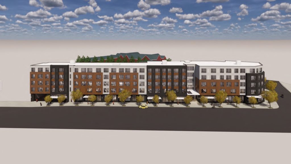
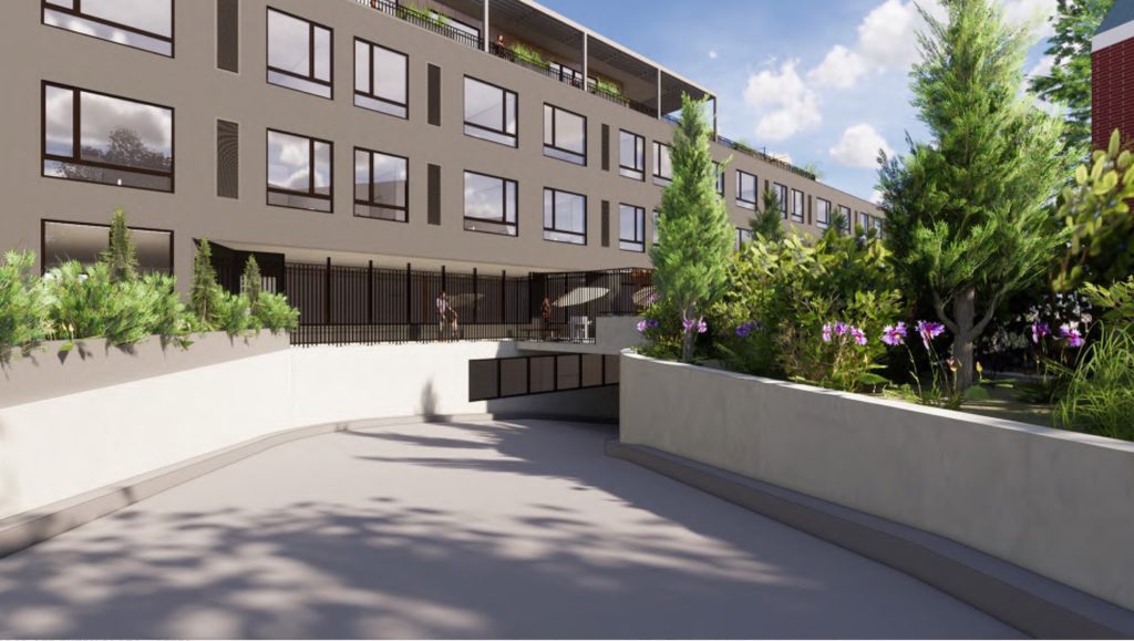
The Morningstar at Laurelhurst, a proposed senior living facility on NE Sandy Blvd, has returned in front of the Design Commission for a second Design Advice Request meeting. The five story building is being designed by Ankrom Moisan Architects for Morningstar Senior Living. The project would include 114 units of memory care and assisted living, with a mix of studio, 1-, and 2-bedroom units. Approximately 70 vehicular parking spaces would be provided in a single level below-grade garage.
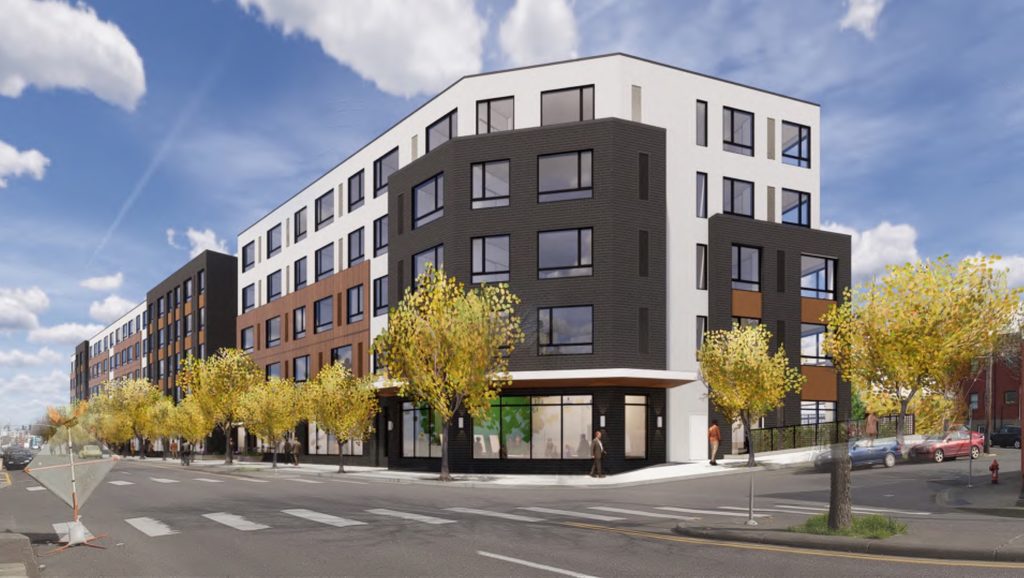
The project site is a 42,757 sq ft parcel at 3100 and 3150 NE Sandy Blvd. Most of the site is currently undeveloped. At the corner of NE 31st and Sandy is a 1929 building, most recently occupied by the Tonic Lounge. It was announced in April that the music venue would be closing at the beginning of September. At the opposite corner of NE 31st and Sandy a Lexus Dealership is planned.
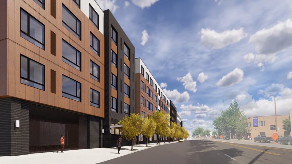
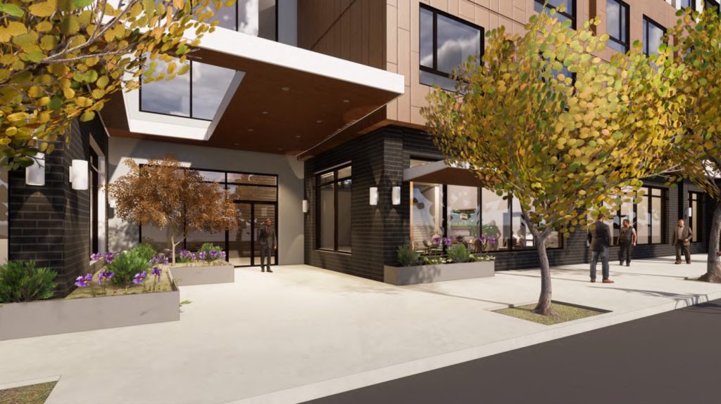
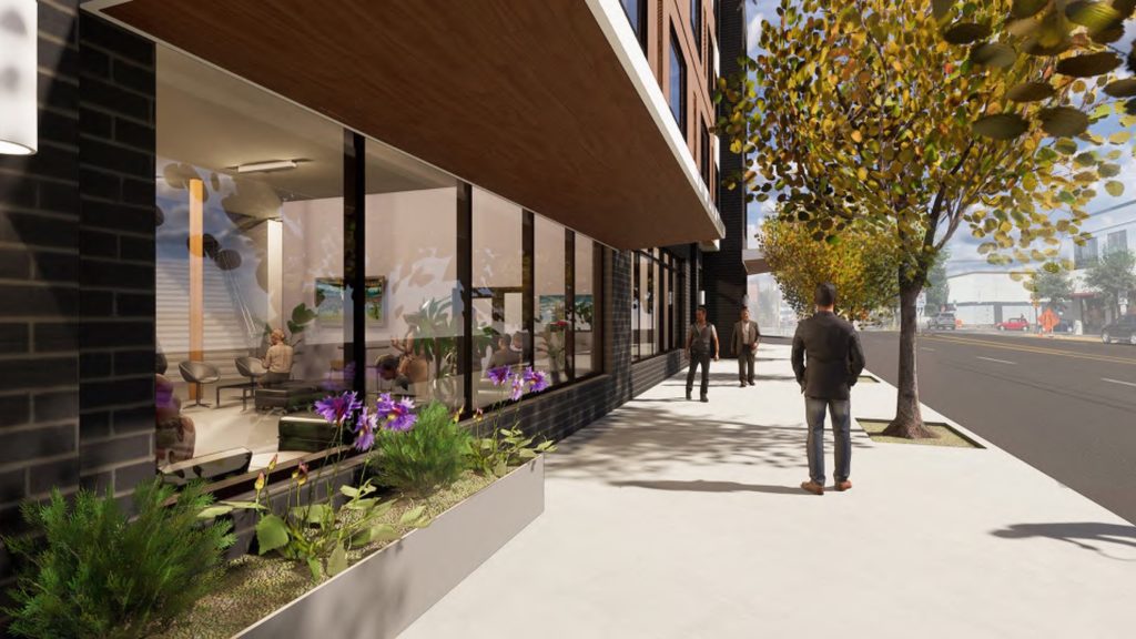
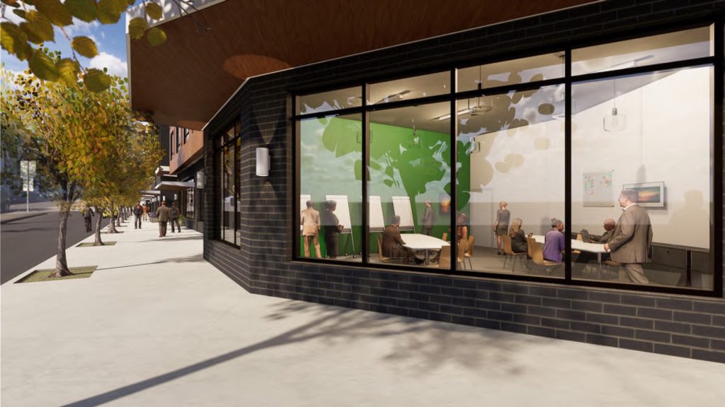
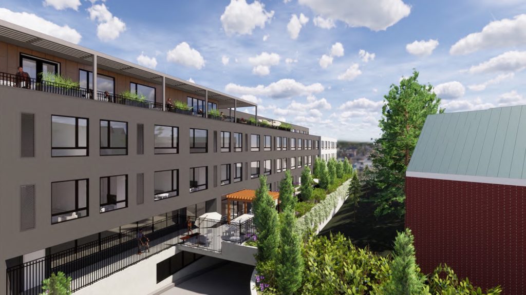
The building is massed as a bar shape along its nearly 400′ long frontage. The ground floor will include a number of active uses for use by the residents such as a lobby, bistro, offices, salon, and theater. Memory care units will be located at the second level, which, due to the grade differences on the site, will be level with the ground at the back of the building. Assisted living units will be located on levels 3, 4 and 5.
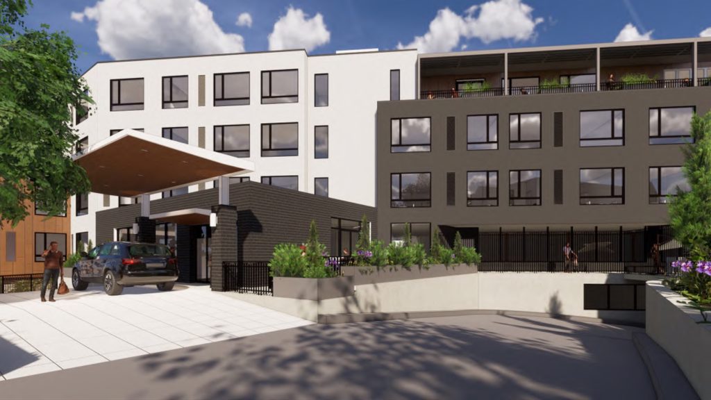
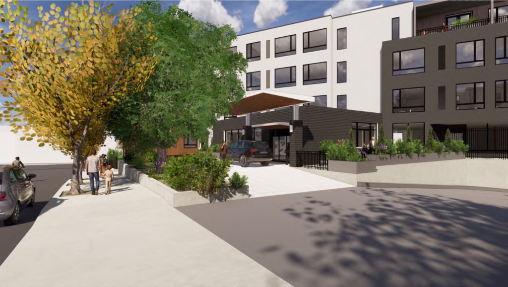
Vehicular drop off will happen along NE Hassalo St, a short dead-end street at the back of the building.
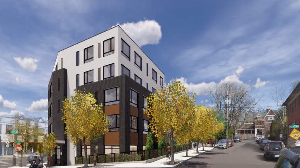
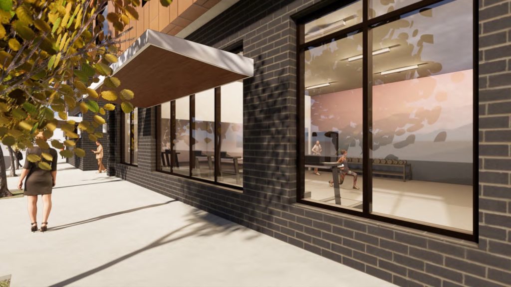
Materials proposed include stucco, metal panel, brick, fiberglass windows and aluminum windows.
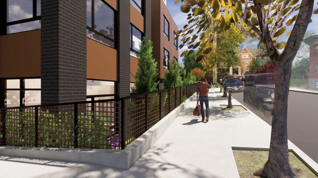
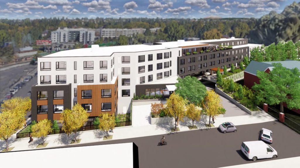
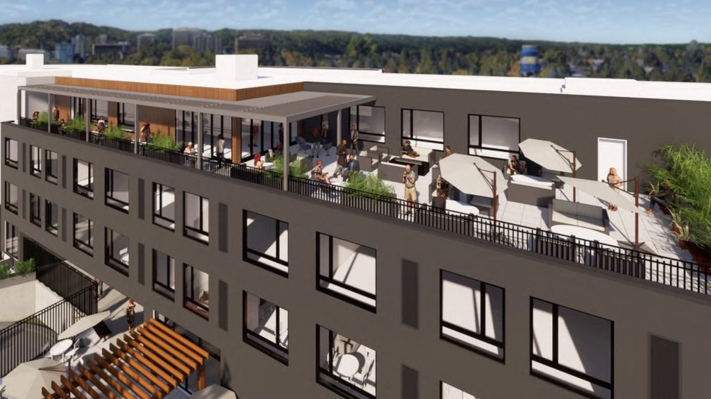
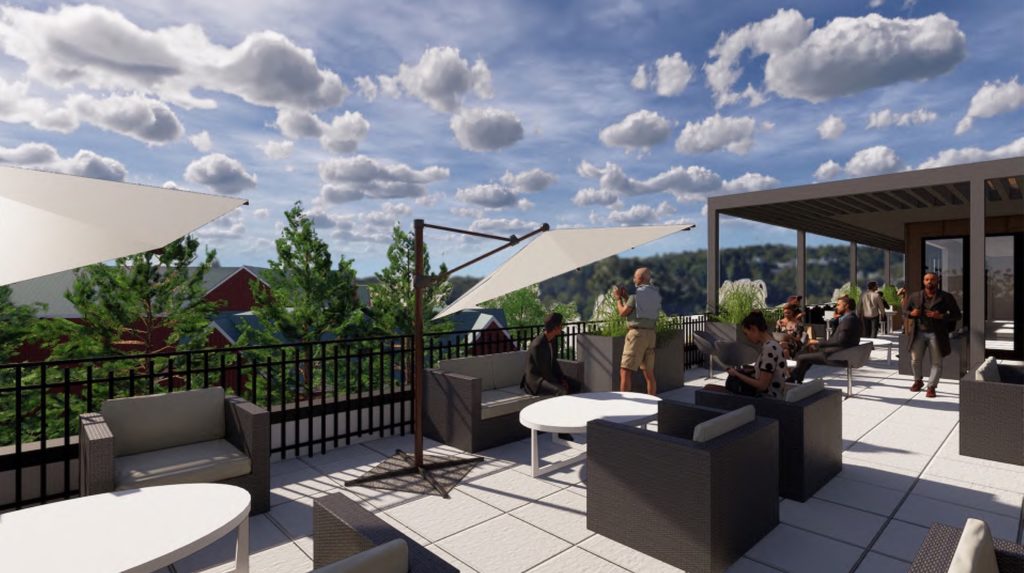
A club room and rooftop terrace for the use of building residents is proposed at the fifth floor.
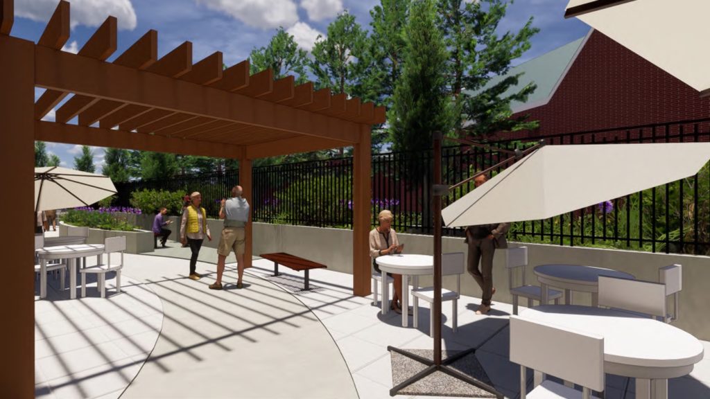
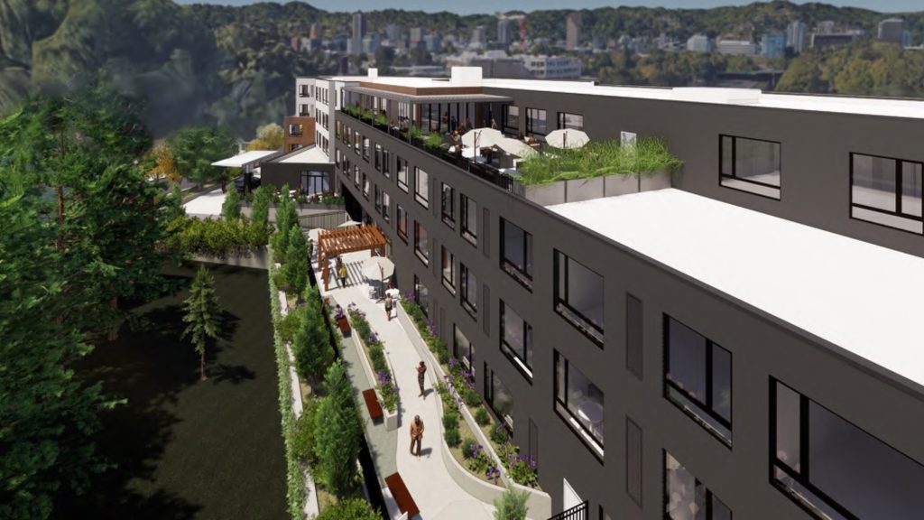
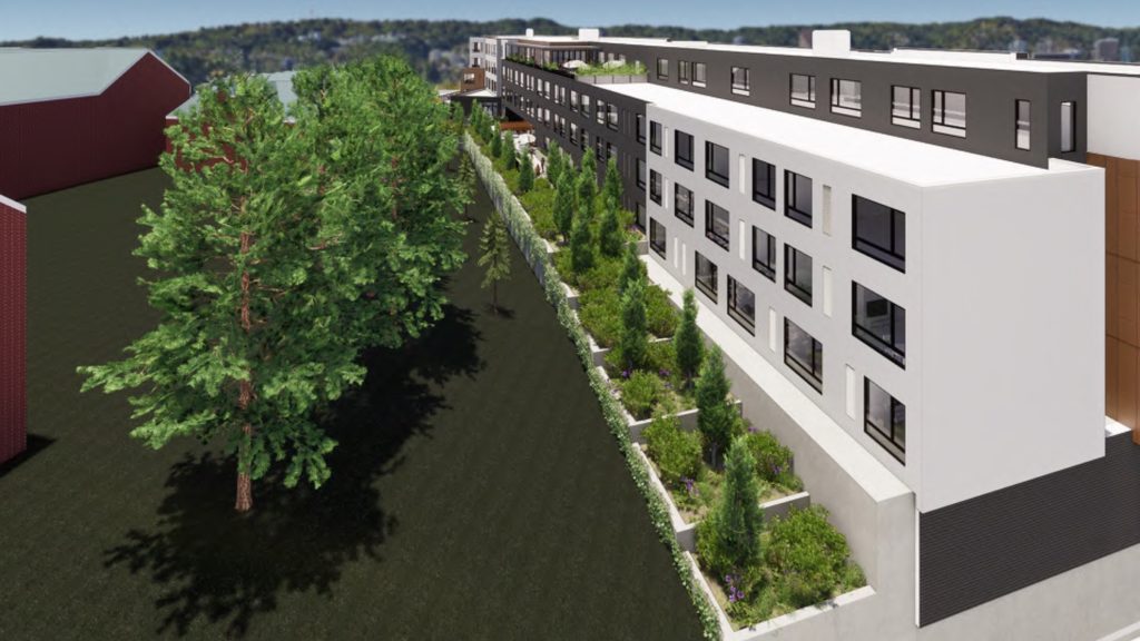
The Morningstar at Laurelhurst returned in front of the Design Commission on July 11th, 2019, following a previous Design Advice Request meeting in May. The evolution of the project was generally praised by the Commission, with areas still needing further refinement noted in a summary memo:
1. Relocating the building’s primary Sandy entrance to the notch and carrying the notch all the way to the ground are huge improvements from DAR #1. However, the notch in its entirety needs to be a strong composition with a prominent and inviting Sandy Blvd entrance and is not there yet. To achieve this, significant changes to the entry courtyard at the ground level are needed as well as a rethinking of the notch’s sidewalls on upper levels.
2. Work needs to be done to simplify the design of the entire building to create a more coherent composition that better responds to area context. This might include reducing the number of materials, but also could be a matter of applying the materials in a more regular way.
3. The design of the loading zone needs additional consideration. The design must mitigate for the presence of a loading bay on Sandy Blvd and is not yet achieving that. Options should be shared with the Commission during Design Review that show the area with and without weather protection.
4. Modifications to step-down height and setback are better meeting design guidelines and are thus supportable as currently shown. The building length Modification is supportable with further refinement of the design at the notch.
5. The redesign at the corner of Hassalo and 31st is successful in creating a safer recessed area that allows in more light.
In order to gain approval the project will be required to go through a Type III Design Review with public hearings in front of the Design Commission.
Drawings
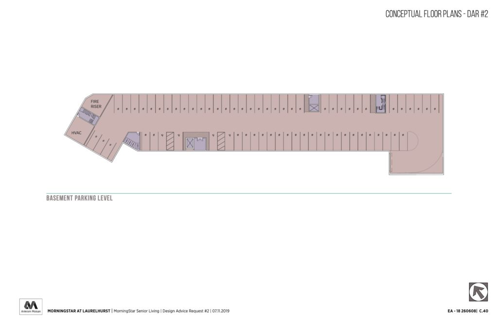
Plan | Basement 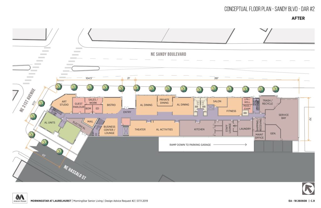
Plan | Level 1 (NE Sandy Blvd) 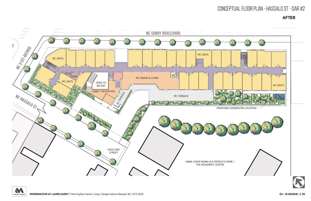
Plan | Level 2 (NE Hassalo) 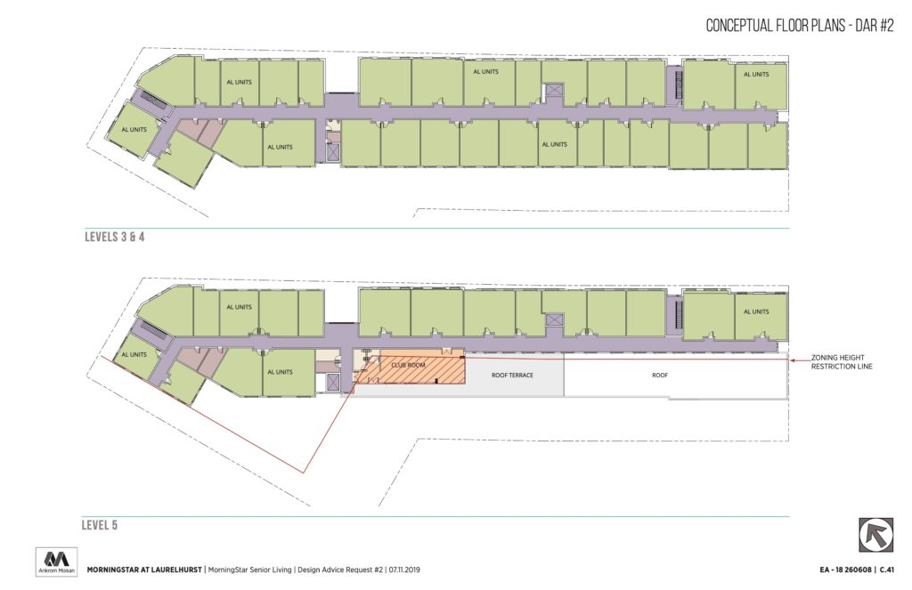
Plans | Levels 3 & 4, 5 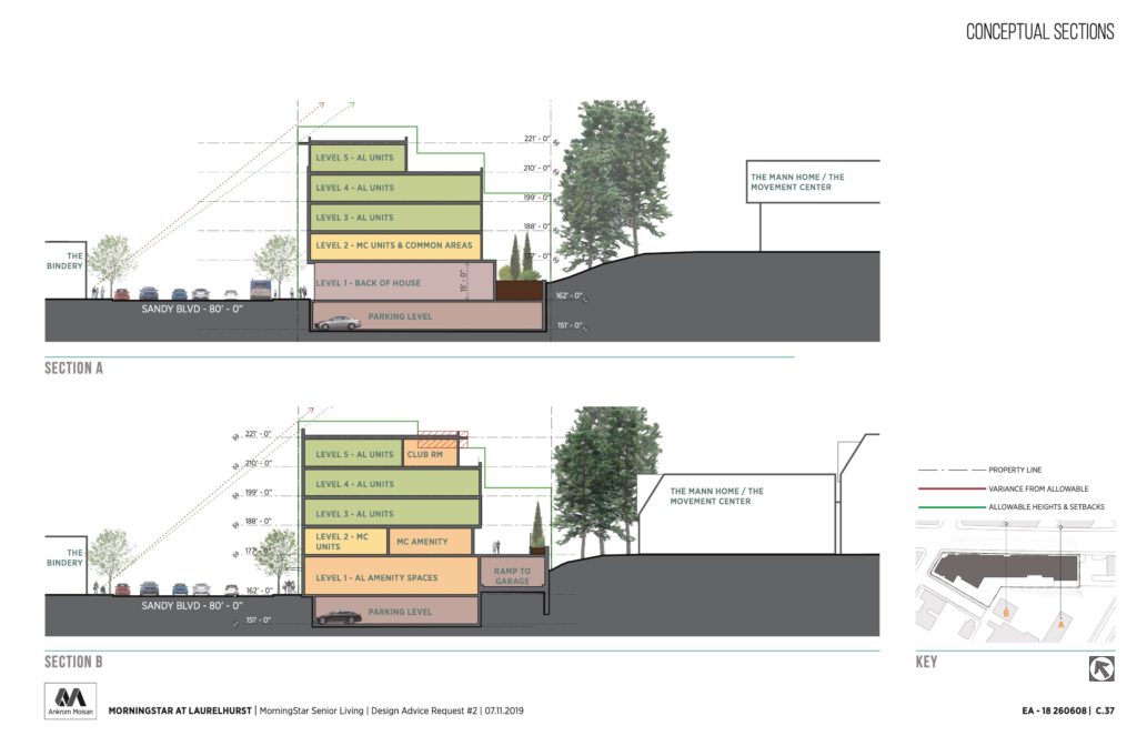
Sections 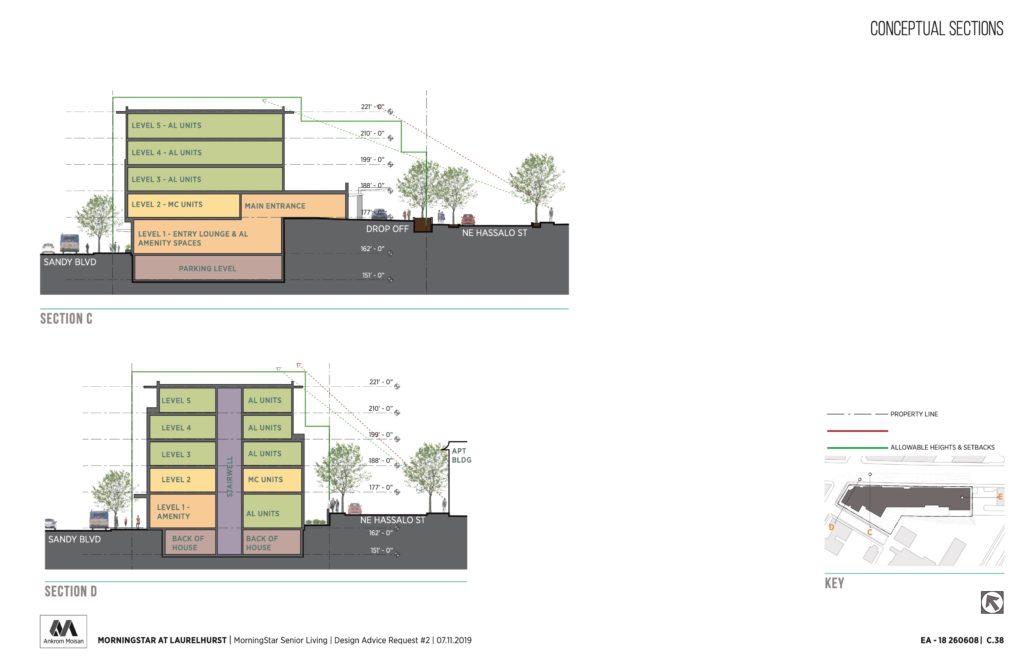
Sections
Hope the seniors don’t mind waiting multiple rounds for the architect to conjure up the right context for Sandy (is it vacant lots, strip malls, constantly shifting high speed travel lanes, lack of safe crossings, or fast food tear downs…hmm).
Apologies for the snark, but quite a few disappointing setbacks for net positive developments in this city lately.
Not disagreeing with you about context…but this building could be part of the city for a very long time. It’s getting built one way or another, so there really is no need to rush the design. Also, this type of feedback does not push back the completion date.
If that hideous building on 33rd and broadway where the new seasons can be built then there is nothing wrong with this building
A white plain building, with smaller appliques of brown, which somehow never go to the top. Are they trying to “step down” to Sandy? Why not bring those brown projections all the way to the roof line? Heck, they should project above it a little. The parapet can exceed the max. height by 4′.
Can’t you preserve even a small section of this historic building? This is a music town, but I wonder if retired musicians or their widows could afford to retire here. Are there affordable units? The article mentions none. I need to get on some wait lists as my cost of living is eating my retirement funds up so I can’t hold on much longer here without affordable housing options. I’ve been gentrified out of two neighborhoods now. Pretty soon I’ll have to leave PDX altogether.