Design Advice has been offered to SERA Architects and Wood Partners for a proposed development at 1634 SW Alder St. The 7 to 8-story building would include 218 residential units and 3,700 sq ft of office / co-working space facing SW Morrison St. 15 vehicular parking spaces are proposed, accessed from SW 17th Ave.
The building will be subject to the city’s inclusionary housing rules, which require the provision of affordable housing or the payment of a fee-in-lieu.
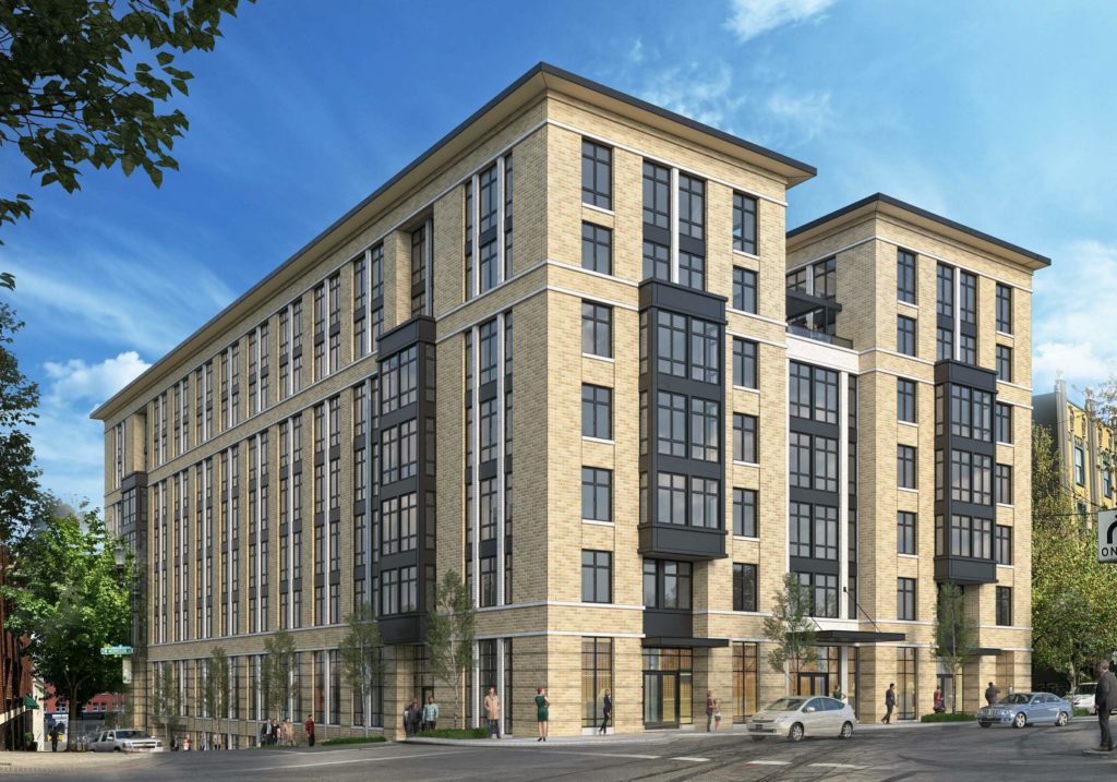
The project site is the western half of the block bound by SW Morrison St, 17th Ave, Alder St and 16th Ave. The site is currently occupied by a 2-story 1925 office building and associated surface parking. The development will abut the 1927 Commodore Apartments, which are listed on the National Register of Historic Places.
1634 SW Taylor would join two other development in Goose Hollow by Wood Partners: the ART Tower and the Alta Peak. Other projects planned nearby include the Press Blocks, Lincoln High School, 1715 SW Salmon St, 1440 SW Taylor and 1500 SW Taylor.
The building is arranged in an E-shaped plan, with two exterior courtyards facing the interior of the block. Due to the steep grade of SW 17th Ave the building will be 8-stories facing SW Alder St, and 7 stories facing SW Morrison St.
Exterior materials proposed include brick veneer in two colors, vinyl windows, aluminum storefronts and painted fiber cement panels.
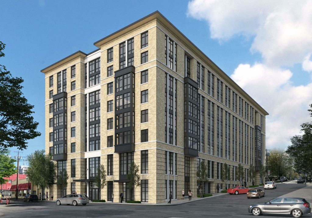
1634 SW Alder went in front of the Design Commission for an advisory meeting on May 23rd, 2019. As described in a summary memo, Commission feedback was mostly positive, with the largest issues relating to the pedestrian experience on the steeply sloped 17th Ave:
Overall, commissioners felt that the building was a very successful contextual response to the neighborhood and they applauded the use of brick as the primary material and the employment of a tripartite composition. They responded favorably to the general design direction and comments indicated that there was much more right with the design presented than wrong with it. Thus, they would not want to see large changes that could potentially move away from the things that were already successful about the design. The largest issue discussed was the scale of the building in relation to the pedestrian realm along the sloping 17th Ave frontage. While other options should also be explored, landscaping at the base of the building was supported by all commissioners present as a way to potentially mitigate this issue while not detracting from the building’s design.
In order to gain approval the project will be required to go through a Type III Design Review, with public hearings in front of the Design Commission.
Drawings
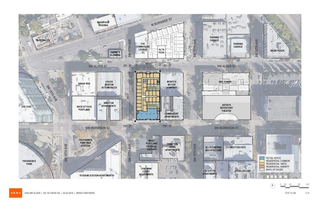
Plan | Vicinity 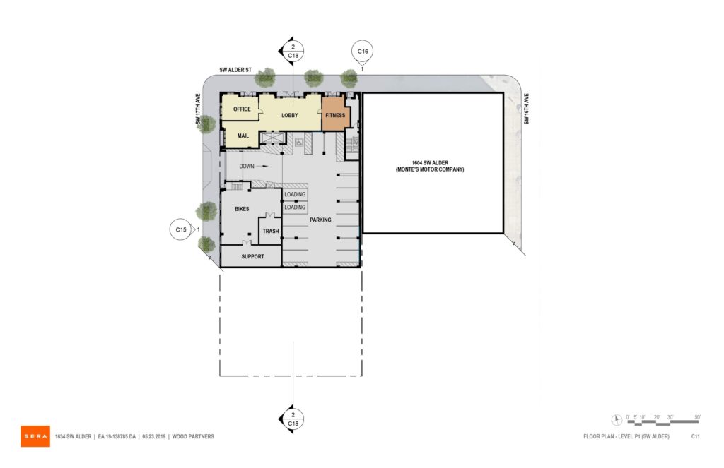
Plan | Level P1 (SW Alder) 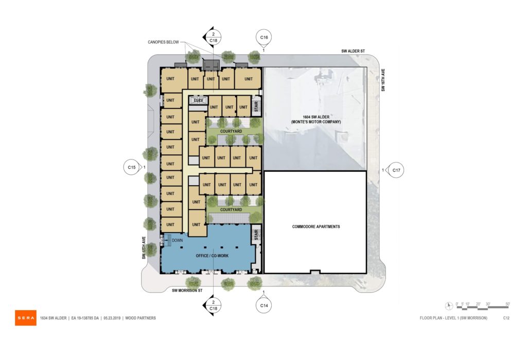
Plan | Level 01 (SW Morrison) 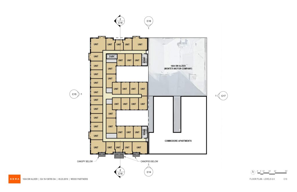
Plan | Levels 02-05 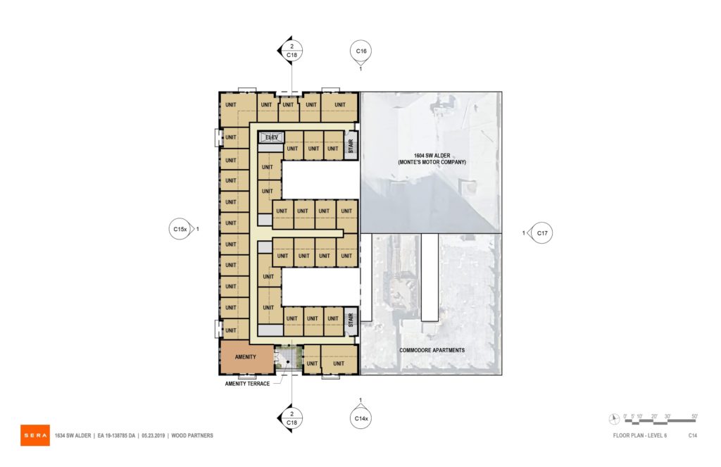
Plan | Level 06 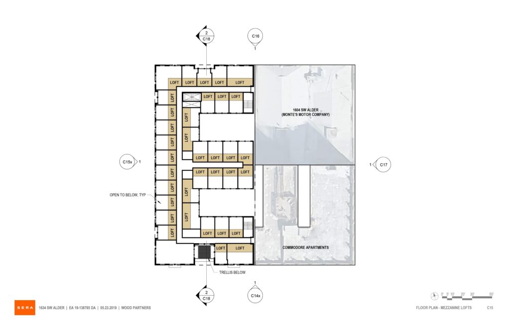
Plan | Mezzanine Lofts 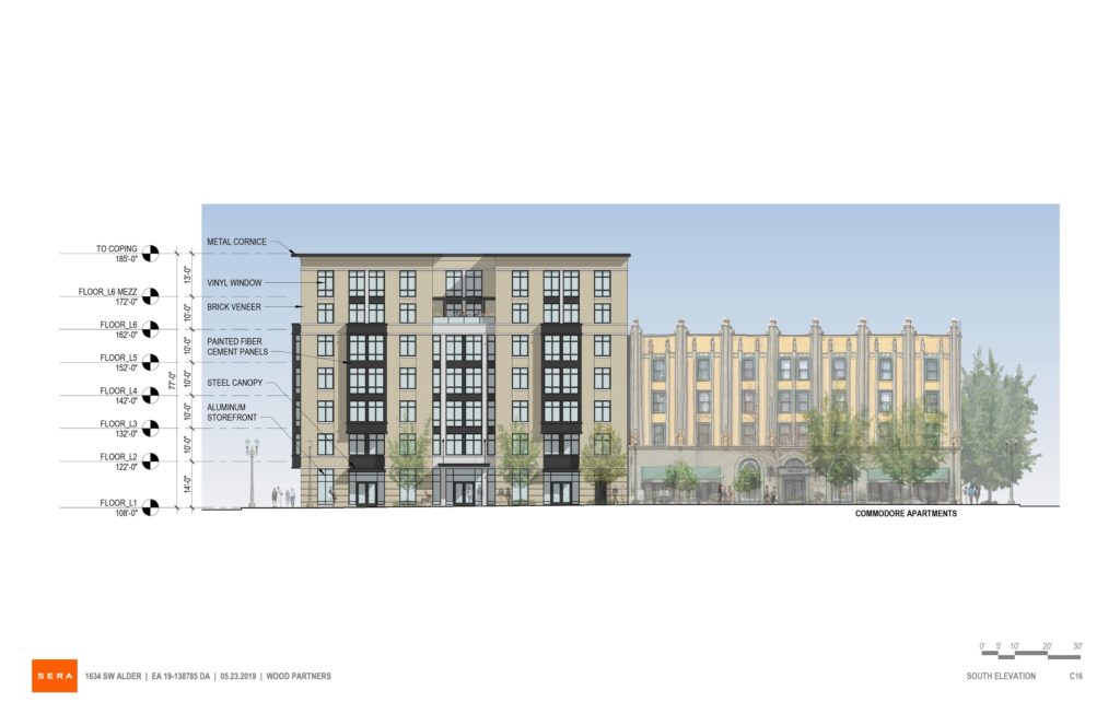
Elevation | South (SW Morrison) 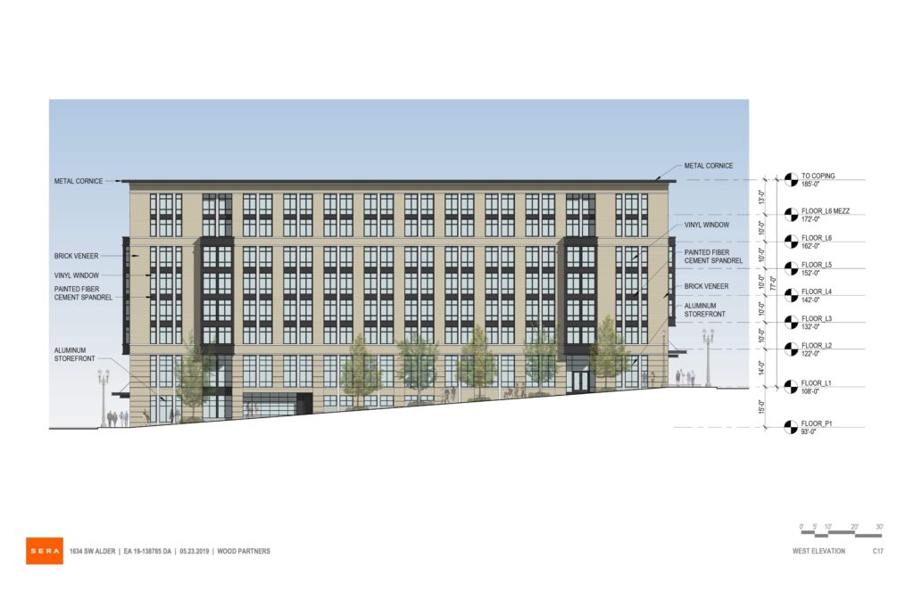
Elevation | West (SW 17th) 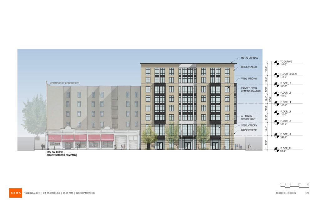
Elevation | North (SW Alder) 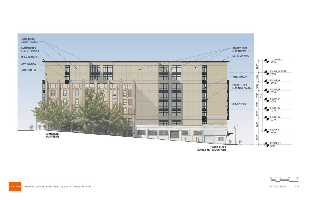
Elevation | East 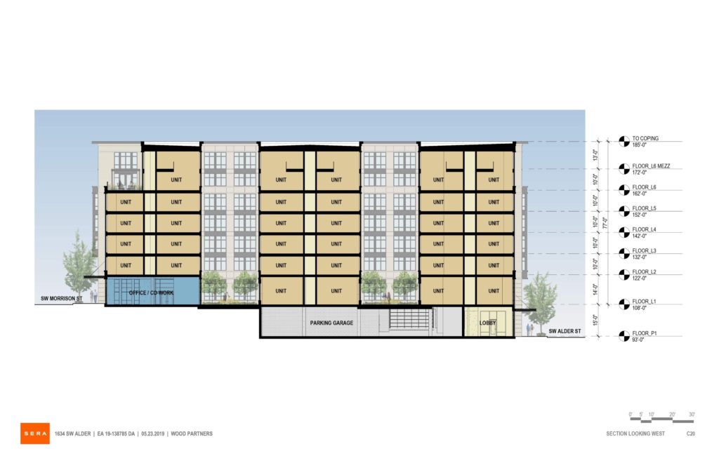
Section
Wow bricker revival again.. shocker. This city is a joke
If you’re going to be a negative nancy could you maybe post something other than this low effort trash?
thanks
If they’re going to build something using finite land and resources could they at least build something other than this low effort trash?
Thanks
What do you want? The Guggenheim? It’s a freaking apartment building. Get over yourself.
I think that design has already been done, Andrew from Sera. Are you suggesting that people live in a museum? No, how about something more contemporary that takes some thought to put together.
Perfection.
If detailed well, this will be a good neighbor for the other early 20th century apartment buildings nearby. Though this is not a historic district, there are quite a few handsome almost 100-year-old brick buildings in the neighborhood. Not EVERY new building needs to shout “Bold 21st Century Design Statement!”
I do agree that not all buildings have to be a magazine cover building, but the neighborhood is not heading in the historical revival direction… Providence Park just got redone, the Artists Repertory is being redone, and Art Tower is going in.. All of which are contemporary building designs. So why are we now throwing in a bricker? I don’t get the thought process.
LIkely because the general population, and in this case savvy developer, prefer them over most contemporary alternatives. We architects live in a bubble, and our tastes don’t reflect the publics.
Sure, and maybe that is because we think we live in the year 1910 in Portland. In many cases, our taste doesn’t reflect that of the public because design is learned through practice. People are afraid of anything remotely different, but what boggles the mind is that you don’t need to know anything about design to appreciate good design. Just thinking of products that cost relatively the same amount and are used for the same thing, but are not equal: Nike/Adidas and Sketchers. I’m not a shoe designer, but I can tell you that Nike/Adidas are far superior in function and form. You know, forget it…. we should just let the public/developers design all of the buildings from now on. They definitely know better than the people who have dedicated their lives to design. Put on your Sketchers Portland, we are going to moonwalk into the future!
By the way, the ZGF/PAE Living building in the article posted just after this article is a brick building, but it has taste. It is a contemporary brick building that looks great. So, I’m not just some brick building hater that wants everything to be made in aerogel or something… just do your job for christ’s sake.