A staff level approval of a new mixed use building has been upheld by the Design Commission, following an appeal by the Overlook Neighborhood Association. The four story building, designed by Works Progress Architecture, will include 36 residential units over ground floor retail. The building will be subject to the city’s inclusionary housing rules, which require the provision of affordable housing. 42 long-term bicycle parking spaces, mostly in a secured ground floor bike room. No vehicular parking is proposed.
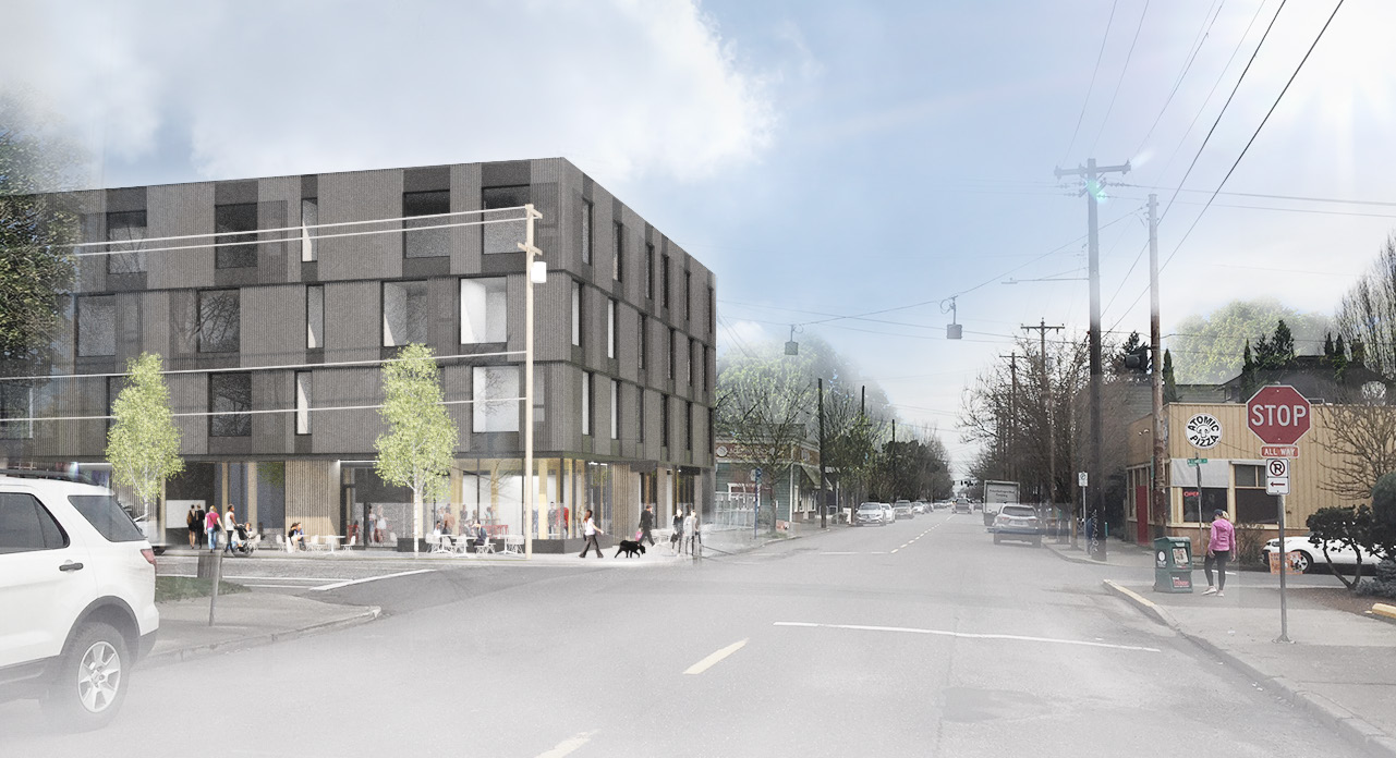
The project site is a 10,000 sq ft lot at the corner of N Killingsworth St and N Denver St, currently occupied by a former gas station.
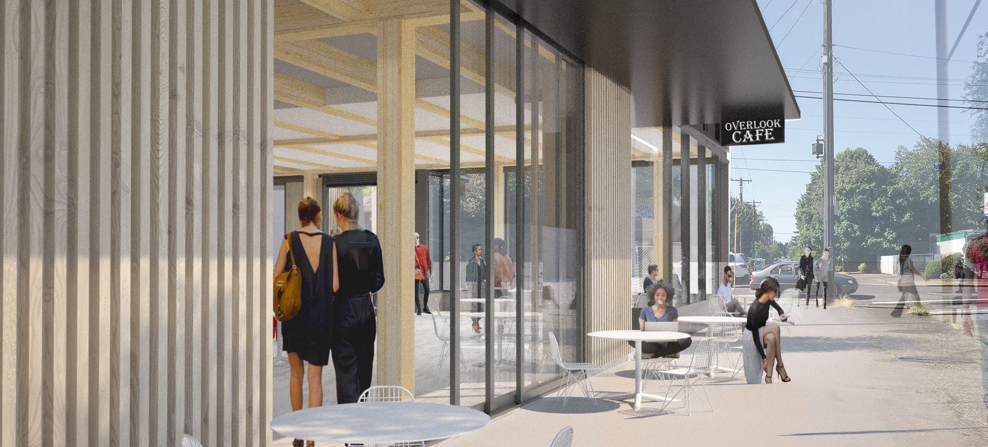
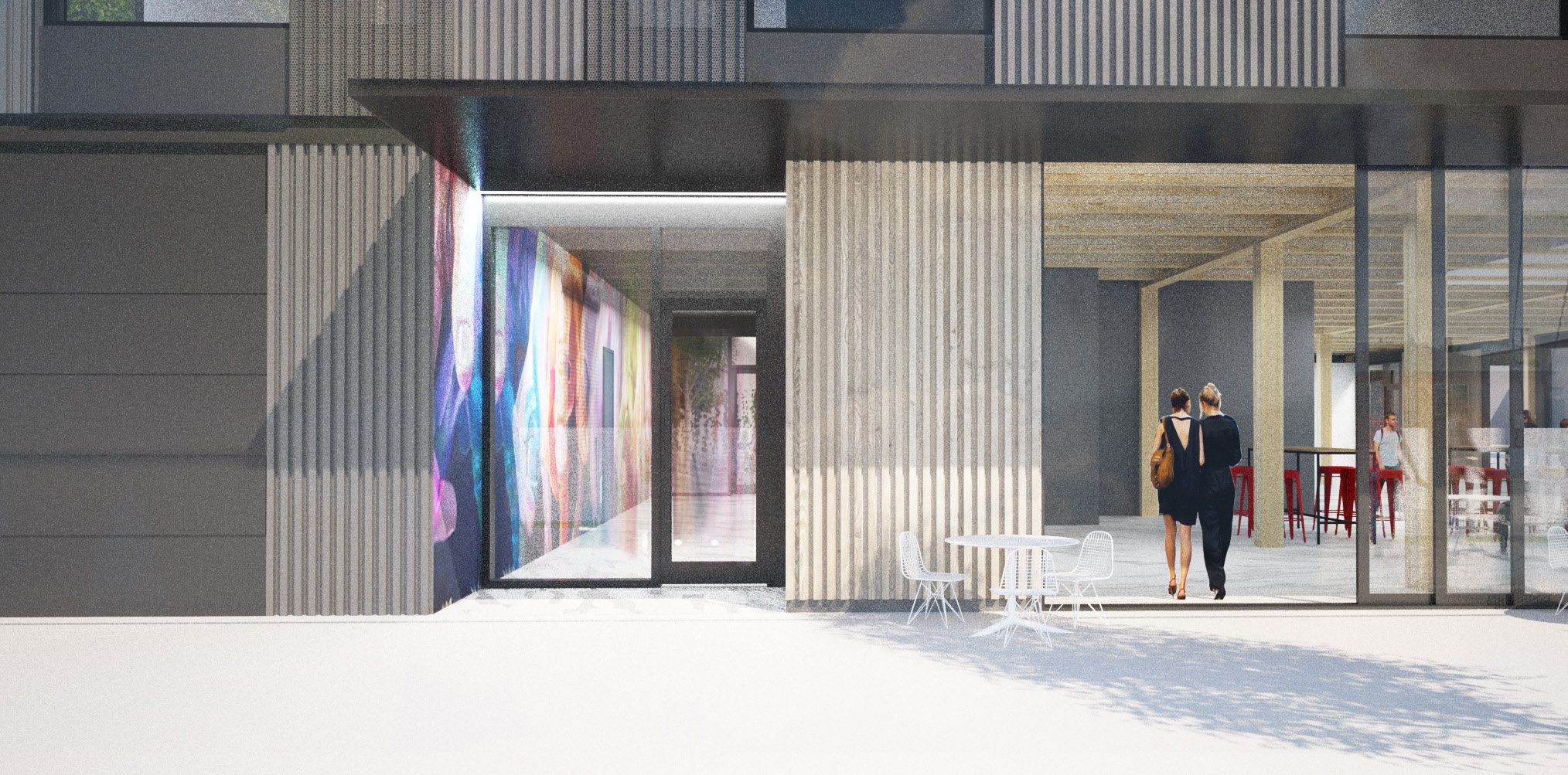
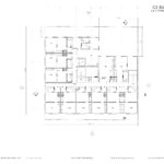
The building is arranged in a L-shaped plan, which wraps around an interior courtyard at the ground level. The building is set back 6′ from the property on N Killingsworth, as required by the zoning code. The setback will be paved as an extension of the sidewalk, creating a spill out area for the retail spaces.
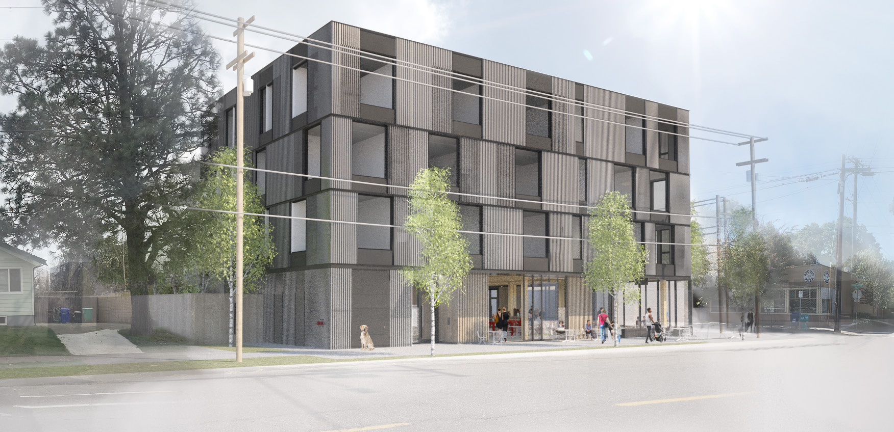
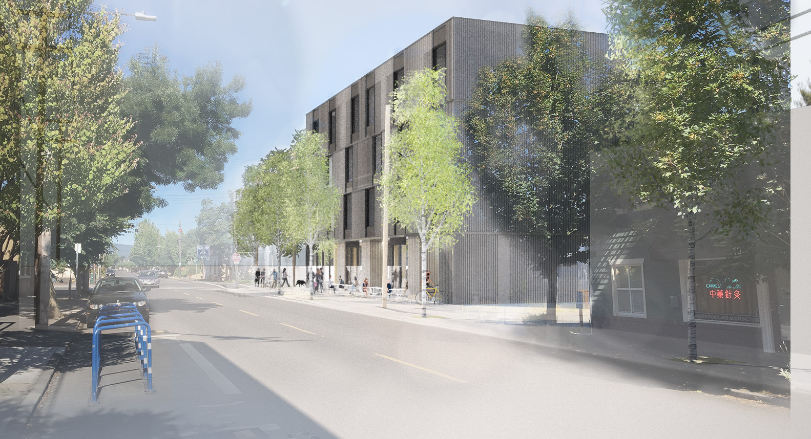
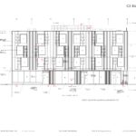
Materials proposed for the building include vertical box rib metal panel, flat metal panel, vinyl windows, aluminum storefront glazing and vertical cedar cladding. The box rib metal panel will be perforated in the areas where it sits in front of the staggered upper story windows. The second floor platform will be framed with cross-laminated timber, the underside of which will be visible at the street level through the storefronts.
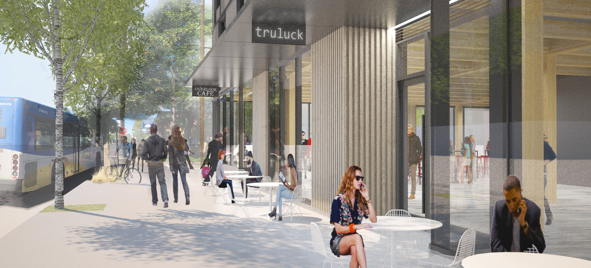
1935 N Killingsworth was approved on October 23rd, 2018, through a Type II Design Review, where the decision is made by Bureau of Development Services staff. In the conclusion to the notice of the decision the project was found to be create “vibrant” street level activity:
The proposed ground floor commercial along North Killingsworth, with its deep, publicly accessible setback, will contribute a vibrant, visually interesting and accessible place for the neighborhood. The building’s simple expression of residential over retail relates to the street’s historic streetcar era development through a contemporary architectural expression.
The approval was appealed to the Design Commission by the Overlook Neighborhood Association, who felt that the project had not met guidelines D7 “Blending into the Neighborhood” and D8 “Interest, Quality, and Composition”. At a November 15th appeal hearing the Commission agreed with the original decision, and unanimously voted to uphold the staff findings.
A building permit will need to be obtained before construction can begin.
Drawings
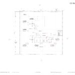
- Plan | Site
- Plan | Ground
- Plan | Levels 2-4
- Plan | Roof
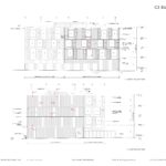
- Elevation | South (N Killingsworth St)
- Elevation | West (N Denver St)
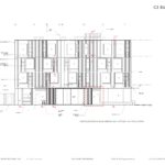
- Elevations | North and East
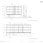
- Sections
It has been unfortunate to see the stark drop in design quality from Works Progress Architecture after the departure of one of the founding principals. It’s probably much better for the culture of the firm and hopefully will lower employee turn-over but it does highlight where the design innovation in the firm was coming from. Their recent buildings, this building included, are kind of a dull echo of their past work and are either compositionally incoherent or just plain ugly. Perhaps more than any other firm in Portland, they used to consistently deliver well composed designs based on clear concepts, often on very constrained budgets. Hopefully this is just a period of recalibrating the design focus rather than the end of a good design firm.
Agreed. This building looks like something you’d find in the Lloyd Center. It’s no wonder the neighborhood fought hard to stop it. It’s shameful Works Progress Architecture cares so little for the neighborhoods they are disfiguring. An empty parking lot is more attractive than this.
I concur as well. It seems like this lack in low-time preference – contextual design – has been contagious to many once smaller influential firms that really made an impact on our city, and especially on me back in college. Now these firms and their work look identical to development companies to the point where you can see how much they’ve quatered their coins in materiality and craftsmanship. Albeit, having something there may be more positive than the derelict gas station now, it’s going to resemble something similar if they go cheap on materials. Architects should be offering alternatives so property owners aren’t spending more on upkeep and updates. Realize that every problem was once a solution. Corrugated steel siding and raw wood are going to look terrible in 40– no 10 years. If you can’t even afford better quality than vinyl windows for multi-family housing, maybe consider reducing the size of the condos by a floor. Modesty and sensitivity goes a long way but modern architects seem to have left those aesthetics behind a long time ago. Shame.
Sounds like you have all the answers cupcake.
If that is your real name…
I agree that the former principal had an approach that prioritized clear concept and to that extent he was a very good editor. But don’t hurry to lay further accolades at the feet of a person who was at the crux of a very toxic culture at the firm and the reason why so many talented people left or lost their jobs. The leadership there bungled their response to a very serious #metoo issue and allowed someone to walk away from taking accountability of his actions while taking business along with him.
WPA’s deterioration isn’t because they lost him but because they didn’t turn around and invest and TRUST the good ideas, talents and skills of its people. The old boys hierarchy is in full effect there trying to carry on a tainted legacy. TOO BAD because there was a real chance for the firm to evolve and develop its vernacular and its business had it stood up for human value. What a fall from grace!
Make room for the creatives that can execute clear concepts AND practice in the field of architecture with virtue and principle.
It may look like a watered down Brad Cloepfil or Corey Martin bldg from 15 years ago but it’s still an improvement. Sexy pictures don’t build buildings. W.PA has managed to finish the Jupiter and the Flatiron while keeping other projects going here in PDX (23rd, Stark, the Chamberlain) with half the staff. All while working on massive projects in Denver and Los Angeles. They still have the ambition and tenacity to get buildings built. I don’t believe it is fair to judge their re-calibration on this project alone.
Jupiter NEXT is a garbage building that already looks weathered and dated. They don’t deserve accolades for getting cheap gimmicks slapped together, no matter how lean they are running on staff.
I do think this building will be good for the area and I support adding density (rather than sprawl) as we have a housing affordability crisis. I’m just disappointed that WPA seems to have lost its design ability that it was known for. If you look at their past work and even some of the work that was designed in the past couple of years and is now wrapping up construction – it is very well composed and often has clever responses to its site. Their new work is just… muddy. Specifically, the Nomad on interstate and the building at 550 SE MLK. These looks like massive building designed in Microsoft Excel with a few materials pulled from past WPA projects applied to them. You can’t tell me those buildings are going to look good in 10 years, considering how downright ugly they are now. The lower quality, sloppy rendering style for the project above doesn’t help. It makes the building hard to decipher. Holst is another firm in town that had a reputation for stellar work that lost its design principals and is now producing mediocre work at best. Similar to WPA, they have also taken on some very large scale projects that tried to recycle design moves from their previous projects with poor results. Maybe these firms will evolve into more production oriented firms and new ones will step up to be the design innovators.
This project is such a manifestation of a company with bad intentions deteriorating from the inside out. Greedy people working for greedy developers. It’s sad that they try to justify their bad behavior with ‘good design.’ Seems like they are lacking in the ‘good design’ department now as well. Make way for the new design firms in town. I have faith that the new cohort will have better morals as well as buildings. WPA is on the out.
I agree that W.PA is on out. I doubt their will get better – It’s pretty common knowledge that Carrie wanted to pursue a political career rather than continuing in Architecture prior to Bill leaving as the design principal. She stated this is several articles that her “political career” is on hold.
If you look at the web page they have less than half the staff they had a year ago. I think some of the people on the site don’t even work there anymore. Makes you wonder how much attention each of these projects is actually getting.
This project had so much push back from the neighborhood and the planners that it took them almost a year to get it approved. Really unfortunate that she’s so unwilling to listen and work with the city and the local communities. At least poor quality work like this combined with strong community involvement will push firms like this out and make way for higher standards in the future.
A little harsh, no? The building hasn’t even began construction, and not only are people attacking the design, but the firm as well.. There is way too much trash being built for this to be so targeted for the self-acclaimed architecture critic chopping block. It’s a perfectly fine building, not pushing the envelope and not an eyesore. Also, if you do think it sucks so bad, you all obviously don’t hold the developers, city and everyone else involved to the same standard by blaming the Architect. If it is such a piece of crap and you could build a better company and building, let’s see it.
I’ll wait.
I’m glad others agree that this building isn’t a success. This development has little to no support from the neighbors and it doesn’t meet the design criteria (despite what the Design Commission said, or didn’t say). The developer, Andrew Clarke (Hugh Realty) serves on the Design Commission and used his influence to push his building through. In the initial stages, he feigned commitment to the neighborhood only to later drop all communications and refuse design modifications that would’ve enhanced aesthetics and boosted local support. I’ve lost all respect for Hugh Development/Andrew Clarke, Works Progress, and the biased Portland Design Commission.