A proposed development in the Central Eastside has gone in front of the Design Commission for three Design Advice Request (DAR) meetings. The 8-story Grand Avenue Mixed Use Apartments are being designed by Ankrom Moisan Architecture for developer Fairfield Residential. As presented at its most recent DAR, the project would include 170 residential units, over approximately 5,000 sq ft of retail space. 51 vehicular parking spaces would be provided in a garage, located partially below grade. The building will be subject to the city’s inclusionary housing rules, which require the provision of affordable housing or the payment of a fee-in-lieu.
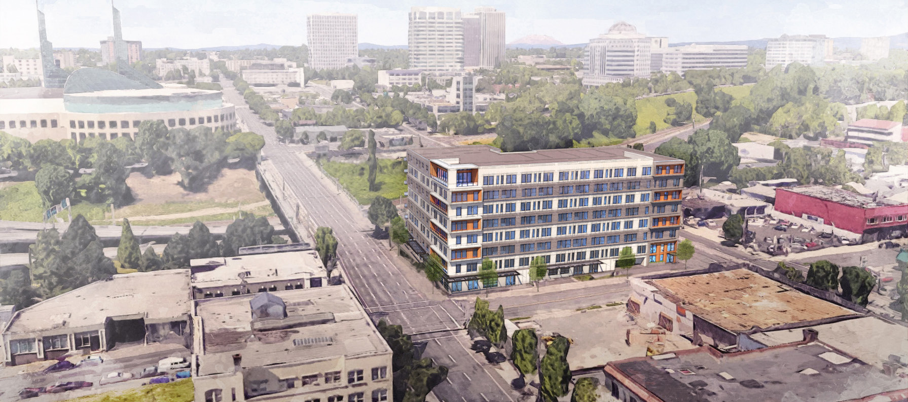
The project site is a roughly 22,000 sq ft L-shaped parcel, at 203 NE Grand Ave and 206 NE Martin Luther King Jr Blvd. A single story garage, built in 1929, currently sits on the parcel facing Grand Ave. The rest of the site is currently used as surface parking.
DAR #1
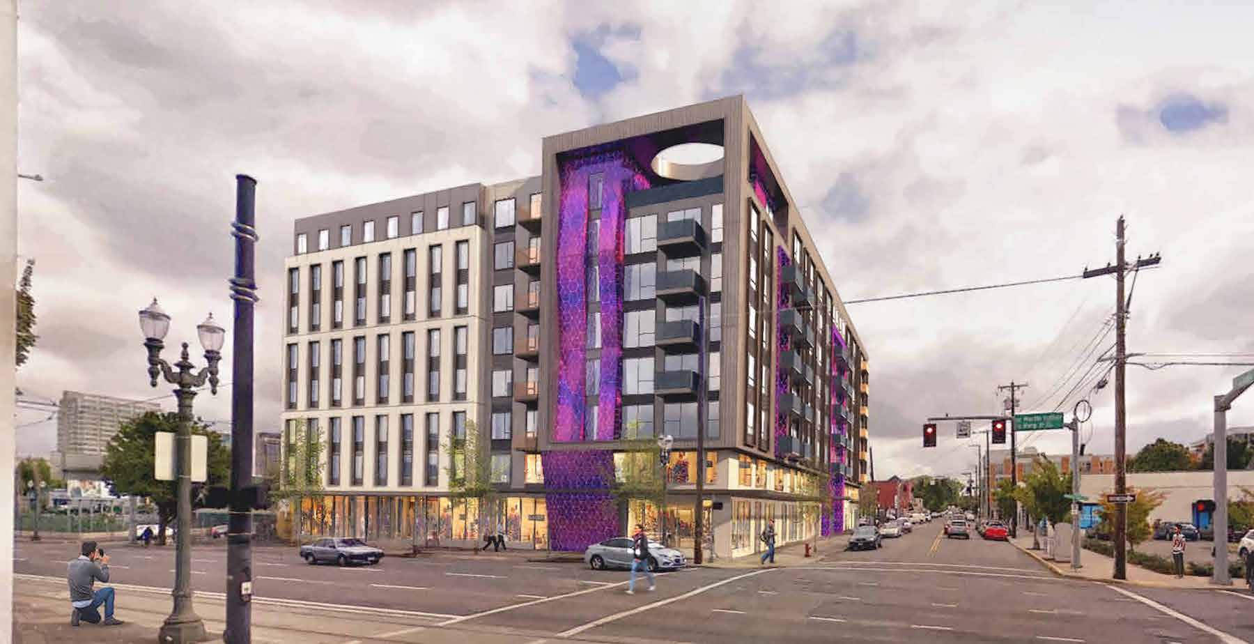
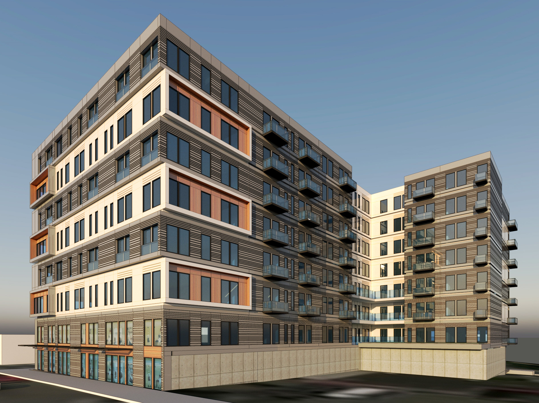
The Grand Avenue Mixed Use Apartments first went in front of the Design Commission on April 24th, 2018. The first design intended to bridge the gap between the traditional massing found in nearby buildings such as Lower Burnside Lofts and the Aura Burnside, and highly sculptural buildings such as Slate, Yard, the Fair Haired Dumbbell, and the Jupiter NEXT.
As noted in a summary memo, the “Commission struggled with the building’s mix of concepts, especially since buildings in this area around the Burnside Bridgehead have such a clear identity.” Direction was given to simplify the concept around one core idea. Other areas of discussion included the close relationship of the garage entry to the lobby, the building mass projecting over the right-of-way, and the placement of the fitness room on NE Grand Ave.
DAR #2
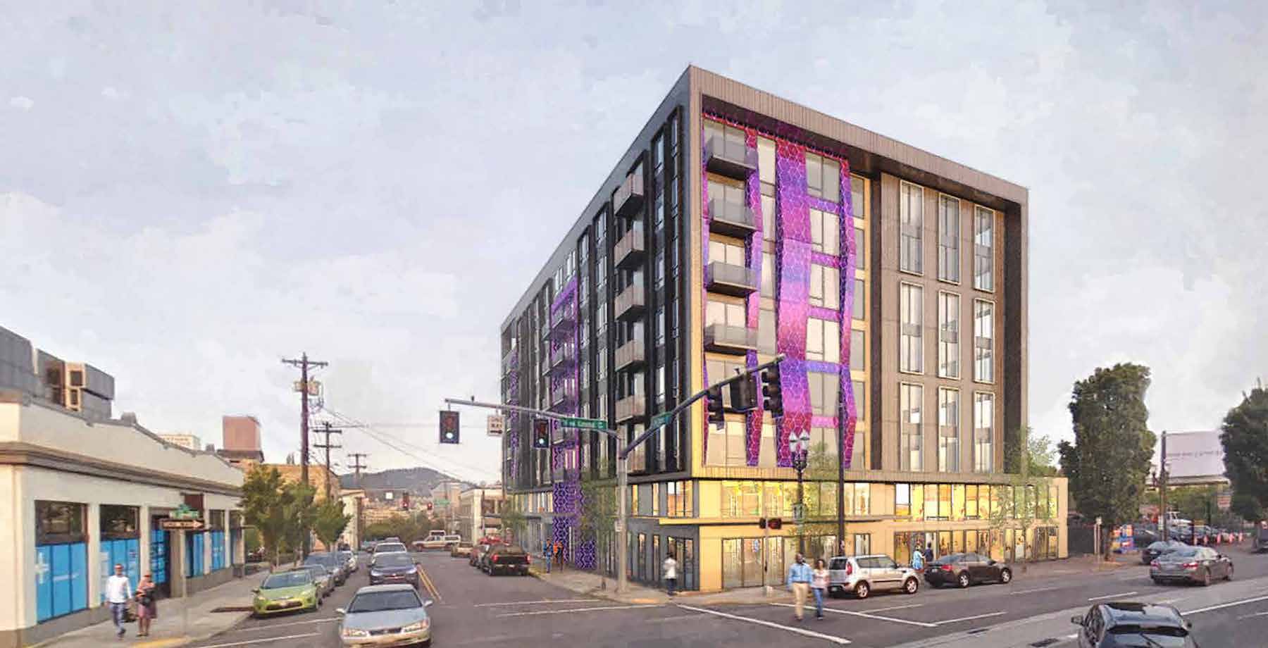
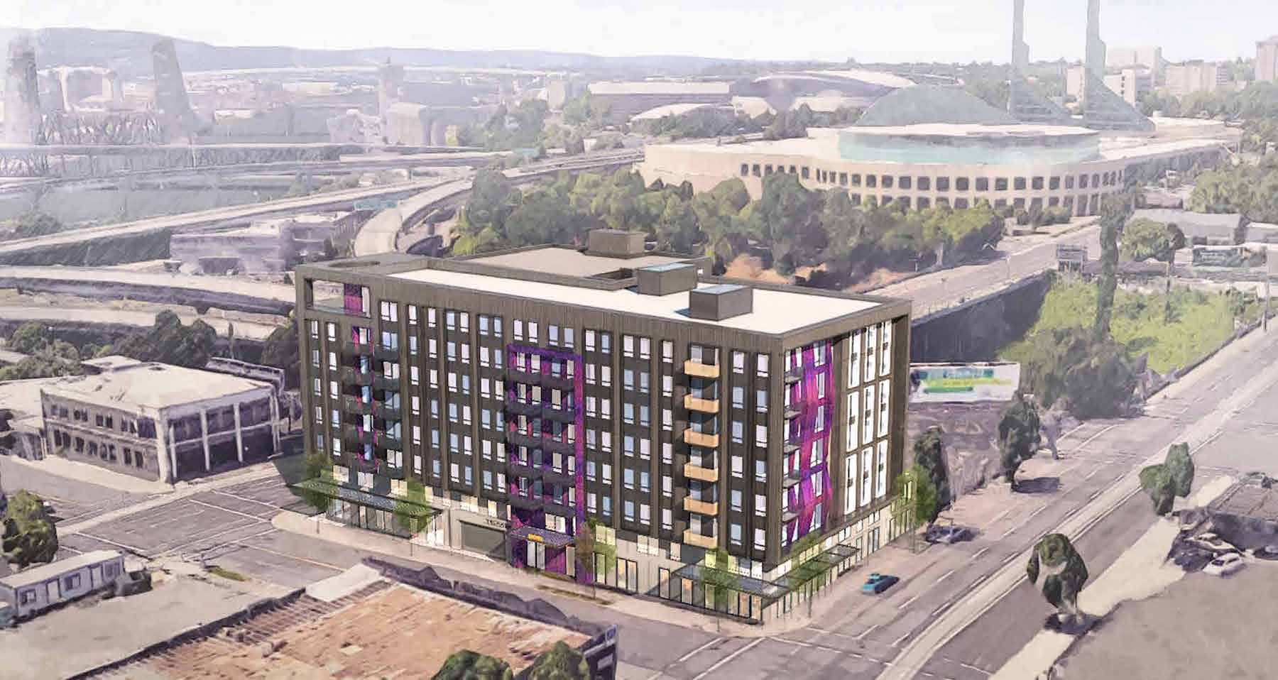
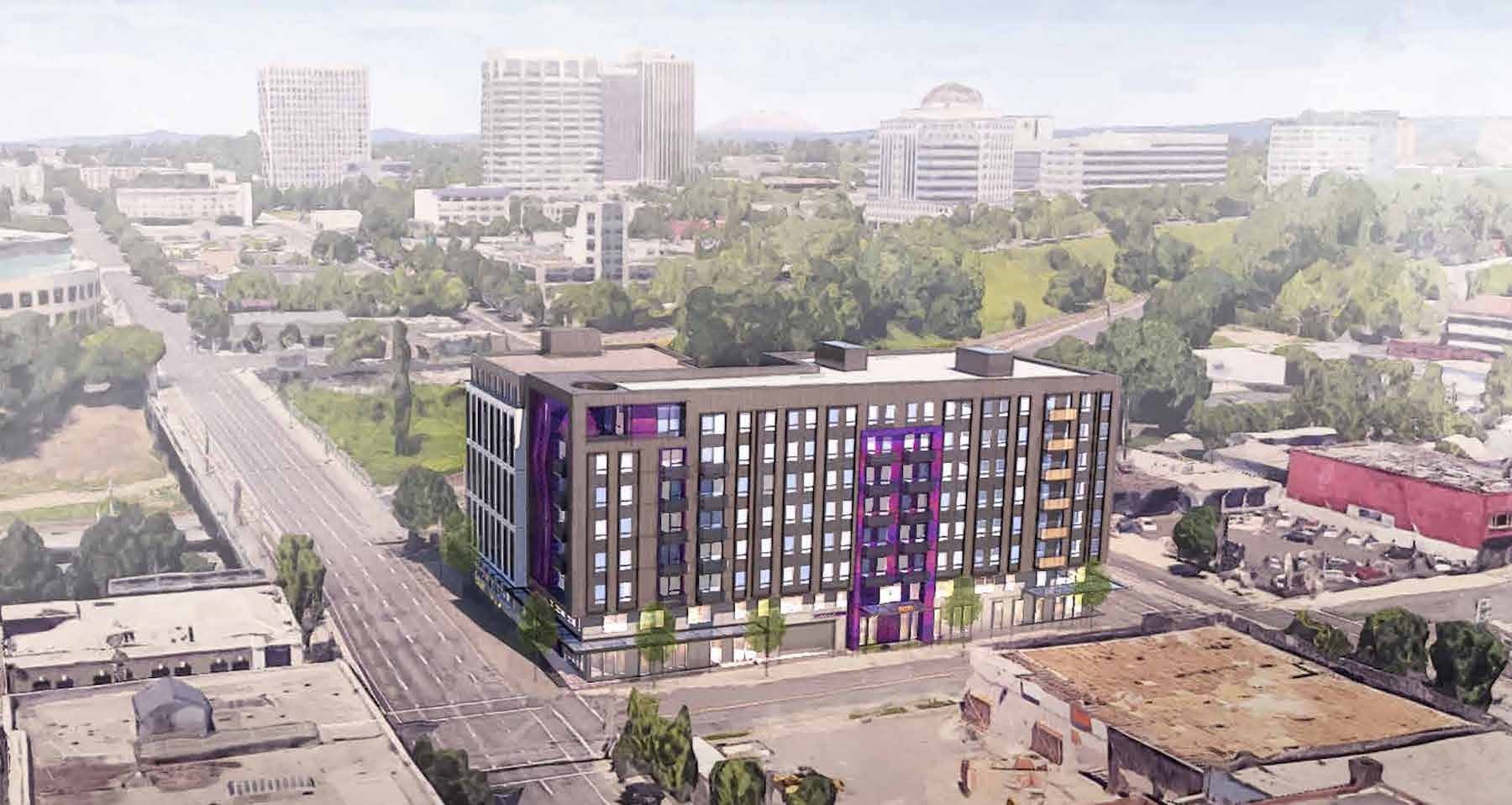
The applicants returned in front of the Design Commission for a second DAR, held on May 17th, 2018. Based on the feedback received at the first meeting, the design was significantly revised. A new concept, inspired by hand built railway bridges, intended to represent alternating layers of logs rotated at a 90-degree angle. Two colors of metal panel on the facade were proposed, shifted out plane with each other, to represent the logs and voids in between them. The colored frame element at the corners was intended to represent the end grain of the logs.
A second summary memo outlined design Commission comments, including that the concept should be “more distilled, abstracted, and simplified”, and that it may be difficult to read the concept given the residential style windows at the edge of the “logs”.

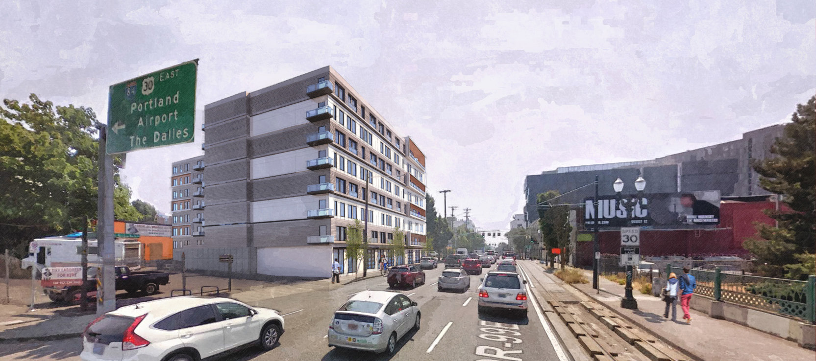
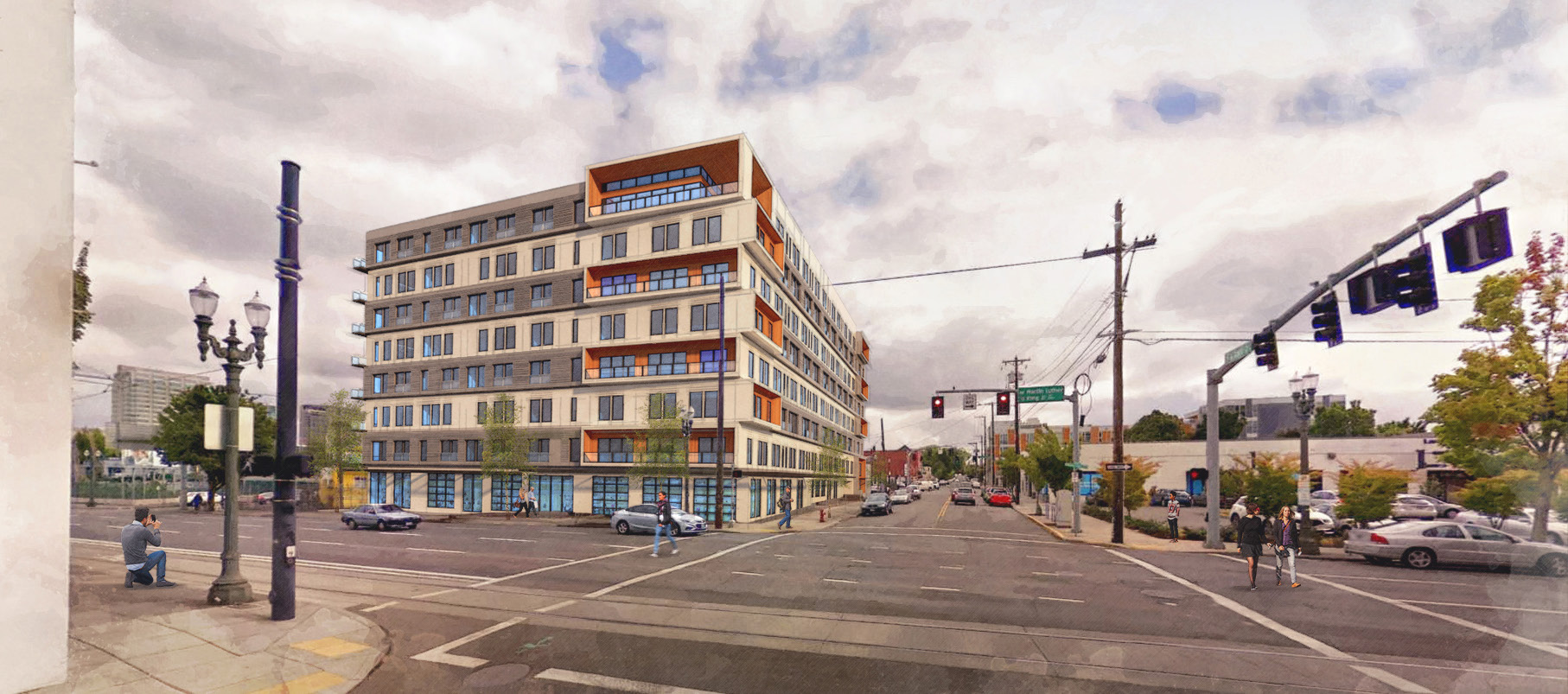
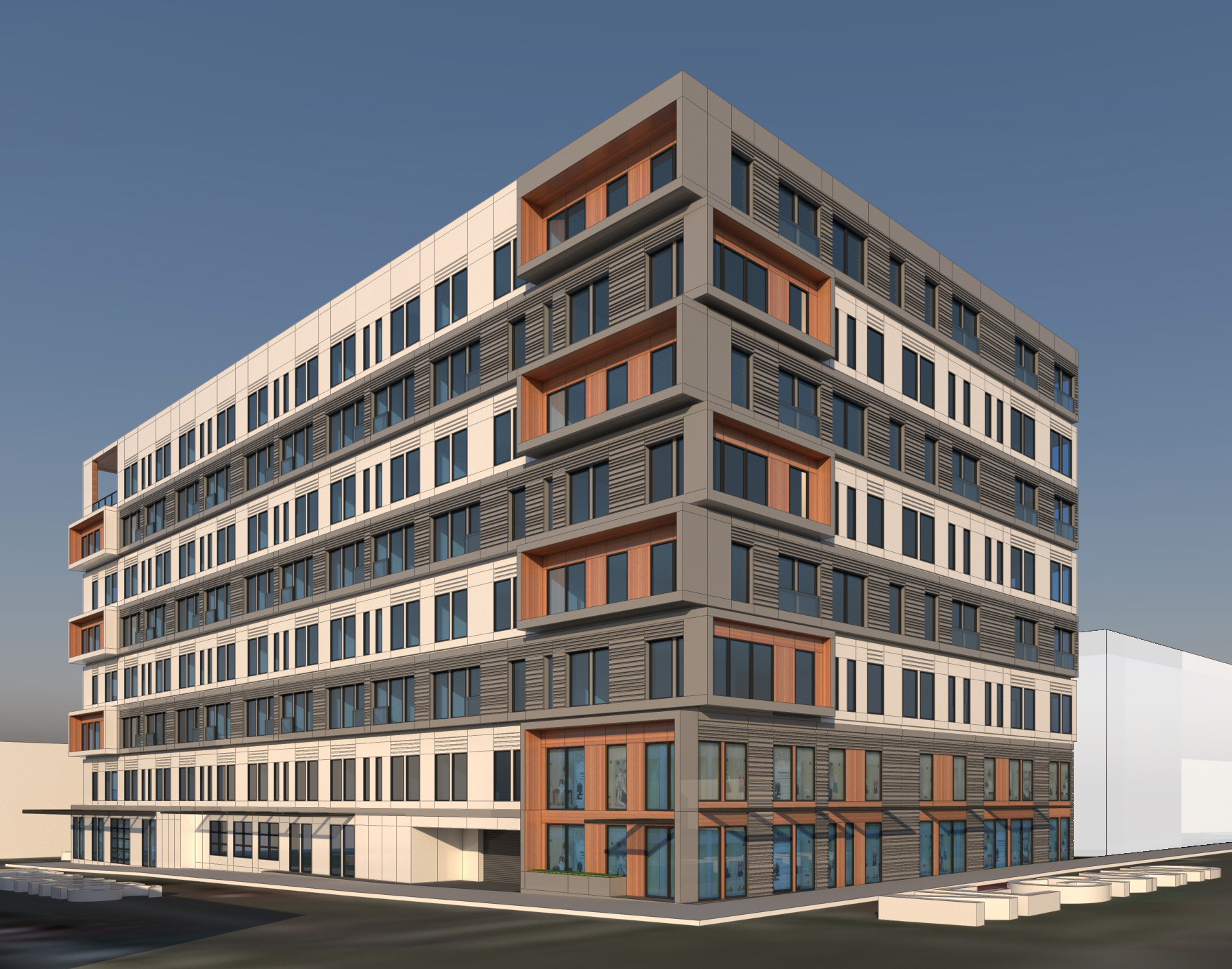
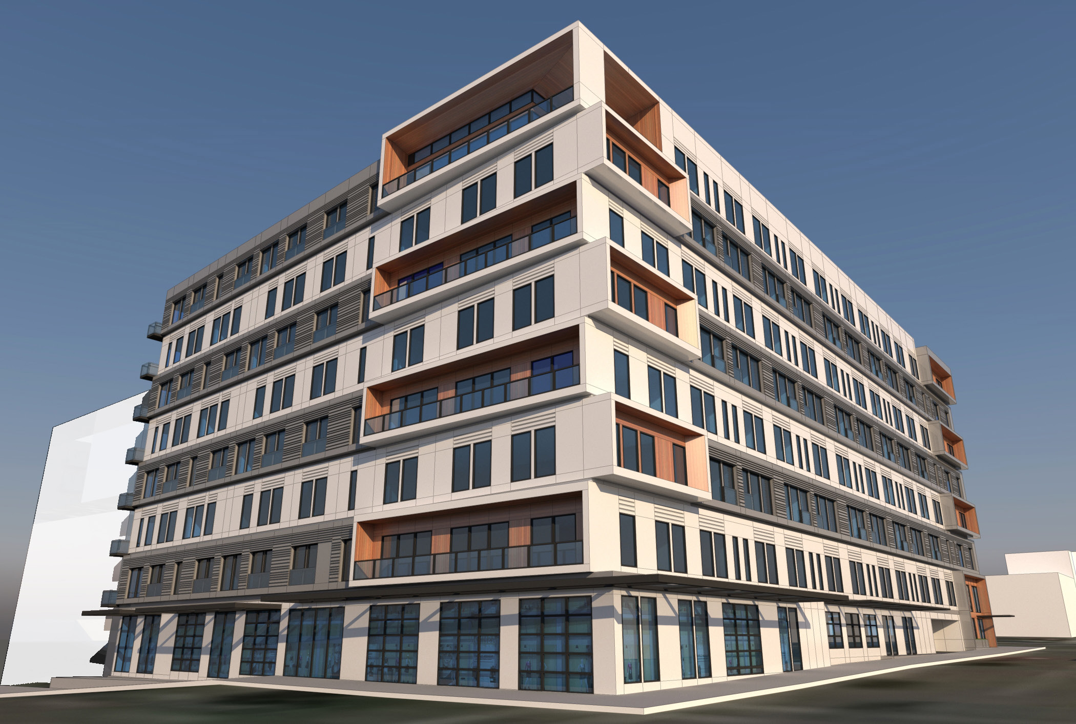
DAR #3
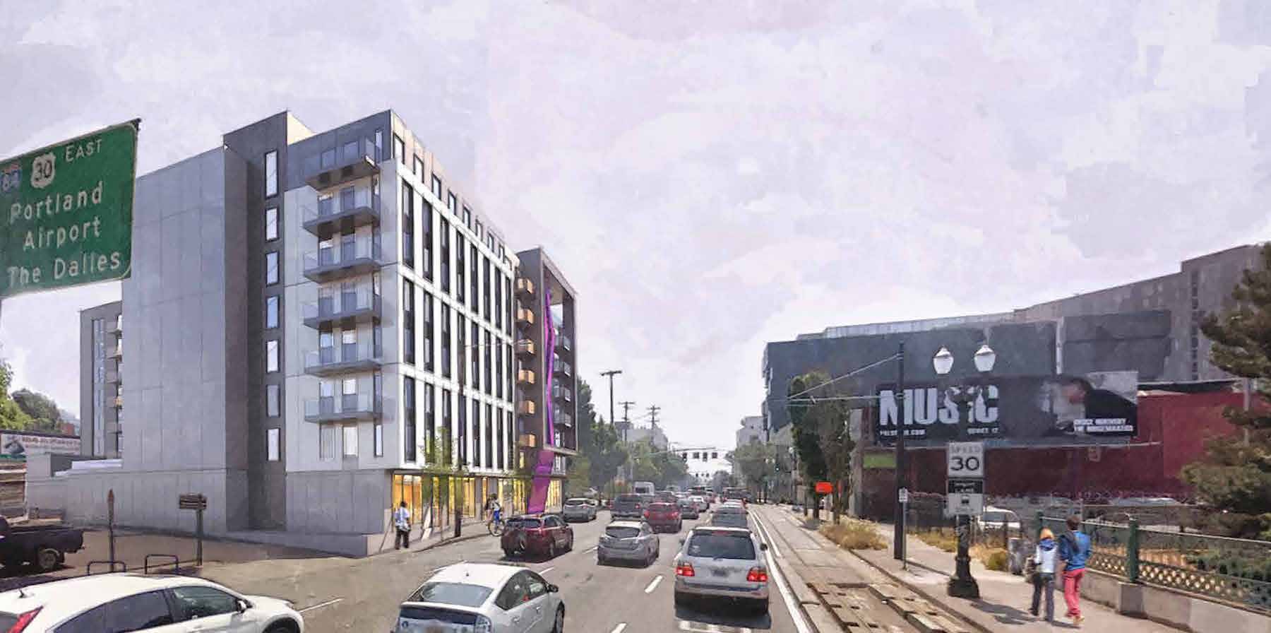
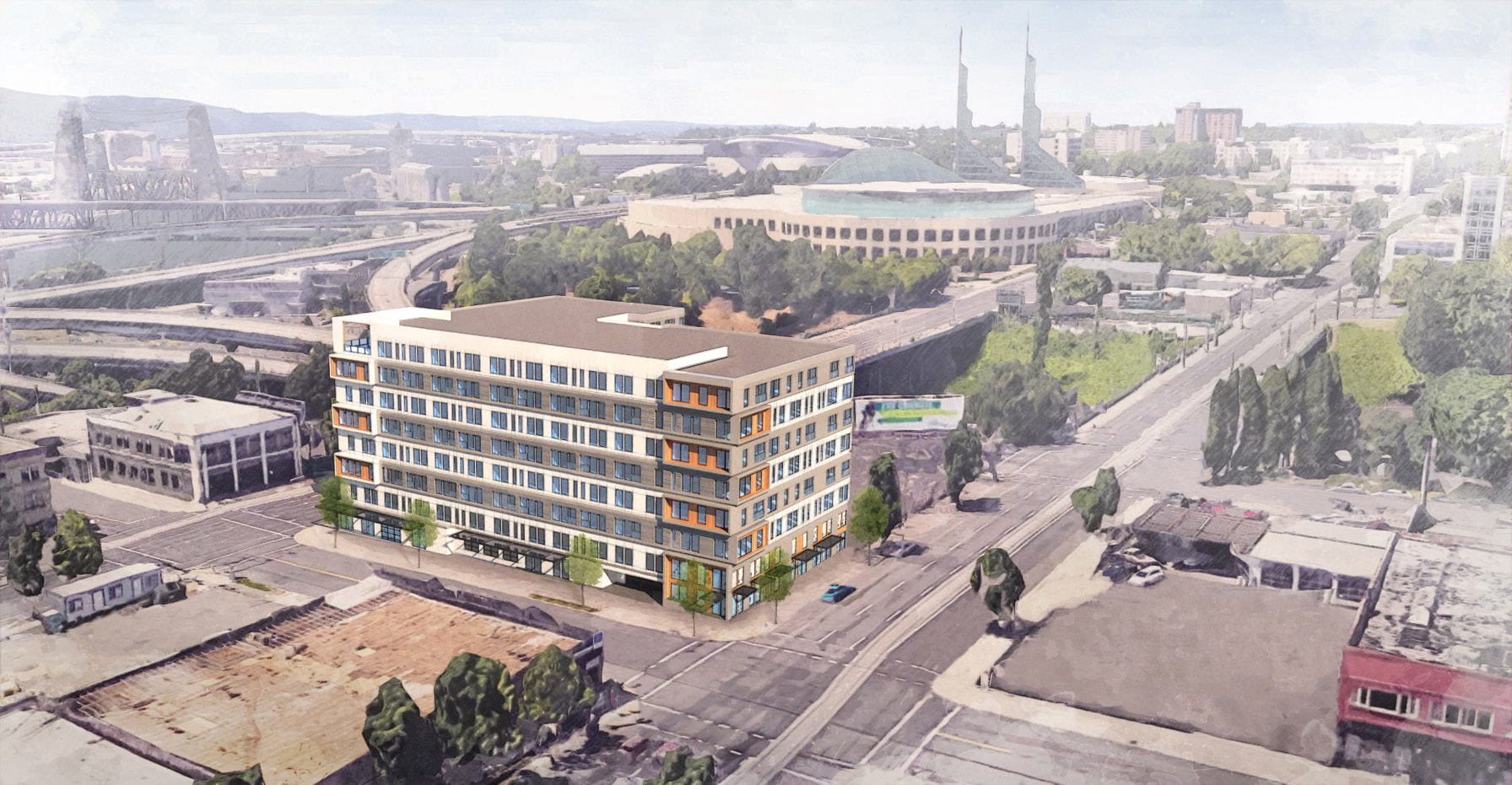
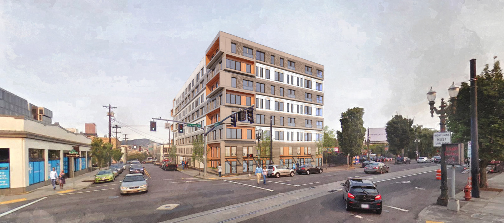
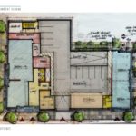
Shortly after the second DAR, a follow work session was held on June 7, 2018, with only concept level massing diagrams presented. Changes made included a new plan at the ground floor, with greater retail presence on both MLK and Grand. The stacked logs concept was revised to a tripartite 2-3-3 arrangement, creating larger “end grain” expressions at the corners. As noted in a third summary memo some Commissioners continued to have concerns about how this would read once windows are added back into the elevations, but that the overall building form had improved.
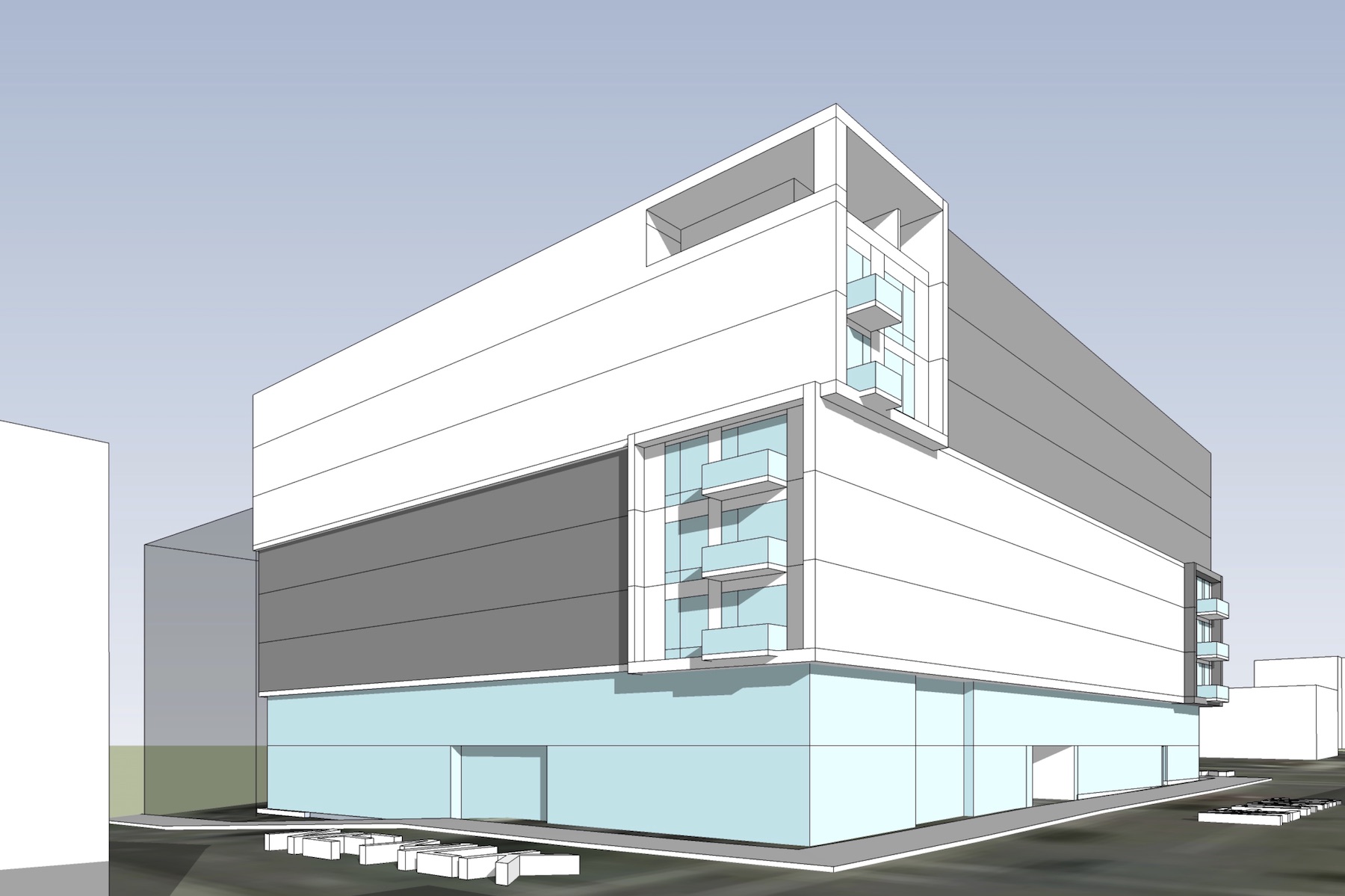
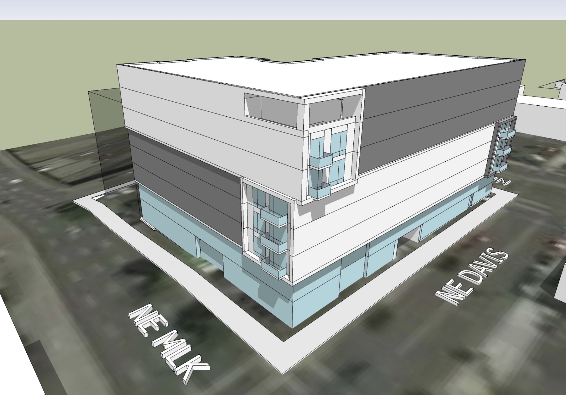
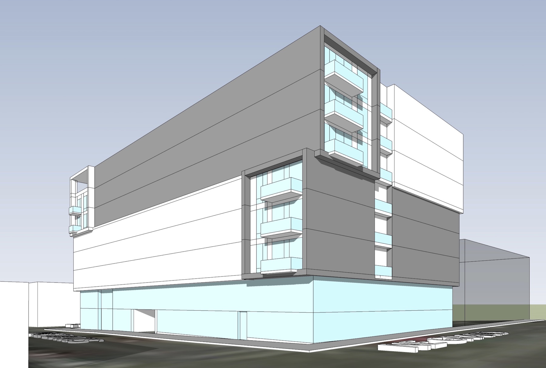
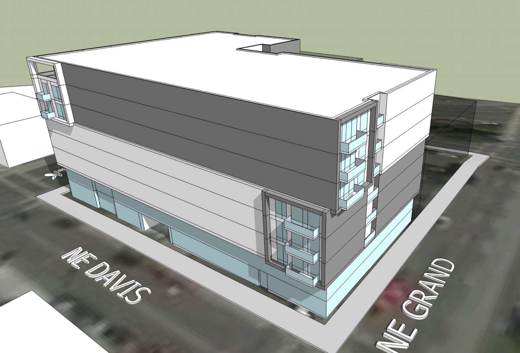
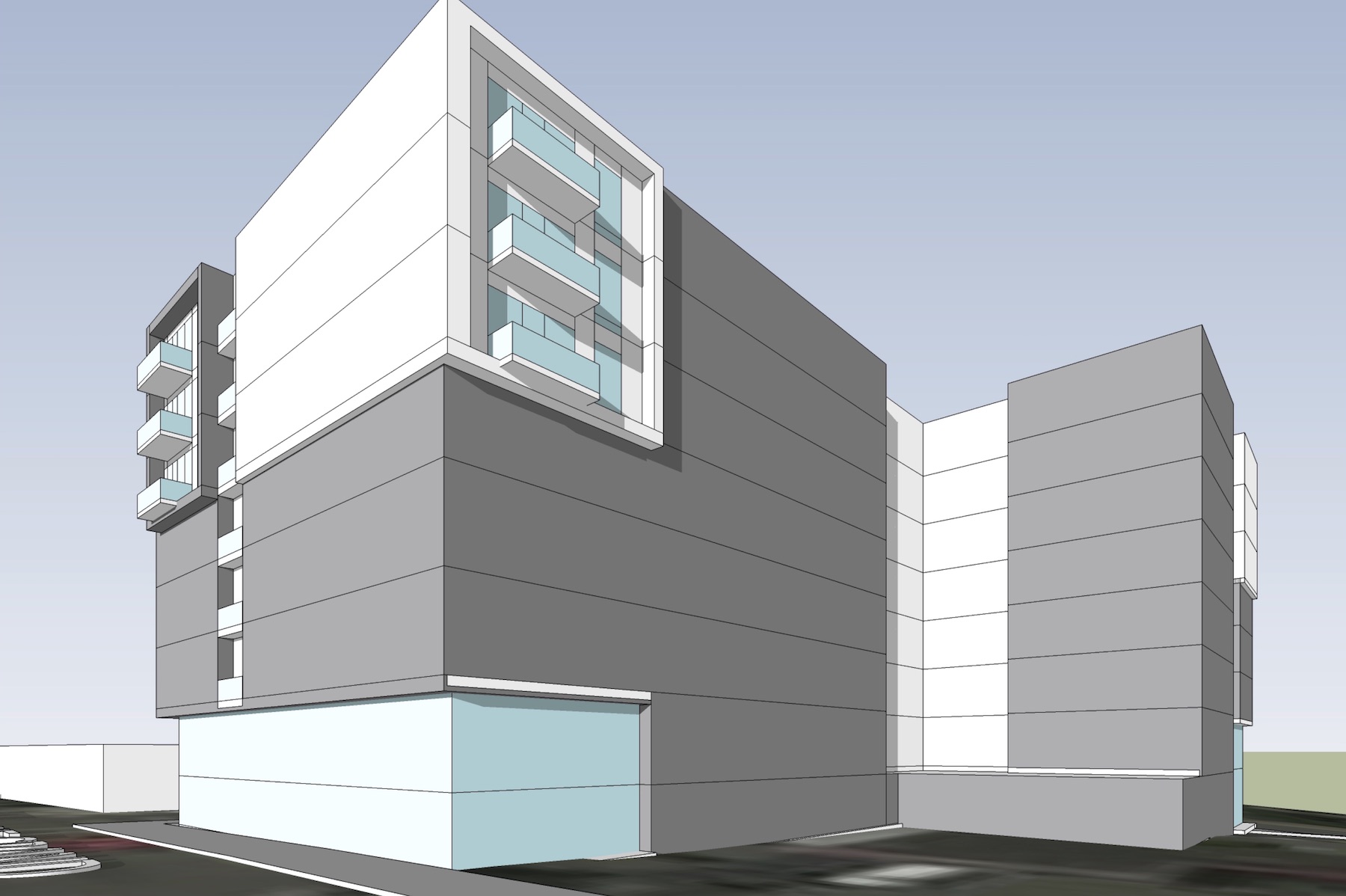
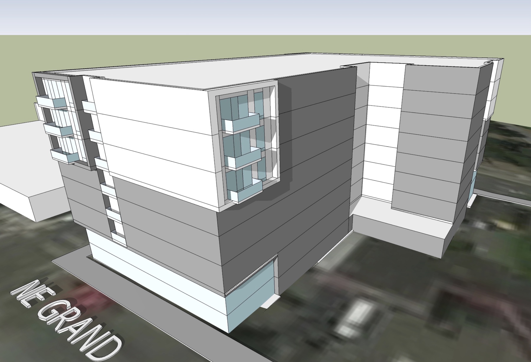
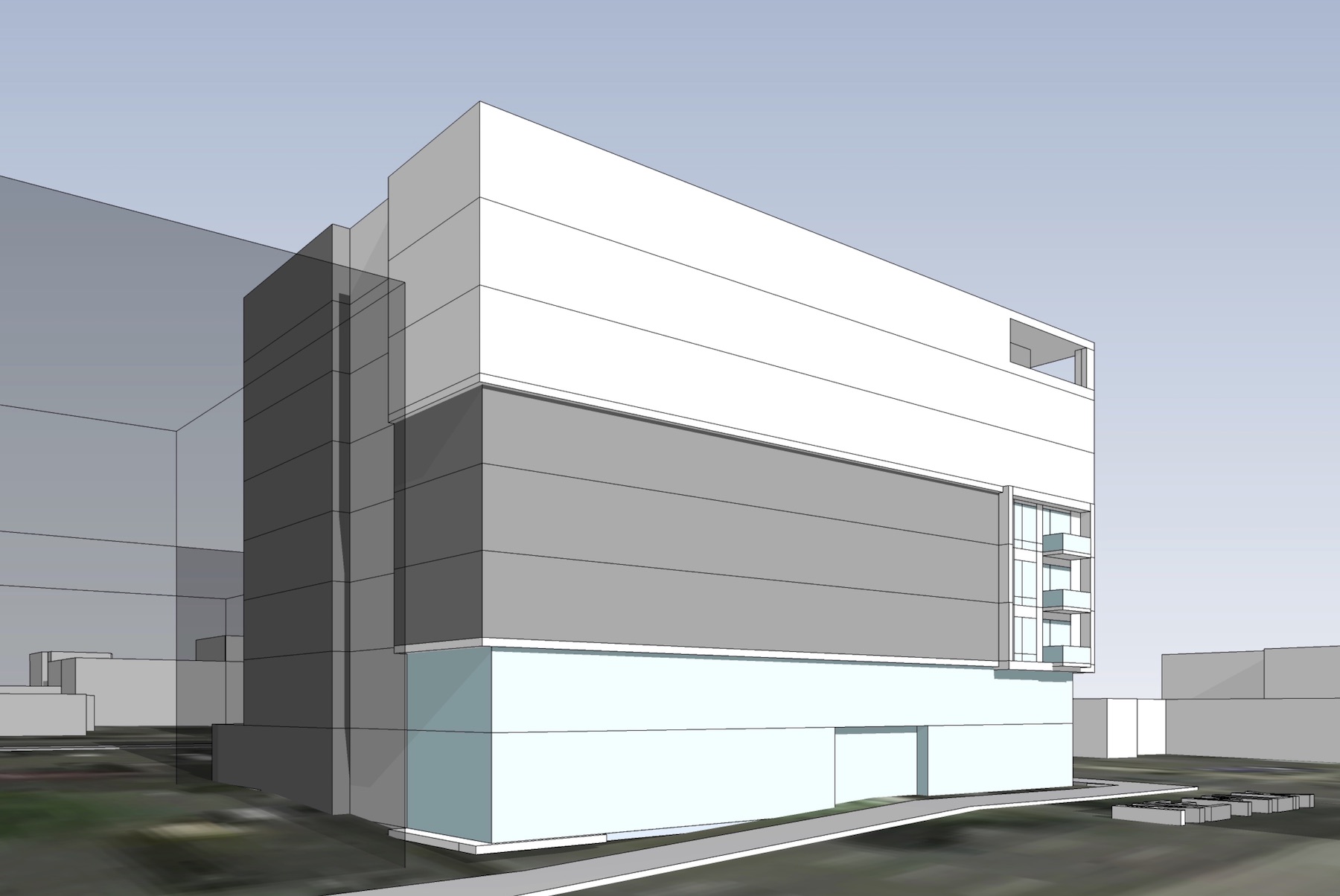
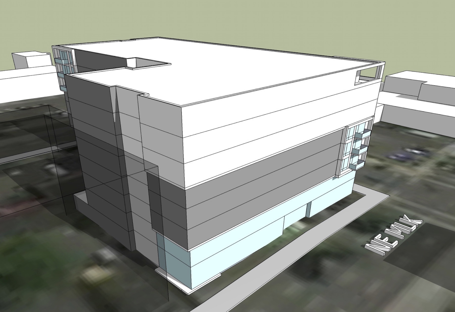
The project is set to go in front of the Design Commission for its first Type III Design Review hearing this Thursday, the 18th of October.
Drawings
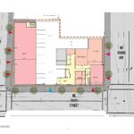
- DAR # 1 | Plan | Site
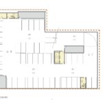
- DAR # 1 | Plan | Parking
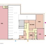
- DAR # 1 | Plan | Level 1
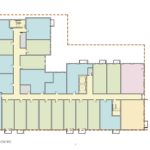
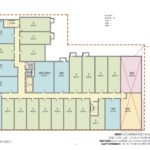
- DAR # 1 | Plan | Typical
- DAR # 1 | Plan | Level 8
- DAR # 2 | Plan | Site
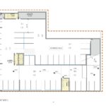
- DAR # 2 | Plan | Parking
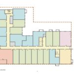
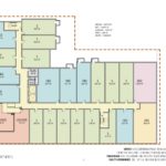
- DAR # 2 | Plan | Typical
- DAR # 2 | Plan | Level 8
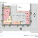
- DAR # 3 | Plan | Ground
What’s up with this firm? They are usually more competent.
Just go back to the first version, each decision is worse than the last…
Seriously! It’s one revision away from being an L-shaped brick with no visual interest whatsoever.
I do prefer the second version to what the third rendering shows, but the first version looks looks like what happens when tacky Las Vegas crashes into bland Midwest suburbia.
The first was just tacky, and the third seems bland. Possibly it’s just the simple drawings. But the third….logs. Silly idea, grasping at straws.But it looks pretty nice. Just don’t call it “logs”. How corny can you get.
They’re cribbing the design from cribbing?
Who cares.. this is just an 8 story infill apartment building. Why the anal inputs that take forever to pass when this city needs more housing fast.
This is the problem with Portland and why it’s slow to move things forward. Small city minded.
You clearly need to reacquaint yourself with the meaning of “infill building”. The anal inputs are put in place for a reason and, while they are far from perfect, simply eliminating them just to help developers put buildings up as quickly as possible at the expense of the city isn’t exactly a great long-term approach. Especially when there are buildings like this one, which has got to be one of the poorest-designed buildings to come out of a major Portland firm in a while – and that’s saying something.
Connie’s attitude is exactly what most Portlanders find repugnant. Low-quality, bottom-line, over-priced apartment buildings that pop up in so many neighborhoods will never be loved. Besides, the rental market shows signs of over-building because new units sit empty while developers offer incentives to entice signatures on leases. So the persistent call to build new housing without any expectation of quality seems unwarranted. Design review scrutiny is one of the only ways that we have to demand a smidgeon of design quality.
This entire project has got to be one on the ugliest proposals I’ve seen in awhile. I’m in the business of development and this is simply pitiful. Time to start over or pick another design firm. Boooooring!!!
This is such a serious frowny face for all of Portland. We cannot keep this up or we will be littered with junk in 15 years. When people think of San Francisco, they think cute little Victorians. If we keep this level of building design up, people will think of these buildings (They are literally everywhere,) and that we destroyed this stunning natural environment with a bunch of turds. So absolutely sad.
Wow! Each reconfiguration of this project is worse than the last. Zero creativity on this one. Such a waste of prime land to put such an ugly building on. Pretty soon Portland might make the list shittiest new construction in the country. SAD!
We are well on our way led by the Design Committee and the prostitute architects. John