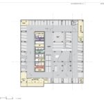
GBD Architects and PLACE landscape architects have gone in front of the Design Commission to present a 35-story mixed use building proposed for downtown Portland. The Block 216 tower would include retail, office, hotel, and residential condominium uses, with a 310 stall underground parking garage. The project is being developed by BPM Real Estate Group.
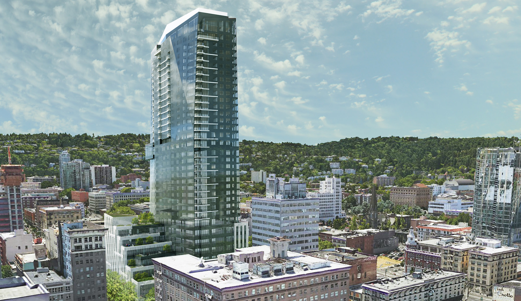
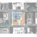
The project site is the full block bound by SW 10th, Washington, 9th and Alder. The block, owned by the Goodman family controlled Downtown Development Group, is mostly used for surface parking. It is however better known for the food carts that line the perimeter of the block. News that the site could be redeveloped broke in April 2018.
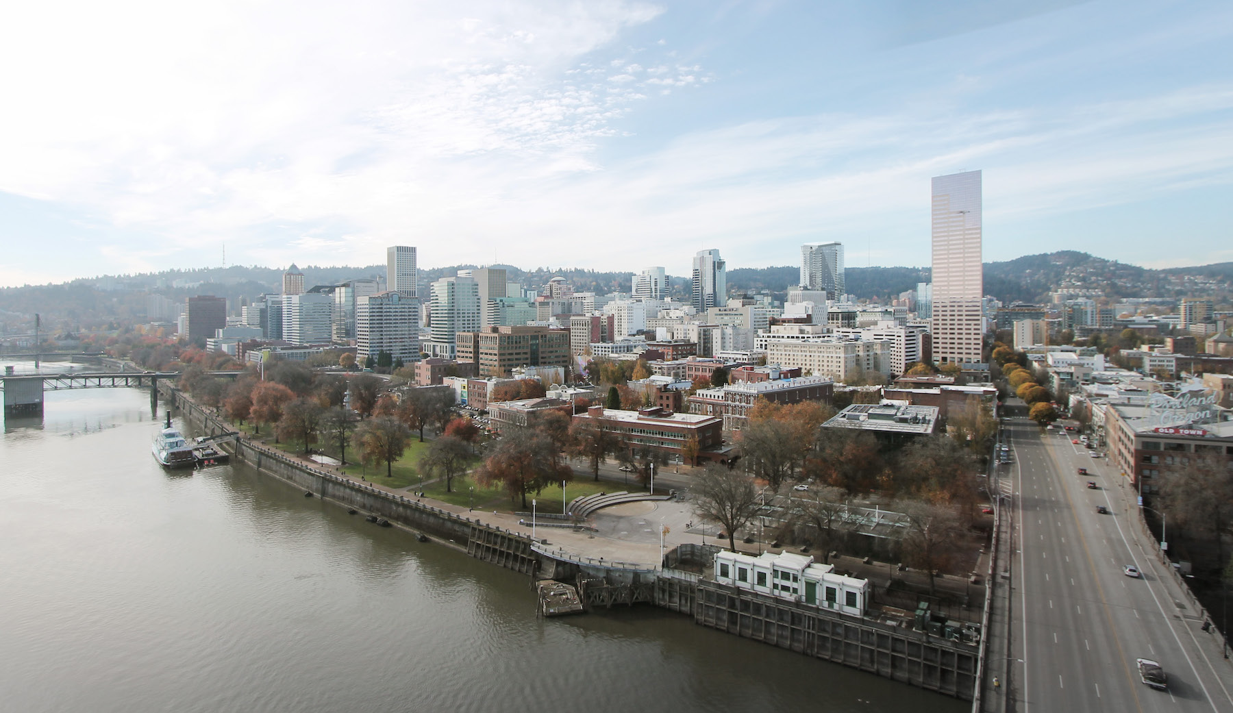
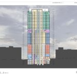
The 455’-7” tall tower would be located on the western half of the block, and oriented on a north-south axis, in order to minimize the amount of shadow cast on O’Bryant Square. The nearby park has been closed since March, due to structural issues with the parking garage located beneath the park. Portland Parks & Recreation currently has funding to study redevelopment options for the park, and hopes to have it open again by 2023.
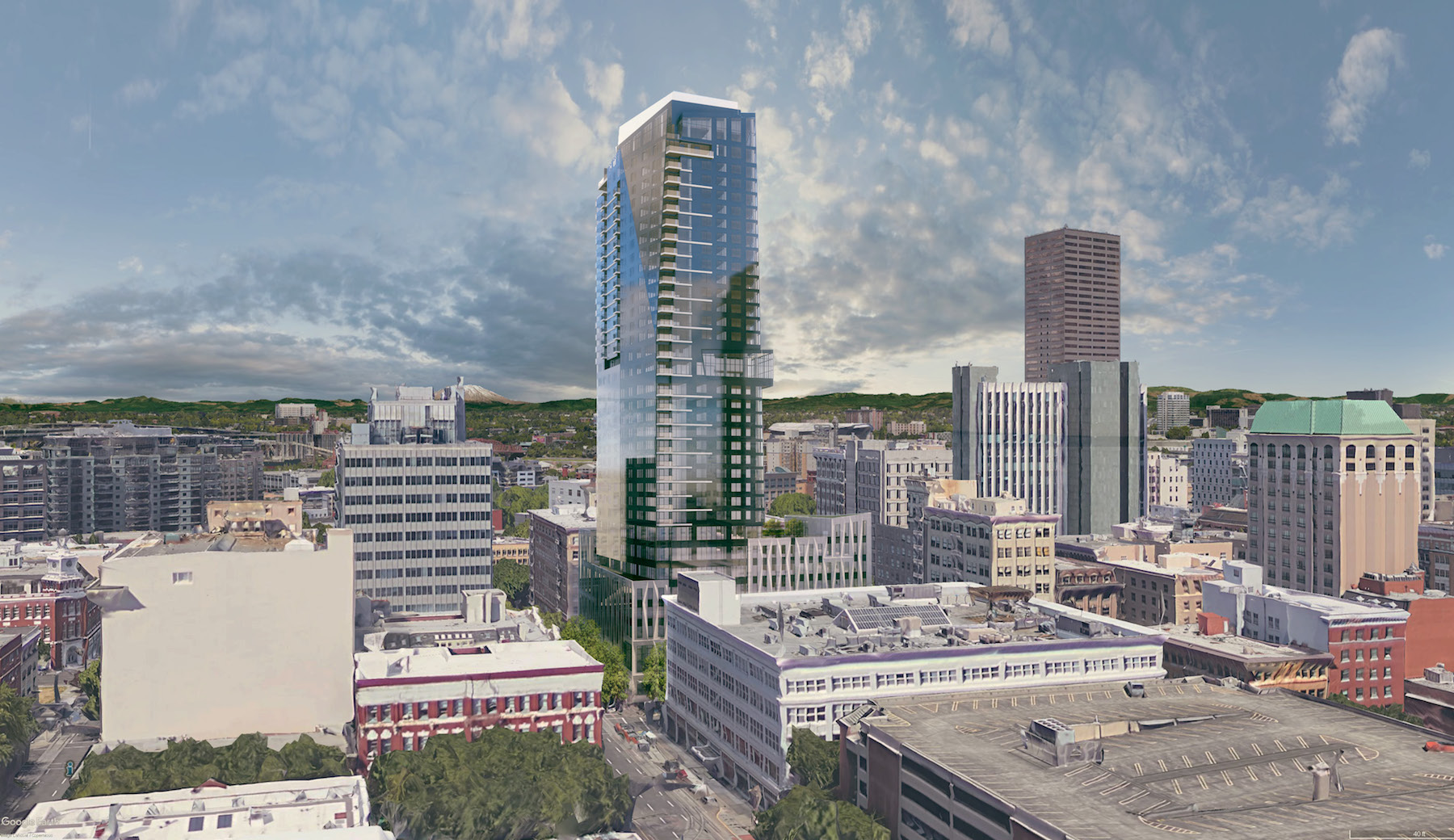
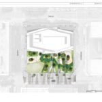
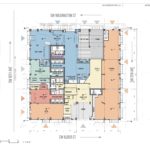
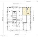
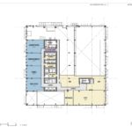
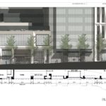
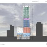
At the ground level Block 216 would include approximately 10,400 sq ft of retail space; separate residential, hotel and office lobbies; a hotel lounge; and parking and loading entries. The entire frontage facing SW 9th Ave would be taken up by a food hall, intended to replicate the energy that the food carts currently bring to the site. An event level at the second floor would include an 8,400 sq ft ballroom, meeting rooms, and a small junior ballroom.
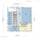
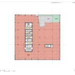
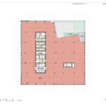
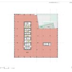
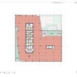
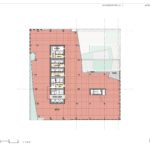
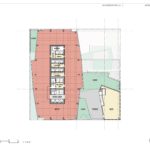
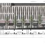
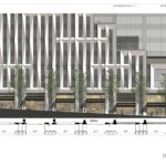
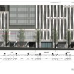
The rest of the podium, occupying floors three through eight, would be filled by roughly 160,000 sq ft of office space. The podium would be clad in a honed white precast concrete panels, reminiscent of the nearby Union Bank tower. Each office floor would open onto a series of landscaped roof terraces, which cascade down towards O’Bryant Square.
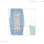
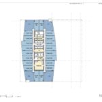
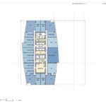
Levels 9 to 18 in the tower would include 240 hotel guest rooms. Levels 19 and 20 would be dedicated to hotel amenities, including a spa, pool, club lounge, fitness center, and a restaurant open to the general public. Although the brand of the hotel has yet to be released, the developer has signed a letter of intent with a hotel operator.
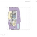
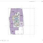
The top 15 floors of the building would include 138 residential condominium units. The developer intends to meet the city’s inclusionary housing regulations by paying a fee-in-lieu, at a cost that was reported earlier this year to be $7.5 million.
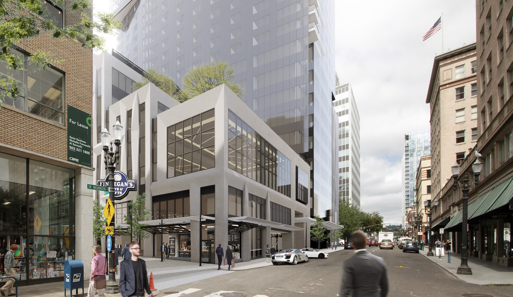
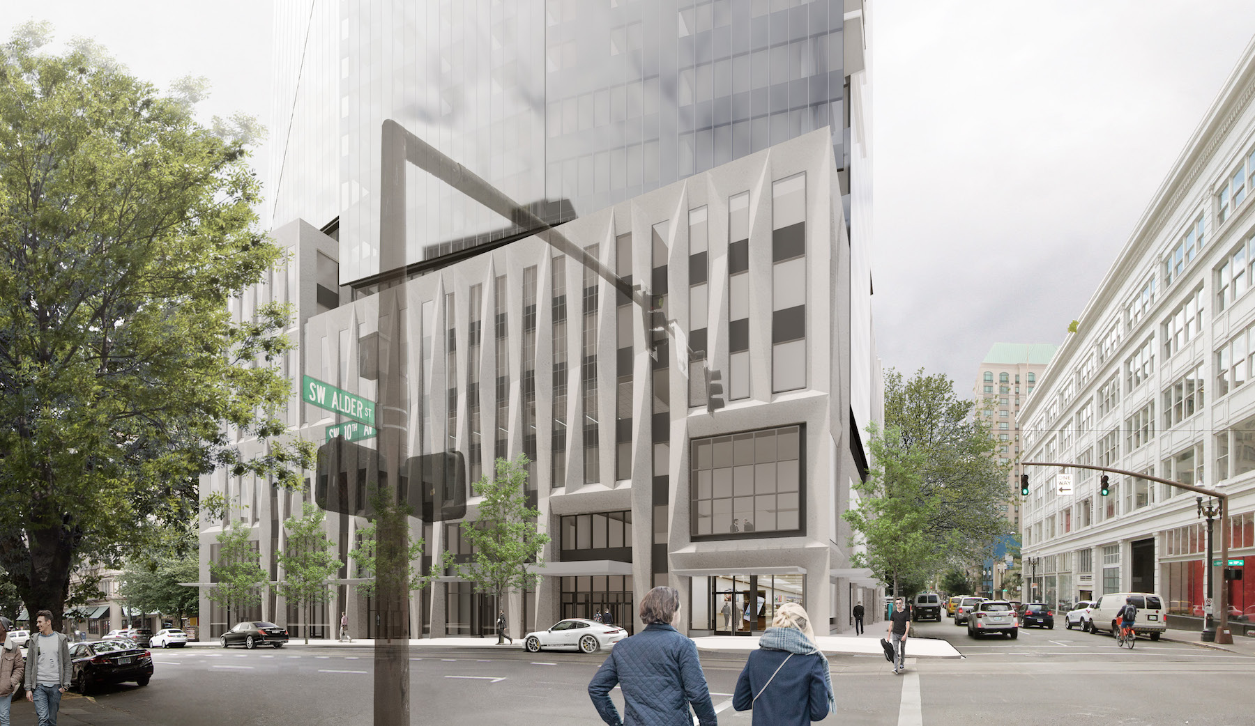
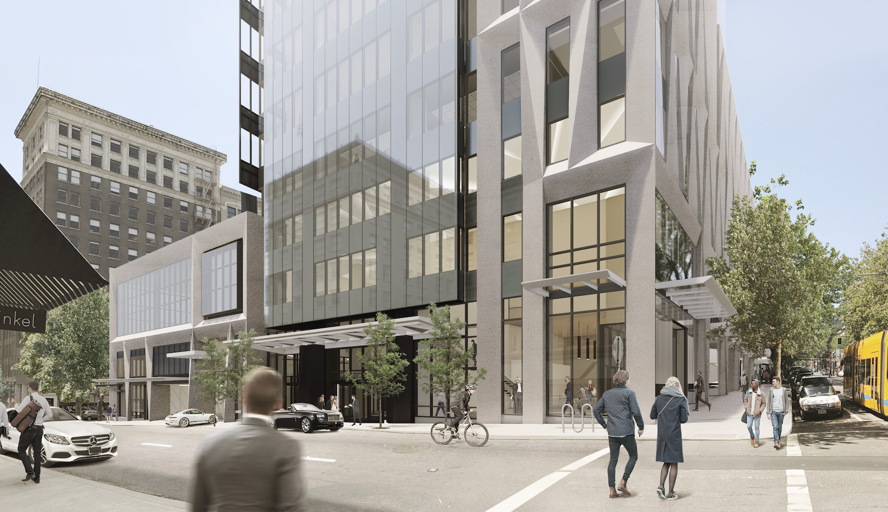
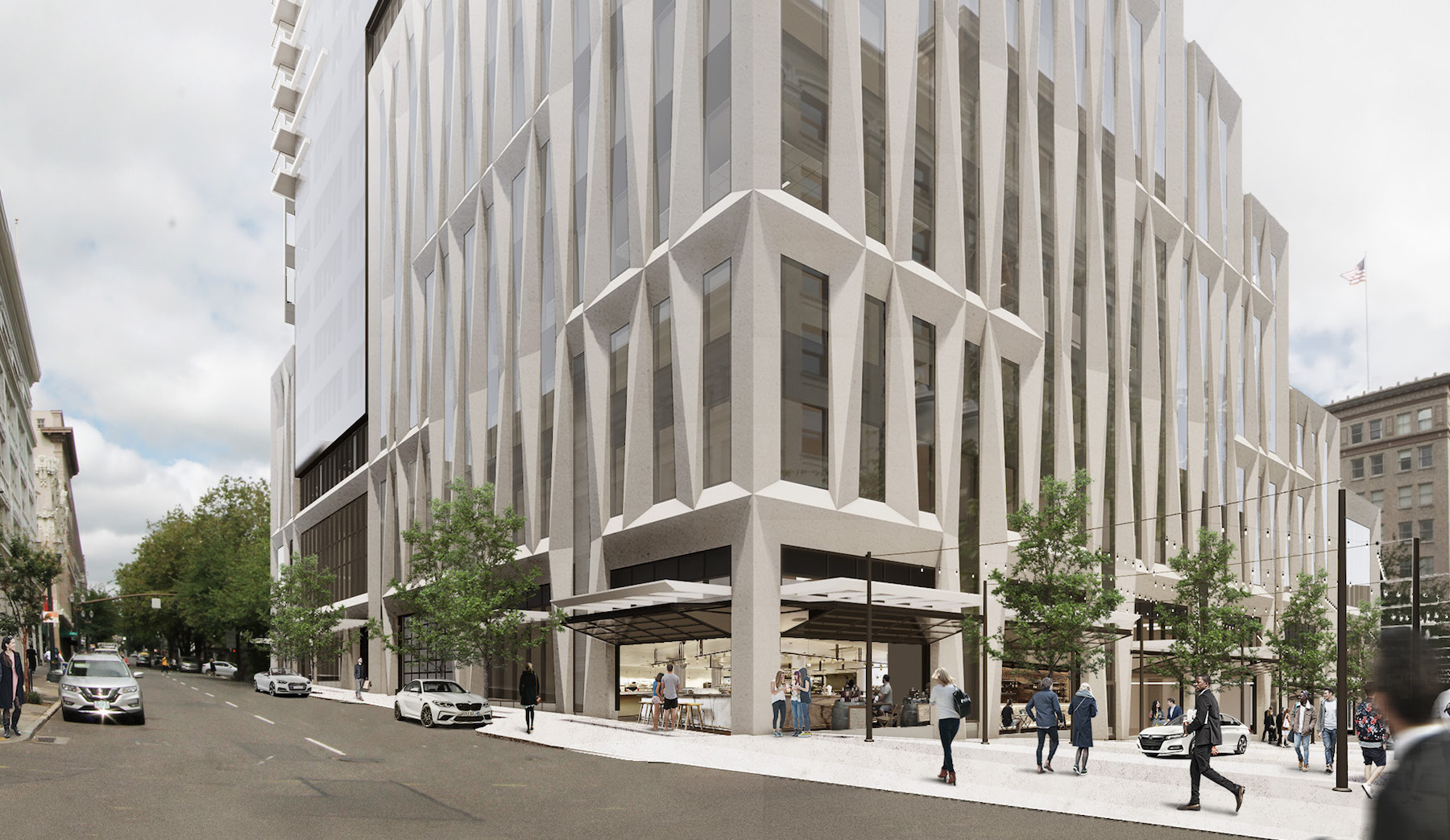
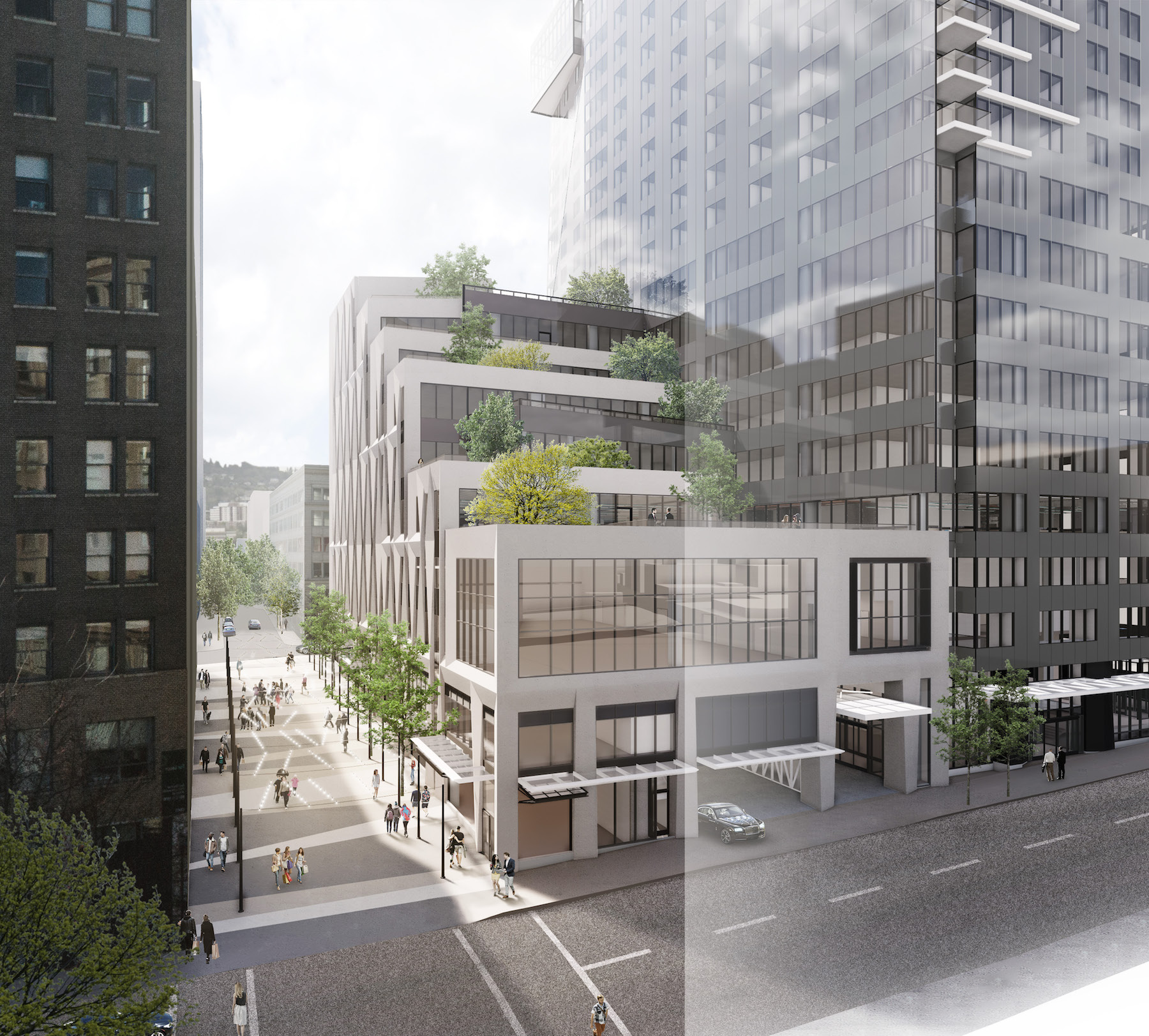
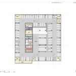
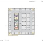
Access to the underground parking garage would be from SW Washington St. A “luxury drop off” valet area is proposed adjacent to the hotel lobby.
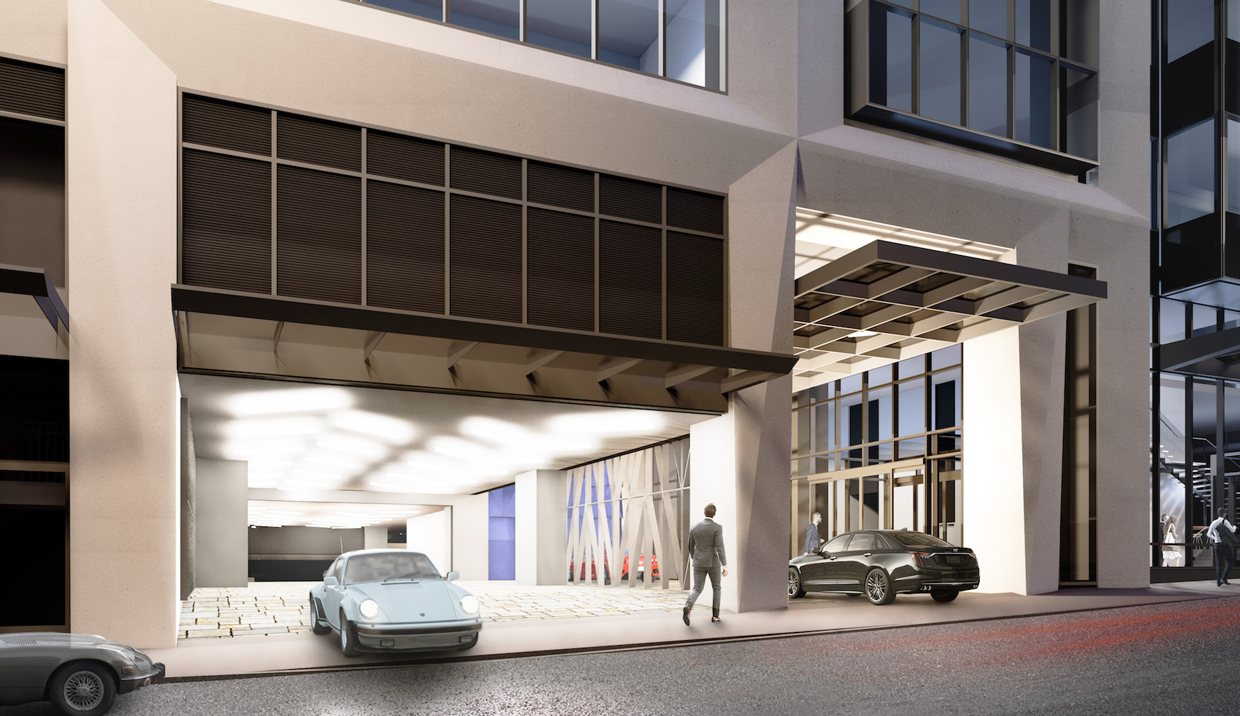
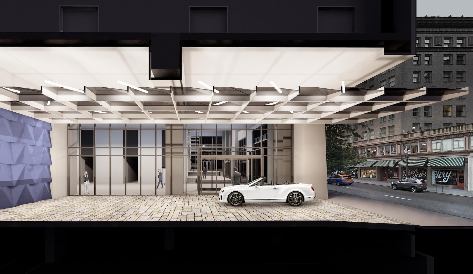
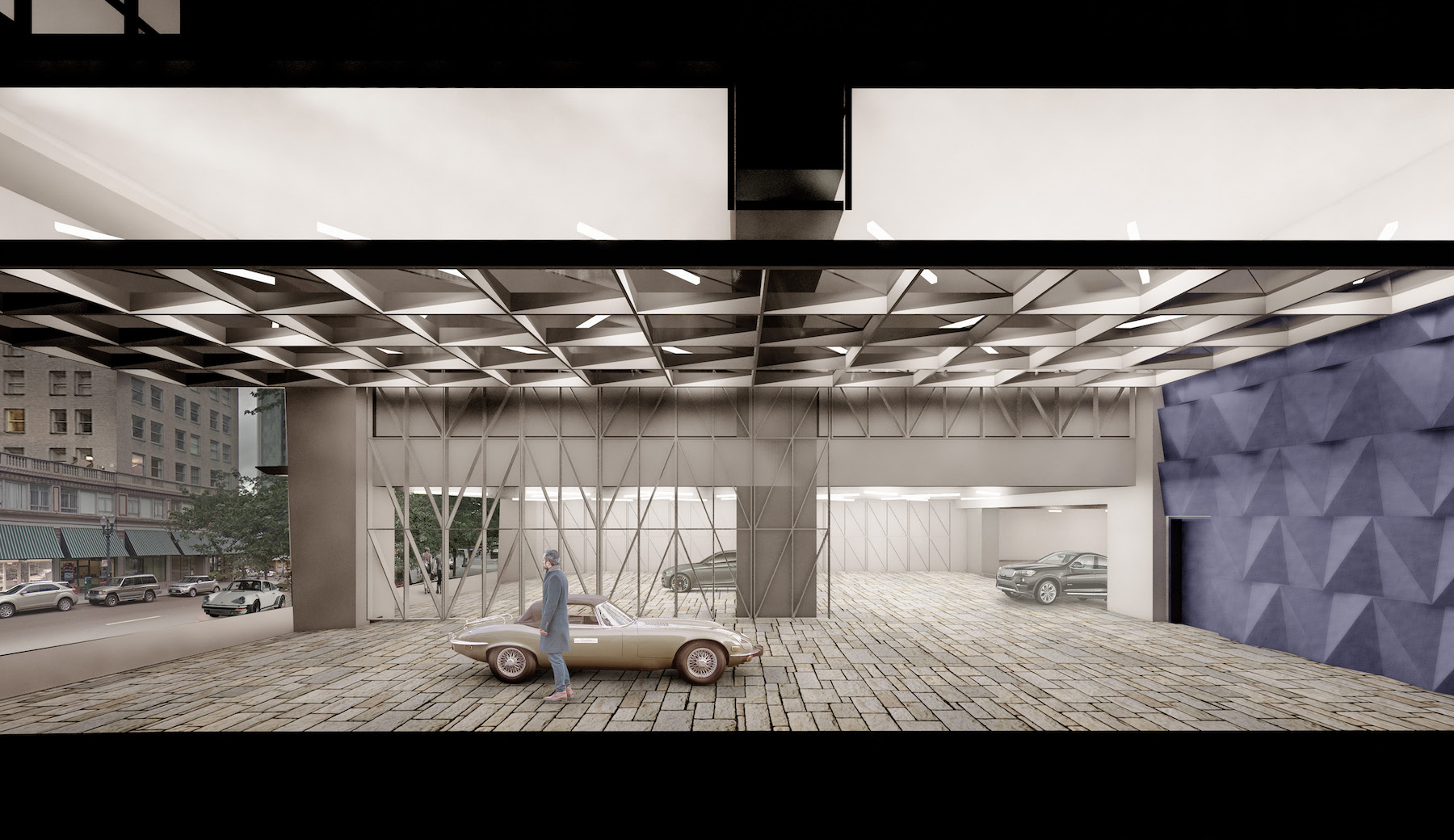
The project team went in front of the Design Commission to receive Design Advice on August 16, 2018. Issues discussed, and summarized in a memo written by city staff, included how the podium of the building relates to its immediate historic context; the overall coherency of the building, including the number of moves made in the design; and the ground floor design, including the food hall and the vehicular drop off.
Green Loop
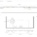
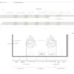
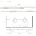
Along SW 9th Ave the building will touch the future Green Loop alignment. A new standard, added to the zoning code for the Central City in May, requires that buildings fronting the Park Blocks set back at least 12 feet from the property line. The applicants are requesting a modification to the zoning code, to allow this setback to be reduced. In order to better meet the Design Guidelines, as required when modifications are requested, they are proposing to build out the first block of the Green Loop, adjacent to their proposed food hall.
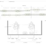
At a follow up Design Advice Request hearing on August 23rd four options were shown for how the street could be redesigned. All options involve a curbless building face to building face design, similar to Director Park. The base option would include trees on the west side of the street only, due to the existing basements under the sidewalk at The Woodlark and Stevens Building to the east. Refinement options showed trees and flexible seating in the location normally used for on-street parking. Whether cars would still be allowed to drive on this section of the Green Loop is a decision that the Bureau of Transportation has yet to make.
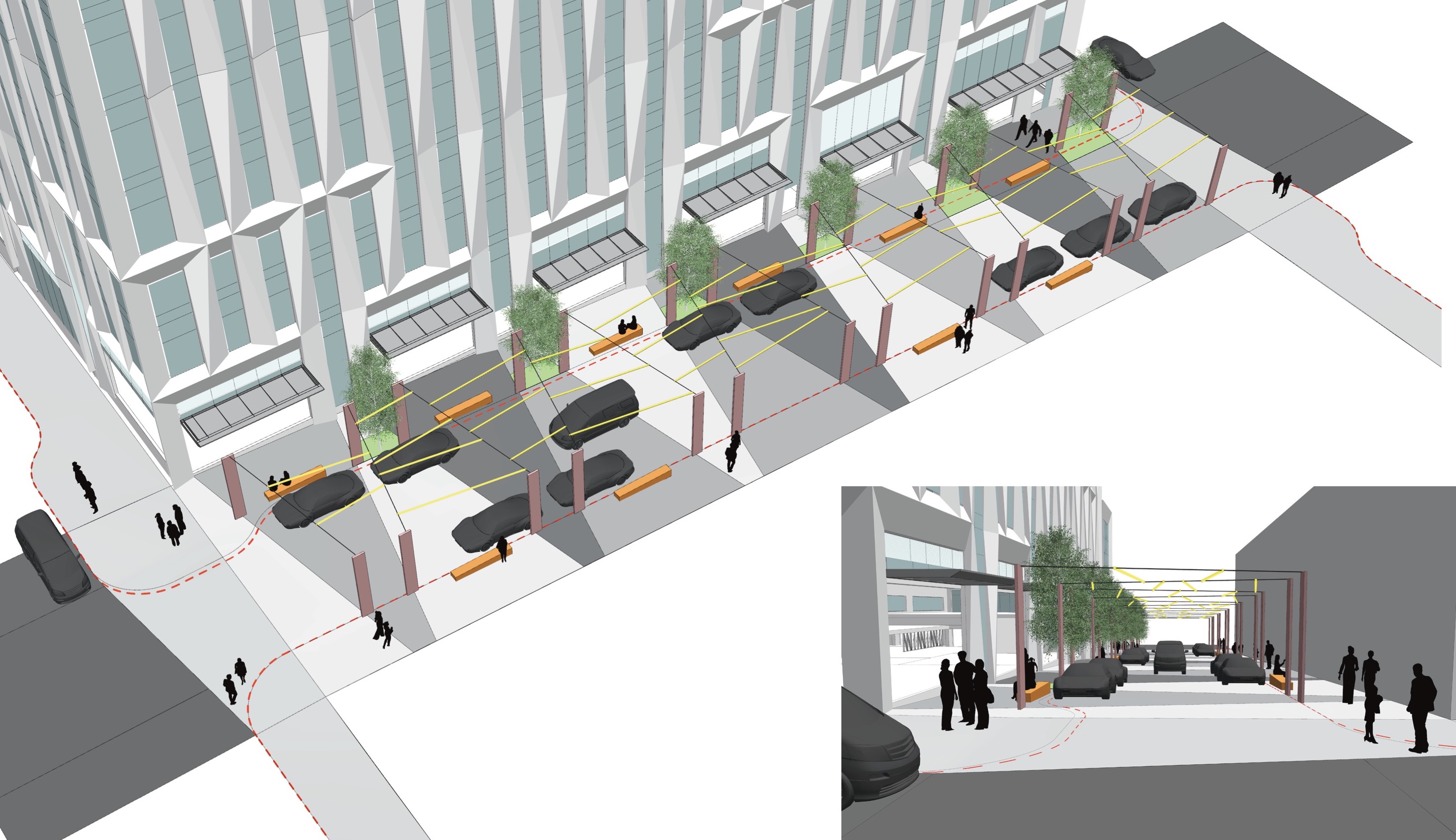
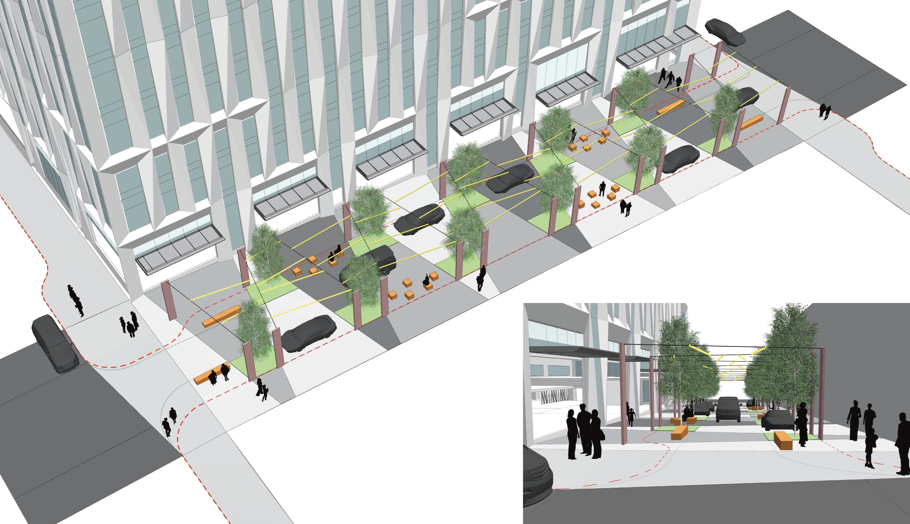
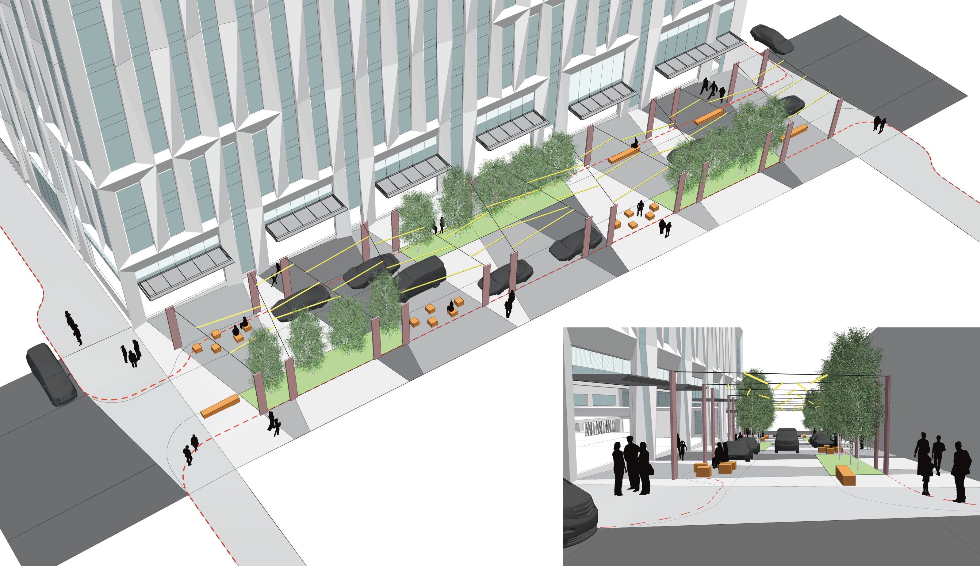
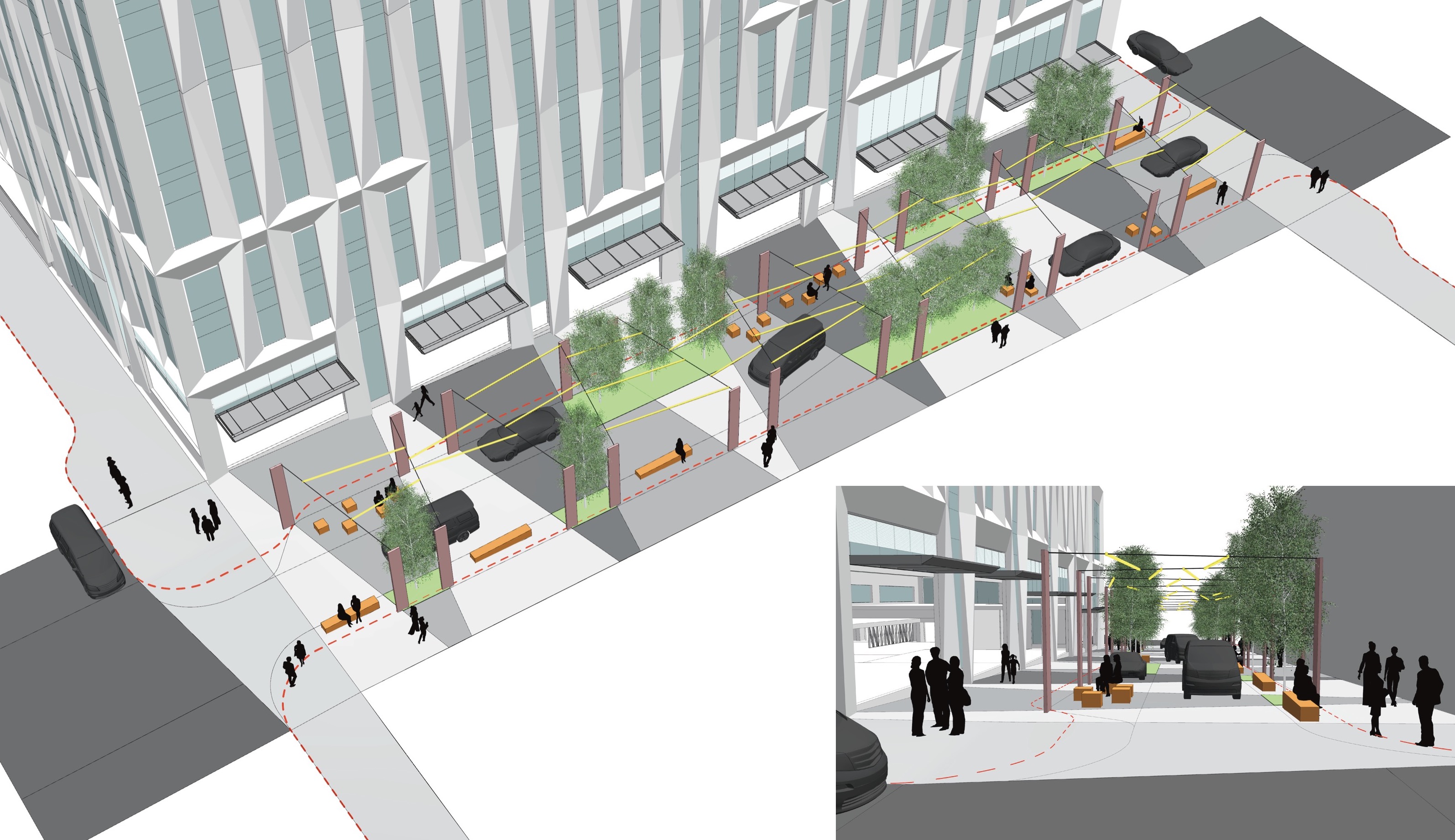
Block 216 is set to go in front of the Design Commission for a further Design Advice hearing tomorrow, September 13th. The project has a pending Type III Design Review application.
Drawings
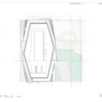
- Plan | Site
- Plan | Landscape Site
- Plan | Level P4
- Plan | Levels P3-P2
- Plan | Level P1
- Plan | Level 01
- Plan | Level 1.5
- Plan | Level 02
- Plan | Level 2.5
- Plan | Level 03
- Plan | Level 04
- Plan | Level 05
- Plan | Level 06
- Plan | Level 07
- Plan | Level 08
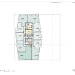
- Plan | Level 09
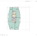
- Plan | Levels 10-17
- Plan | Level 18
- Plan | Level 19
- Plan | Level 20
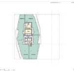
- Plan | Levels 22 to 33
- Plan | Level 34
- Plan | Level 35
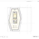
- Plan | Mechanical Penthouse
- Plan | Roof
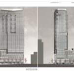
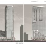
- Elevations | West and South
- Elevations | East and North
- Enlarged Elevation | West
- Enlarged Elevation | North
- Enlarged Elevation | East
- Enlarged Elevation | South
- Section
- Section
- Green Loop | Base Option
- Enlarged Elevation | Option B
- Enlarged Elevation | Option C
- Enlarged Elevation | Option D
What is the purpose of building another alienating glass high-rise? On a human scale, what was the design inspiration of the lower floors’ facade? A simple stroll down the street from the GBD offices would show how infatuated this city used to be with brick and how misplaced buildings look with glass or metal cladding.
I feel the design commission is correct in this project’s importance, that “It will set the tone for everything in the city that comes next.” Thankfully they have addressed how lacking this building looks in cohesiveness within itself and the surrounding context. The project needs to be “consistently honest and obvious and add a rhythm to the city” just as the peripheral buildings have done. Most importantly, as they bring up, this should bring clarity to itself and the rest of the community for how it relates itself within Portland. I’m glad we have people on the design commission that are addressing these architects and developers that continue to reject architectural & historical context. I’m hopeful that they can dramatically change this to adhere to the rest of the city while standing as an informative, substantial landmark in constructing Portland’s future developments that rise up at our skyline.
Agreed, Cupcake. It’s an awful concept that seems designed by multiple people who never spoke to one another. It would be another blight on Portland’s skyline. It’s not the height, it’s the wretched design.
>September 12, 2018 at 4:06 pm
What is the purpose of building another alienating glass high-rise?
Commentary aside, the purpose of building buildings is generally to make money.
I agree with cupcake!! As a business owner on the block, I expect BETTER! Mixed use is the right approach, but the design of the building is way off!
This building will never rise
Too tall for this city
I think it would be the 4th tallest in the city as proposed. After Wells Fargo Center, US Bancorp Tower (Big Pink), and Park Avenue West. If those weren’t too tall, this isn’t either.
In my opinion, at that location, it should be even taller.
Totally agree with what ebetsure commented on: this building could afford another 5-7 stories from what is proposed. It is at a lower elevation than the Wells Fargo building, Pac West Center and KOIN building, thus even at 42 stories, it would not appear taller than the Wells Fargo building….currently at about 40 stories and the tallest in Portland….which by the way, is not that tall
more hotel rooms in a city that is building them way too fast
So true. I trust someone’s doing the math, but I’m having a hard time figuring out it there really is that much demand for the current tidal wave of hotel rooms (and apartments).
I quite like the design. The tower has a good shape and the terraced pedastel works well. I’d be happy with more brick accents and facades on towers in Portland. The Koin Center pulls that off well and Big Pink has a similar hue. Hopefully there will be anther champion of that aestetic soon. However I think this will look good in its context.
Once they resolve some street level issues: New Food-cart Location and Public spaces, this could be a welcome addition to the Portland skyline.
You can tell the strong influences of the International Style of TVA’S Park Avenue West, SOM’S BanCorp Tower and (Anshen and Allen of San Francisco) Portland’s, Union Bank of California Tower on Broadway.
GBD Architects of Portland is very well respected locally and internationally.
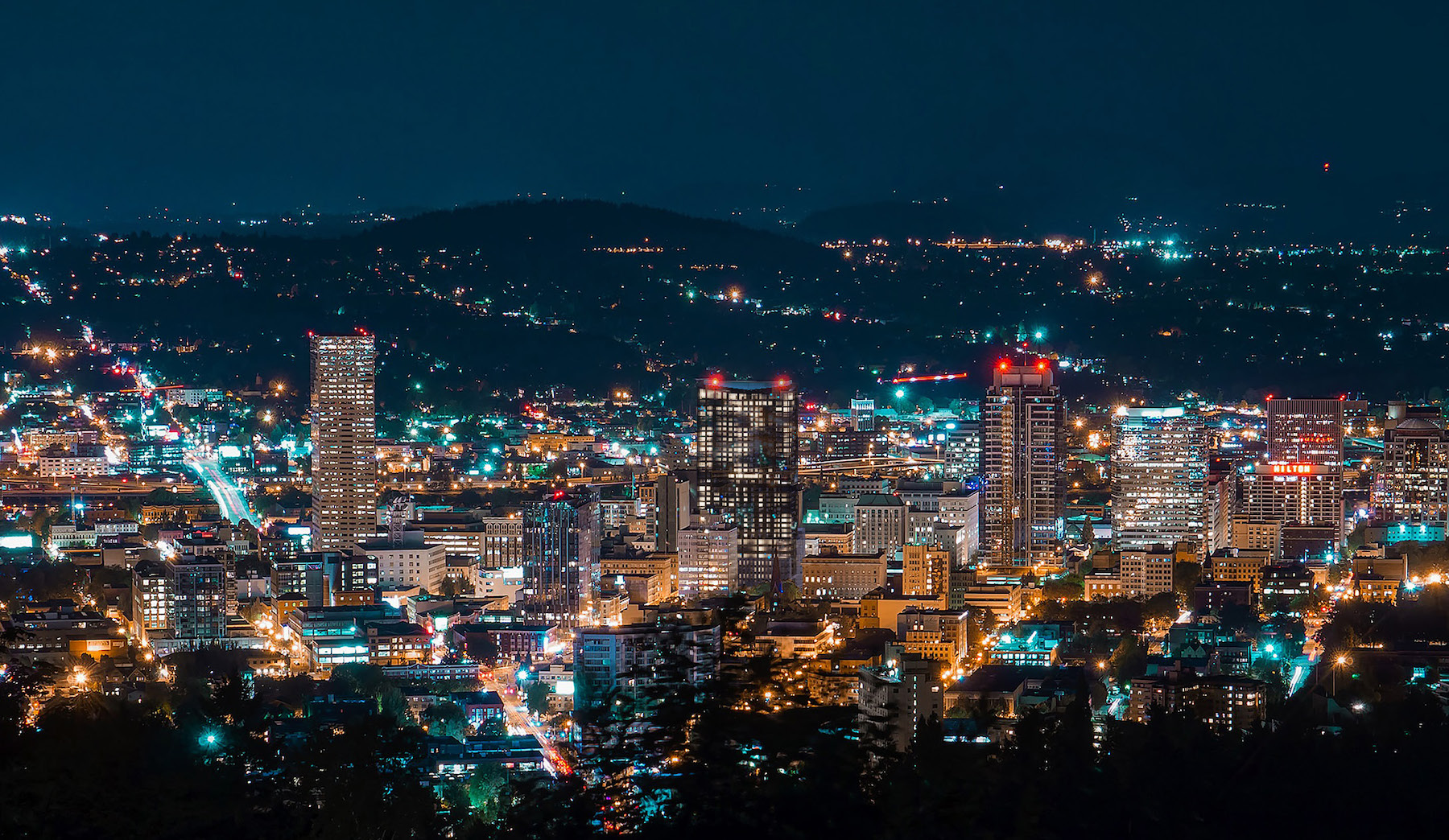
The above night-time rendering is amazing . . . . should be fun to watch construction!
Oversized over scaled ignorant of its community..another great one from the BPM Greed group
It woulds work in a large city like LA or San Francisco, but it has far too much of an “I’m a douche” feel.
Sorry Portland is starting to be a big city now
You should go move to Boise
Portland can be a big city, but is nowhere near a large city when the population of the city proper gets in the millions we can talk.
I find it interesting that many people who use this “Oh you don’t like Portland with skyscrapers / big-city Portland? You should move to [location] then!” retort are usually the ones that have moved from big cities who are only looking to recreate what they are running from. Just like the Californians who have escaped the problems they created down south but will continue to vote for those policies in their new cities. Moving isn’t an answer – as a country, we’ve tried running and that created the suburbs, malls, and urban sprawl. Look where that got us. To suggest that we keep a resemblance to some of our historical qualities in material, site geometry, and an overall aesthetic, shows how important it is to us to preserve relationships between our architectural past and communities in the future while resisting “foreign” states’ influence. It certainly isn’t suggesting that we halt building development. Like the Portland DC stated, this site, like many others, needs to set a precedent that has its roots in historical context, or merely a present day context since its such an important project. Innovative thinking nowadays is designing with context in the forefront of your concept, otherwise it’s an alienating development.
I was born and raised in Portland Oregon actually
Big city or not the building is still a piece of crap. It looks like some ametuer went to the Sketchup Warehouse and made a 3d model of a bunch of unrelated elements. Of course when the Design Gods get through putting their paws on it , the building will end up looking like all the other ones they approve, glass and steel at the ground with cantilevered awnings, some irrelvant open space and sculptures, and probably some variant of a grid pattern. In any case the building is a blight on the city and dont look for much improvement or design diversity when it gets passed around from comittee to committe.
Where, pray tell, is it written in stone that new buildings must “set a precedent that has its roots in historical context”? Maybe some of us would like to see new buildings that look new and don’t try to blend in with the old buildings. Why does the style of the old buildings take precedence over the new? Why are we stuck in a rut? Why can’t we be bold and innovative, like our beautiful neighbor to the north, Seattle? Why can’t we man-up (gasp! I used the politically incorrect “M” word) and build something breathtaking like what has been proposed for the postal blocks? Why must we settle for these bland, Soviet-style buildings that seem to make our design commission giddy? let’s try something new for a change, as the boxes being built these days all look the same- boring!
The terracing section looks great, with some interesting kinetics going on, but the tower is . . . yawn. Not much different-looking than a taller version of the new Radisson Hotel tower on Broadway@Clay. Go bold or go home.
that is the uglyest building ive ever seen ! just leave the food carts ! keep Portland Portland !!