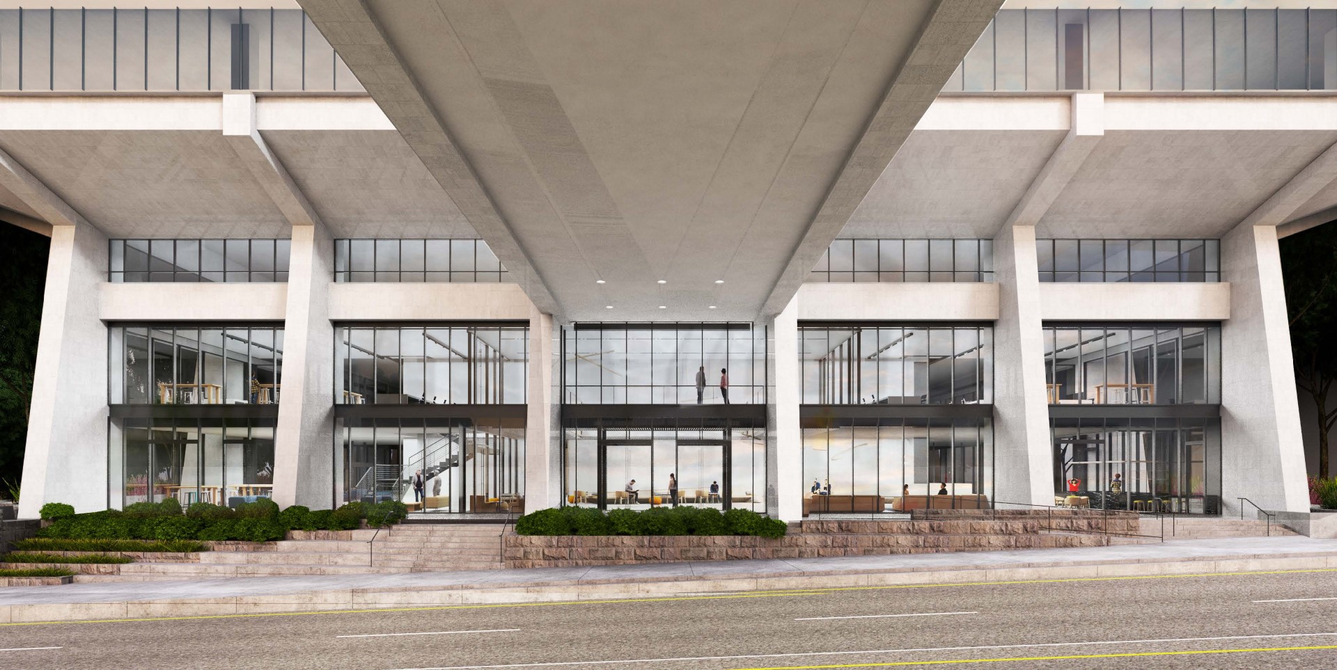
The renovation of the Wells Fargo Center, designed by West of West and SERA Architects for the Lincoln Property Company, will include infilling the existing drive through at the data processing building on SW 4th Ave.
Every week, the Bureau of Development Services publishes lists of Early Assistance applications, Land Use Reviews and Building Permits processed in the previous week. We publish the highlights. This post covers August 13th to August 19th, 2018.
A renovation and expansion of the Wells Fargo Center at 350 SW Jefferson St has been submitted for building permit review by SERA Architects:
Renovation of existing office building; add new floor and remodel existing floors for office space; new entry, new roof deck; create shell spaces for future tenants
A building permit was issued for a project at 5715 N Greeley Ave:
New 3-story, 6 unit apartment building with 32 sf trash enclosure and F2 screen fence around mechanical equipment.
I fear it will still be very, very ugly. I remember when it was going up back in 1972, I believe, and I remember thinking “What an ugly building.” I’ve been forced to look at that monstrosity for about 46 years, and my opinion hasn’t changed…..
Yep. Can anyone think of a more off putting, unfriendly, major building downtown than the tower? Fixing it at street level would take some serious architecture and dollars.
What a terrible looking building. To think this is this tallest tower in Oregon as well.
You would think by now it would be somewhat surrounded by taller towers thus hiding it more but what you know 50 years later it still sticks out like a sore thumb
Ouch
I actually think this building looks just fine. “Terrible” and “ugly” describe The Yard and the Portland Building, not this.
The big problem, as I see it, is that this building and its stubby accomplice across the street are not just indifferent to their urban surroundings; they are hostile to the city. One is surrounded by a moat, the other is built upon a rampart. They say: “Admire us at a distance or in your passing car. See how elegant and tall we are, a fortress and a soaring tower, but you hoi polloi are to stay out.” These structures deactivate the streets that surround them. It is fitting that the recently disgraced Wells Fargo Bank owns them since they so well epitomize the self-important, anti-social ethos of corporate hubris at its worse.
Well, I couldn’t put it quite so eloquently as David, but I agree with him.
As silly as it may sound with those alternating white and black stripes, it makes me hearken back to the old prison striped uniforms of long ago. Very unfriendly looking. I almost expect to see a ball and chain attached to the base. Or, maybe that’s the reason for the annex across the street. Sorry, you’d have to be older to understand.
David’s eloquent comments captures my opinion. And don’t forget the skybridge that obscures the streetscape sightlines and is one more nod to separating the workforce from ground floor street level uses and pedestrians. These two buildings are the reason the city has downtown and central design guidelines and required design review.
I forgot the skybridge! Ah yes, it was part of the bankers’ antiseptic dream life of 1969: living in a suburb, commuting to an underground garage, elevating to one’s office in a soaring sterile tower, taking a skybridge when needing to visit the sanctum across the street, and never ever having to set the sole of your shoe on problematic city ground. How rich to have at your disposal multiple vistas of teaming urbanity, but always kept at a safe distance. Casting shadows.