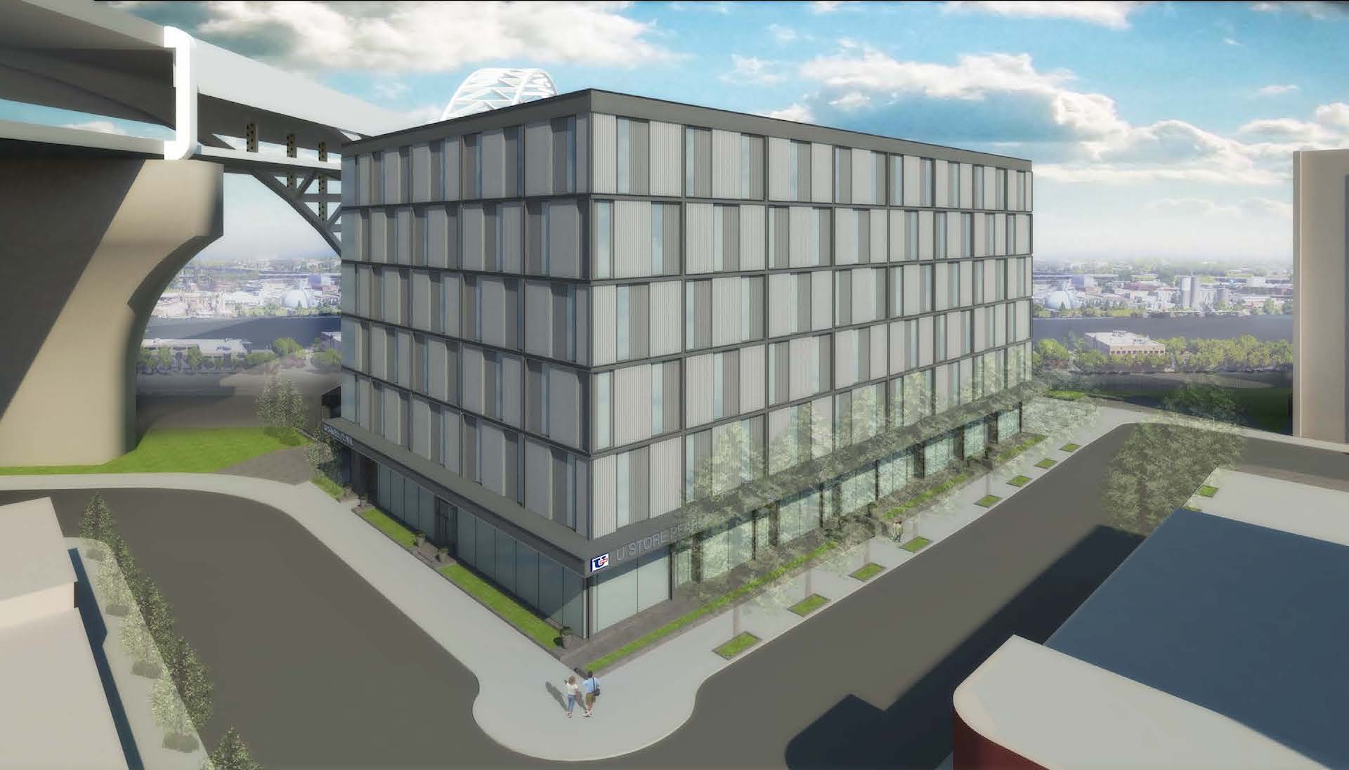
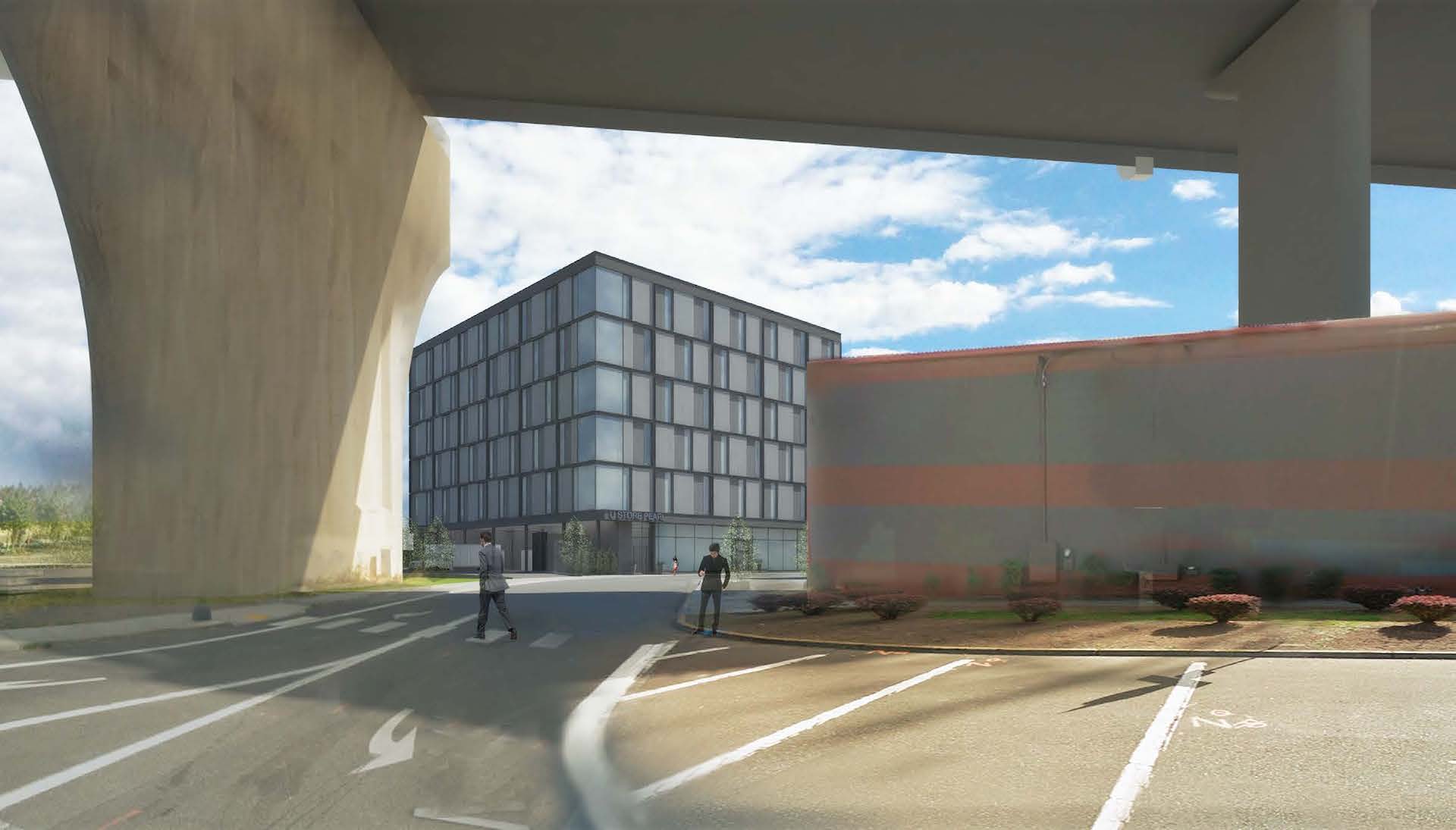
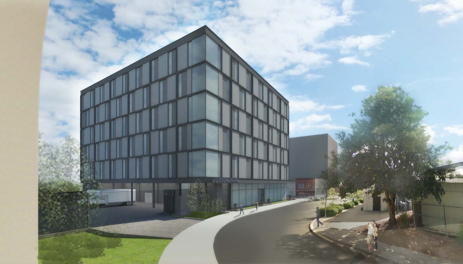
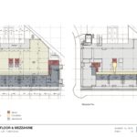
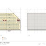
The Design Commission has approved a proposed U-Store self storage facility at the north end of the Pearl. The six story building is being designed by MCA Architects for Hoyt Street Properties. At the ground floor the building will include 6 retail / office units, accessed from a raised dock. The five floors above will include 109,075 sq ft of storage space. As part of the development a new plaza is proposed where NW 13th Ave and Savier St will meet.
The project site is vacant land, at the far end of the former railyard acquired by Hoyt Street Properties in the 1990s. Nearby developments under construction include Vibrant!, 1411 NW Quimby, and the Vista Pearl. Recently completed buildings include the Abigail and the Modera Pearl.
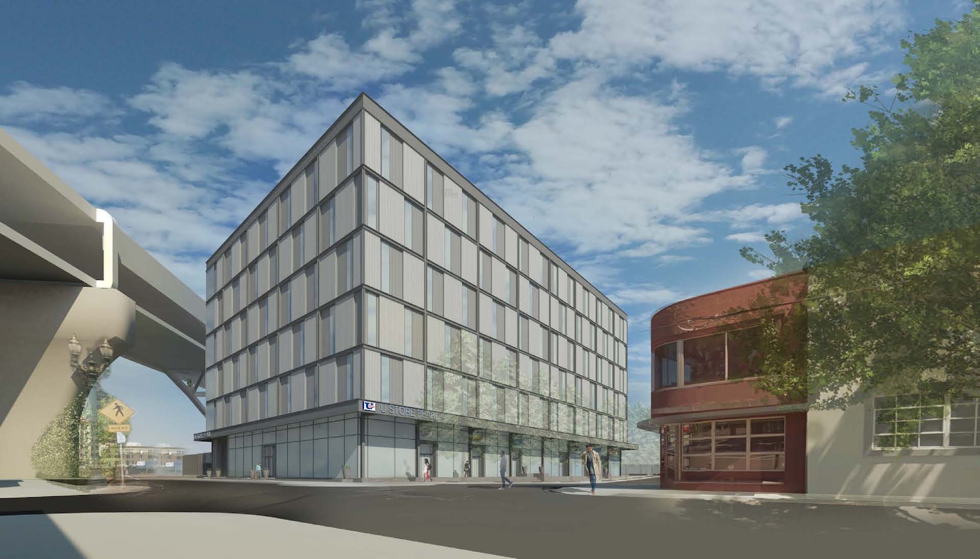
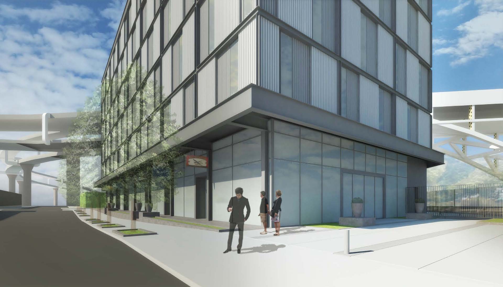
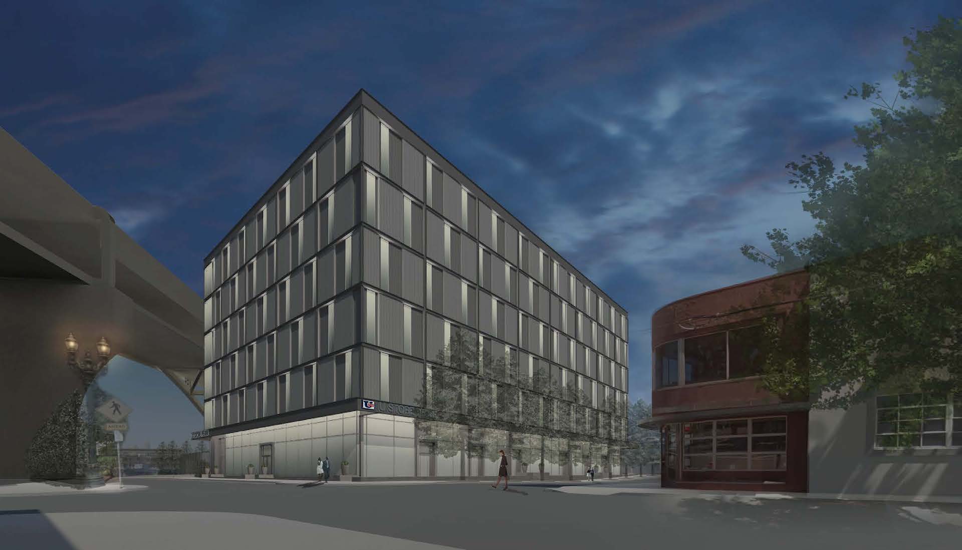
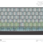
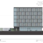
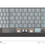
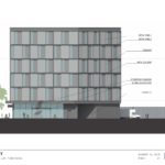
The primary materials at the upper floors of the building will be a pattern of ribbed metal panel, in alternating grey tones, with aluminum windows. These will be set inside a frame of 12″ steel C-channels. At the ground level on the street facing facades will be primarily composed of aluminum storefront glazing.
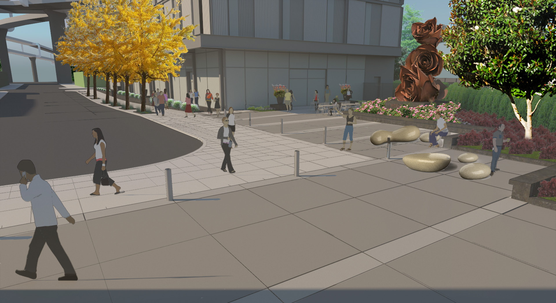
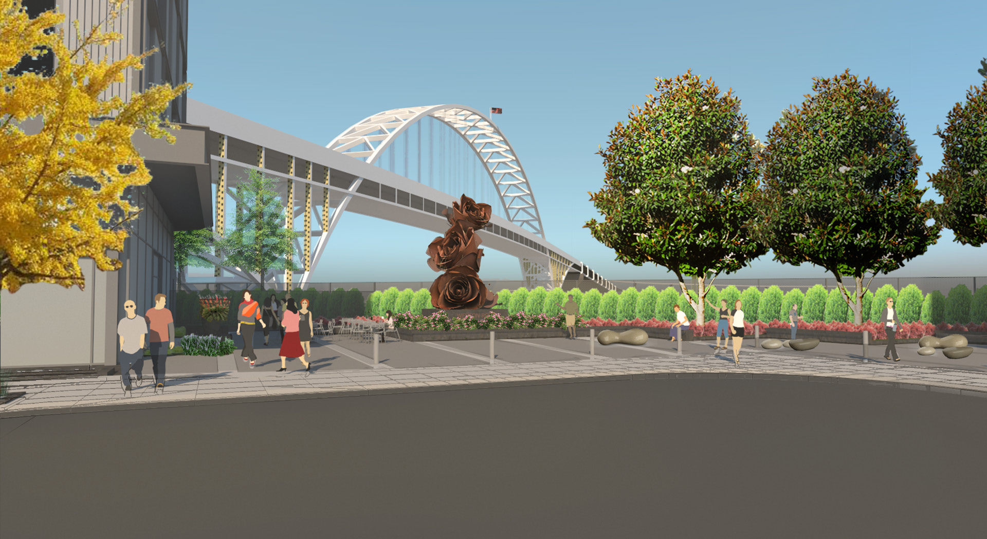
An 8,400 sq ft plaza will be created where NW 13th Ave and Savier St will meet. The plaza will include planted landscape areas, fixed and movable seating, and a rose sculpture placed on axis with NW 13th Ave.
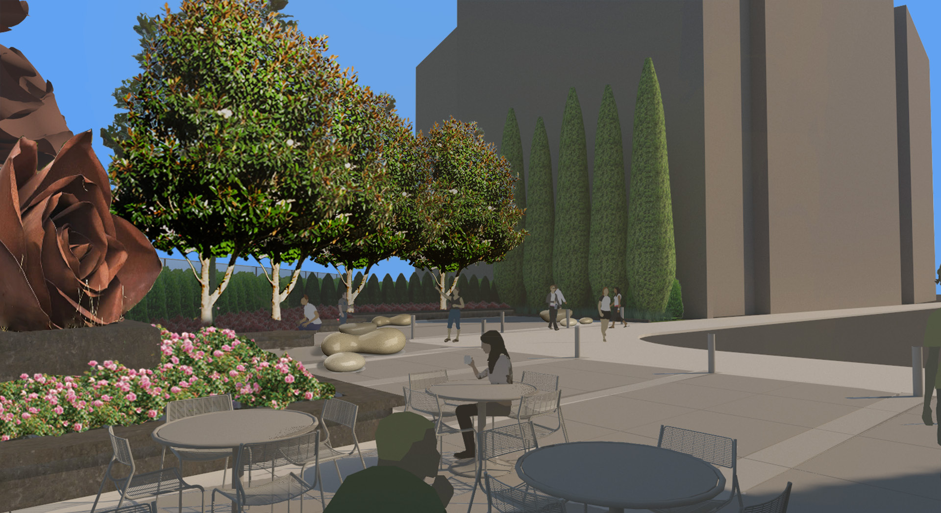
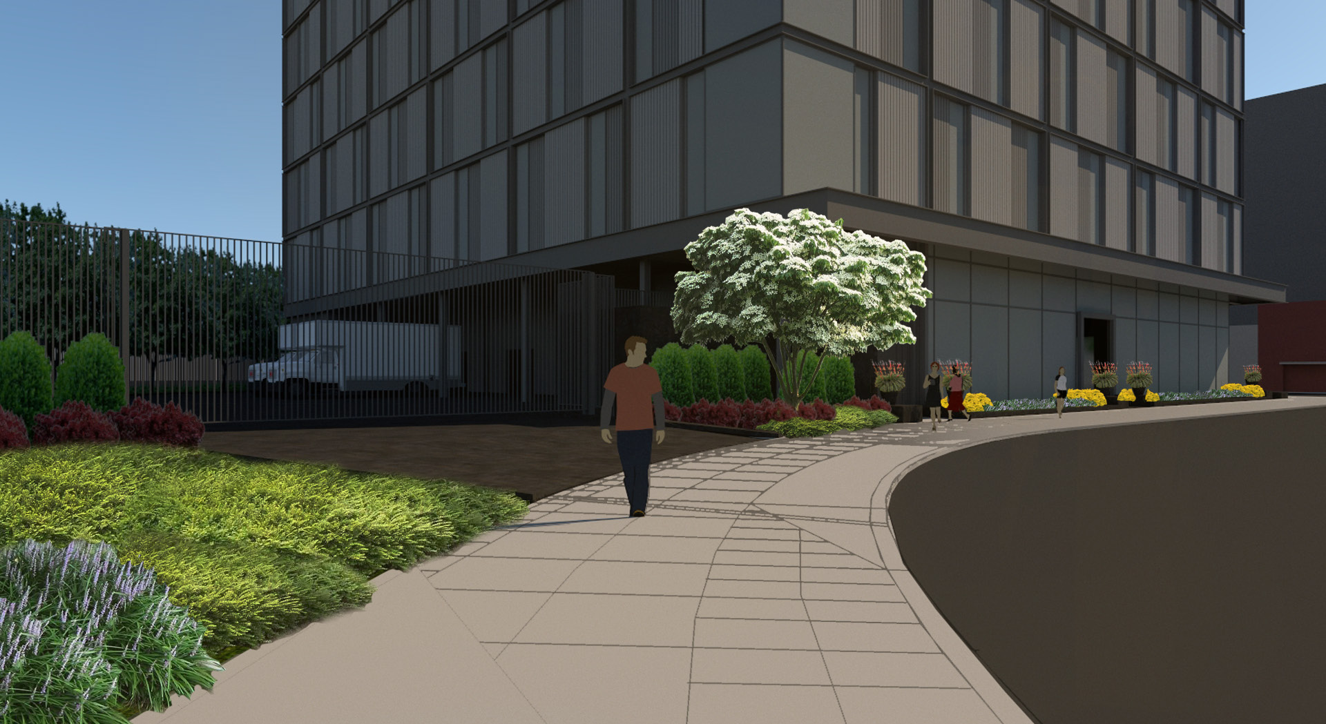
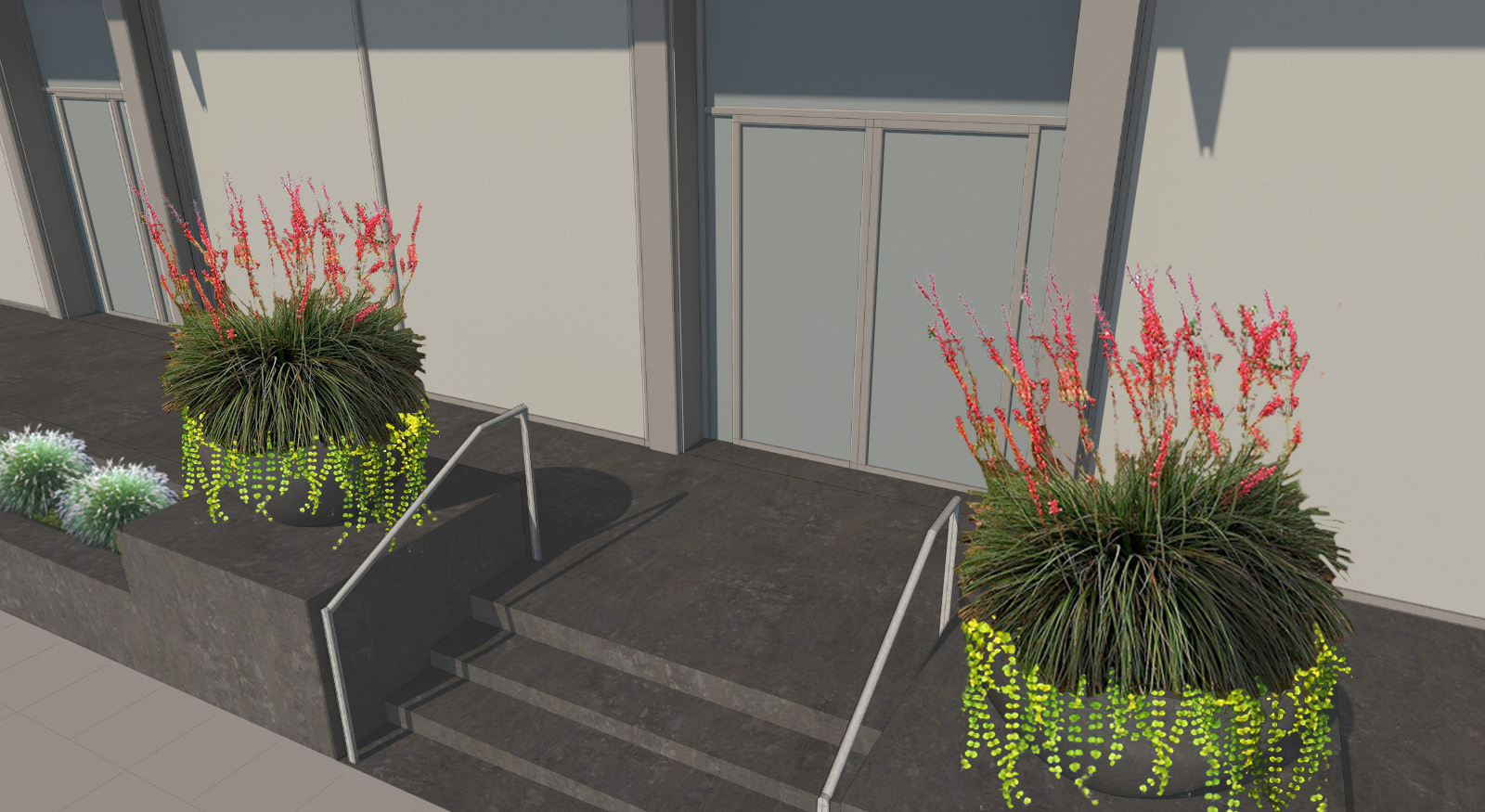
The Pearl U-Store went before the Design Commission three times in total: for Design Advice hearings in May 2017 and September 2017; and for its Type III Design Review hearing on March 23rd, 2018. The project was approved by a unanimous vote. In the Final Findings and Decision by the Design Commission the project was found to have a ground floor level that “reinforces and supports a robust pedestrian experience”:
This project has commendably evolved since the Design Advice Request, including the addition of an integrated, quality building exterior of alternating ribbed metal panel and glazing set within a steel channel frame. The building creates a sense of street enclosure along NW Savier Street and NW 14th Avenue, and the design of the ground level reinforces and supports a robust pedestrian experience. Two dead end street conditions will be improved and the raised dock feature and public sidewalk on the south building edge will meet current River District standards. The paving materials, seating, and lighting concept used for the plaza space are visually interesting, durable, and well-considered.
The project will need to receive a building permit before construction can begin.
Drawings
- Plan | Site
- Plans | Ground & Mezzanine
- Plans | 2nd to 6th & Roof
- Elevation | South (NW Savier)
- Elevation | West (NW 14th)
- Elevation | North
- Elevation | East
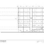
- Section | North to South
Beautiful!!!
What a piece of shit. A vacant lot full of debris is more aesthetically pleasing.
Ooh, such language. I’m verrrry religious ya know…..
The “DESIGN “ Commision is a joke. Every building that they stick the nose in looks homogonously the same from one end of the city to the other. Glass and steel, ribbed panels, a plaza with no purpose, and a few cantilevered awnings. Their recipie is the same for every building. Their DESIGN DICTATORSHIP is becoming really boring and mundane.
But in their drawing there are people in those plazas!
At least the sculpture looks nice
Oh what a wonderful gray building for this location. I can’t wait to hang out around there! /sarcasm
Honestly I can’t believe the design commission would even think about approving this. Inner NW is a walkable area and this eyesore is total crap. Then again I bet the design commission would probably approve an apartment building with these exact same aesthetics.
And RACC probably approved the “sculpture” too.
What precisely is a “robust pedestrian experience”? Any why would anyone interested in a robust pedestrian experience be doing hanging out on a dead-end by a storage facility? I’m sure our resident transient population will joyfully start camping out on the new seats, and will probably take up residence atop the silly rose sculpture. I just don’t understand the lingo the commission uses.It’s just more double-speak and nonsense.
This is still light years better than the abomonation of a self storage facility that just went up on E Belmont and 7th. I realy hope the design comission didn’t approve it too. The ground level facing Belmont is literally a blank CMU wall.
And as mundane and repeptive as this design is (let’s hope the hegemony of the staggered grid has finally reached its peak), it could actually be rather elegant for a self storage facility if the detailing and materiality is done right.