The Design Commission has approved the Block 290 development at NW 21st and Pettygrove. The project by LRS Architects and PLACE Studio for Guardian Real Estate Services will include a new publicly accessible square, surrounded by a mixed use building of four to seven stories in height. The project will will include 201 residential units over ground floor retail. 120 vehicular parking spaces are proposed in a below grade garage.
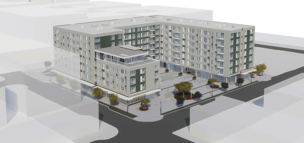
The project is located on land formerly owned by Con-way (now XPO Logistics), and occupied by a truck servicing facility built in 1967. The adopted masterplan calls for the western half of block 290 to be developed with a privately owned square and associated development. The eastern half of the block will be a publicly owned park, to be developed by Portland Parks & Recreation when sufficient funding from Systems Development Charges becomes available.
Construction on other sites identified in the masterplan is proceeding quickly: the LL Hawkins and Slabtown Marketplace was completed in 2015, while construction is now underway on Blocks 294E and 295E and the Leland James building. Other nearby developments, outside of the masterplan boundary, include Q21 and Raleigh 22.
Block 290 went before the Design Commission in 2015 for design advice. The previous scheme, developed by YBA Architects, proposed a four sided square surrounded by buildings on all sides. The YBA scheme was submitted for design review in 2016, but was withdrawn prior to the scheduled Design Commission hearing.
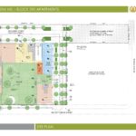
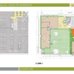
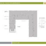
The revised scheme by LRS, first presented to the Design Commission in May 2017, proposes a U-shaped building with the square occupying the interior of the “U”. At the southwest corner the building massing is lowered to allow additional sunlight into the square. A covered breezeway will connect the square to the future park to the east. At the west side of the building double sided retail spaces will front both NW 21st and the new square; at the east side of the building a double sided retail space will front the square and the park. Five ground floor residential units will also face onto the park.
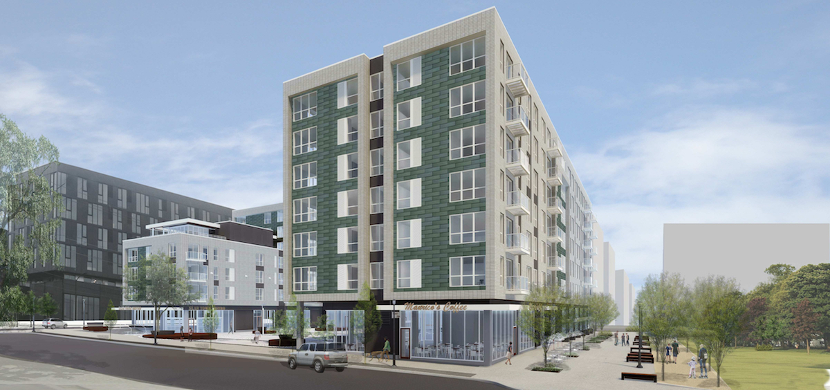
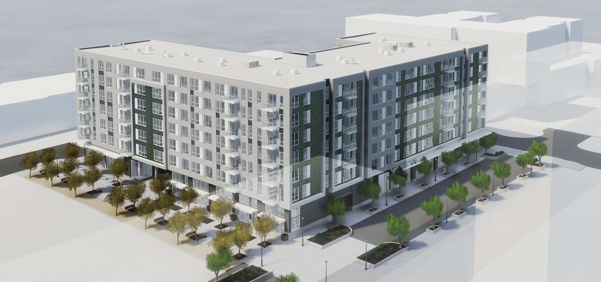
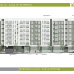
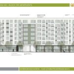
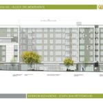
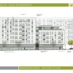
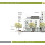
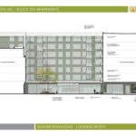
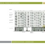
The primary material for the building will be brick, with zinc accents. Other materials include composite metal panels, concrete, vinyl windows, aluminum storefronts and glass balconies. Materials proposed for the square include concrete pavers, accent paving and circular wooden seating islands.
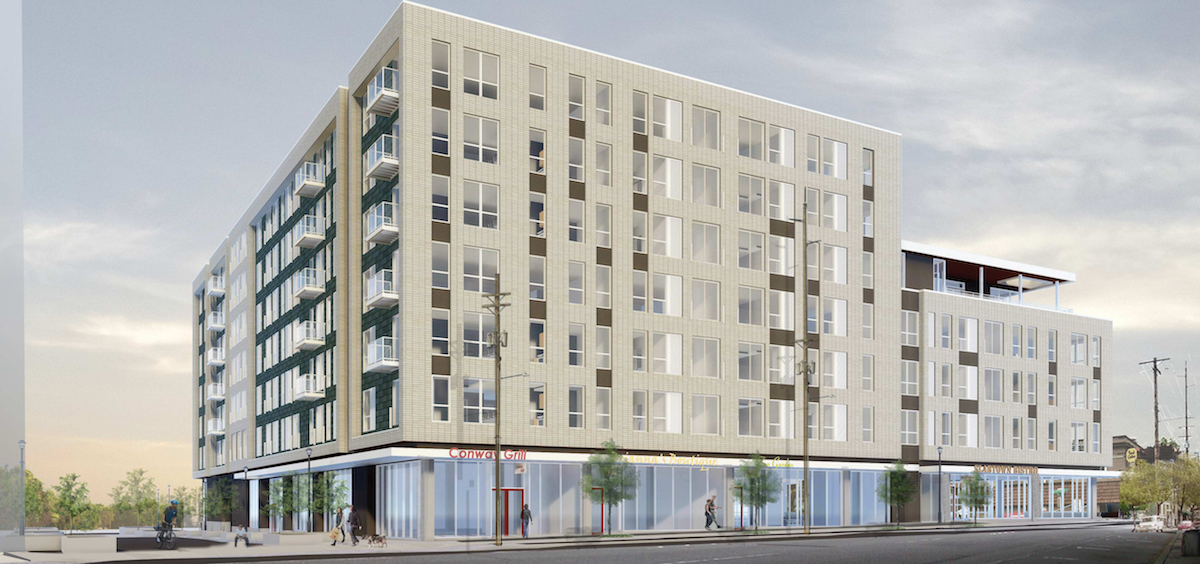
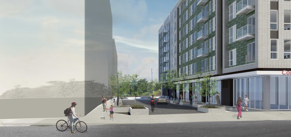
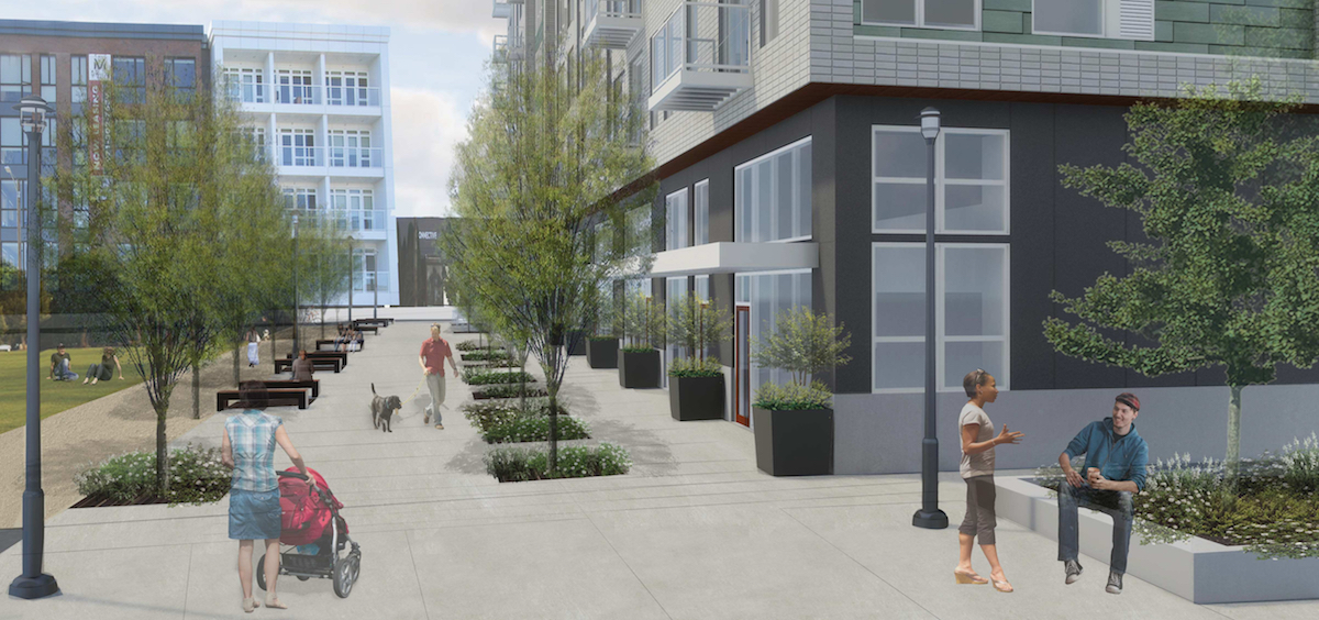
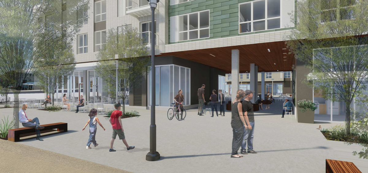
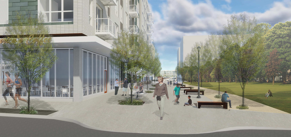
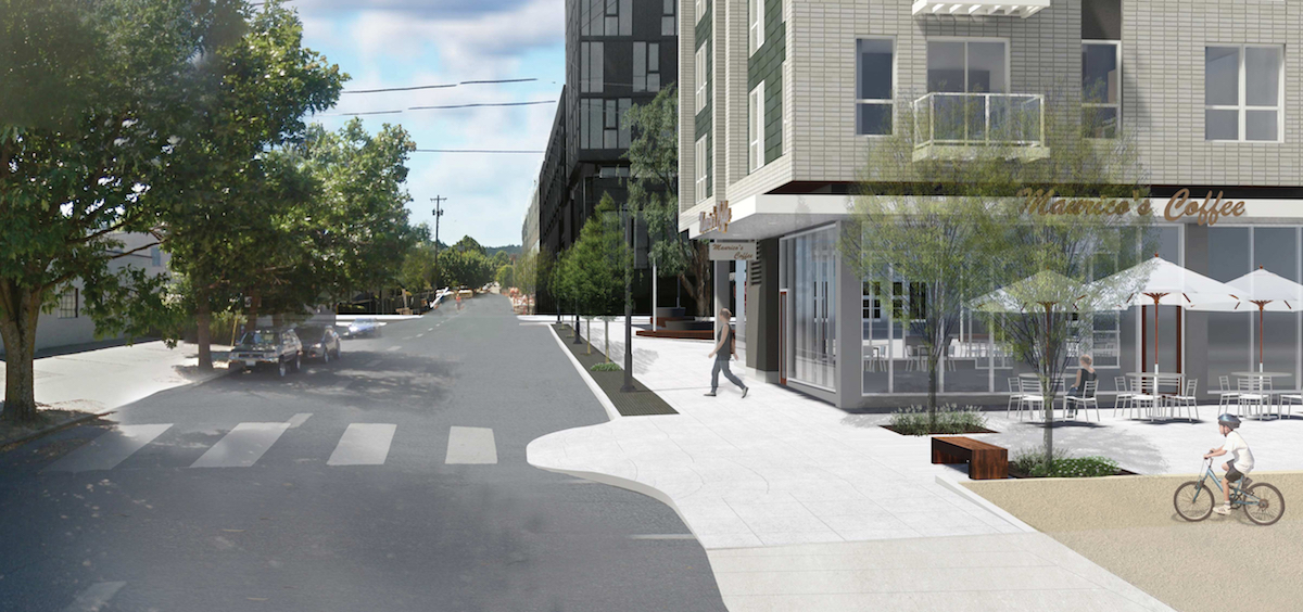
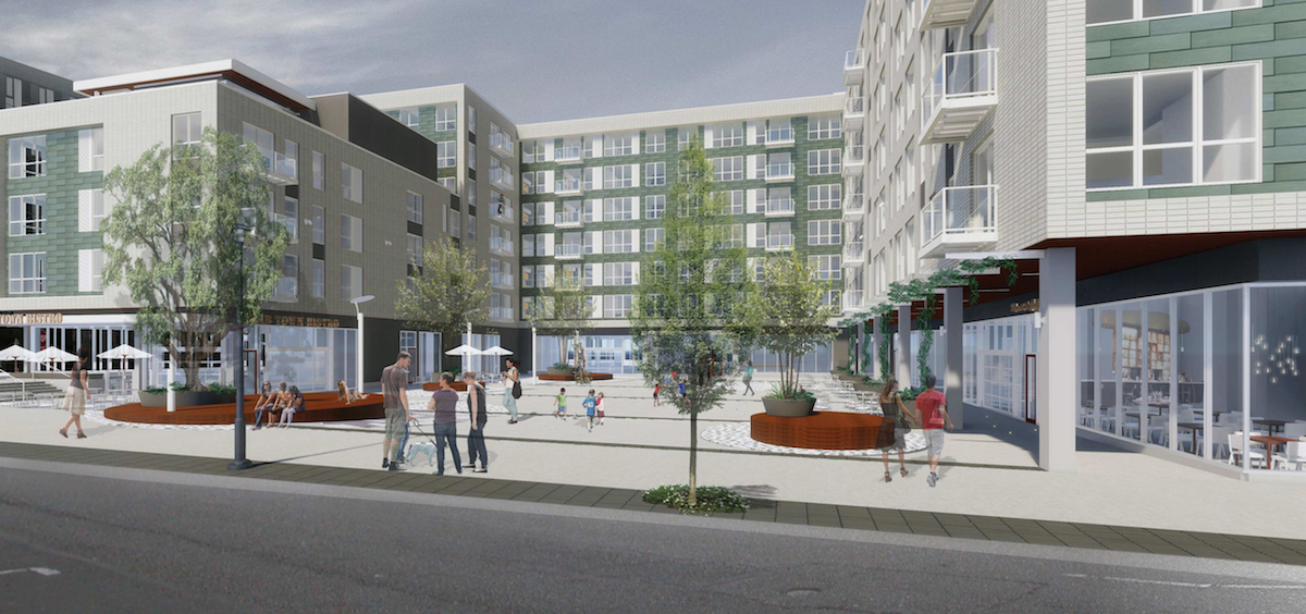
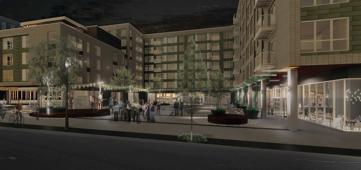
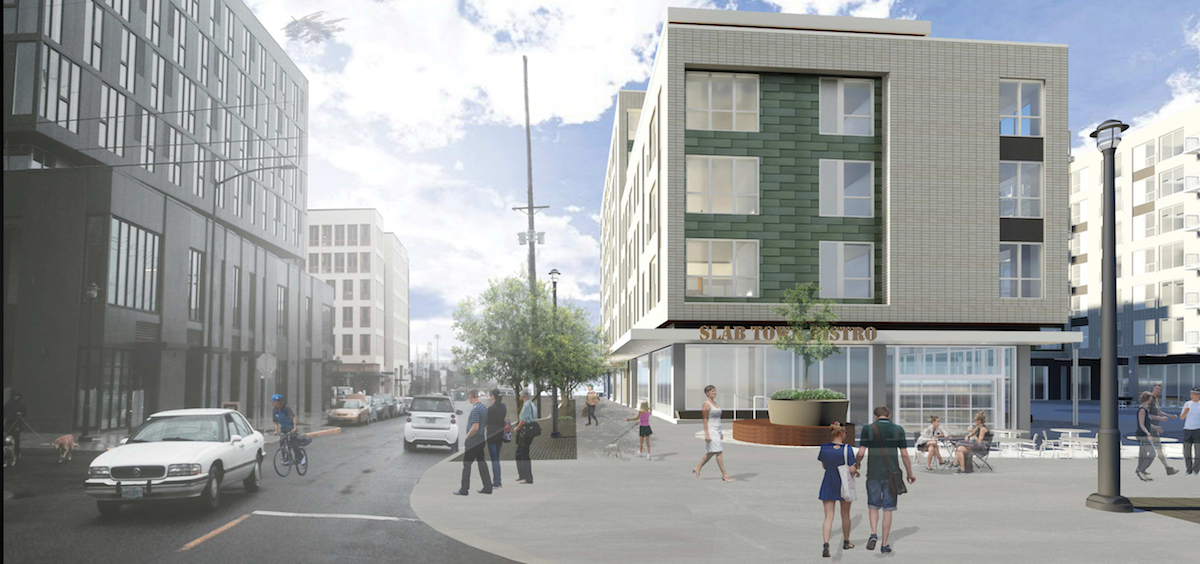
Block 290 was approved by the Design Commission at their August 3rd hearing, following revisions to the building massing designed to create a larger square, albeit with a 15′ eastward extension into the area previously reserved for the park / pedestrian accessway. The conclusion to the Staff Report and Recommendation to the Design Commission, adopted by a 5-0, summarized the procedural history of the project while finding that the final iteration had “substantially improved over prior designs”:
Staff recognizes the significant challenges of accommodating the required public square as well as supportive private development on this site, which meets the standards outlined in the Con-way Master Plan. Staff has now worked with two different design teams in an attempt to support approval of a proposed development for this site. The previous designs had some challenges, which resulted in recommendations of denial, as staff did not believe they were ready for approval. The current proposed design has made significant strides in working through the challenges of this site combined with market realities of developing a proposal that is financially feasible and ensures the development of three open spaces for public use.
While staff and the Commission previously encouraged that a development of lesser intensity be developed on this site, it has since become more clear that a higher level of intensity is needed to support the development of the required open spaces on site. That said, the proposed level of development on the site remains within the maximum 3:1 FAR limit of the Con-way Master Plan area.
The proposed design fits with the desired character of the neighborhood, is of good quality, and will provide a substantial public square for individuals and groups to gather for programmed and un-programmed events. The revised design is substantially improved over prior designs and has been found to meet the intent of the Master Plan.
Buildings permits will need to be obtained before construction can begin on site.
Drawings
- Plan – Site
- Plan – Parking & Level 1
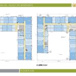
- Plan – Levels 2 & 3-4
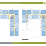
- Plan – Levels 5 & 6-7
- Plan – Roof
- Elevation – North (Quimby)
- Elevation – East (Park / Pedway)
- Elevation – South (Pettygrove)
- Elevation – West (21st)
- Elevation – West (Square)
- Elevation – North (Square)
- Elevation – East (Square)
- Elevation – South (Square)
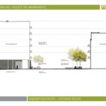
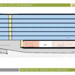
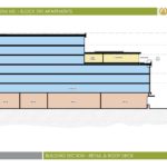
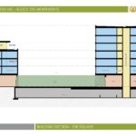
- Section
- Section
- Section
I just looked up the Con-way Master Plan from 2012, and it shows the entire block 290 as a public park. Anyone know what happened to that plan? Is there a revised plan out there?
The previous iteration was a lot more interesting than this thing. I didn’t like the closed off square that was initially presented, but wow, this design became so uninspiring in my opinion. I hope the square will be utilized well. There seems to be a good amount of foot traffic developing in the area so I have some hope.
All these new 5 – 7 story apartment projects are starting to all look the SAME. Soon Portland neighborhoods will have NO individual identity . . . . and Portland will be just another be 5 – 7 story apartment wasteland somewhere out west . . .
More like Drab-town, amirite?
The public square simply does not comply with the objective criteria set forth in the Conway master plan, so there will be an appeal to City Council. The criteria are very specific, so a design team that blows them off is either negligent or is directed to do so by the developer.
What’s so different about this proposal from the last one that got rejected? Did they actually enlarge the public square at all? Because the design itself is much worse.
The design with the closed off square was more visually interesting to me.
Why isn’t the U shape open to the ‘festival street’ aka Quimby. That would make the square more open and feel bigger. This seems like a miss.
http://yb-a.com/block-290/ The previous iteration is far more interesting that the current approved one.
Pingback: Portland's New Design Rules Could Kill Housing—But They Don't Have To
Pingback: Portland’s New Design Rules Could Kill Housing—But They Don’t Have To – Business News Press