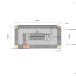
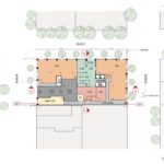
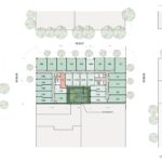
The Historic Landmarks Commission has approved a mixed use development at SW 3rd & Ash. The building by GBD Architects for Downtown Development Group will include 133 residential units, 20% of which will be reserved for people earning no more than 80% of Area Median Income. At the ground level 8,640 sf of retail space is proposed. Parking for 63 vehicles will be located in one level of underground parking. Long term parking for 250 bicycles will be provided.
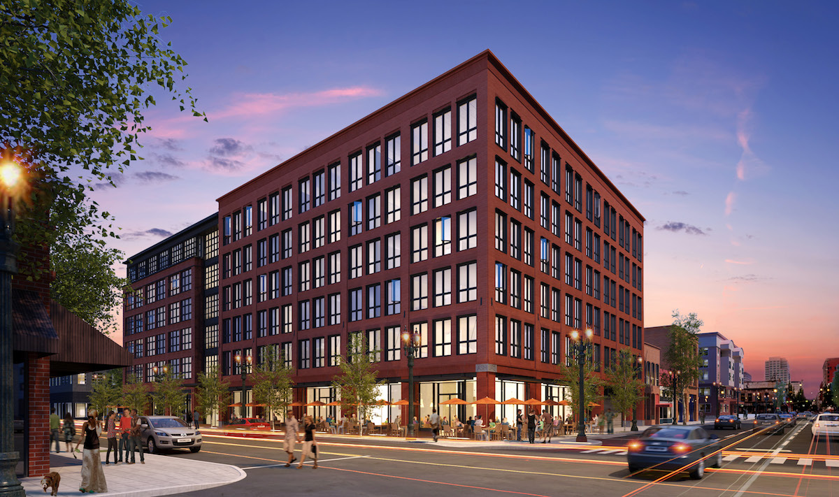
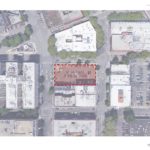
The site at 108 SW 3rd Ave sits on a half block bounded by SW 2nd Ave, 3rd Ave and Ash Street, in the Skidmore/Old Town historic district. The project is the first new building to be reviewed under an updated set of guidelines for the historic district, which were adopted by City Council in 2016.
The site is currently being used for surface parking and a couple of food carts. The site is one of the Goodman family-owned ‘Ankeny Blocks’ announced as available for redevelopment earlier in 2016, and the first of the sites to move forward with a firm proposal.
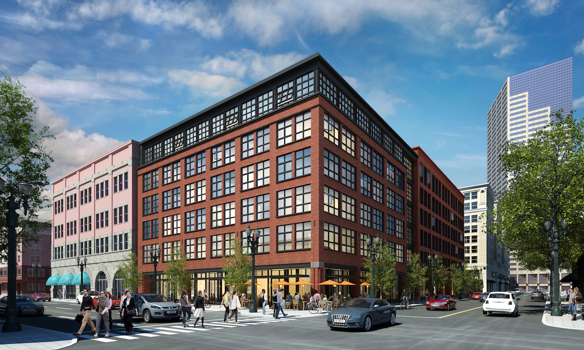
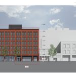
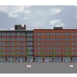
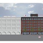
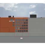
The building is massed as two volumes: a 6 six story volume west side of the block, and five story plus glass penthouse volume on the east side of the block. The six story volume will be clad in a smooth cut red brick, while the five story volume will use a rougher cut red brick. Other materials proposed include fiberglass windows, aluminum storefronts and precast concrete sills.
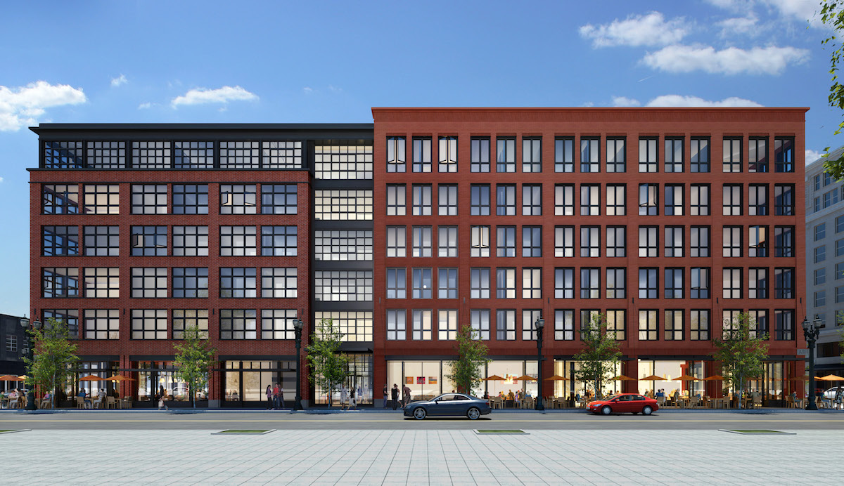
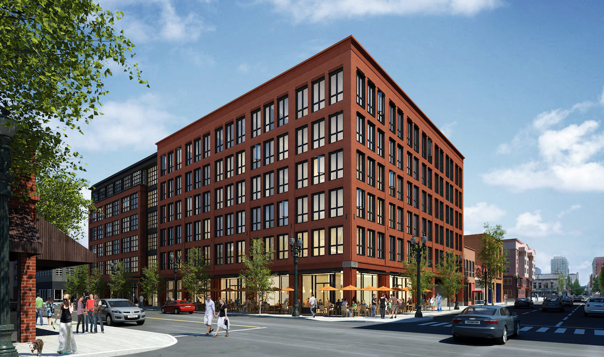
SW 3rd & Ash was approved on June 12th 2017, following a design advice hearing in October 2016 and an initial historic resource review hearing on April 10th 2017. In the conclusion to the Final Findings And Decision By The Landmarks Commission the project was found to complement the historic district:
The proposal will fill in a hole in Skidmore / Old Town’s urban fabric with a high quality masonry building. The proposed design will include fine-grained details, while also being simple enough to remain complementary to the adjacent landmark Hazeltine building as well as historic buildings in the district in general.
Buildings permits will need to be obtained before work can begin on site.
Drawings
- Plan – Site
- Plan – Parking
- Plan – Level 01
- Plan – Level 02
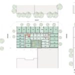
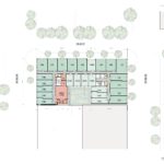
- Plan – Levels 03 to 05
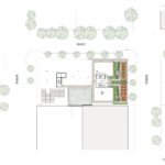
- Plan – Level 06
- Plan – Roof
- Elevation – West
- Elevation – North
- Elevation – East
- Elevation – South
Always good to see more much-needed density, but my God, that is one boring looking building!! I wish Portland would up it’s architecture game more.
Why are interesting buildings here the exception and not the norm?
Because if they appeased your tastes, the traditionalists would complain. And if they appease their tastes instead, you complain. That’s why. The commenters on this site will never ever be happy with anything built here and should just come to terms with it. Your preferences don’t matter.
Uh, Chris, actually my preferences do matter 😉
lol, anyway, I love the way this building looks. Traditionalism and historical relevance is somehow radical and that’s okay. I think this building will show how cohesive architecture will benefit a community. It’s tastefully done.
After going through design review, many of the buildings tend to look the same.
Its really depressing and disappointing to see other cities and countries benefiting from great architecture and Portland getting the shirt and of the stick when it comes to great design. Maybe its because society is looking down at their phones all the time that designers and architects feel that they don’t have to make an effort to make surtoundings beautiful because no one cares anymore.
Beautiful Building… well balanced, will fit into that part of town well. Glad to see something designed that won’t look heinous in 5 years. The smaller units will be good to get younger people injecting life into that part of town, ideally cleaning up the riff raft.
Omg boring as heck! Waste of a spot. A nice skinny tower would be better. Once again Portland loves their 6 story stub buildings
Why do you people even bother to comment on this website? Nothing is ever good enough for you. It’s either bland, or ugly, or too tall, or too short, not enough parking, or some other ridiculous reason that no one in their right mind would ever care about. You people whine like nobody else in the world.
It is likely the negative comments here are in large measure due to a lack of understanding of Portland’s zoning code, planning goals, Landmarks/Design Review process, market forces and available financing. For if one has that understanding this building is precisely what one would expect at this site. Many people think you can build anything you want anywhere you want and make it look like whatever you want. Perhaps we could benefit from a major civics and economic education campaign. Its fine to not like something or not agree with policy but it helps to know the context of one’s critique.
Everyone here seems to be complaining about the so-so architecture of this building, but I welcome it! Every time I go home to my hometown of Seattle I am crestfallen by the completely tricky-tacky claptrap squat crapholes that are popping up all over my old stomping grounds (namely Capitol Hill).
Its not the most striking architecture I’ve ever seen, but it slides in nicely with the neighborhood and will convey a sense of history and permanence. I also like how the building looks like it has two elevations to it.
parking lot < mixed use building
During the design process I wrote to the architecture firm urging them to push the glazed penthouse over SW 2nd & Ash back at least 10 feet from the parapet, which would push the glazed entrance on Ash to that setback. I also wrote to the Landmarks Commission urging that change which would remove some GSF but would make the 2nd Ave side less top heavy and create a small entry court on Ash St. Obviously my suggestion was not taken.
Ground floor retail space is empty in every quarter of this city, and building more ground floor retail space won’t solve the problem. It’s almost comical when you consider that the economy is at full employment, and yet the planning decision makers for Portland clearly don’t get that, if the ground floor retail market is in a permanent state of change during such conditions, then it’s not going to get better.
Downtown Portland is going to be saddled with empty ground floor and under-utilized hotels in the next recession.
To those who seem to think that most new buildings in Portland are boring and should do better at making an architecture statement, I invite you to visit the cities in Europe (and some in the U.S.) that so may us Americans flock to, find charming, and wish we could duplicate in some way where we live. Notice that most of the old buildings of a neighborhood are of a kind, similar in style and scale, one distinguishable from another in the same way most people are: in the detailing. They tend to excel in how they meet and activate the street. Their collective effect is greater than their individual. Visit New York City. The places so many people love to live there are mostly one brown stone after another, almost no individual place exceptional. I do think there is a place for exceptional buildings, but the places for them are exceptional. Important civic buildings, sports arenas, grand places of worship. Otherwise, it’s not unwise to expect new structures to try to get along with their neighbors.
^ This guy knows. I do wish they could set aside budget for ornamentation AND an ornate main entry but this is certainly on the right track. Can’t wait for more buildings to do this as well.
I’m a huge fan of daring contemporary architecture and I love buildings like the Fair Haired Dumbbell and others. But we also need more historically respectful designs, which this one (sort of) is. Can’t argue with good old red brick.
What so many US cities lack is any respect for *district-scale design*, in which you can look down a street and see a visual coherence among all the many parts. Think Hausmann’s boulevards in Paris. It’s a tragedy we have so little of it, because the human soul needs it. Yet here we are, individualist Americans, with our hodge podge parts all cobbled together.
Yes, we can continue to build daringly and as a sign of our own era, but we can also respect universal design principles and the harmony and beauty of historical context and visual unity.
Are they putting the street names carved in stone, at each of the corners, as it appears? I think that’s a nice touch. Maybe they’ even use a stone-carving font, instead of a photographed type font like Pioneer Place did.