The Design Commission has approved 5 MLK, the 17 story Burnside Bridgehead tower. The design of the project is by Chicago based GREC Architects, for Portland based developer Gerding Edlen. The 200′ tall building will include approximately 112,000 sq ft of office space, 220 residential apartments and 14,000 sq ft of retail space. Parking for 158 vehicles and 344 bicycles will be provided.
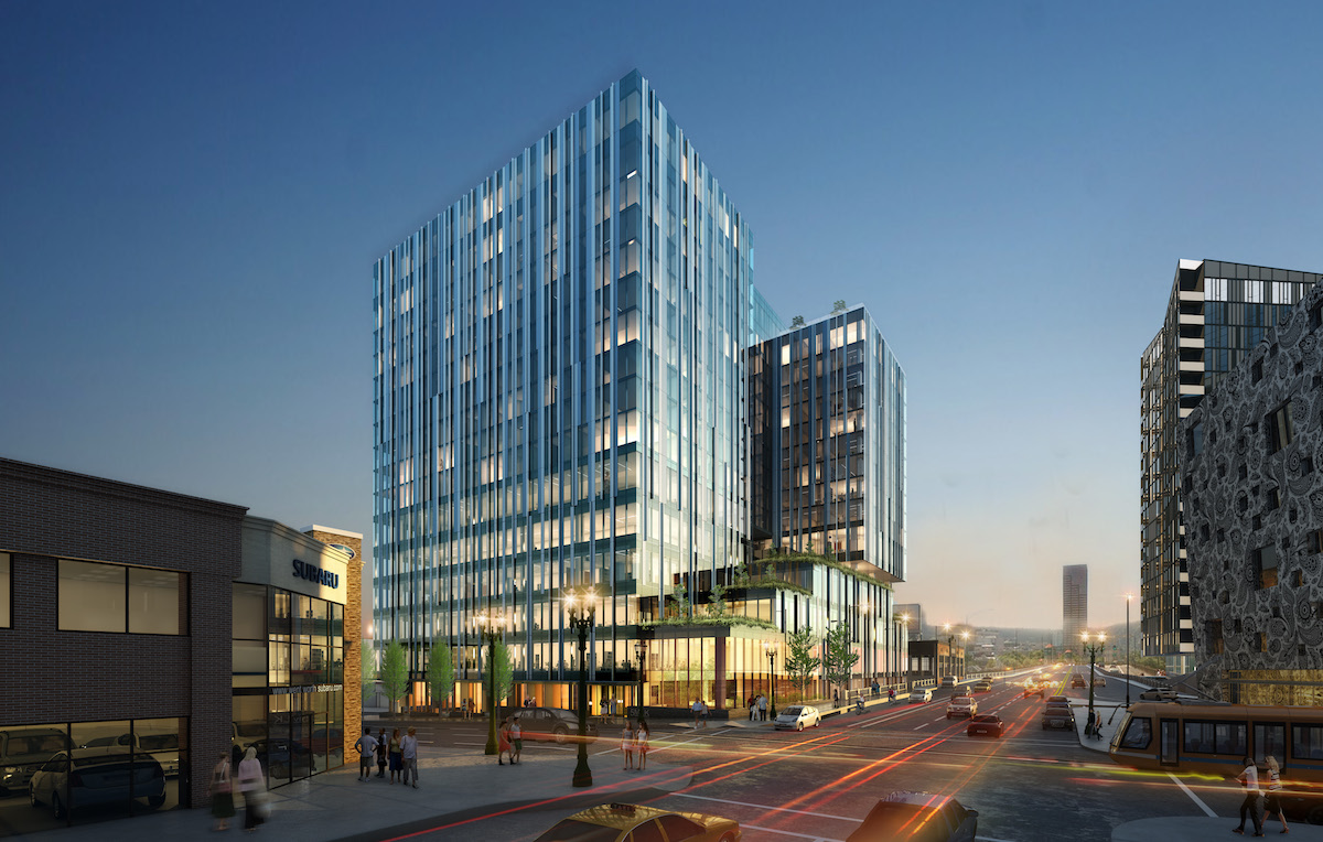
The building will be located at the site that was until recently home to Fishels Furniture. According to a 1988 survey [PDF] the existing quarter block building at 5 SE Martin Luther King Jr Blvd was built circa 1900, to designs by an unknown architect. The building is described as “typical of others of its type which consist of a first floor retail space with offices above”. Other buildings on the same block, also used by Fishels Furniture, are listed on portlandmaps.com as constructed in 1920, 1941 and 1953. Fishels Furniture was founded in 1921, and announced in April 2016 that they would be closing following a liquidation sale.
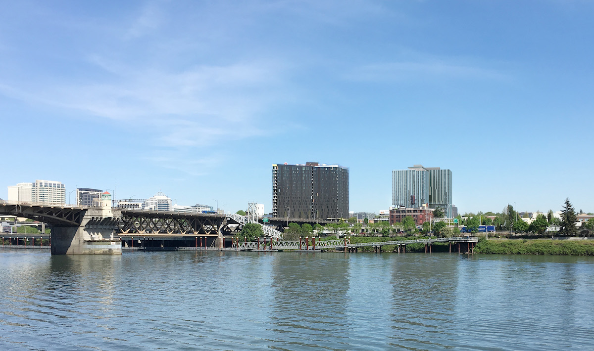
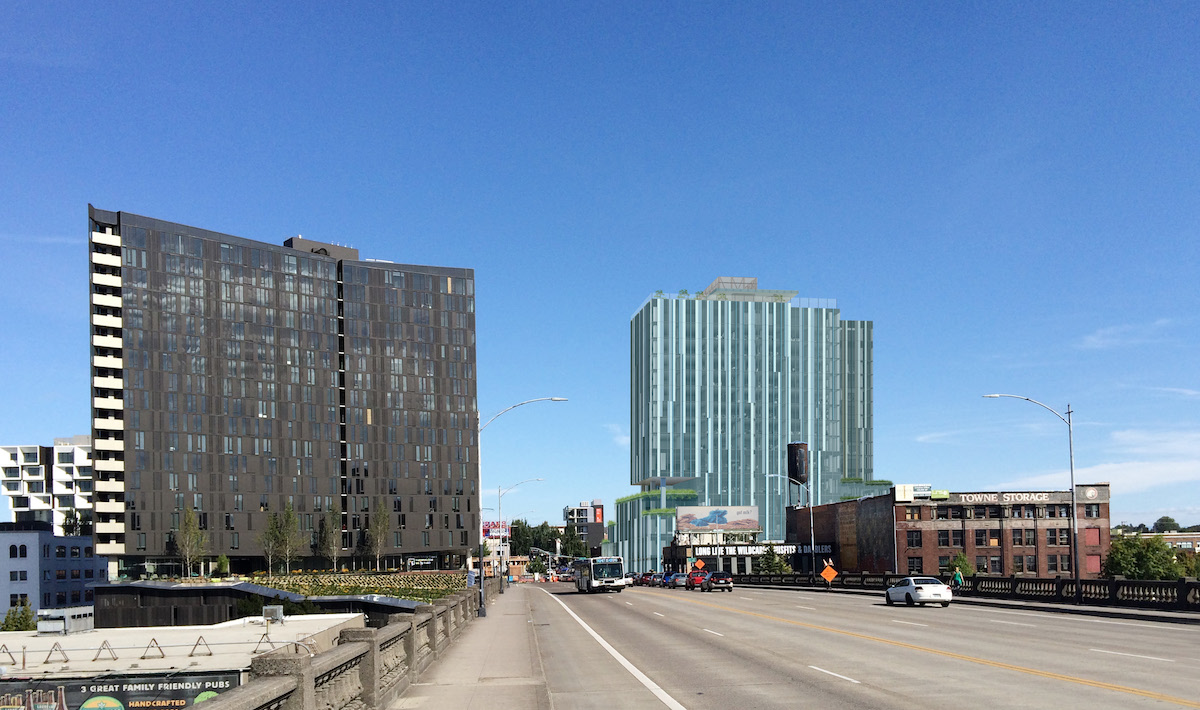
The surrounding area at the east end of the Burnside Bridge is growing rapidly. 5 MLK will be just to south of the recently completed Yard and Slate buildings, and the under construction Fair Haired Dumbbell and Aura Burnside. Other buildings planned or under construction in the lower E Burnside area include the Towne Storage Building, the Jupiter Hotel Expansion, the Ankeny Apartments and the Burnside Delta.
The massing and facade articulation of the project is based on the “Layers A” scheme presented at the third Design Advice Request hearing, held in October 2016. The building will be comprised of a five story retail and office podium, with a pinwheel form residential tower located on floors 7 through 17 above.
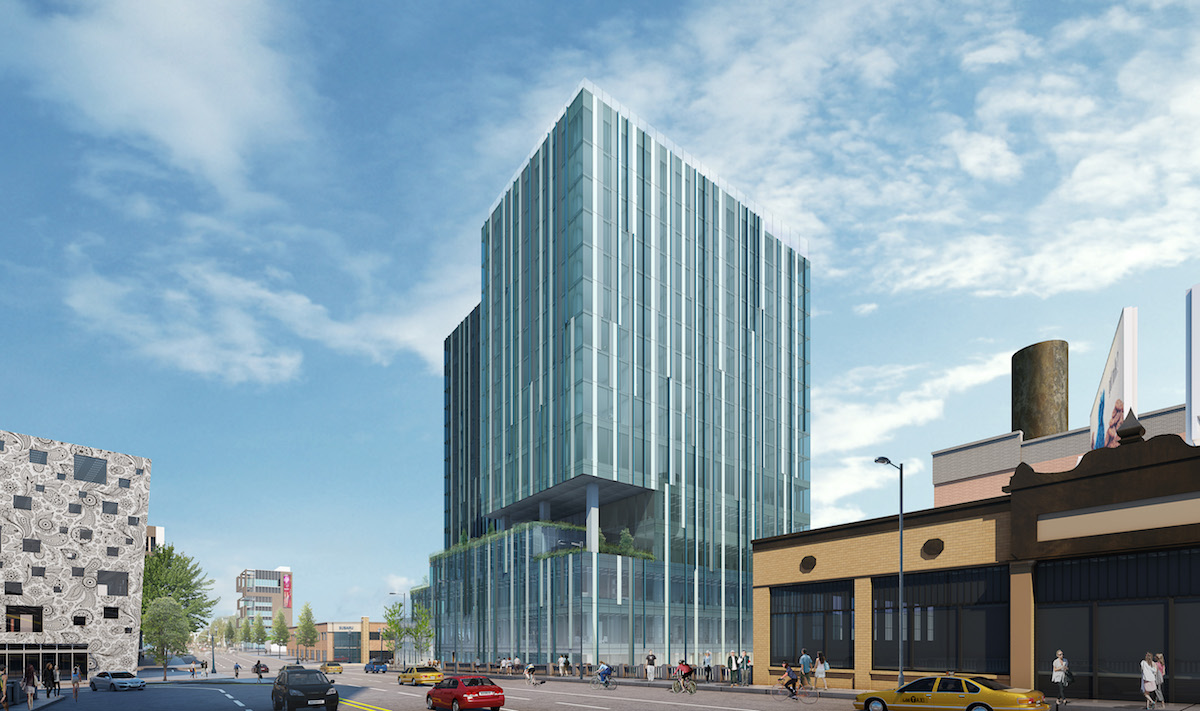
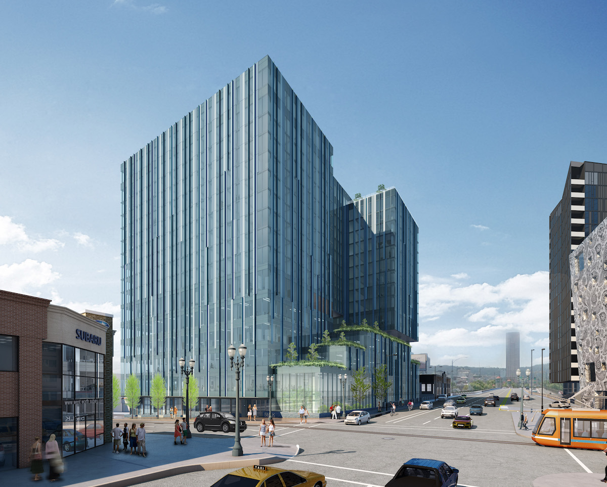
The main entrance to the building, shared by the office and residential uses, will be at the corner of E Burnside and SE MLK. A series of large rooftop terraces, with with landscape designed by PLACE, are proposed at levels 3 through 6. Amenity features including a fitness center, yoga studio and lounge will open onto the level 6 terrace. A roof deck with a pool is proposed at level 17.
The skin for the tower will be a window wall system, with a pattern of vision glass, spandrel glass, porcelain panels in two colors, and projecting mullions. Other materials proposed include metal soffits and stone masonry at the ground level planters.
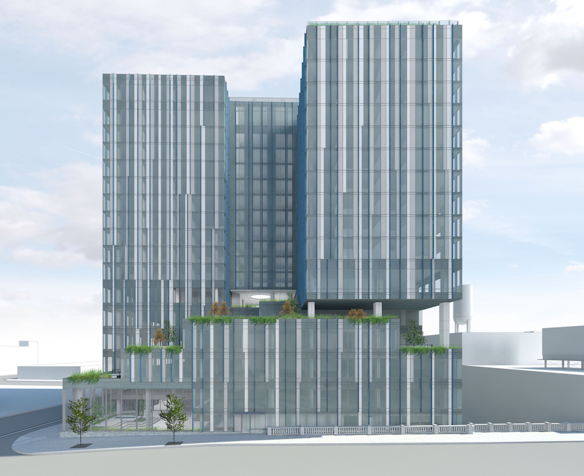
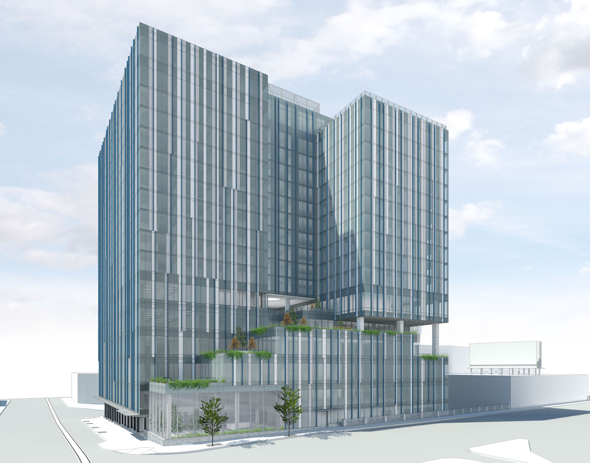
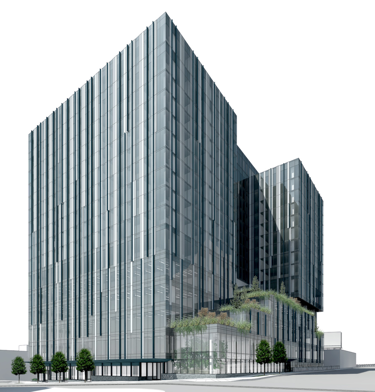
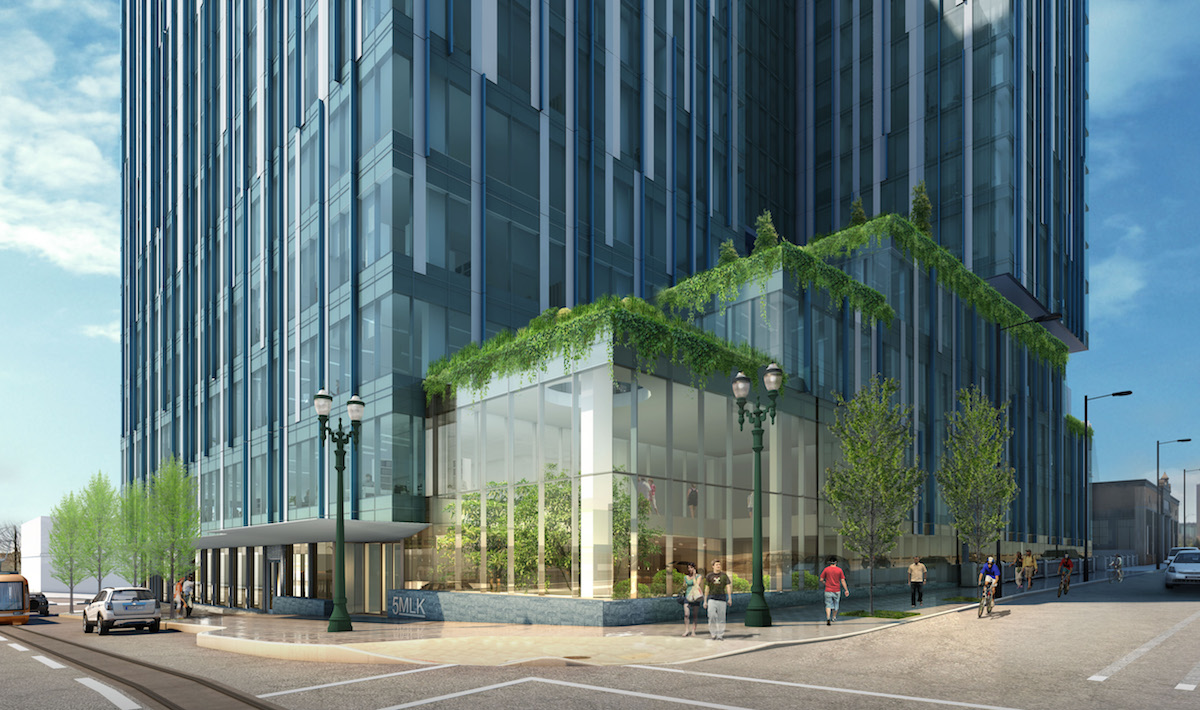
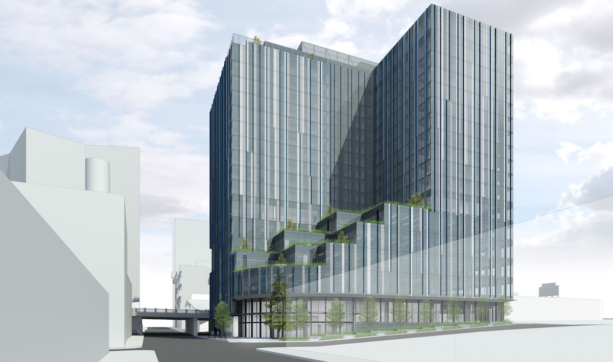
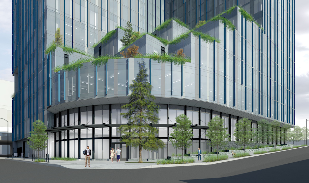
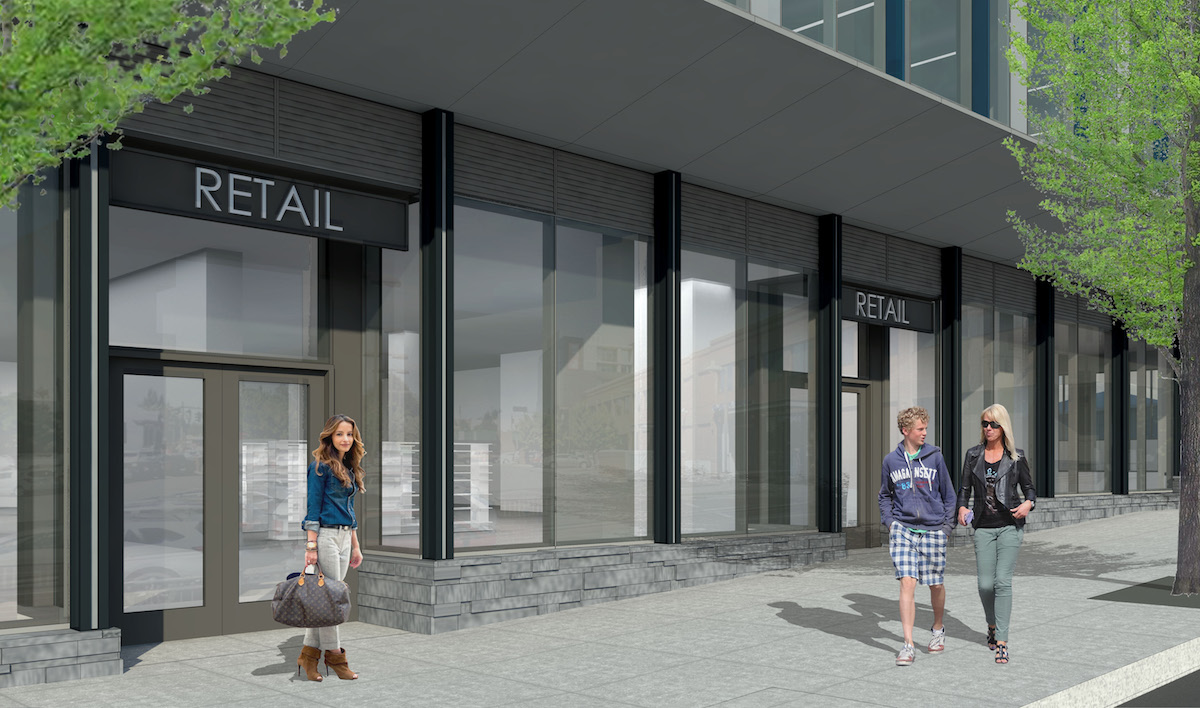
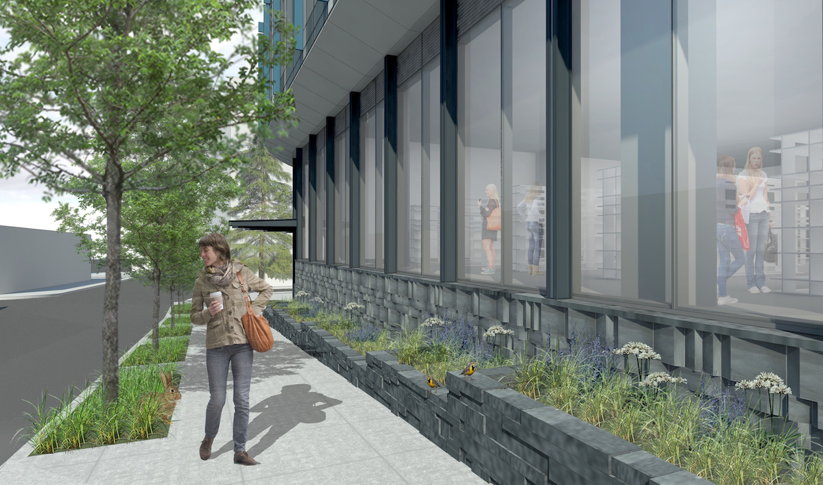
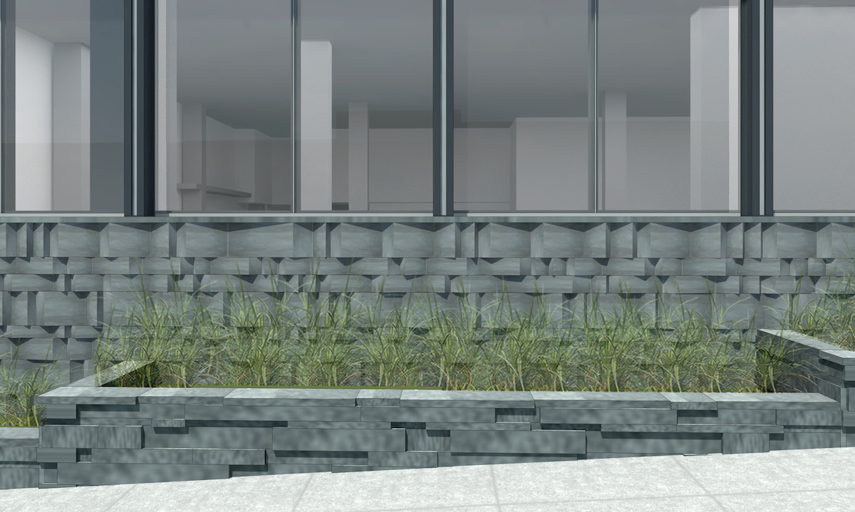
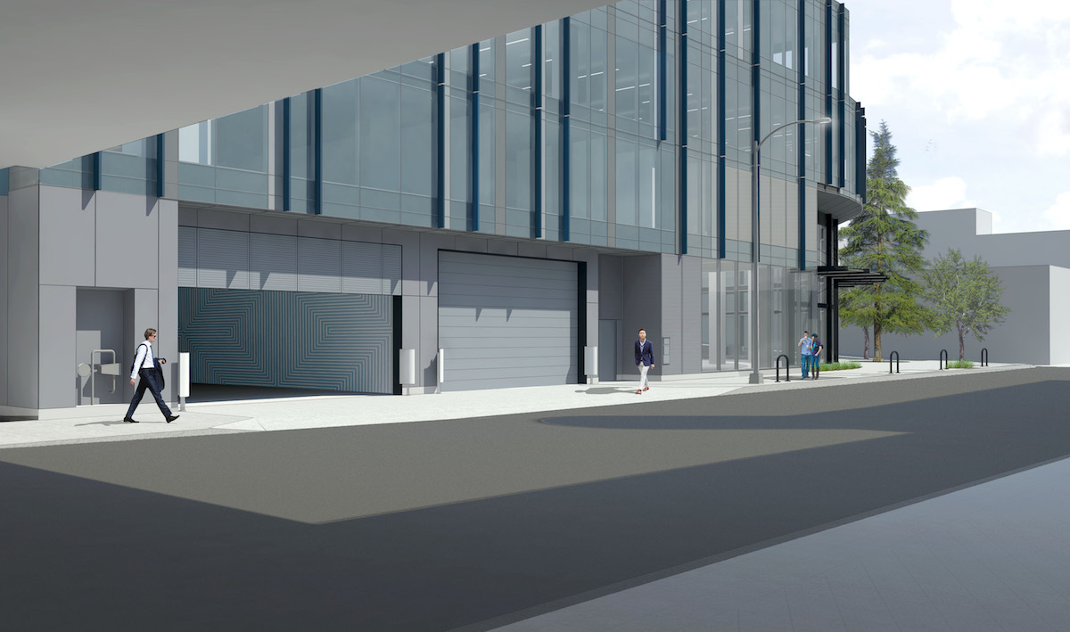
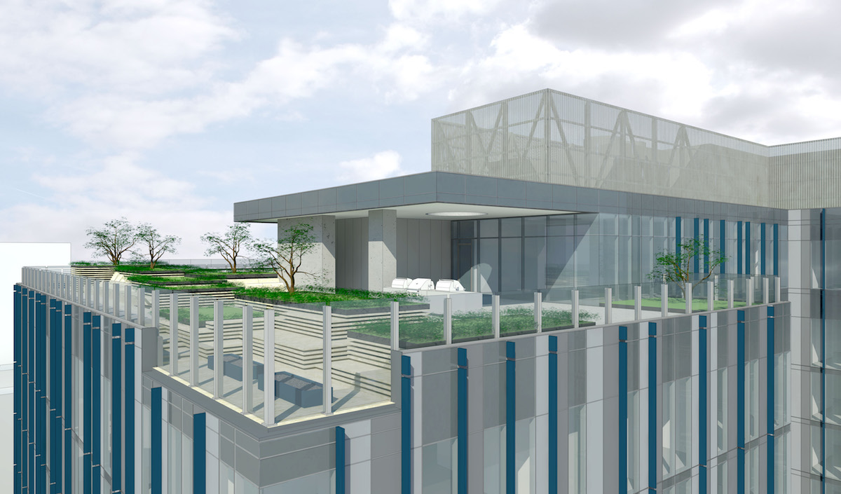
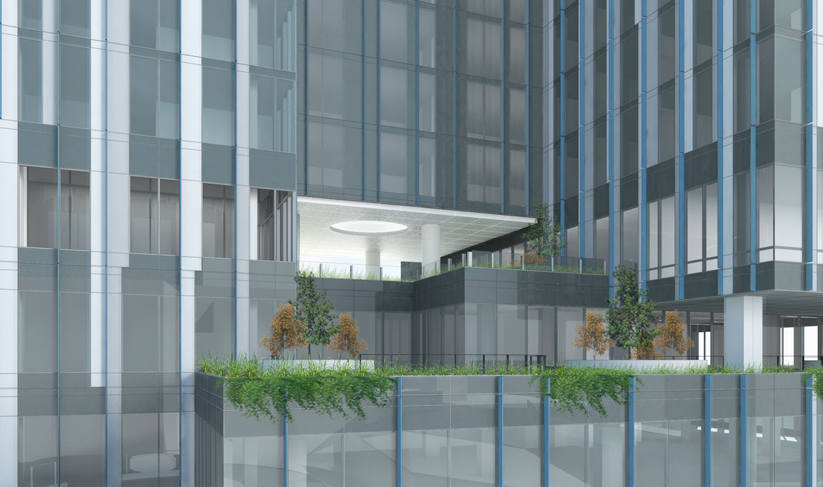
5 MLK went before the Design Commission five times in total: for Design Advice Requests, held in July, September, and October 2016; for an initial Design Review hearings in March 2017; and for a final Design Review hearing on May 18th 2017. Revisions made to project between the first and second Design Review hearings included: the provision of additional loading spaces accessed from SE 3rd Ave; revisions to the massing at the curve on the SE corner; and to the patterning on the facade. In the conclusion to the Final Findings and Decision by the Design Commission the project was found to provide an “activated and transparent ground floor” that will improve the ground level around the building:
The proposed 17-story, 370,863 square-foot mixed-use building in the Central Eastside Subdistrict of the Central City Plan District will be a well-composed addition to the burgeoning development area around the E Burnside bridgehead, clad with high-quality materials and providing an activated and transparent ground floor to improve the pedestrian realm along E Burnside Street, SE MLK Boulevard, SE Ankeny Street, and SE 3rd Avenue.
Building permits are currently under review for the project.
Drawings
- Plan –
- Plan – Parking Levels 2 & 3
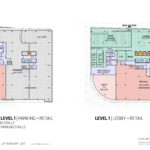
- Plan – Level 1 & Parking Level 1
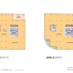
- Plan – Levels 2 & 3
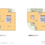
- Plan – Levels 4 & 5
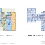
- Plan – Levels 6 & 7-16
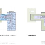
- Plan – Level 17 & Penthouse
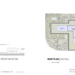
- Plan – Roof
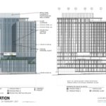
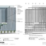
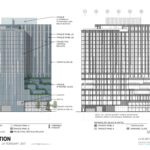
- Elevation – North
- Elevation – East
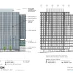
- Elevation – South
- Elevation – West
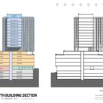
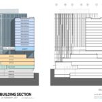
- Section
- Section
It really doesn’t look like anything else in Portland, and I hope the glass turns out to be a nice contrast to the Yard and Fair Haired Dumbbell. I’m kind of excited to see how that intersection looks once it’s complete.
Yes, I am with you on that! I hope the pictures and renderings are close to the actual “product” being built.
The glass on this building will make or break this project. Any improvement over The Yards is welcome. The Dumbbell projects is looking good . . . .
beautifulportland, I agree on both counts. The Fair-Haired Dumbbell building is one of my favorite recent constructions: idiosyncratic, whimsical, a floral splash of color amidst more somber architecture and climate, and scaled just right. I wouldn’t want a whole neighborhood like it, but it is single and nestled in exactly the right place. It plays perfectly off of the hulking and ominous Yard, like a bright garnish, helping to humanize it. I am aware of no other building like it in America. Walking or driving past the Dumbbell, especially on a gray wintery day, who doesn’t feel like they are being treated to a patch of sunny spring garden? The intersection of Burnside and MLK has become one of the most interesting, perhaps even pleasing, crossroads in the central city, certainly on the east side. Who’d have thought it possible a decade ago? Much credit must go to city planners, so regularly criticized on this site.
Why are modern architects so scared to design distinctive entries, roof lines, or windows? What happened to the arch? The grand thresholds, standing proud with the name of its owner on its front? A roof line and materiality that can show permanence in its location? Is it really that hard for these so-called designers to make anything distinctive in this town anymore or should we look to the property owners to blame for this bore of a cityscape addition? They aren’t designing, they’re just accountants that look for efficiency over everything and bury the humanity, context, and aesthetic. Look to the KOIN building for a pleasant silhouette and materiality in the modern architecture vein I’m speaking of.
I’m surprised the Design commission allowed this as their final proposal.. but then again, the dumbbell was allowed, and it’s still squabbling to be filled with businesses two years after opening! Same with Aura next door. These buildings don’t look appetizing to business owners and it shows. Shame.
cupcake, I certainly agree with you that materials and design can lend a sense of permanence to a structure and that Portland hasn’t many distinctively designed modern buildings. On the other hand, I think it’s easy to get carried away trying to build a lot of strikingly unique buildings. For the most part, the reason that a building stands out is because most of its surrounding buildings are more conventional, and/or it has a monumental scale, which is why so many of these memorable buildings have an important civic function, such as capitals, museums, city halls, train stations, stadiums, etc. It is the absence of many similarly different and monumental buildings that makes these exceptional.
Actually, I applaud Portland for avoiding one path to architectural renown: starkitecture, catering to famous architects more interested in creating testaments to their own genius than in creating good architectural citizens. This doesn’t mean that you can’t have both a first rate architect and the creation of a superb, responsive architecture. For an example of this I would point to Kendo Kuma’s additions to the Japanese Garden, which I think are sublime. I think there’s much to be said for the certain sameness that has resulted from the city’s insistence that new buildings pay attention to their neighbors, that they enhance the experience of the sidewalk and street, that their scale be respectful of humans, and that their appearance suggests durability and, yes, permanence. While the results are rarely breath-taking, they do tend toward creating places that are vital and where people want to live and do business.
Most of the inner east side neighborhoods of Portland, like Irvington where I used to live, exemplify how a certain similarity can produce a good place to live. Nearly all the houses are 1 1/2 – 3 stories. Of the tens of thousands of houses, only a hand full of styles are represented: lots of bungalows and Craftsmans, some English Tudors and Colonials, fewer prairies. Variety is mostly subtle, in color differences and in the addition and subtraction of details. I lived in an Old Portland, (a Craftsman variety) of which there were probably a dozen or more just in my neighborhood. To see the differences, you have to pay attention, as few seem particularly distinctive. But how people love these neighborhoods! They may have seemed blandly similar when they were built and the street trees were but saplings, but how they have aged well, being now the object of warm nostalgia.
Finally, I want to come to Dumbbell’s defense. I mention some of its architectural and civic virtues above in another comment, but I also want to mention its commercial success. I pass by the building at least twice each week. A few days ago, my wife and I had coffee at Creme Coffee Shop & Bakery, which recently opened there. So far as I could see, not a ground floor retail space was unoccupied and there was no “For Lease” signs advertising commercial space. From the beginning, Fair-Haired Dumbbell sold itself as providing CREATIVE office spaces and it seems to be precisely the kind of place that does appeal to creatives. And please visit the place at night when it is two brightly illuminated, colorful and skewed cubes surrounded mostly by the darkness. Then ask yourself: How do we not want at least one such cheerful, whimsical building in our city?
Pingback: Construction Tower Cranes Provide Unique Views of Portland – Between the Lines Blog