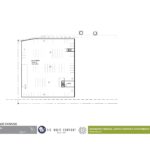
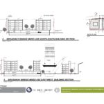
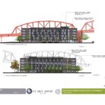
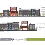
Design Advice has been offered to LRS Architects for the Broadway Bridge-Naito Parkway Apartments. The project, being developed by the Wolff Company, will include two buildings located either side of the Broadway Bridge. The southern building will rise to 5 stories, and will include 43 units. The northern building will be 6 stories tall, and will include 203 units. Parking for for both buildings will be located in the north building, with 210 spaces provided.
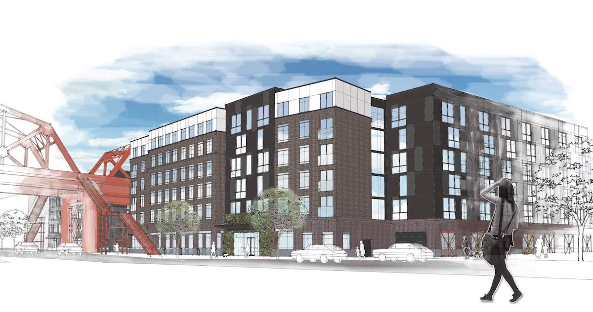
The site at 1053-1201 NW Naito Parkway is currently vacant. It was once part of the railway yards adjacent to Union Station, which were abandoned by the 1990s. It is currently owned by Prosper Portland (formerly known as the Portland Development Commission), who voted in August of last year to sell the property to the Wolff Company for $9 million. Under the terms of the Purchase and Sale Agreement 20% of the units in the development will be made affordable to households earning 60% or less of Average Median Income.
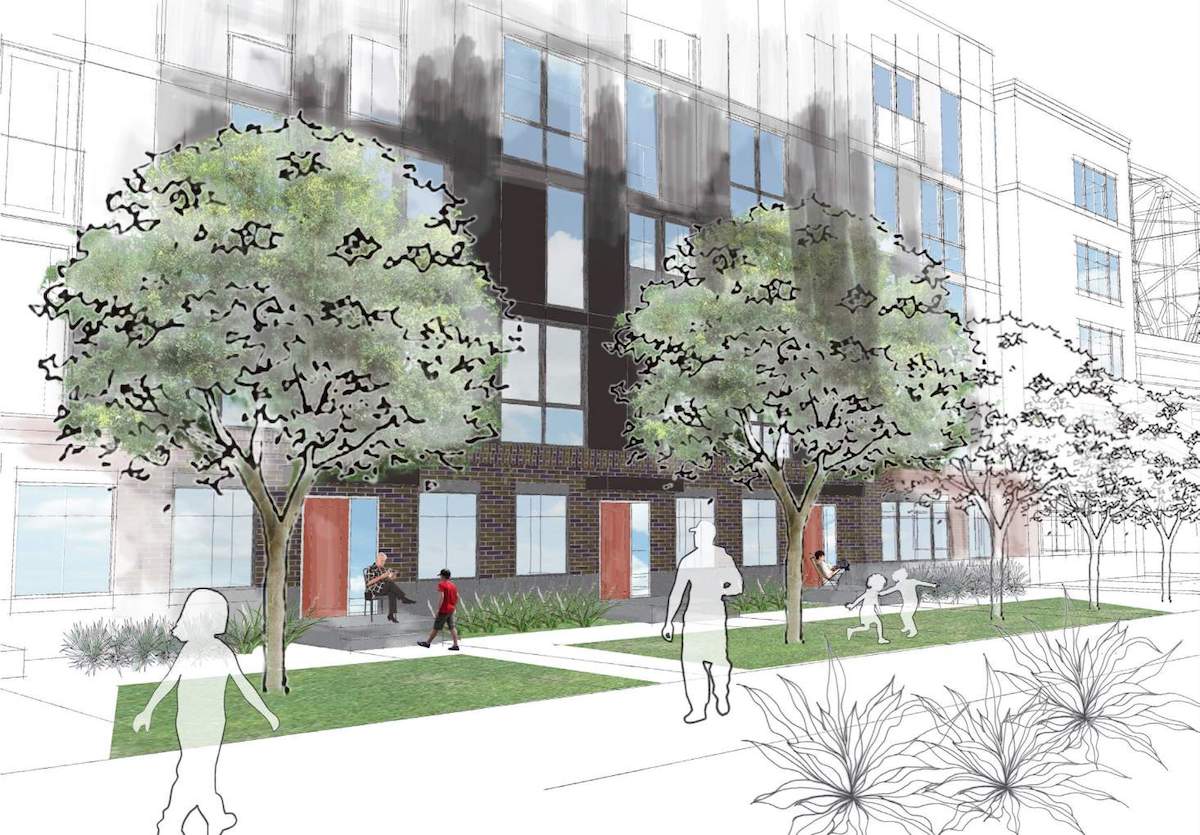
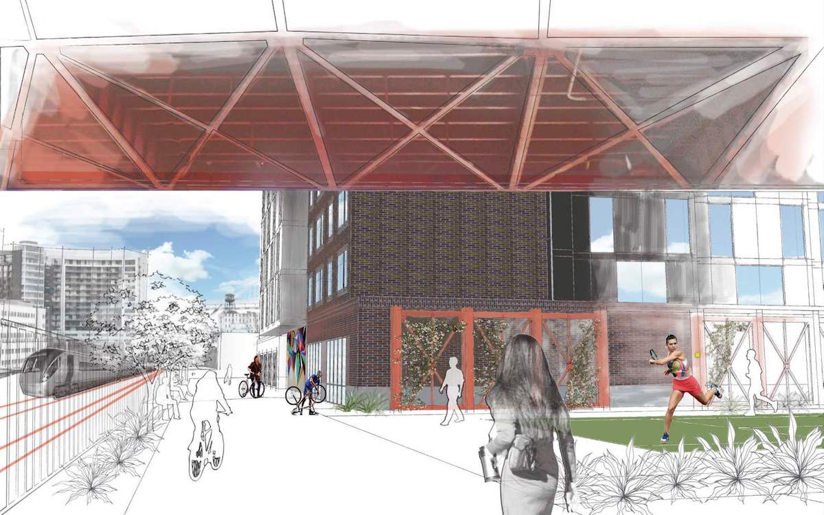
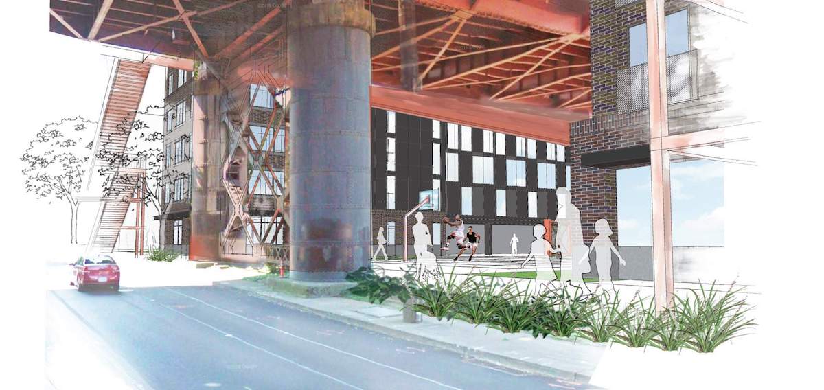
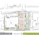
An existing pedestrian access way adjacent to the railway tracks will be extended north as part of the project, with connections back to Naito Parkway. In between the two buildings, beneath the bridge, a hard surfaced recreation area is proposed. Drawings show a tennis court and a basketball court.
Exterior materials proposed for the building include brick and Cembrit fiber cement panels.
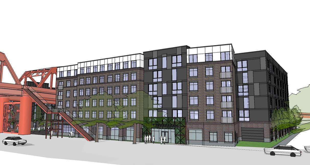
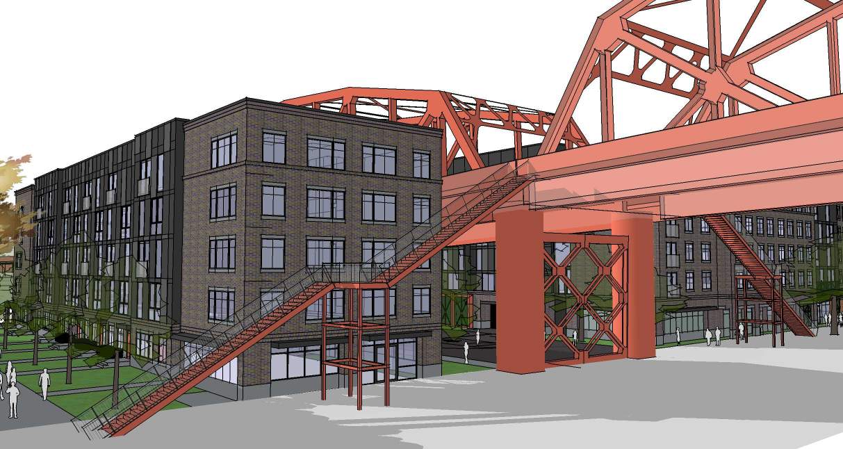
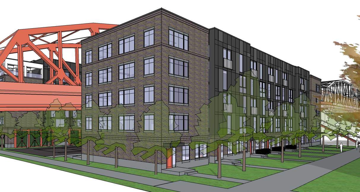
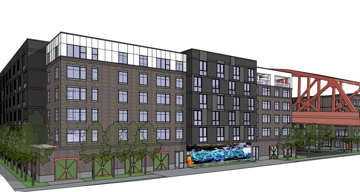
A Memo to the Design Commission, published before the May 11th advisory, outlined potential areas for discussion, including: the context of the Broadway Bridge and Union Station, and the how building responds to the bridge at the upper levels; the site design, including pedestrian circulation and the design of the space below the bridge; the ground floor uses, including the suggestion of residential units adjacent to pedestrian way at the north of the site; and design of rooftop mechanical equipment. Commission comments largely aligned with those outlined in the staff memo.
In order to gain approval the Broadway Bridge-Naito Parkway Apartments will be required to go through a Type III Design Review with public hearings before the Design Commission.
Drawings
- Plan – Parking
- Plan – Site / Level 1
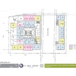
- Plan – Levels 2 to 5
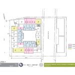
- Plan – Level 6
- Sections
- Elevations – South Building South & North
- Elevations – East (Naito) & West (Trainyard)s –
ugly
Portland is turning into a city where rich people live in quiet houses and everybody else is crammed into apartments next to noisy and polluted arterial streets, bridges, and railroads.
So, a city.
another ugly people warehouse
I’m guessing the 20% affordable units will be the ones up high facing the bridge girders and at eye level with the Trimet buses whizzing by.
From what I can see by the plans, no units face the bridge.
They’re plainly visible in the renderings.
Yet another BOXY TENANT WAREHOUSE with some widows: 5 ft from the busy Broadway bridge! Portland, we can do better . . . . .
“I’m often frustrated by architects because they are artists at heart. But LRS is creative within budget, they deliver on time, listen and respond to questions and are accessible and personable.”
GREG SPECHT, CEO, SPECHT DEVELOPMENT
This is from the archtects web site….I dont think they are applying the same standard here with this project. There is NOTHING “artistic” about this project!
Who on that project team thought that this design looks good? Or wanted those renderings to be published under LRS’s name?
There was a great opportunity to utilize the space under the bridge, unfortunately they put a tennis court there and gated it off.
I urge thise that are concerned about the design process that this project is going through is to contact the archtectural firm designing it and the developer financially backing this hideious building, Their name are in this artcle above and you will be linked to their sites when clicked.
What an abomination! Is it possible to revoke an architectural license?
I have an honest question: a lot of comments here remark on how ugly this is. But to my eyes it looks perfectly similar to everything else that is getting built in Portland. Is the issue that it’s sandwiching the Broadway Bridge? I agree that it’s an awkward location and there are a lot of hindrances to this site; but given that, what could be done to make this a stellar project?
Mike …… I was the one that commented that it was ugly….I just dont have thbe time to go through all the projects on this site and give that same critique. 😉
Mike, I think you hint at the very problem with this building. It looks similar to some other hideous buildings in Portland But it is in a very specific location that asks for a specific solution. Split by this red, industrial age bridge is a space that’s an opportunity to do something exciting, something creative, something that better responds as well to the river. Instead, for now at least, we are offered thoughtless mediocrity.
it warehouses people! what other aesthetic is needed!
Are you quoting Hilter?
It shouldnt block the view of the bridge structure
I agree! The Broadway Bridge with the red steel beams is an iconic bridge in Portland. This walls in the bridge and is ugly to boot!
My thoughts exactly in reading some of these comments. We are supposedly a city of bridges and the Broadway Bridge IS iconic. When I saw this design I thought-really-we’re going to cover one of our beloved symbols for Eternity with this brown box??!! Every structure currently near the bridge does not impair it’s presence except the old Alber’s Mill. Why aren’t we holding the line on height & impact? (Can we give Wolff some of their money back if it doesn’t pencil out at a lower height.). And absolutely, who wants to be enduring traffic on a 24 hour basis within arm’s reach. Can’t we do better? And driving over the bridge-do you experience a brown tunnel or flashes of human life in their little apartments? Maybe you could strategically stick a few flashing lights or neon signs to complete the ambience -especially for the poor residents in the discounted apartments.
“Don’t it always seem to go that you don’t know what you got til it’s gone, pave paradise and put up a parking lot!”
J. Mitchell.