Design Advice has been offered for a proposed U-Store self storage facility at the north end of the Pearl. The five story building is being designed by MCA Architects for Hoyt Street Properties. At the ground floor the building will include 6 retail / office units, accessed from a raised dock. The four floors above would include over 70,000 sq ft of storage space. As part of the development a new plaza is proposed where NW 13th Ave and Savier St will meet.
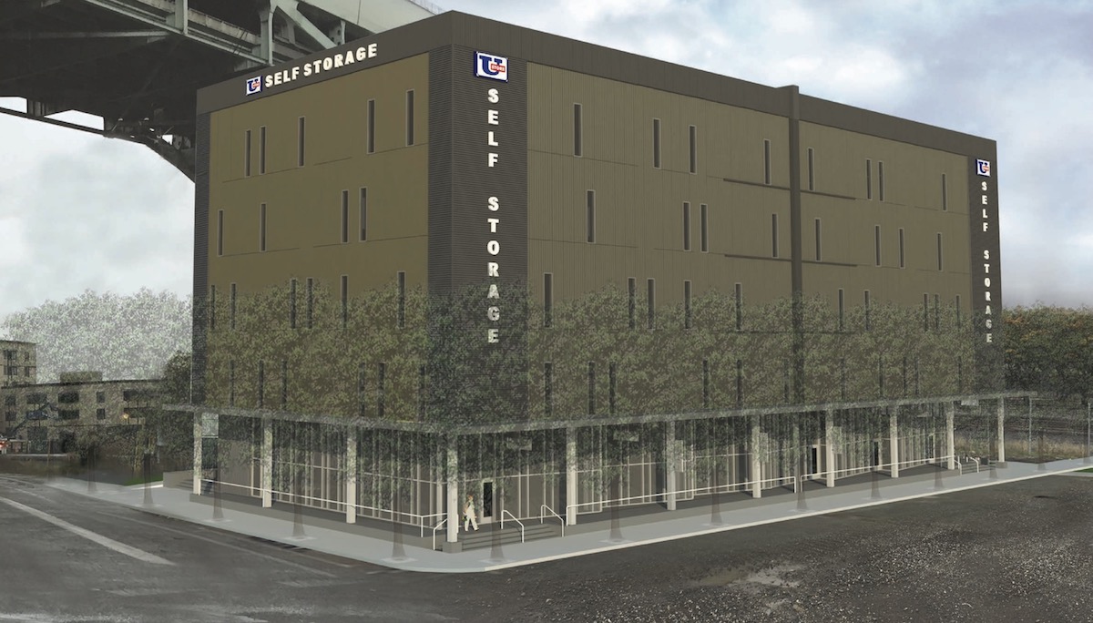
The project site is vacant land, at the far end of the former railyard acquired by Hoyt Street Properties in the 1990s. Nearby developments planned or under construction include NW 14th & Raleigh, 1411 NW Quimby, Modera Pearl and the Vista Pearl. Construction was recently completed on the Abigail.
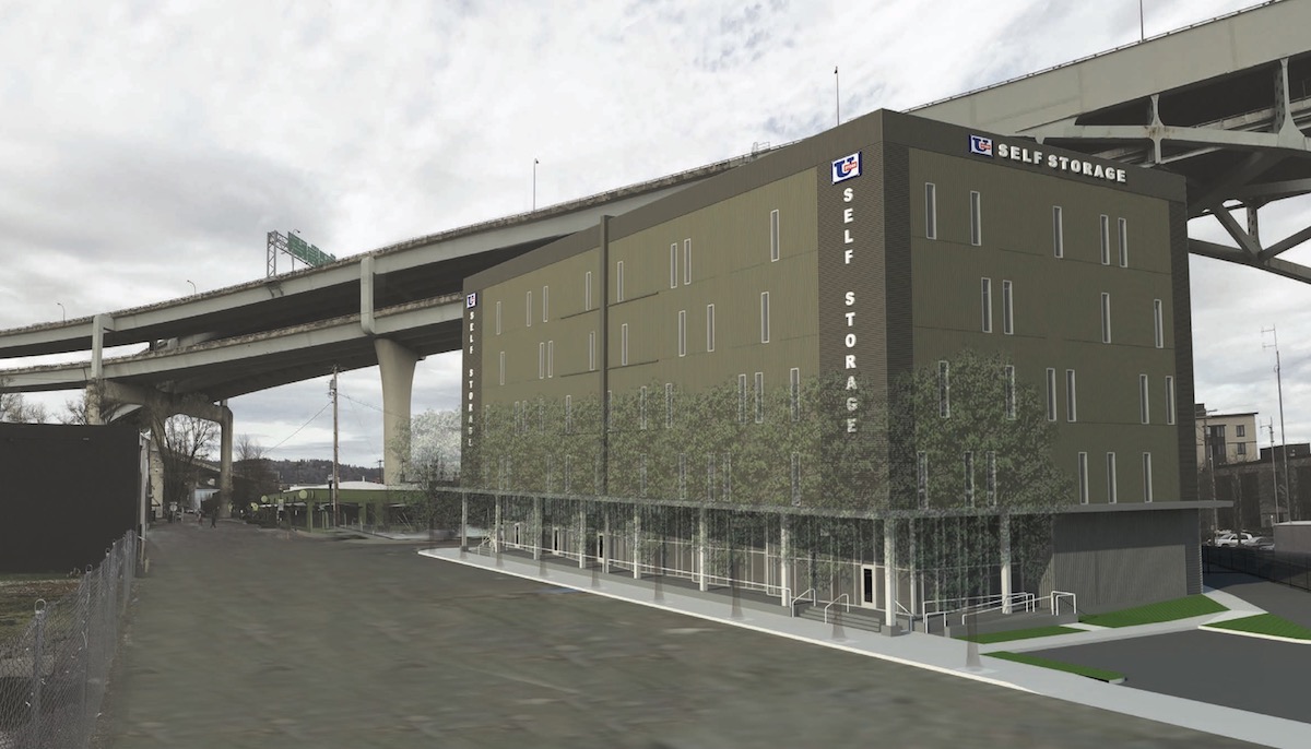
The primary material for the building will be a ribbed metal panel, in two colors.
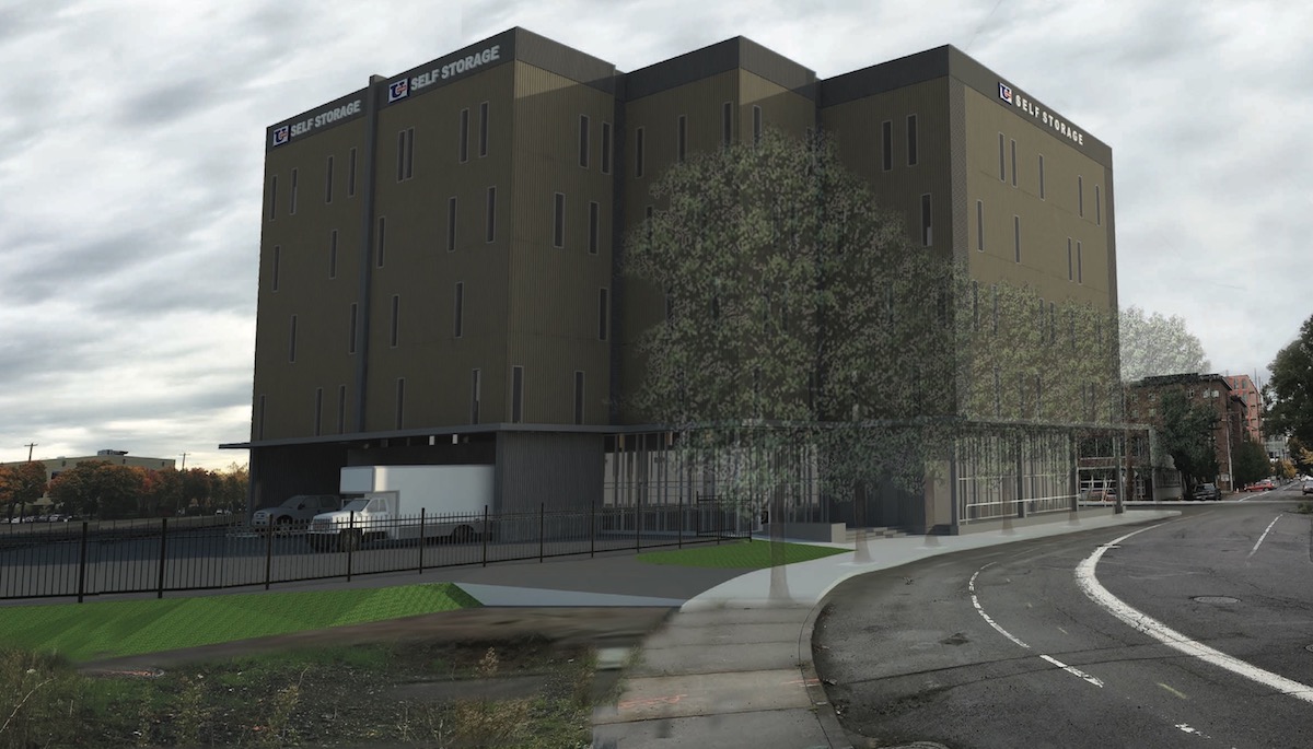
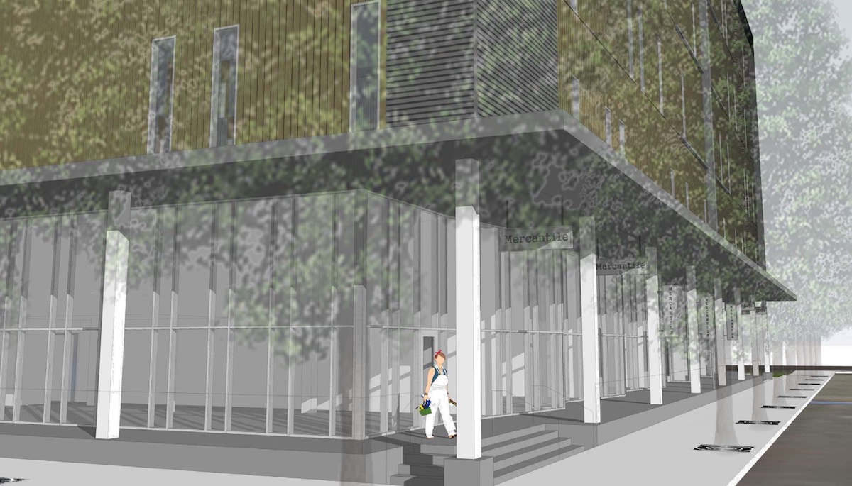
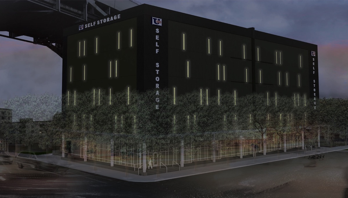
The project went before the Design Commission on May 11th. A Staff Memo to the Commission outlined potential areas for discussion, including: the urban design/pedestrian environment/ground floor; massing; and the facade articulation. While the ground floor programming and landscaping proposed drew praise, the Commission had reservation about the exterior expression of the building. During the hearing Commissioner Rodriguez offered his thoughts:
I think a box can be a sculpture too. It isn’t right now, but the blankness [of the walls] is what it is; it’s storage. It could be really honest about being what it is. I think it just needs some work. The transparent lower level is actually going to add a lot of interest to what otherwise could be a very blank corner. I do think there needs to be a sculptural quality to the skin. I don’t know what is the material; it could be anything. I was just thinking about a project I saw in Madrid, CaixaForum. Basically they took a warehouse, blanked out the walls, and put a COR-TEN box on top of it, very sculptural… it’s a blank box, but it’s a fantastic blank box. I’m not saying COR-TEN because it will rust and bleed all over the place, but that said I think there’s an opportunity here to actually be very frank about what it is. It is in what was an industrial neighborhood.
In order to gain approval the U-Store will be required to go through a Type III Design Review with public hearings in front of the Design Commission.
Drawings
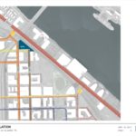
- Plan – Context
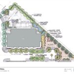
- Plan – Site
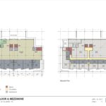
- Plan – Ground & Mezzanine
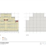
- Plan – 2nd to 5th & Roof
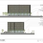
- Elevations – South & West
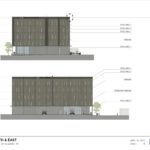
- Elevation – North & East
This would be a great building…under the Fremont Bridge. What a waste of valuable property. While it’s location next to the bridge isn’t ideal, it would have worked well for affordable housing.
If ever a building deserved a Fairhaired Dumbell style mural treatment, it’s this one.
if ever a building deserved not to be built!
great landscaping plan… dont see this much detail aqrounf the perimeter of a storage warehouse….now some of that care needs to be taken in the skin of the building….
I prefer the vacant land, myself.
This is repulsive. There’s already one awful, giant mostly-windowless box self-storage facility a few blocks away at 16th and Pettygrove. As a city, I’m not sure why we continually allow the accommodation of a private need (storage) such as this to become a public burden (ugh, that building!). If you want to build a storage facility, it should have to be below ground or at the core of building wrapped with active use (studio or shop space, light industrial, warehousing or distribution, &c).
Premeir Storage, despite its trite corporate suburban vibe, at least plays with glass, light and layers… this could benefit from some of those moves.
https://www.google.com/maps/uv?hl=en&pb=!1s0x54950f7ed5b40d0d%3A0xccc9fd7ff49e42e9!2m19!2m2!1i80!2i80!3m1!2i20!16m13!1b1!2m2!1m1!1e1!2m2!1m1!1e3!2m2!1m1!1e5!2m2!1m1!1e4!3m1!7e115!4shttps%3A%2F%2Fpicasaweb.google.com%2Flh%2Fsredir%3Funame%3D111604485971026219167%26id%3D6087910080139426290%26target%3DPHOTO!5spremier%20storage%20-%20Google%20Search&imagekey=!1e3!2s-Tmd-yVJkI-w%2FVHyZ9nc6-fI%2FAAAAAAAAABY%2FFI5rxzfCEy04OV-vgTqMSt63YUWNz7QqACJkC&sa=X&ved=0ahUKEwiT26ues7HUAhUG0mMKHUVODMsQoioIiAEwCg
from looking at all the ugly apartment building etc that are being submitted for design review it looks like the city of portland is being duped