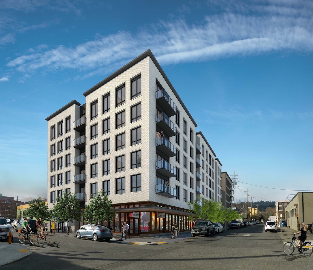
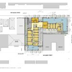
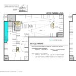
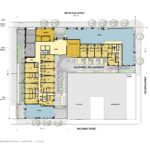
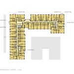
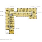
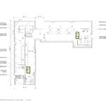
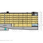
The Design Commission has approved the Raleigh 22 Apartments, a 6 story mixed use building by SERA Architects for developer Cairn Pacific. The 70′ tall building will include 173 residential units, with 6,118 sq ft of ground floor commercial space along the NW Raleigh and 22nd frontages, and 1,746 sq ft of commercial space facing facing NW Quimby. Vehicular parking will be provided in an underground parking garage, which will also include long term parking for 216 bicycles.
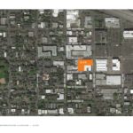
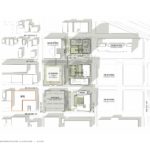
The project site is currently occupied by a warehouse built in 1957, used by George Morlan Plumbing. The L-shaped site is approximately the same size as a 3/4 of a standard Portland block. The site is located just outside the boundaries of the Con-way Masterplan, and is directly across the street from the LL Hawkins and Slabtown Marketplace. Other developments in the vicinity (shown as already built in the rendering below) include the Leland James office building, Con-way Blocks 294E and 295E and Q21.
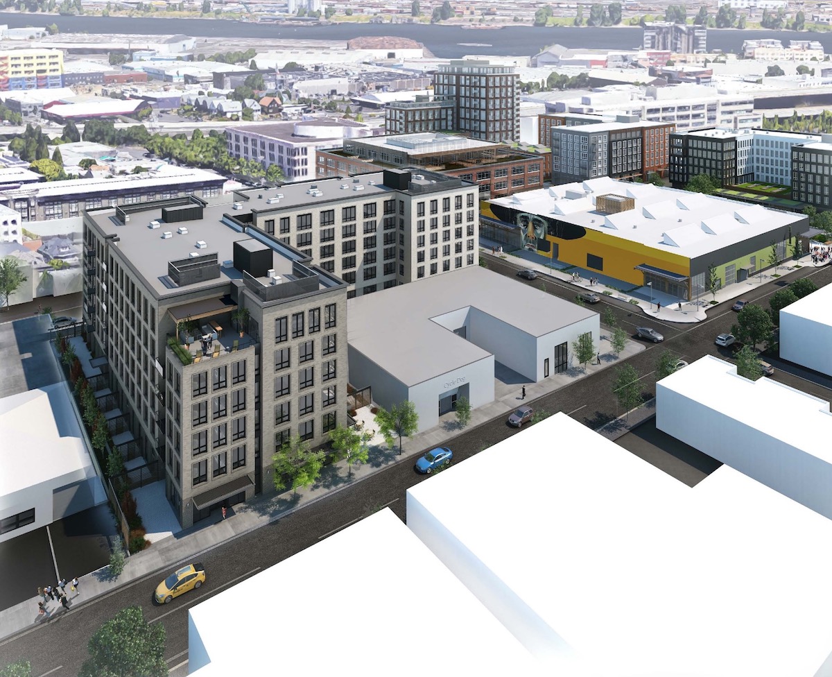
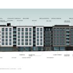
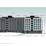
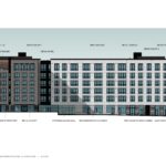
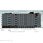
The building is arranged in an L-shaped, pulled away from the property lines on all sides in order to allow glazing.
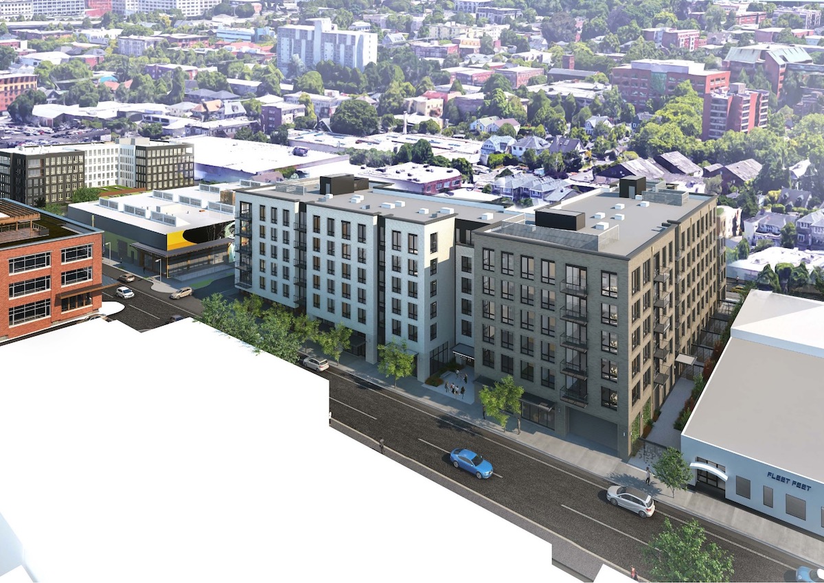
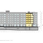
Materials proposed for the building include brick, in a grey and limestone color; aluminum and wood storefront systems; steel canopies; vinyl windows; smooth metal panel; and steel balconies with glass railings. Standing seam metal panels, proposed at the project’s first design review hearing, have been removed from the project.
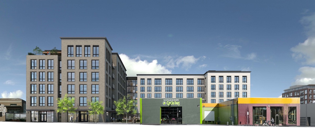
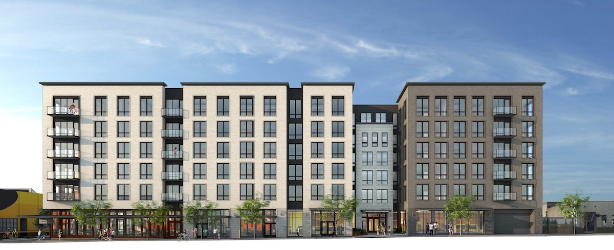
The mass of the building is broken down into two primary volumes, connected by a ‘bridge’ element. Since the first hearing the bridge has evolved from being primarily glass to being clad in brick and metal panel.
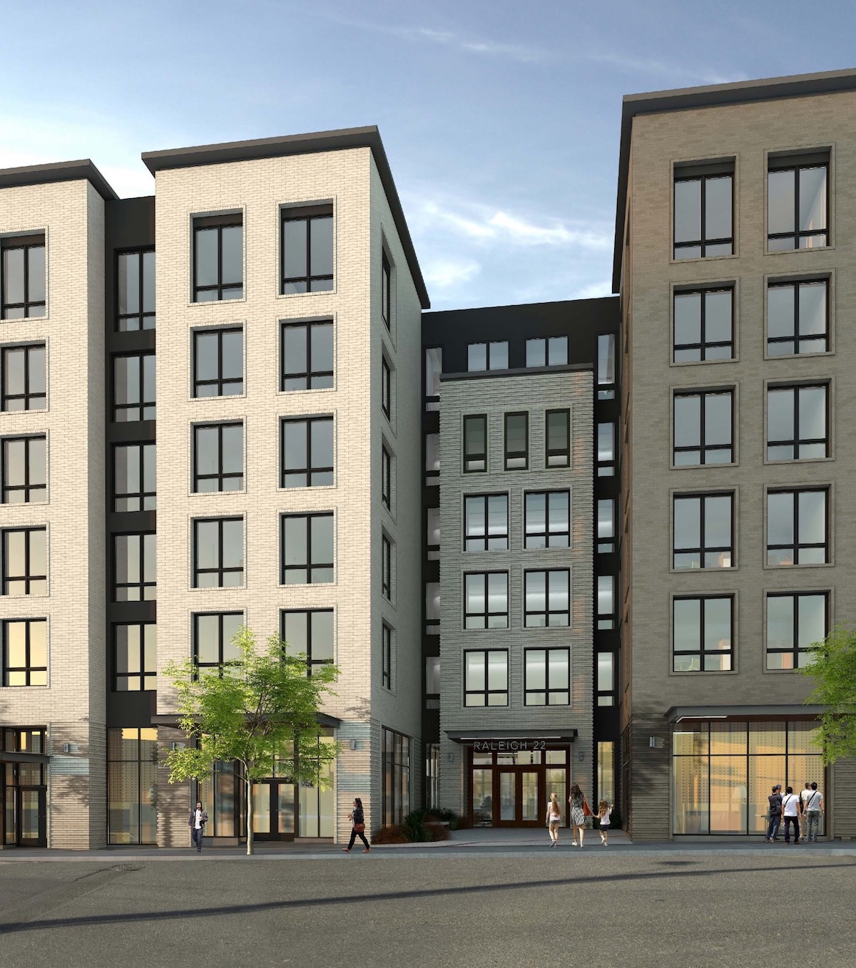
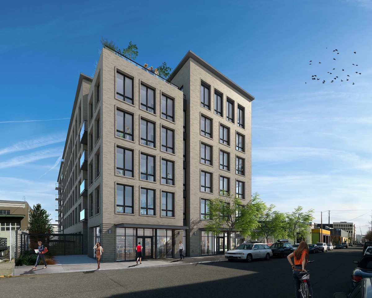
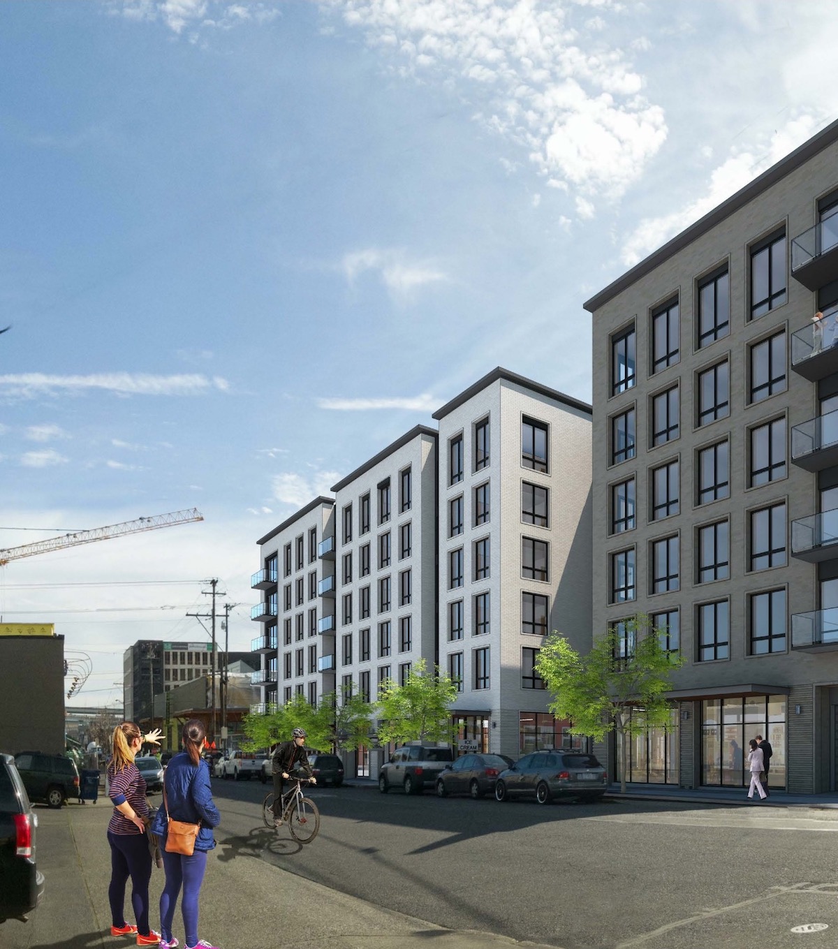
The Raleigh 22 apartments were approved at their second design review hearing, held on April 13th 2017. Commissioners Livingston, Vallaster, Clarke, Molinar and Rodriguez voted to approve the project, while Commissioner Wark voted against the project. Commissioner Savinar chose to abstain. In the Final Findings and Decision by the Design Commission the project was praised for the way in which the building elevations are broken down:
The proposal employs a highly active ground floor program as well as outdoor spaces, including numerous balconies and a roof terrace, to create a building that will contribute to a thriving pedestrian area. This site is located in the Northwest Plan Area where a finer grain of façade articulation is a desired characteristic. Breaking up large building elevations into smaller areas is specifically recommended by the Community Design Guideline P1, Plan Area Character including Appendix J. With a large site that includes a long northern frontage to work with, the proposed design has achieved the breaks in massing desired in this area. Such breaks are achieved by shifts in building plane and materials, as well as design elements which offer variation along the facades such balconies and the step down in height at the lobby volume.
Building permits will need to be obtained before construction can begin on site.
I dont know about the rest of you but arent we just seeing the same thing as all the other apoartment buidings going up? Same box different finishes?
You mean the way it has always been? Old apartment buildings were all brick boxes with the same 2-3 double hung windows per unit and a hallway dividing the two sides of the buildings. Our “prized” single family housing stock are basically the same 4-5 floor plans but with slight tweaks to the outside. I know this from being a carpenter working in these houses every day. Even the old gothic churches in Europe follow the same basic design cues. As with things in the past a combination of new building material technology, labor and capital limitations, and land use regulations narrowly constrain the basic design of buildings. Outliers do now and always have existed but they are outliers.
Same millennials drawn in pointing at it saying how “cool” it looks
I’m a Millennial and I can tell you I’m far from impressed about the design. I just think we could do so much better than these shoebox buildings choking out better design from Portland’s neighborhoods. But it all comes down to cost doesn’t it? Just more developers going for the cheapest options, leaving out parking, leaving out spires or other rooftop differences, sticking to the same old height parameters… it makes for a dull boring, architecturally lazy city.
Well between a long and expensive permitting process, strict land use control, oppositional delay-to-kill tactics, increasing labor costs, and design reviews done by people who have to be dragged kicking and screaming into the 21st century, buildings are expensive to build. Parking, which is extremely ugly in all it’s forms, only adds to the direct costs not to mention the missed opportunity costs. Spires were built when labor was done by poor people living off bread rations. Now our carpenters, rightfully so, earn a good living. I think losing spires is a worthwhile trade off. “Height parameters”? You mean land use controls limiting the height a building can be? Yes they can have some parts of the building shorter but, and trust me on this, you would not do that if you were in charge of the financials of a project of this scope.