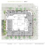
A proposed mixed use building at NE 13th & E Burnside has gone before the Design Commission to receive Design Advice. The project design is by Seattle-based Encore Architects for developer Alliance Realty Partners. The building will include 208 apartment units and 129 vehicular parking spaces. Retail, amenity spaces and live/work units are proposed at the ground level.
The project site at 1337 E Burnside is a full block bound by NE 14th Ave, E Burnside, NE 13th Ave, and NE Couch St. Until the completion of the Burnside-Couch Couplet in 2010 NE Sandy ran diagonally through the site. At the request of the adjacent property owner, Weston Investment Co, the NE Sandy right-of-way was vacated in January 2016.
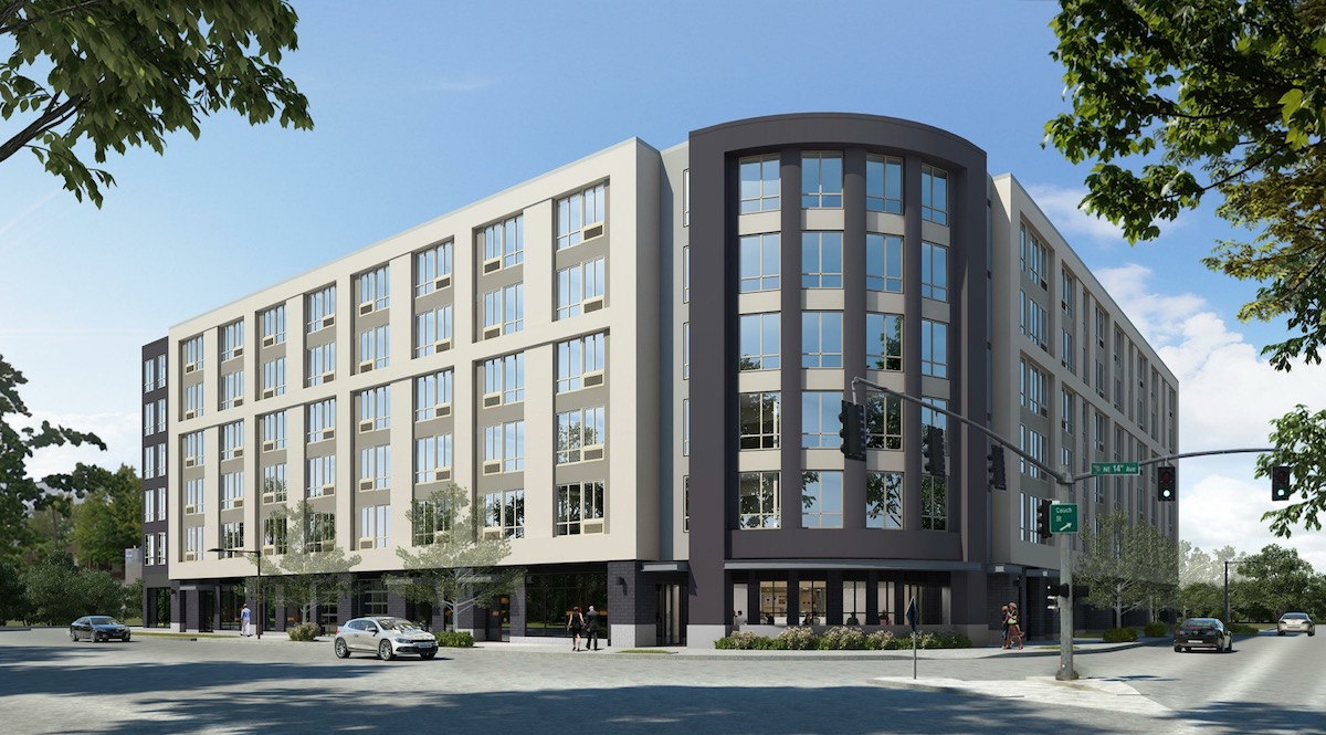
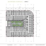
The building is arranged in a C-shape plan, with a west facing open courtyard at level 2. A prominent curved corner element is placed at the corner of NE 14th & Couch, where Sandy Blvd terminates.
The primary material proposed for the project is a three coat stucco system, in four colors. Other materials include vinyl windows, aluminum storefronts, brick, and metal canopies.
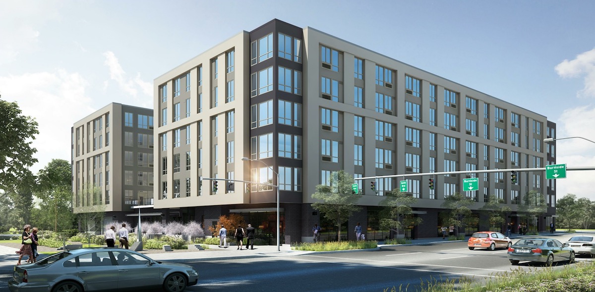
A Memo to the Design Commission, published before the April 6th advisory hearing, outlined potential areas for discussion, including the massing, materials, and response to the corner at NE 14th & Burnside. Commission discussion included whether the retail should relocate to NE 13th, which is likely to remain as a pedestrian only street, south of the garage entry; the need for the building to have more of a residential character, which could be achieved by adding balconies; and the need for the building to respond in a strong way to its prominent location, particularly at the NE 14th & Sandy corner.
In order to gain approval the project will be required to go through a Type II Design Review, where the decision is made by Bureau of Development Services staff.
Drawings
- Plan – Site
- Plan – Level P1
- Plan – Level 01
- Plan – Level 02
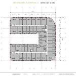
- Plan – Level 03
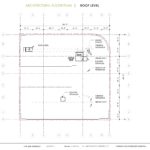
- Plan – Roof
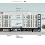
- Elevation – West (NE 13th Ave)
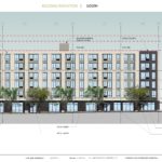
- Elevation – South (E Burnside)
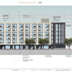
- Elevation – East (NE 14th Ave)
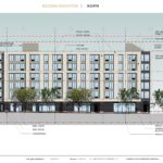
- Elevation – North (NE Couch)
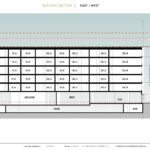
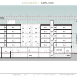
- Section
- Section
One issue which I hope will be addressed is the predominant beige color of the massing. The two most recent buildings built directly across Burnside are very similar in color, and in the case of one, size. We could potentially wind up with a beige corridor as a follow up to the very interesting developments happening on lower Burnside.
Damn that’s a seriously ugly building. AC units like a cheap hotel. Apartments with windows that open a crack.
Wow, Jo – great eye! I totally missed those AC units in the windows. I hate to just out and out bash a whole project but you are correct. File this one under “tore up from the floor up”.
Once again, like at Burnside and MLK, a corner with no door. That building shape would lead you to think that the corner is an important feature, and the main entrance will be there. Instead, it is blocked with shrubbery (!), and you have to walk down one side to find an actual door.
Is there a link to the previously submitted design with metal panels?
Damn shame. This site was perfect for a public plaza.