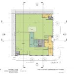
A new office and workshop for construction company Hammer & Hand has gone before the Historic Landmarks Commission for its first review. The two story building by Holst Architecture will include workshop space at the ground level, with office space and a roof deck above. The project is being designed to meet Passive House standards, with the intention that the office portion of the building will achieve net zero energy use. No vehicular parking is proposed.
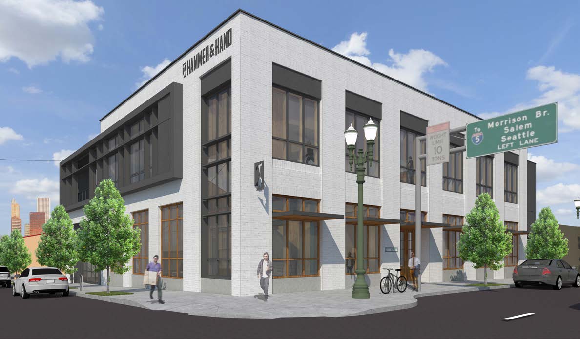
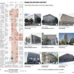
The project site is a quarter block at 1135 SE Grand Ave, at the southern end of the East Portland Grand Avenue Historic District. A vacant 1924 warehouse, considered “non-contributing” to the historic district, is currently located on the site.
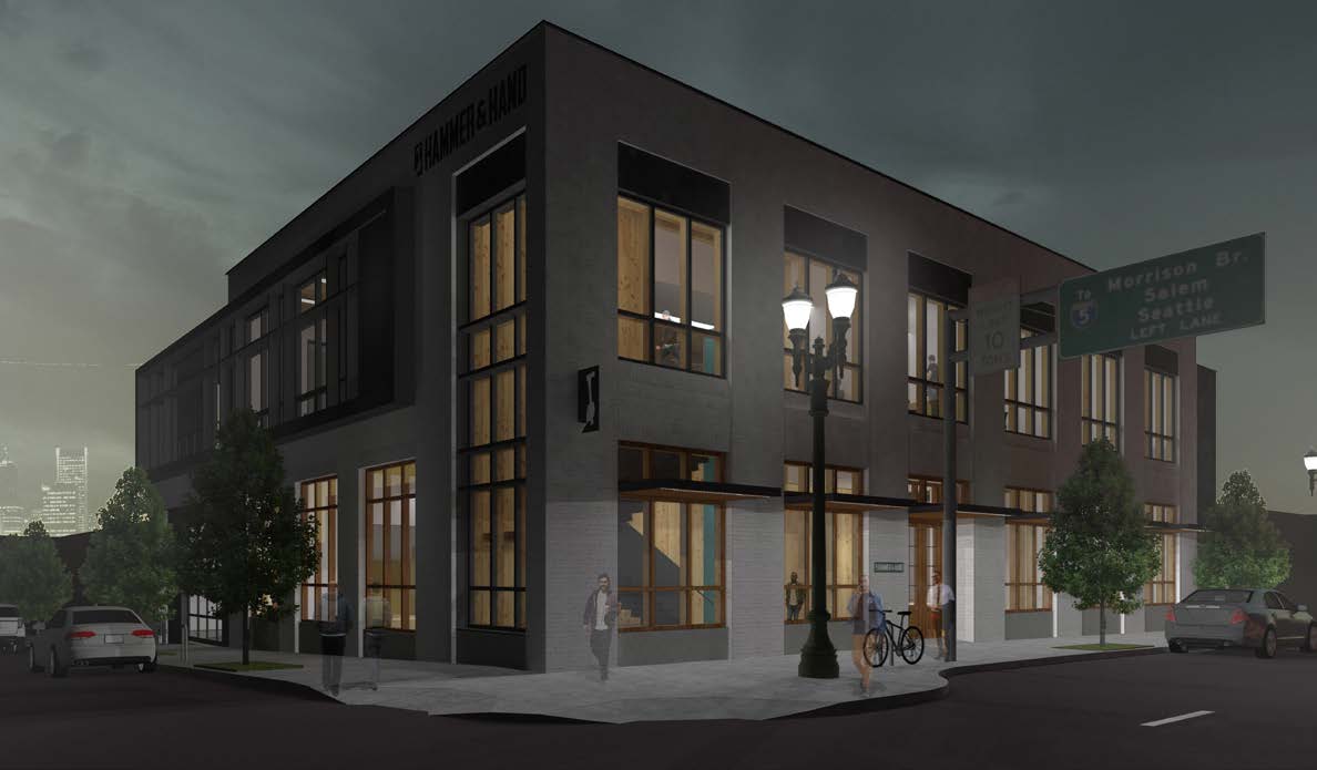
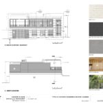
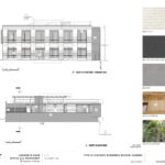
The primary materials for the building will be painted brick with dark stucco accents. Wood windows are proposed at the ground floor, with metal clad wood windows at the upper floor. The windows will use View Dynamic electrochromic glass, which changes tint as needed to reduce solar heat gain in the summer.
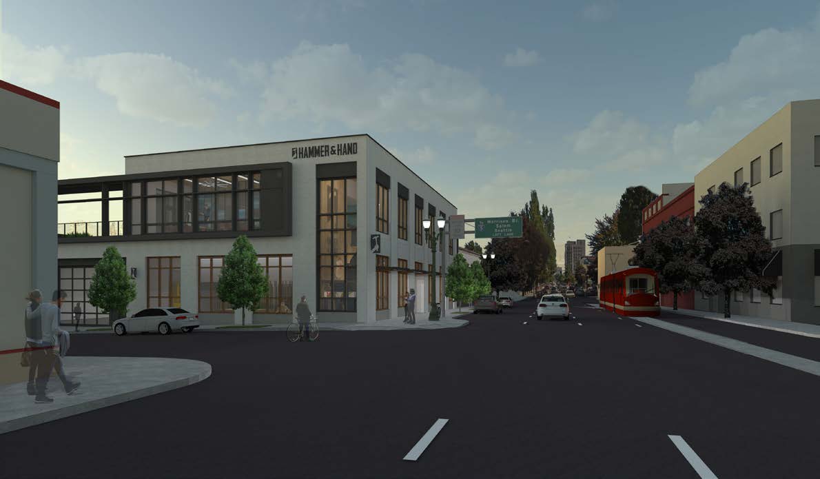
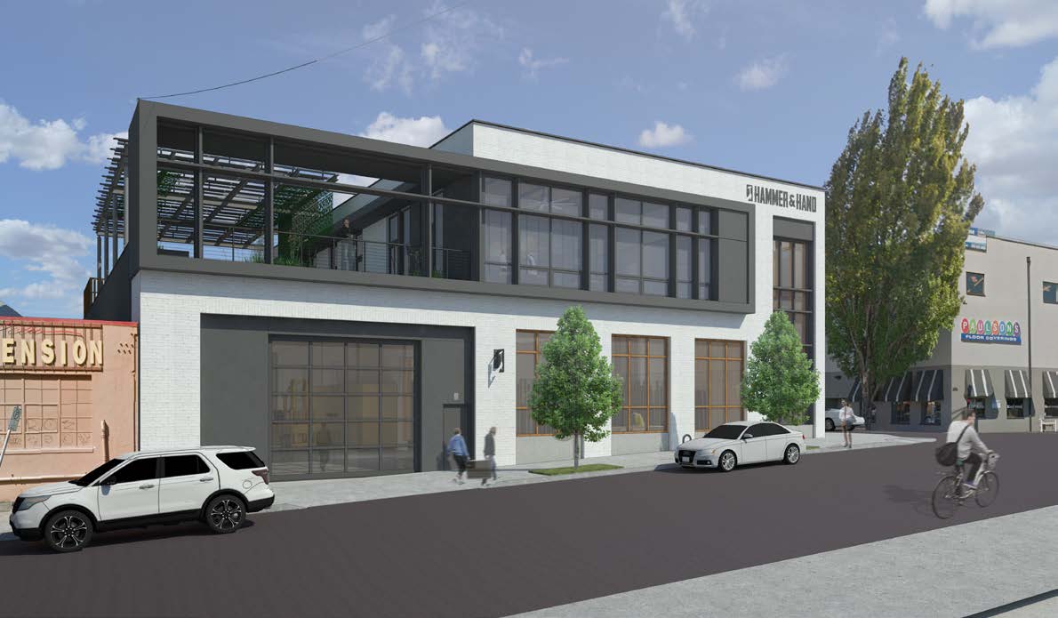
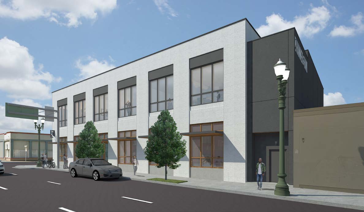
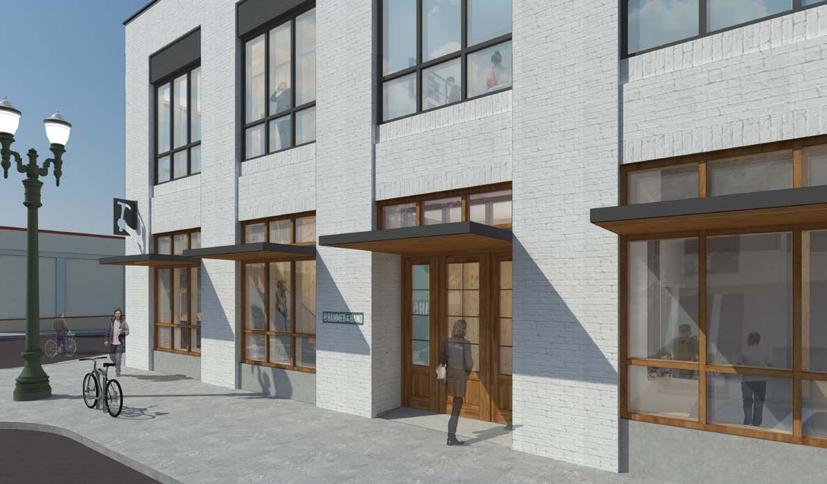
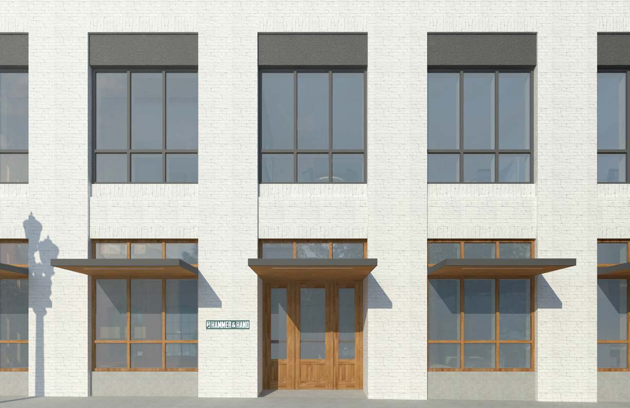
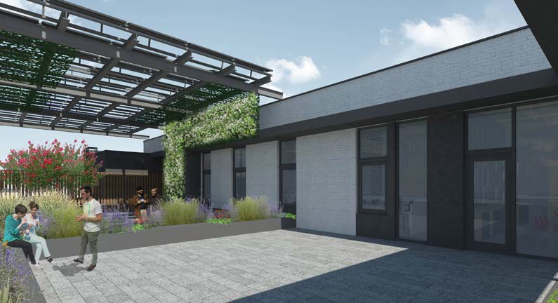
The project went before the Historic Landmarks Commission on March 13th. A Staff Report did not yet recommend approval, citing issues that included: the composition of the west elevation and roof deck, including the solar panel canopy; the south elevation, including the double story window and projecting architectural frame; and the use of the View Dynamic Glass. At the hearing the Commission was broadly supportive of the project, with the south elevation being the largest area of discussion. During the hearing Commissioner Roman offered his views on the project:
I think the issues that resonated most with me in the Staff Report were related to the south elevation, particularly the double height bay. I look at that site as almost a little gateway into the district; it’s a very prime elevation and I’m just curious if that’s a little too contemporary to be the entrance. I know staff were concerned about the west deck, and I don’t feel strongly about that. It’s not a primary facade in the district itself. That little corner, I agree with the applicant that it is a special corner that should be accentuated, I’m just not totally convinced the double height glazing works. I’m not sure about the nomenclature for that bay that projects [applicant: “brise-soleil”] , but it certainly adds to the contemporary feeling of that facade. I wonder if it could be pulled back, or does it have to wrap the entire south facade?
I actually like the building a lot, I think it’s really successful on the Grand Avenue side. It feels modern, yet seems to fit the context of the district. I like the rhythms that are going on. I think there’s some really nice stuff going on with that. I just think that if any of staff’s concerns resonated with me they were primarily related to the south elevation.
The Hammer & Hand Office and Workshop is currently scheduled to return in front of the Historic Landmarks Commission for a second hearing on April 24th.
Drawings
- Plan – Context
- Plan – Ground
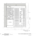
- Plan – Level 2
- Plan – Roof
- Elevation – South and North
- Elevations – East and West
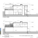
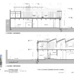
- Sections – East / West
- Sections – North / South

I continue to be confounded by the HLC. In this case, we have a handsomely restrained design being laudably engineered to a net zero standard, and yet, the HLC staff balks at the fact that this brand new building refuses to pretend like it was built 100 years ago. And to raise issue with the View Dynamic Glass windows and the entirely unobtrusive West elevation solar panels makes me wonder if they would prefer that the masonry also be un-reinforced; because after all, 100 years ago that’s how we did things.
I disagree with the notion that pastiche and faux historicity – rather than harmonious dialog – should be the goals when assessing new construction in an historic district; because, if a casual observer cannot differentiate between the buildings of actual historical significance and the contemporary pretenders (I’m looking at you Grand Belmont), then the actual history is diluted. When the new generation of architecture is allowed to speak of today – respectfully, in its own vernacular – it shall only amplify the songs of the few remaining gems of old East Portland.
Well said Ian. agree all around. This is such an important point–new buildings in historic districts should respect context not mimic with hollow gestures.