Design Advice has been offered to Holst Architecture for the second phase of the redevelopment of the Lloyd Cinemas site. The development will contain 520 apartment units and approximately 26,047 sq ft of retail space. 349 vehicular parking spaces are proposed. The project is being developed by a consortium of developers, collectively called Portland Lloyd Center Community, LLC.
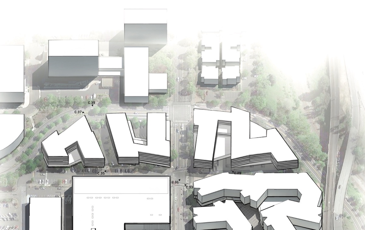
The project at 1510 NE Multnomah St will be located to the east and north of the 1400 NE Multnomah St development. That project, by the same architecture and development team, was approved by the Design Commission last year and is expected to break ground later this year. The second phase, at 1510 NE Multnomah St, will be located on the site currently occupied by the Regal Cinemas Lloyd Center 10 & IMAX, and on the parking lot east of Sears.
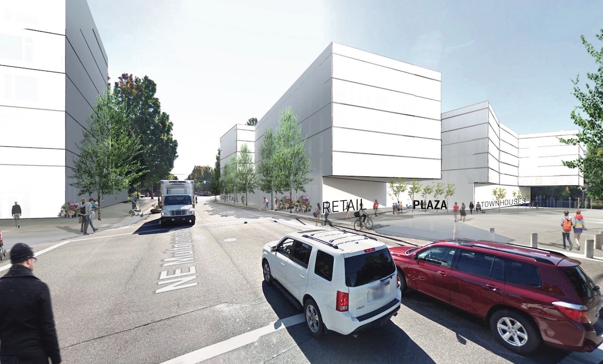
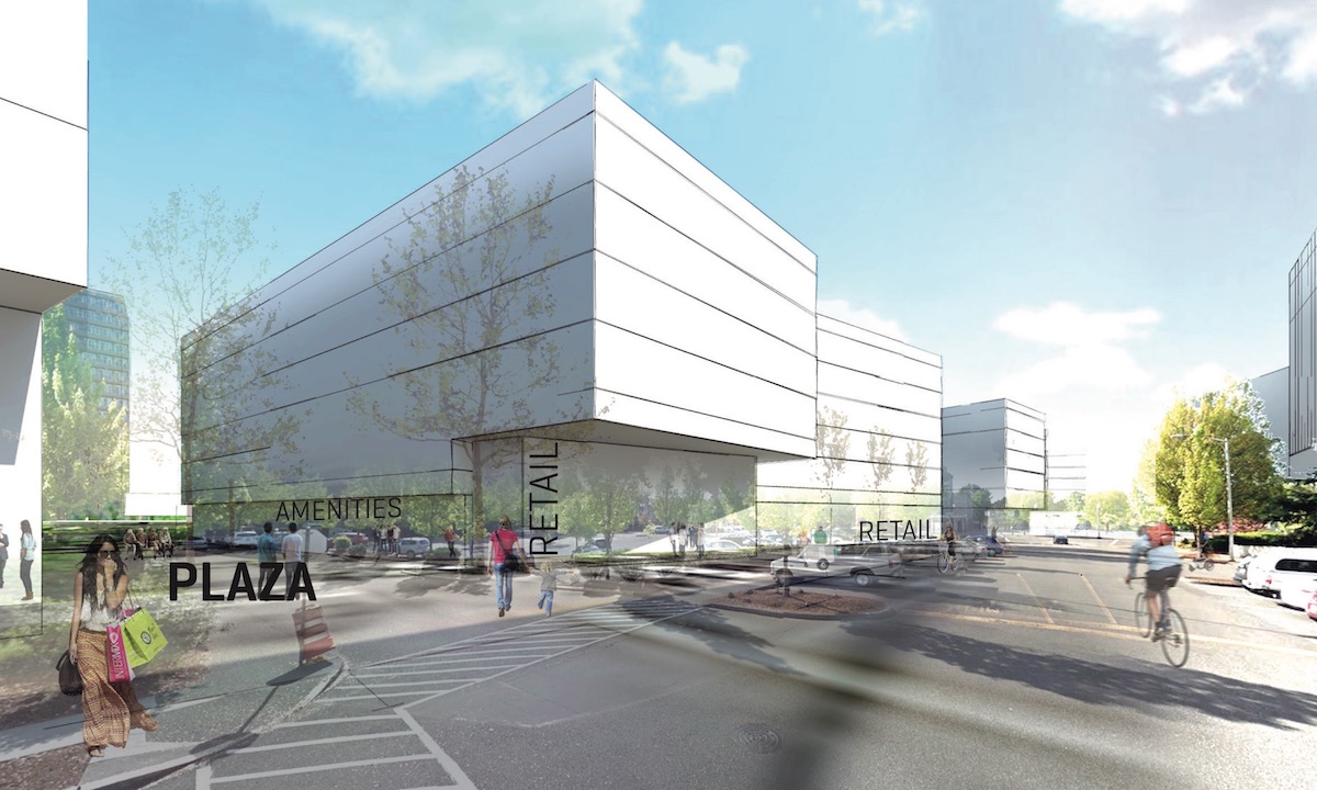
View of Building 3 from Multnomah
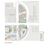
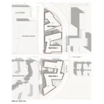
The project is in the very early stages of development, and only rough massing diagrams were shown to the Design Commission. The development would be arranged as three six-story buildings, on two oversize blocks. Building 3, on the southern block, creates a termination to the private drive (on approximate alignment with NE Hassalo St) that will be built as part of the first phase. A plaza near the corner of NE Multnomah and NE 15th Ave would have a “major fountain element”.
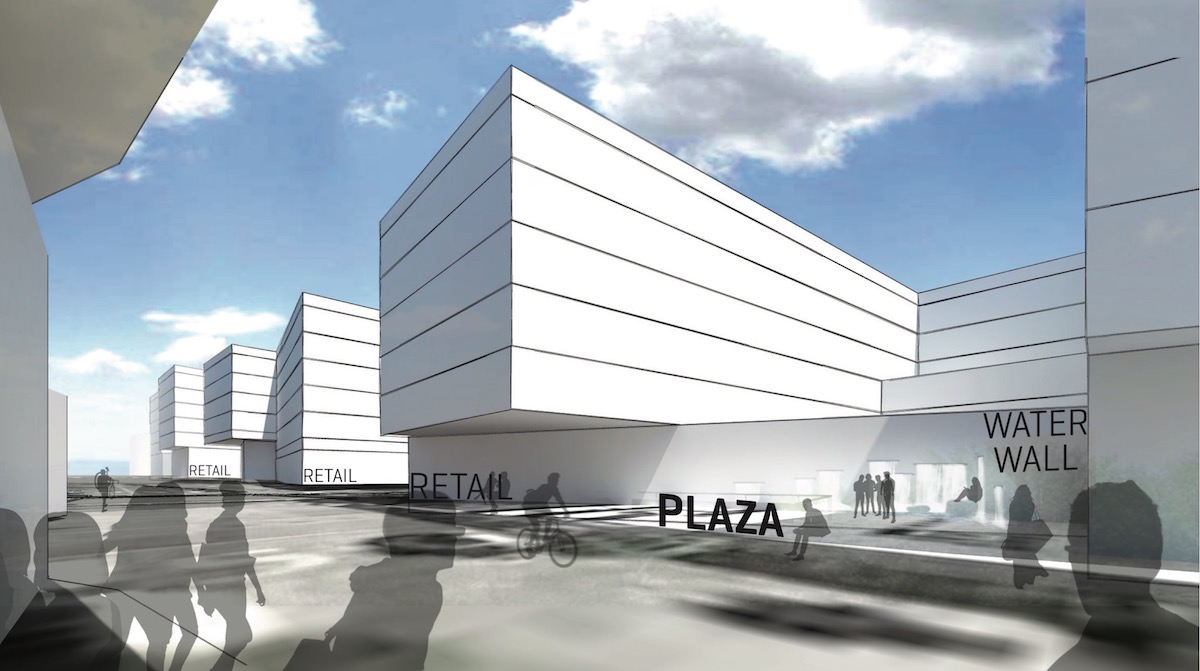
View of Building 3 Plaza
The largest retail spaces, located in buildings 2 and 3, would be oriented to NE Multnomah St. The architects imagine that the buildings would form an implied gateway into the Lloyd District for people traveling from the Sullivan’s Gulch neighborhood to the east.
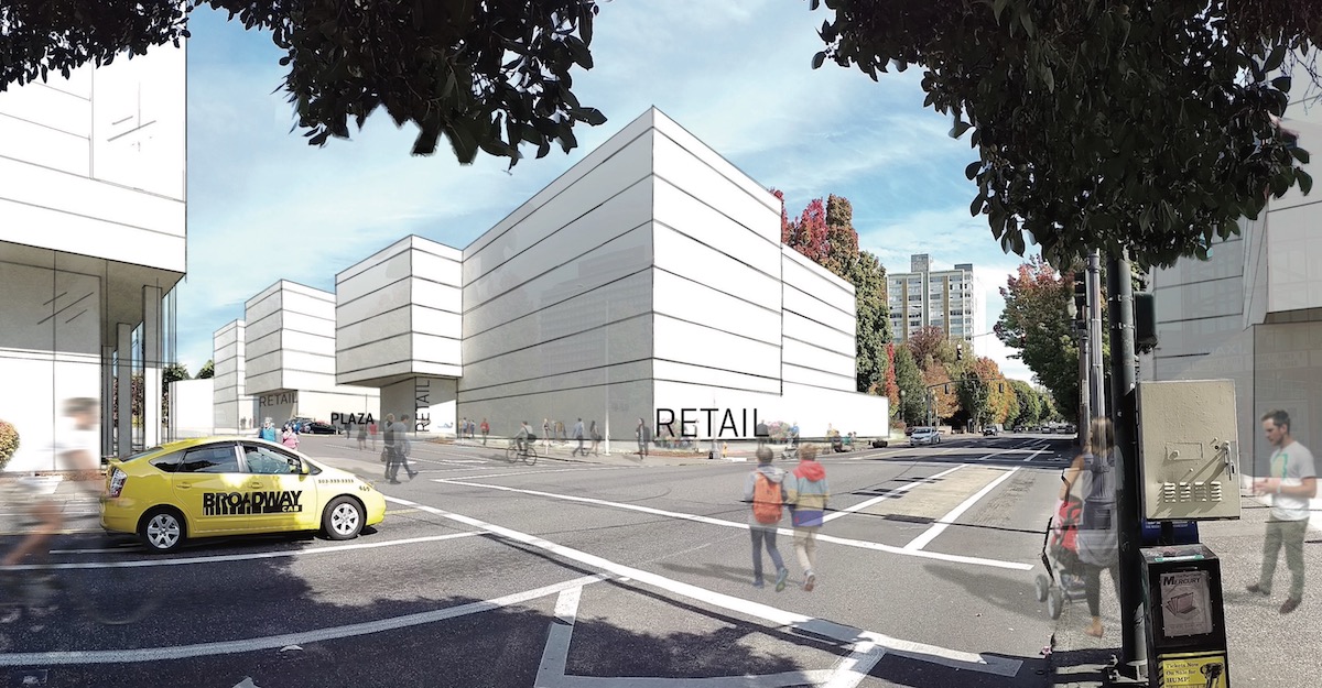
View of Building 2 from Multnomah
The retail uses would continue along NE 15th Ave, which is the current eastern edge of the mall. As reported by The Oregonian, Sears sold its store to the owners of the Lloyd Center last August. In a separate project, by different architects, a renovation and expansion of the Sears building is planned. A Design Advice Request for the remodel is currently scheduled for April 13th.
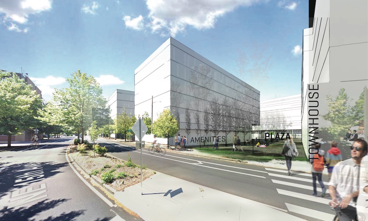
View of Building 2 Plaza
A second plaza is proposed in between buildings 1 and 2. The architects describe this as being “focused around retail activities and engaging the future eastern face and entry of Lloyd Center”. This plaza would lead pedestrians to the existing crosswalk on NE 16th Ave.
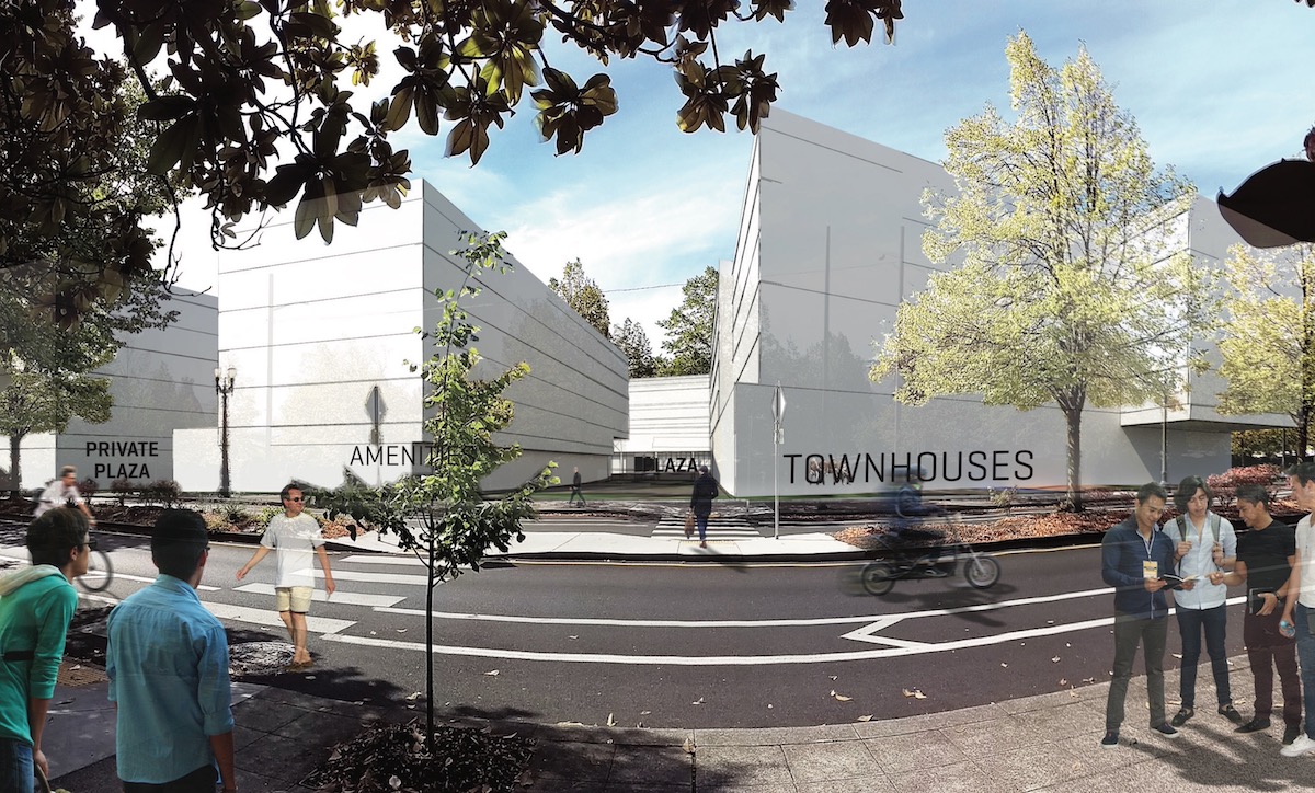
View of Building 2 Plaza from NE 16th Ave
Along NE 16th, where the development faces a more residential neighborhood, townhouses are proposed as the ground floor use.
View of Buildings 1 & 2 from NE 16th Ave Crosswalk
The project went before the Design Commission to receive Design Advice on February 16th. Much of the discussion centered around the massing of the project and the pedestrian circulation. Commissioner Savinar expressed a lot of concern about how the project is laid out:
Why is this a suburban form? Where are these angles coming from?….
I personally think that the key here is to knit two neighborhoods together, and not to build a wall. This is basically a suburban development wall. I find the circulation contorted. It’s basically [all] the same height, you have some little gestures, but its a repeat or a baby sister of what you brought in before. There is nothing that embraces the pedestrian. 16th is actually a lovely little place and this does nothing to support it. It doesn’t respect the 200′ grid. I think it would set the Lloyd Center back rather than forward, and it cuts off Sullivan’s Gulch. I always say you guys [Holst] are the smartest guys in town, but this is an absolute, 100% non-starter for me in its current form. It has to start over for me to even consider it.
Commissioner Rodriguez however was more enthusiastic:
I don’t think this needs to be a 200′ x 200′ block development. I’ll just throw it out there: the Lloyd District is an anomaly, to a certain extent, to that structure, and it’s okay to do something different here. Right now, yes, it’s six stories, it’s all flat, but I’m sure it will not get past this Commission if that’s what comes down the pipe as they develop the drawings. I think there needs to be some more logic over these crossings; …some of the locations for the programming need more thought and some logic; …I think the parti is generally okay, it’s just the forms are contorted. I do believe they can be simplified, and be made to make more sense for how this works together. The transition, how this stitches together a neighborhood full of little houses: I don’t know that there’s a real solution, but I think the density needs to be there and I think you’ve got it. I think there needs to be a little more sky-scape work, to create some of those portals, some of those reliefs in the project, but I would definitely not go to a 200′ x 200′ grid here.
A second Design Advice Request hearing is currently scheduled for April 20th. In order to gain approval the project will be required to go through a Type III Design Review.
Drawings
- Plan – Context
- Plan – Site / Ground
- Plan – Site / Roof
Forget it Jake, it’s the Lloyd Center.
I’m with Commissioner Savinar on this one.
I think he’s way off-base. The thing that’s making it feel so suburban is the fact that there’s a giant mall next door. If you look at the project in plan, those are totally urban forms. The North part of the site does respect the 200′ grid. The South block doesn’t, but does that matter when it’s adjacent to a freeway and MAX tracks? 16th being a lovely place? That street sucks to walk down in its current form. This project would help it! It seems like he’s really grasping for anything he can. For him to say it’s a non-starter and it has to start over is totally disrespectful to everyone involved because there’s some obvious thought put into the massing of these buildings. I’m not saying there’s nothing to criticize about this project, I just think what he’s saying is total BS.