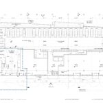
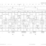
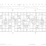
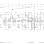
The Design Commission has approved a five-story, mixed-use building on NW 23rd Avenue by Works Progress Architecture. The building will include include 64 residential units over ground floor retail. Parking for 21 vehicles will be provided. 73 long term and 6 short term bicycle parking spaces will be provided.
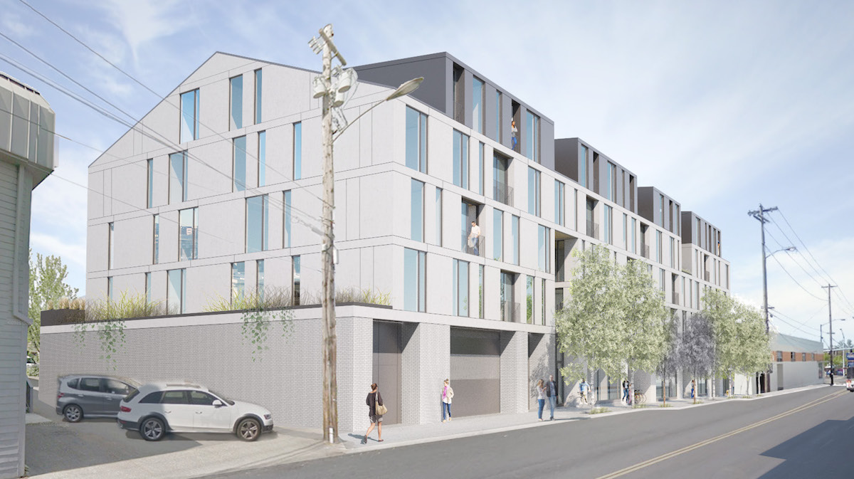
The proposed building will be located mid-block on the west side of NW 23rd Avenue, between NW Thurman St and Vaughn St. The site is currently occupied by a 1950 warehouse and two 1905 residential structures. Both residential structures were surveyed as part of the city’s 1984 Historic Resources Inventory (HRI). The Sarah F Borders House at 1841 NW 23rd Ave was unranked in the HRI, while the Garesche House at 1901 NW 23rd Ave was assigned Rank III, indicating that it “may be eligible for listing in the National Register as part of a Historic District.”
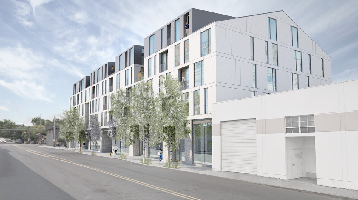
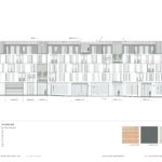
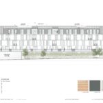
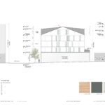
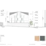
In concept the building is massed as a four story pitched roof building, with ‘dormer’ roof elements at the partial fifth floor. The main body of the building will be coated in stucco, while the dormer elements will be differentiated by the use of charcoal grey metal panel siding. White brick will be used at the ground floor. Other materials proposed include wood soffits and aluminum storefronts.
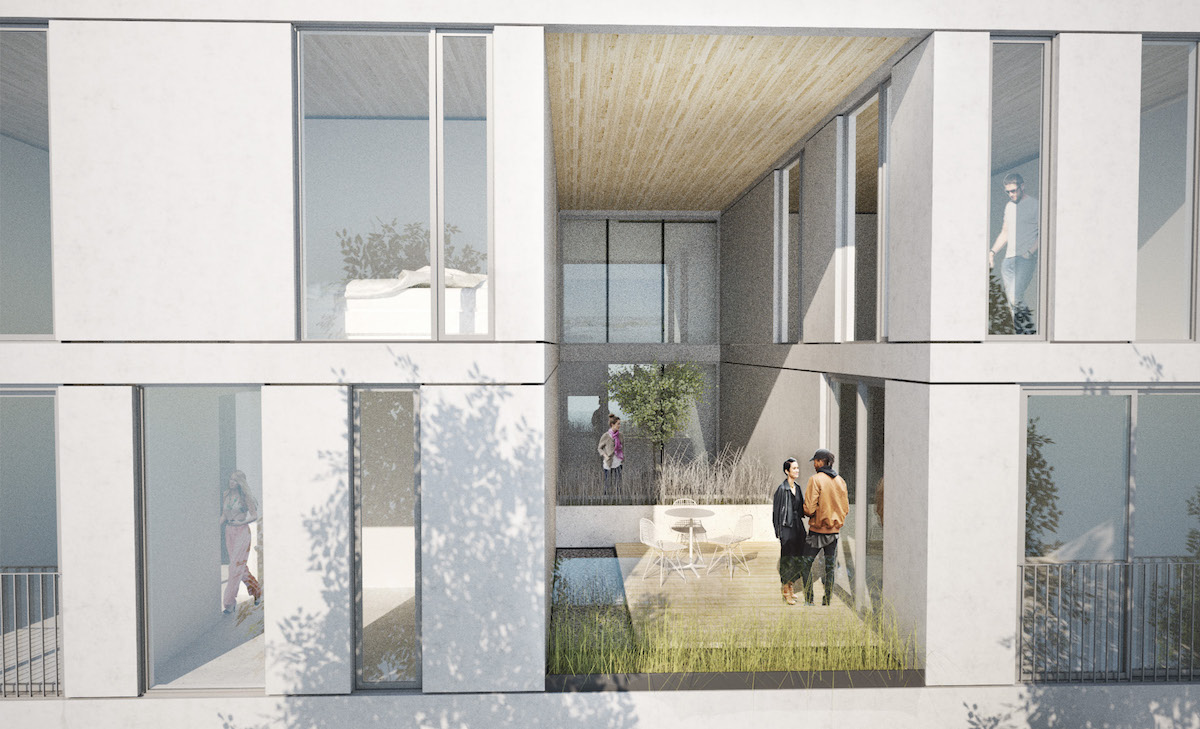
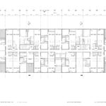
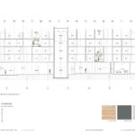
Exterior decks for the for the use of residents in the adjacent units will be carved into the building’s mass at levels 2, 4 and 5.
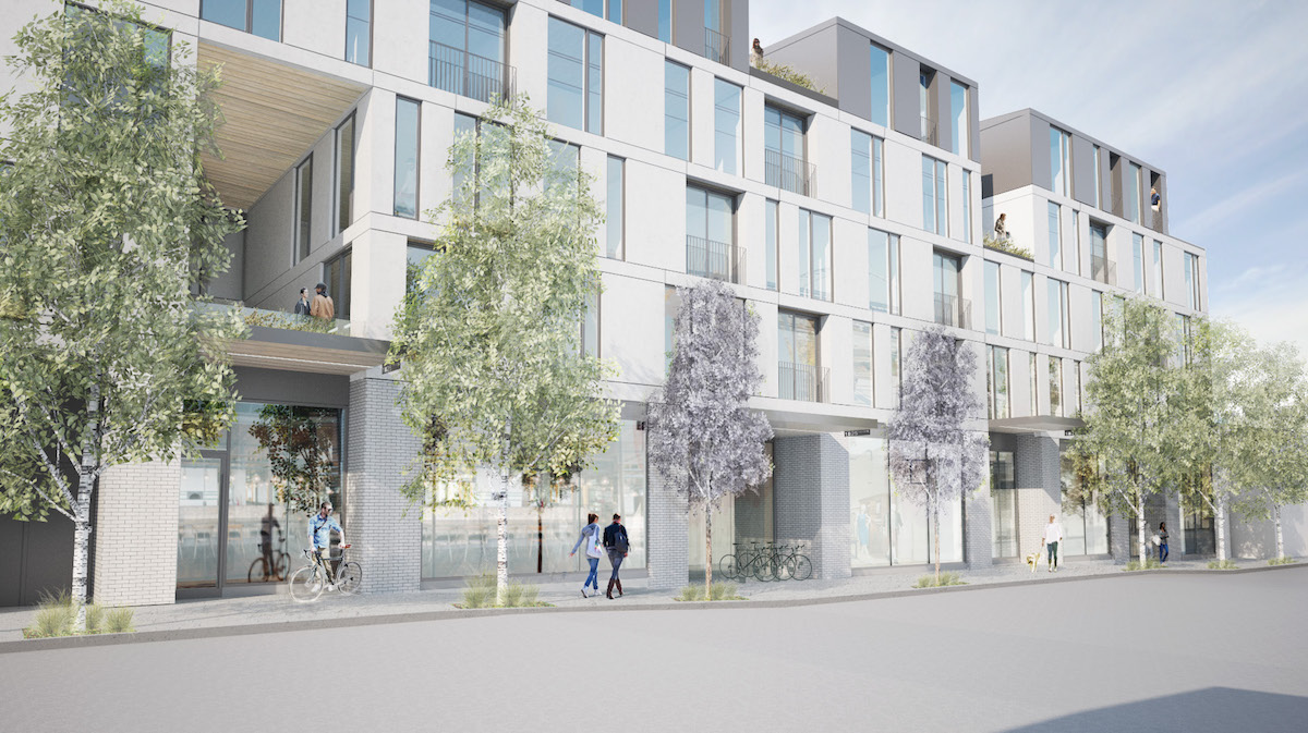
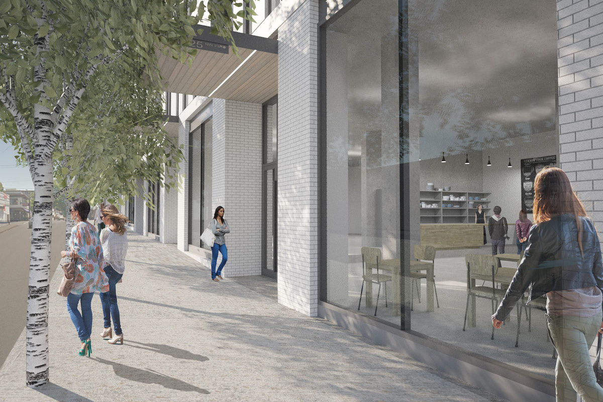
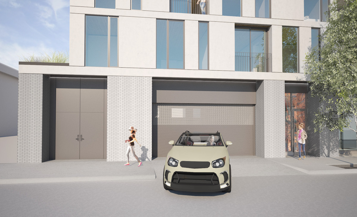
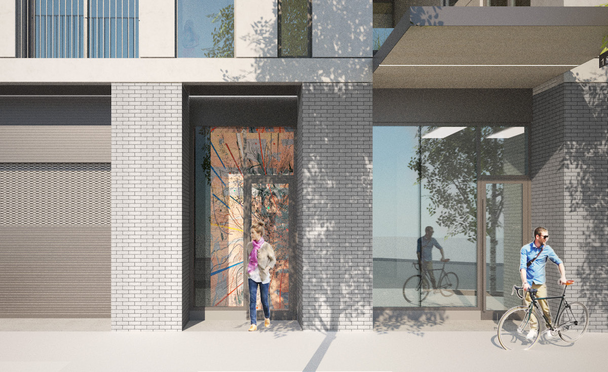
1825 NW 23rd Ave was by approved by a unanimous vote of the Design Commission, at the project’s second Design Review hearing on February 16, 2017. In the conclusion to the Final Findings and Decision by the Design Commission [PDF] it was found that the project will “contribute to the sense of place along NW 23rd Avenue”:
The proposed design will contribute to the sense of place along NW 23rd Avenue with an active ground level, spaces for small-scaled ground level retail uses, and residential units above. The pedestrian experience will be enhanced with highly glazed ground floors, active uses, recessed entrances, and canopy coverage. The proposed cladding materials are durable and long lasting.
Building permits will need to be obtained before construction can begin on site.
Drawings
- Plan – Site
- Plan – Level 01
- Plan – Level 02
- Plan – Level 03
- Plan – Level 04
- Plan – Level 05
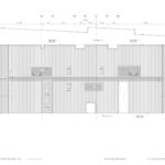
- Plan – Roof
- Elevation – East
- Elevation – West
- Elevation – North
- Elevation – South
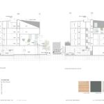
- Section
- Section
What wretched, desperate design. WPA has become such a joke with their limited palate of black/white with offset windows. How cheesy and sadly cliched in 2017.
Not a fan of this building, think it needs another level, but Works continues to be an iconic aspect of post 2000 Portland design.
I find this to be one of the best residential infill designs I’ve seen in Portland. An elegant blend of past and present. Compare this to what we’ve seen built on Hawthorne, Division and other neighborhood main streets recently–cheap materials and/or historic mimicry. This project is a breath of fresh air.
I like it. Reminds me of my visit to Norway.
If you changed the cladding and aligned the windows, it would look right at home in outer southeast Portland.
“The main body of the building will be coated in stucco”
Stucco….in the NW?! I’ve heard from numerous home inspectors that this can be a major issue with our very rainy climate.
Unfortunate that two classic PDX homes need to be removed for this to happen when there are so many lots or buildings that do not contribute to the urban fabric which so easily would fit the bill for removal. That coupled with “the motif of the day” on display here. For me, there are some confusing aspects to the basic diagram – “base, middle, top” – is it modern, interpretive modern, or … ? Beautiful renderings. Just hope they do the final build justice.
I like the roof line looking at the north side. It reminds traffic coming from the freeway that they’re entering a neighborhood. And my office is in the next building – I’m looking forward this – more housing, more business opportunity.
Enough damn grey buildings in a grey damn climate. This is so boring, zero pizzazz. Go back to the drawing board PLEASE
Wow, I’m kind of surprised at the negative reaction here. This is such a dead zone as it currently exists. Usually I’m not a fan of razing historic structures, but those houses are highly isolated along this stretch that is otherwise very industrial and frankly, a little scary as a pedestrian as it’s close to the freeway on/off-ramps.
The combination of the pitched roofline and the big dormers give it an interesting almost-mansard vibe. Having lived across from a big white building in NW for several years, I can say it is probably one of the best colors you can have– it’s bright and light-reflective even on gray days, and when (inevitable) graffiti happens, it’s easy to repaint quickly. This isn’t another bland, boxy, and cheap development for once, and it will effectively activate a deeply underutilized part of an otherwise vibrant neighborhood. More please!
I also like it, but most commenters here have never met a design they liked. There is no pleasing them.
Agreed.
Not only is this a great design for the neighborhood, it’s a breath of well-needed fresh air from WPA after their last few underwhelming projects began to make me wonder if they were just repeating themselves ad infinitum. Nice to see they’ve still got it.
not the best of neighborhoods.
The design is fine . The idiocy is the sixty some units and only 21 parking spaces. This building will have higher rents given its location and its inhabitants will likely have cars. It would be ideal if they did not, but Portland is a city that while pretty nice, the best part is you can get out of dodge on the weekends.
Reducing our carbon footprint will be best done by getting rid of fossil fuels. Electric cars are awesome and that is the future. Not building the parking required, is filling the streets with parked cars. This is making it more dangerous for cycling as cyclists bypass traffic and ride between the slow traffic and the parked cars. All these parked cars on the street pose a dooring threat to the rider. Not having parking anywhere poses a threat to retail at the street level. The Mayor and City council need to wake up and write rules that make the city better – not worse.
Pingback: Locale Bar Reopening in NW Portland - Bridgetown Bites