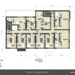
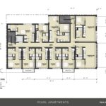
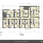
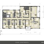
A revised design for a mixed use building at NW 13th Ave & Johnson St has been presented to the Design Commission by TVA Architects. The 7 story building for developer Paul Properties is proposed to include 58 apartments units over 3,378 sq ft of retail. Long term parking for 91 bicycles is proposed. No vehicular parking is proposed.
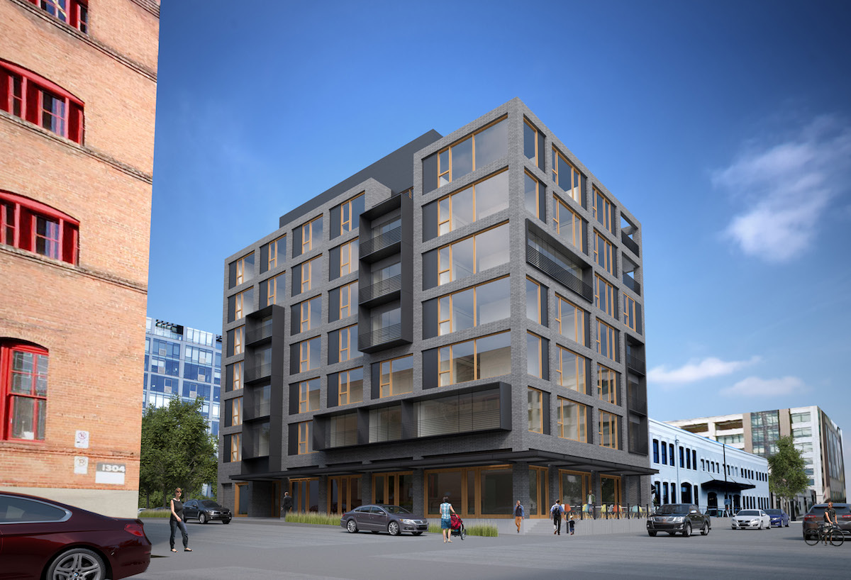
The site at 1319 NW Johnson is currently occupied by a single story warehouse, built in 1942 and currently used by Nossa Familia Coffee. The roughly 1/8 of block site is directly adjacent to the recently renovated Stagecraft Building, and across the street from the under construction Block 136 office, residential and retail development. The site is just outside the boundaries of the NW 13th Ave Historic District, which terminates at NW Johnson St.
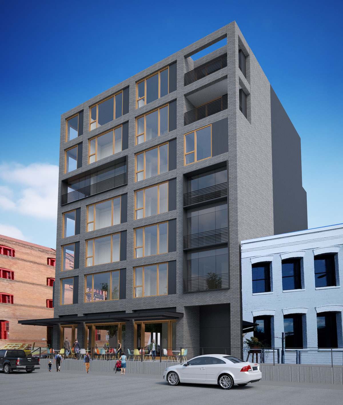
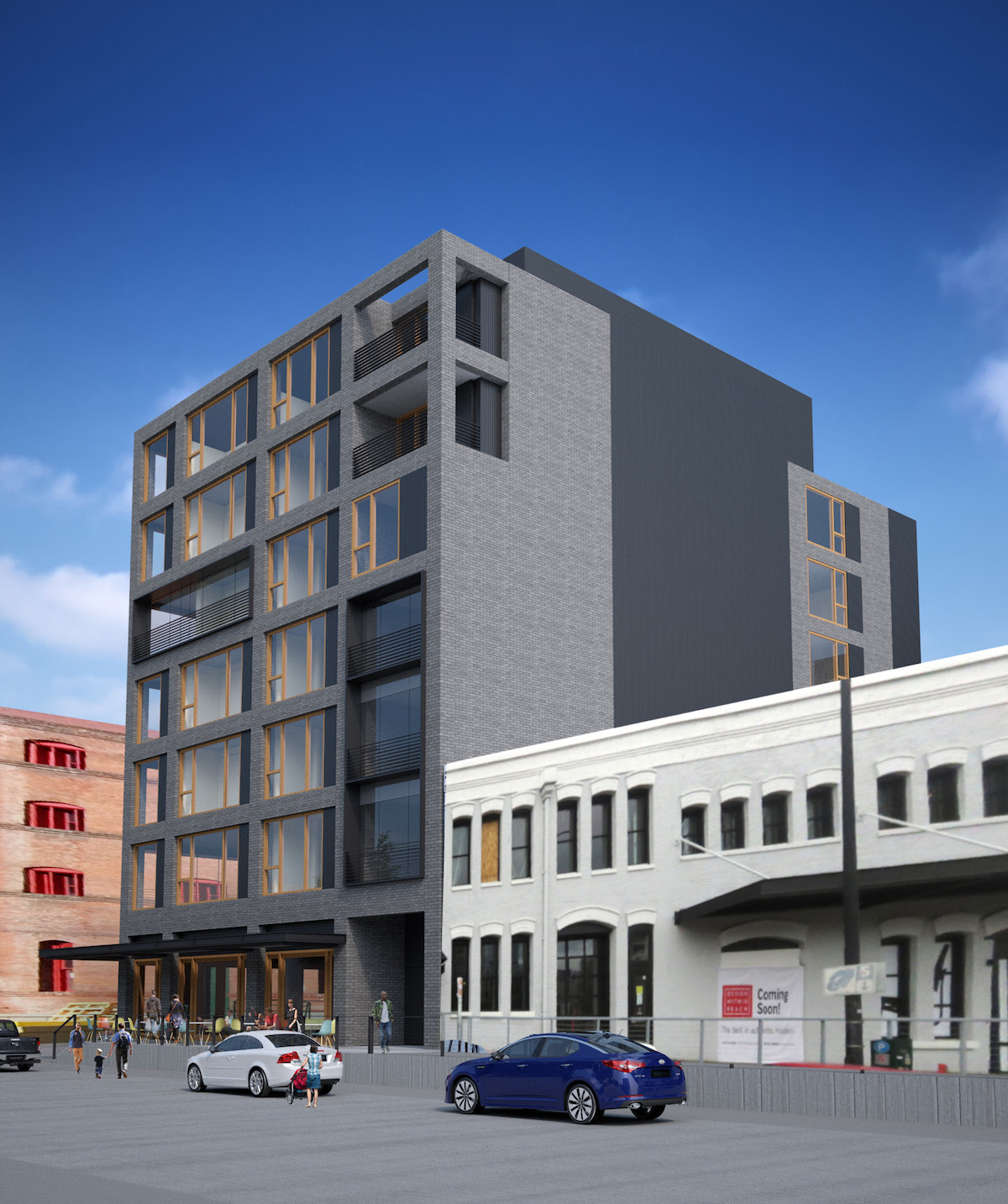
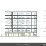
 In response to comments received at the project’s first Design Advice hearing the height of the building has increased to 75′ with 7 stories, while the projecting elements over NW 13th Ave have been removed. The primary material for the building has changed to a medium gray brick with metal accents.
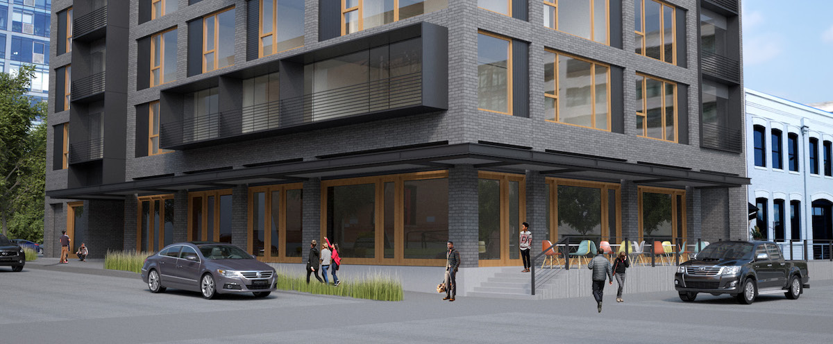
In keeping with the Portland Bureau of Transportation’s River District Right of Way Standards, the building would have a raised dock along NW 13th Ave instead of a traditional sidewalk.
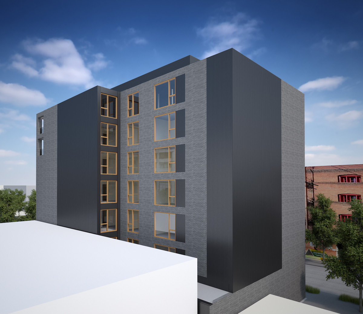
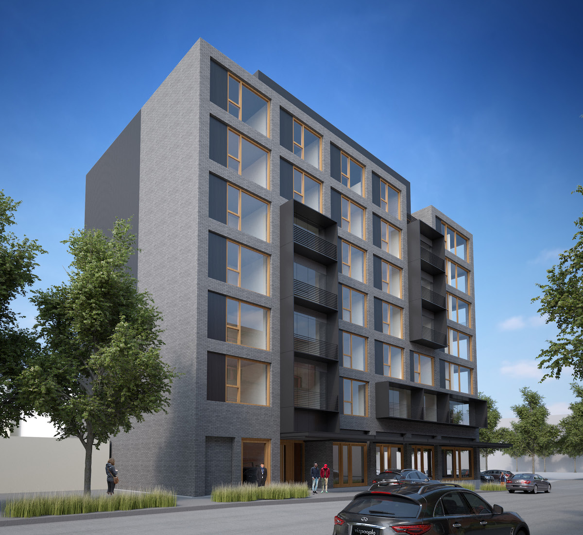
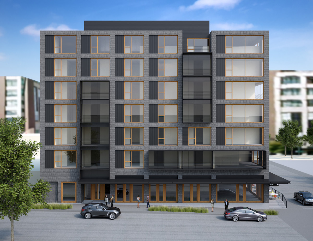
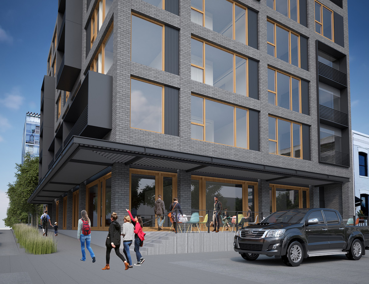
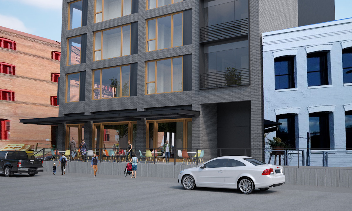
A memo to the Design Commission, published before the December 22nd advisory hearing, outlined potential areas for Commission discussion. These included: massing, scale and form; ground floor activation; upper floors, including balconies; materials; and integration of mechanical equipment. The changes made since the project’s first hearing were well received by the members of the Commission present. During the hearing Commissioner Livingston offered her thoughts on the revisions:
I make this little cheat sheet for myself, and I have three columns: “strong response”, “fair response” and “weak response”. With the revisions you’ve made the “weak response” column is completely blank and the “fair response” column is completely blank. So that means I think you’ve done just a fantastic job with the revisions that you’ve made…
The form is really simple and really stout. The large regular openings, especially at the corner, I think are a really great response. That is just really nicely done. The materials, the loading dock–a lot of what you brought into the last hearing and have now carried over to the redesign is now working fantastically well. It’s a really good response to the characteristic of not only the Pearl District, but also the adjacent historic district. So thank you for that. I actually think it’s a project where people could look at it and do a double take, a wonder if it really is a brand new building or an older building that has been renovated successfully. It has a really nice quality to it.
In order to gain approval the project will be required to go through a Type III Design Review with public hearings before the Design Commission.
Full disclosure: the author of Next Portland is employed by TVA Architects, however has not been involved with this project.
Drawings
- Plan – Ground
- Plan –
- Plan – Level 03
- Plan – Level 04
- Plan – Level 05
- Plan – Level 06
- Plan – Level 07
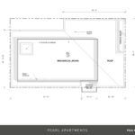
- Plan – Roof
- Section
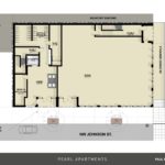
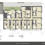
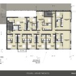
I think this is a really nice improvement…it has a really nice tension and composition. The previous concepts seemed really fussy and struggling with materials. The only area of concern might be the vast area of metal panel at the party walls…maybe look for ways to break down the scale. At a minimum it would be good to add some slits of light at the courtyard portion of the wall even if in bathrooms.
Agreed this is a big improvement on what was a study in sculpture at the expense of the architecture. I still think there are too many gestures and materials for this size of building (comprising mostly of barely livable micro units). More importantly NW 13th avenue is a special street and it’s not the place to stand out but rather defer to achieve a greater continuity. I’d still like to see a simpler program here with equal sized large format fenestration and fewer materials (why do we see so many buildings with metal panels in the window openings?). Straightforward design and quality materials need not be boring–simple elegance is not so simple. The devil is in the details not heavy handed gestures and material
I appreciate the generous awnings on most of the ground floor, including along the Johnson Ave. sidewalk. With increasing warm weather, the shade is welcome. I do hope, however, that the lack of street trees along Johnson is merely artistic license. We will need not only the shade from the trees, but the cooling and oxygen they give, which swales alone can’t accomplish. I hope that PBOT and Forestry agree, and will require trees on this frontage.
I notice that there are two trees on Johnson shown in the plan. That’s a good start.
Nice looking building. However the gray brick…..it looks nice in the artistic renderings with the fabulous blue sky. Not so much with our typical weather.
It puzzles me that developers are not building 3 bedroom apartments in The Pearl that would allow more families to live there -instead of having to relocate to neighbourhoods that are far from downtown and use a car in the already congested streets. When factoring all costs related to home ownership plus time spent going to downtown for work, even “expensive” units in The Pearl are not that more expensive. The Aster Tower near the Lloyds Center (http://hassalooneighth.com/aster-tower/) has a high occupancy rate for 3 bedroom units, so high that they are almost never avaiable, so there’s definitely a latent demand for 3 bedroom units….
Great point, America! I often wonder this too. It seems like even though we preach density and a need to move away from the automobile, our building practices just reinforce the idea that only singles live in the city while families must move to the suburbs. And these types of micro-units aren’t exactly designed for long term living by the singles, either. What kind of city do we want to become?
they only have 5 of those units……..