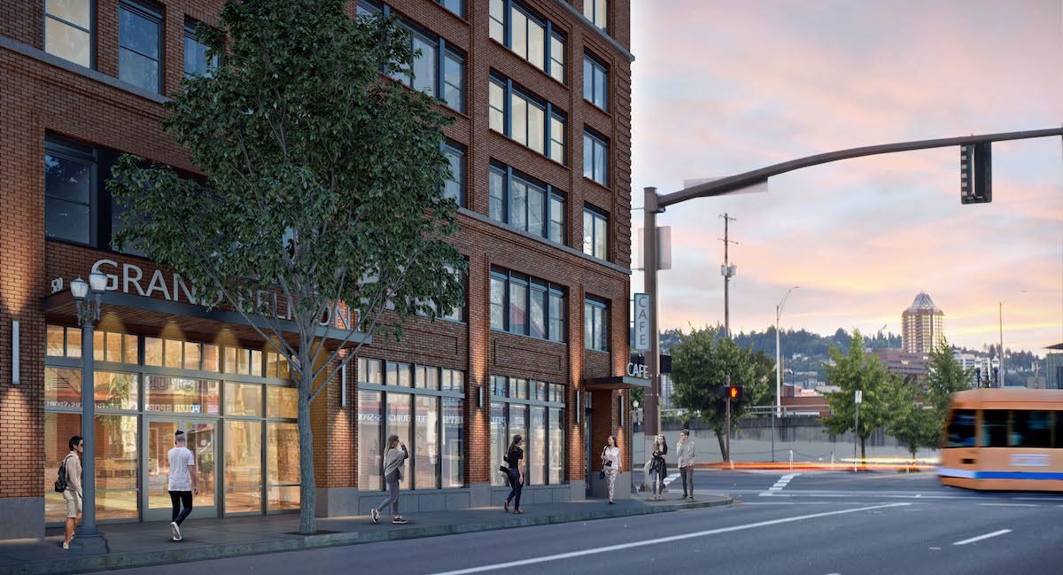
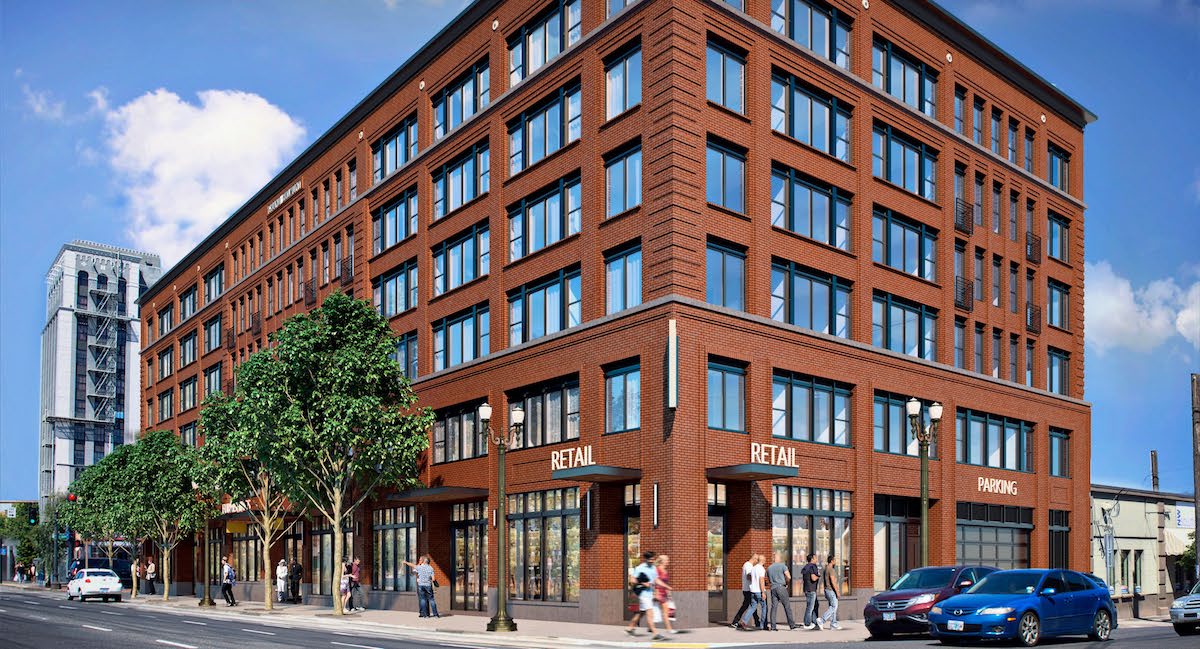
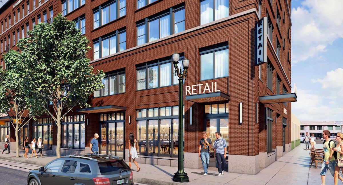
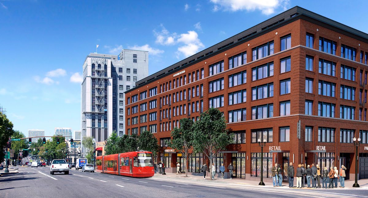
The Historic Landmarks Commission has approved Grand Belmont, a 7 story mixed use building by Ankrom Moisan Architects for developer Urban Asset Advisors. The project will contain 121 residential units and 6,000 sq ft of ground floor retail. At 81′ tall, the building will be dramatically shorter than the 240′ iteration of the design presented to the Commission earlier in the year, and will contain roughly half as many units. Parking for 14 cars and 184 bicycles will be provided.
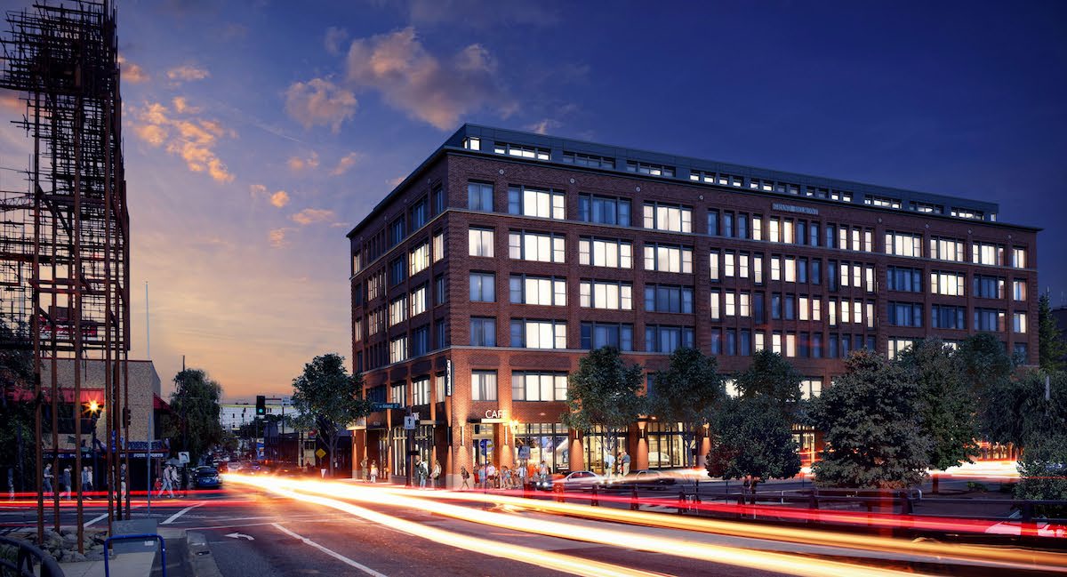
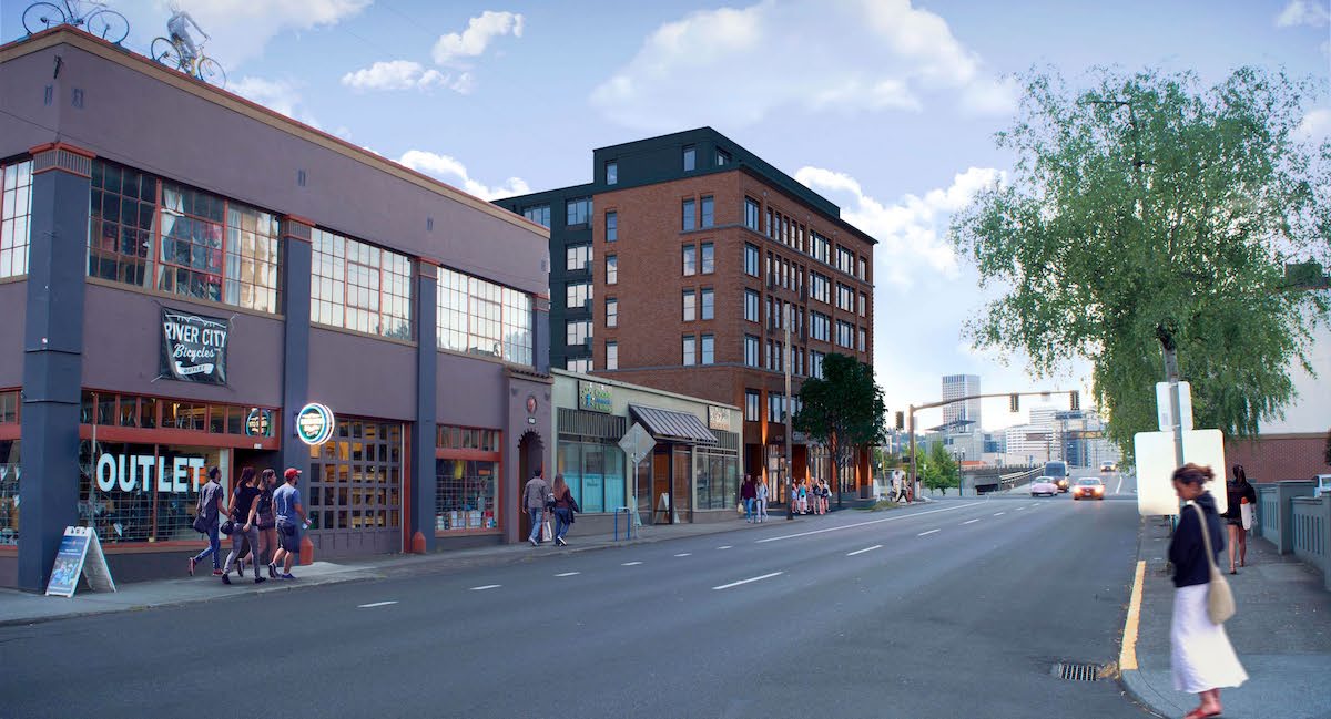
The site for the project is at 514 SE Belmont St, and is currently used as surface parking. A Dutch Brothers coffee stand is located at the corner of the lot. Because the project is located in the East Portland Grand Avenue Historic District the building design is reviewed by the Historic Landmarks Commission, instead of the Design Commission. The historic district is located at the core of the once separate city of East Portland. The lone high rise building in the district is the 175′ tall Weatherly Building, which was completed one year before the start of the Great Depression. Grand Belmont will be the first major building built in the East Portland Grand Avenue Historic District since it was added to the National Register of Historic Places in 1991.
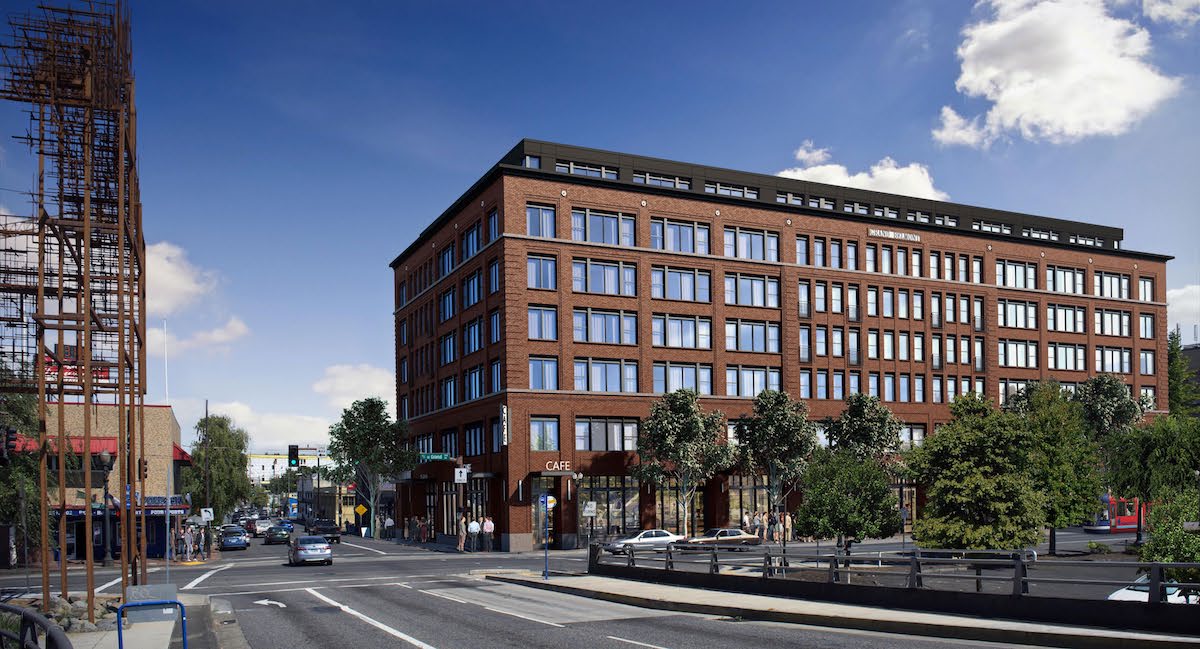
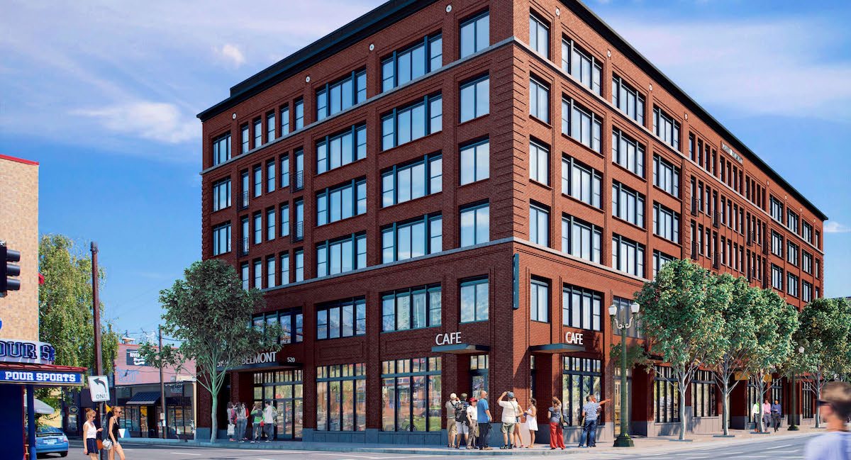
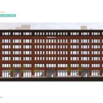
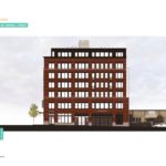
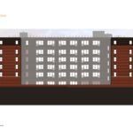
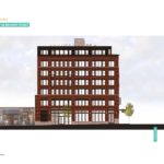
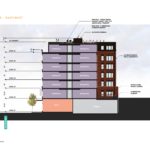
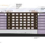
The building is massed as a 6 story building, with a set back penthouse at the 7th floor. (Like the Modera Buckman, Grand Belmont will be constructed with five levels of wood over two levels of concrete). Exterior materials proposed include brick, stucco, exposed concrete, fiberglass storefront, black fiberglass windows, metal trim, steel Juliet balconies, and metal canopies with wood soffits. In its facade expression the building incorporates details from nearby buildings in the historic district, including the Neustadter (Rejuvenation) Building, the US Laundry Building and the Nathaniel West (Bit House Saloon) Building.
Before gaining approval on December 12th 2016 Grand Belmont went before the Landmarks Commission for three Design Advice Requests (DAR), with significantly different designs by Vallaster Corl Architects. At its first DAR on August 24th 2015 the building was massed as a 15 story bar tower, which was then revised slightly downwards for a second hearing on September 28th 2015. When the project returned for its third DAR March 7th 2016 it had been revised to a quarter block, 23 story tower.
The project was submitted for Type III Historic Review in July 2016 as a 22 story building, at 12:1 FAR. In order to fit a building code compliant stair, the tower width was 5′ wider than had been shown at the third DAR. In their response to the initial application Bureau of Developments Services staff stated that they did not “believe that the proposed building is responsive to the Commission’s comments regarding compatibility of scale, mass, or articulation.” According to the developer, who spoke at the December 12th hearing, he then faced the choice of accepting a denial and appealing to the City Council to overturn the decision; or starting again with a lower density design. Choosing the latter option, the project was resubmitted in its current form, at 5.73:1 FAR, with Ankrom Moisan brought on as design architects.
The revised scheme drew strong praise from the Landmarks Commission. During the hearing Commisioner Engeman offered her thoughts on the building:
This is a wonderful design, and a very thoughtful packet, and I appreciate all the research into the context. We can really understand how the applicant got to where they are today. I will definitely say this holds a lot of promise: as far as the fact that the building extends the full block face–I think the Weatherly extends quite a length on Morrison, just beyond the tower part–so I think there’s precedent for that; the way that the applicant has treated it with this three bay approach; the rhythms; the detail; the banding; there’s just so much that’s working here. I’m really excited about this.
At the end of the hearing the Commission unanimously voted to adopt the Staff Report and Recommendation to the Historic Landmarks Commission and approve the project. Building permits will need to be obtained before work can begin on site.
Drawings
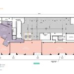
- Plan – Ground
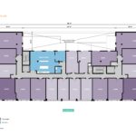
- Plan – Level 02
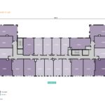
- Plan – Levels 03 to 06
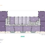
- Plan – Level 07
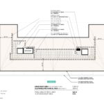
- Plan – Roof
- Elevation – West (SE Grand)
- Elevation – South (SE Yamhill)
- Elevation – East
- Elevation – North (SE Belmont)
- Section – East/West
- Section – North/South
This is a far nicer design than the previous versions, as well as nicer than many other new apartments. Brick clad buildings have a timeless look to them. I also think that six stories is sufficient to generate walkable density.
Seattle continues to climb ever upward, and Portland builds cute little boxes out of matchsticks. Why are these design commission folk so terrified of actual tall buildings? Portland comes across as Seattle’s anemic, impoverished cousin to the south. How sad.
Portland isn’t Seattle. If you took a vote, Portland overwhelmingly doesn’t want to be Seattle. People who move to Portland often have the option of moving to Seattle and instead chose Portland. People need to get that in their heads. Portland is Portland, not generic west coast city #3……..
This seems like a missed opportunity for something other than another fake-brick 6 floor building. It would be nice if the design commission encouraged some diversity of buildings instead of the same old thing, especially in such a central and visible part of the city.
A bit depressing – yet another opportunity for distinguishing architecture lost on yet another low, blocky 6 story building. The design itself is great and the architects did their research, no knock on that – but it’s just one of a hundred others with the same massing. This building can be placed anywhere and it functions the same in most contexts.
One can’t say that of the tower proposal it’s replacing (or any such towers) – it wouldn’t be right to do those anywhere but the inner city. The tower served the context equally as well, if not better given its lonely neighbor. It’s design was iconic and would’ve made a welcome addition to the street level and eastern skyline. Save the inner city blocks for those opportunities – they’re too valuable to pass over. There’s plenty of room for 6:1’s everywhere else.
It is indeed a perfectly handsome building. I commend Ankrom Mosian’s thoughtful and contextual design. But I admit I’m a bit disappointed that the quarter block tower has been abandoned; because, not only did It create a nice dialogue with The Weatherly, but it acknowledged that East Portland had not only history, but ambitions of her own.
*yawn*
the original design was the best. this one is just boring, we do not need more mediocrity and faux historicism.
The original design was absolute garbage, which we have plenty of in new Portland. We do not need any more buildings with offset fenestration, which is all anyone seems to copycat at the moment. When this flavor of the month has passed, we’ll be stuck with all these hideous buildings. This one at least will still look decent.
Like many other posters here, I don’t have any objections to the new design, but I lament the lost opportunity for a tower companion to the Weatherly building. No offense to the new design, but it’s a bummer that we have to settle for a proper gentleman’s building at yet another potential landmark location.
As a bigger question, are we only allowed to go over seven stories in five neighborhoods around town?
There is a huge disconnect between the allowable max FAR and building heights and the current planning staff and Commissions. As a city, we need to get the code and agencies aligned so we can stop wasting everyone’s time.
Booooooooooo, bring towers to the east side.
I really disliked the original design, handsome as it was, simply because it felt like a big institutional wall. I liked the towers much more since they were much less hulking. This final iteration I like most of all. Yes, it could be anywhere but it respects its context and doesn’t attract unnecessary attention.
I liked the earlier, tall version. While not an inspired design (design by committee seems the norm in Portland) the lower version is a dark, hulking and and actually far more massive than a taller tower. And why does it have to be so deferential to a so-called historic district, with details that are supposed to be like older buildings? There is no reason to make a modern building have fake historic elements. A depressing solution.
An all brick veneer facade with pseudo rustication and quoins… how original… The historical nod doesn’t need to be a rip-off replica, but improved upon with innovative materials and concepts. Waste of real estate and resources.
I am a big fan of the Grand Avenue façade, however the back side and the penthouse level look cheap, cheap, cheap. I actually wish Design Commission had looked at this one since I think they would have pushed back on this.
People have to be strong to cope with good architecture. This blog post sums it up pretty well, especially when describing the asinine logic of the HLC:
https://placesovertime.wordpress.com/2016/12/27/landmarks/
I hope we can spare the Central Eastside from the Disneyfication that’s happening in Portland’s other historic districts.
i love the old digzine of this building looks like old storage building