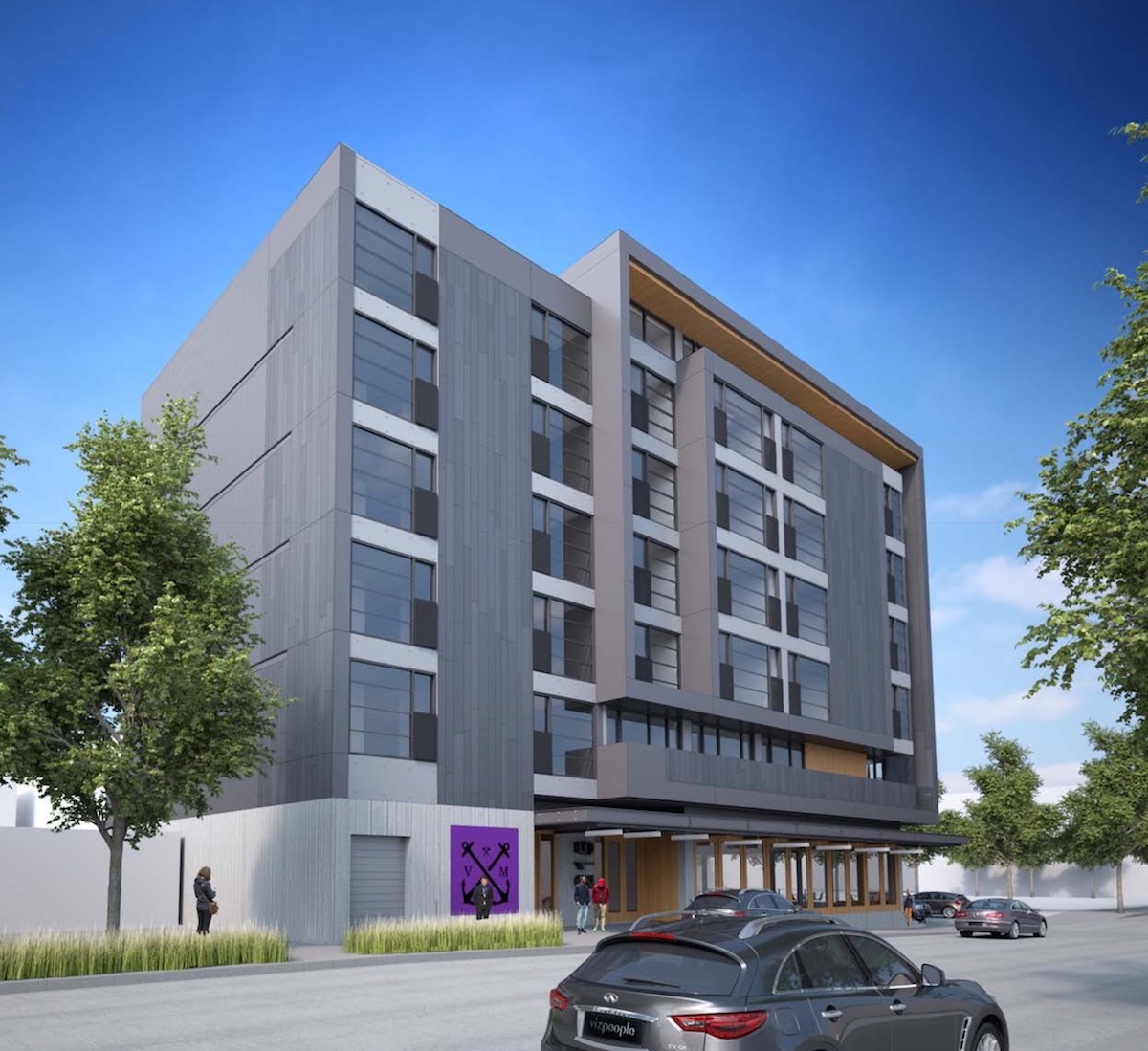
Design Advice has been offered to TVA Architects for a mixed use building at NW 13th Ave & Johnson St. The 6 story building for developer Paul Properties is proposed to include 59 apartments units over 3,492 sq ft of retail. Long term parking for 91 bicycles is proposed. No vehicular parking is proposed.
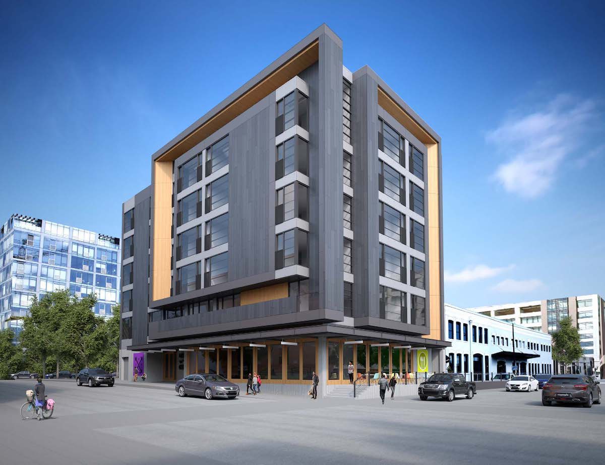
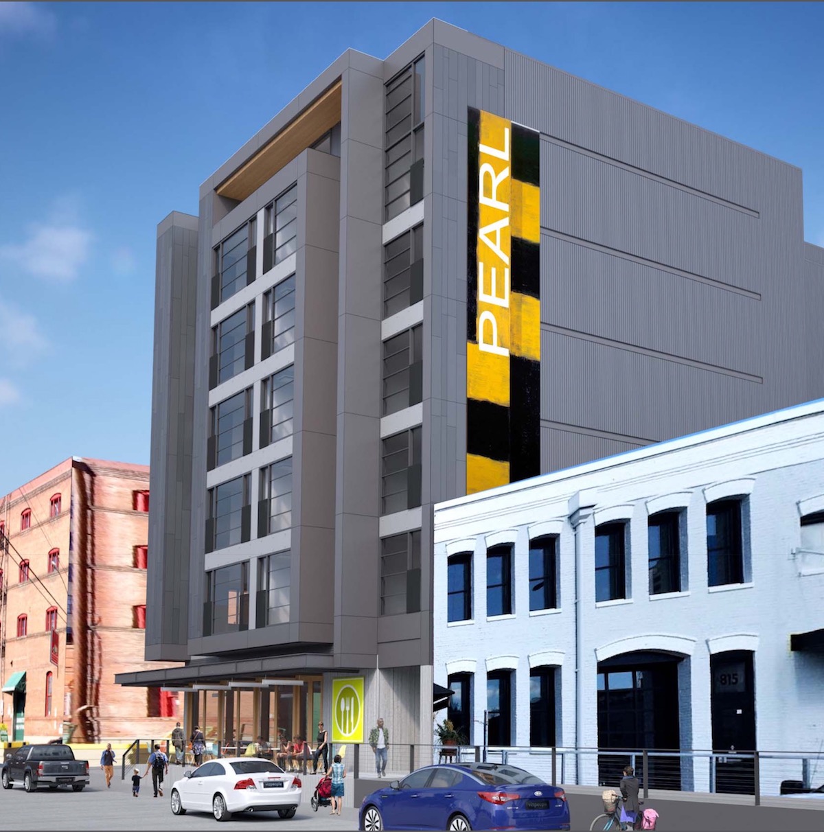
The site at 1319 NW Johnson is currently occupied by a single story warehouse, built in 1942 and currently used by Nossa Familia Coffee. The roughly 1/8 of block site is directly adjacent to the recently renovated Stagecraft Building, and across the street from the under construction Block 136 office, residential and retail development. The site is just outside the boundaries of the NW 13th Ave Historic District, which terminates at NW Johnson St.
At the November 3rd Design Advice Request hearing, the applicants presented three options for the skin of the buildings. All three options have the same massing and program.
Option A
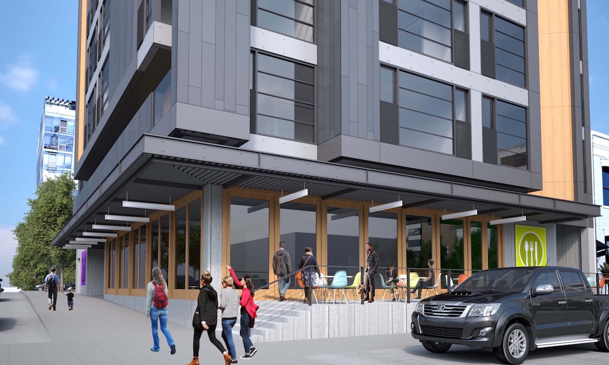
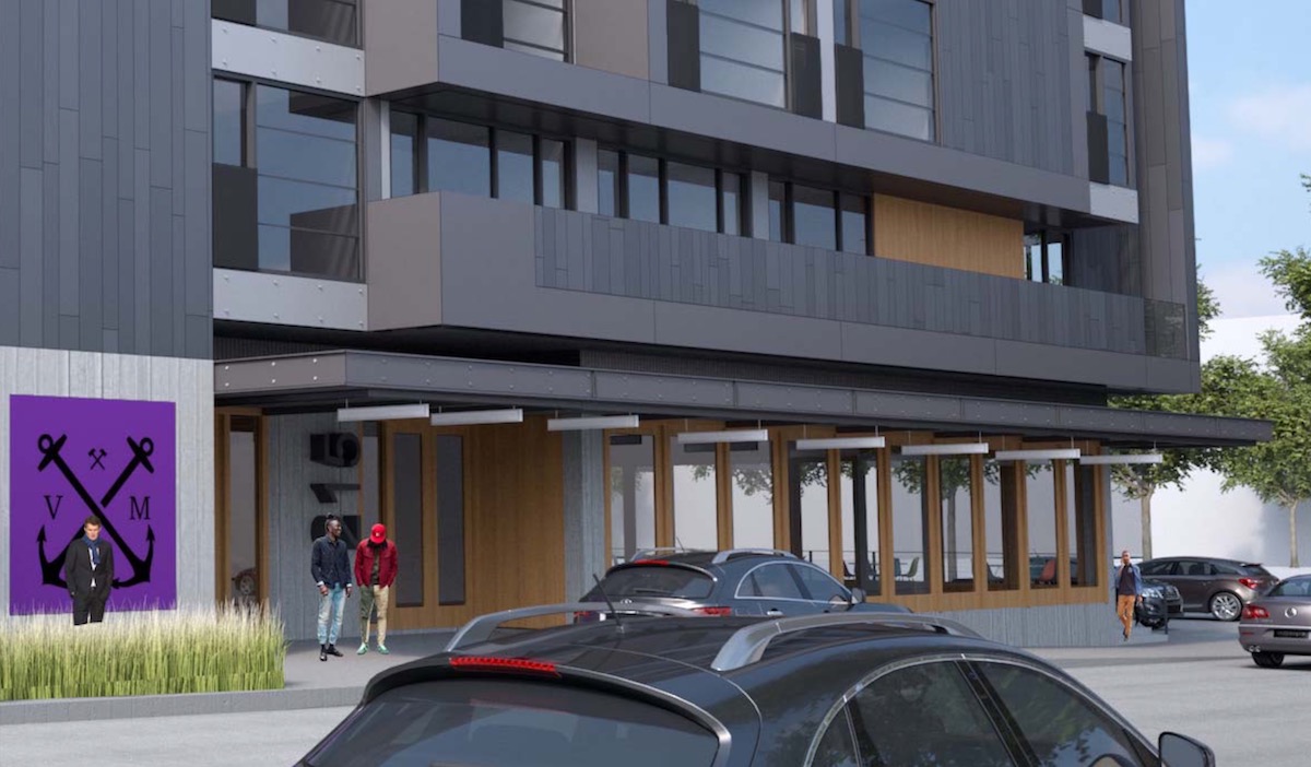
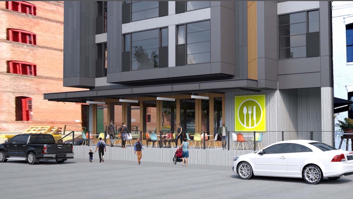
Option A uses zinc metal panel as the primary material for the building, with fiber cement panel and a stamped wood grain composite metal panel as accent materials. Board formed concrete and wood storefronts are proposed at the ground floor.
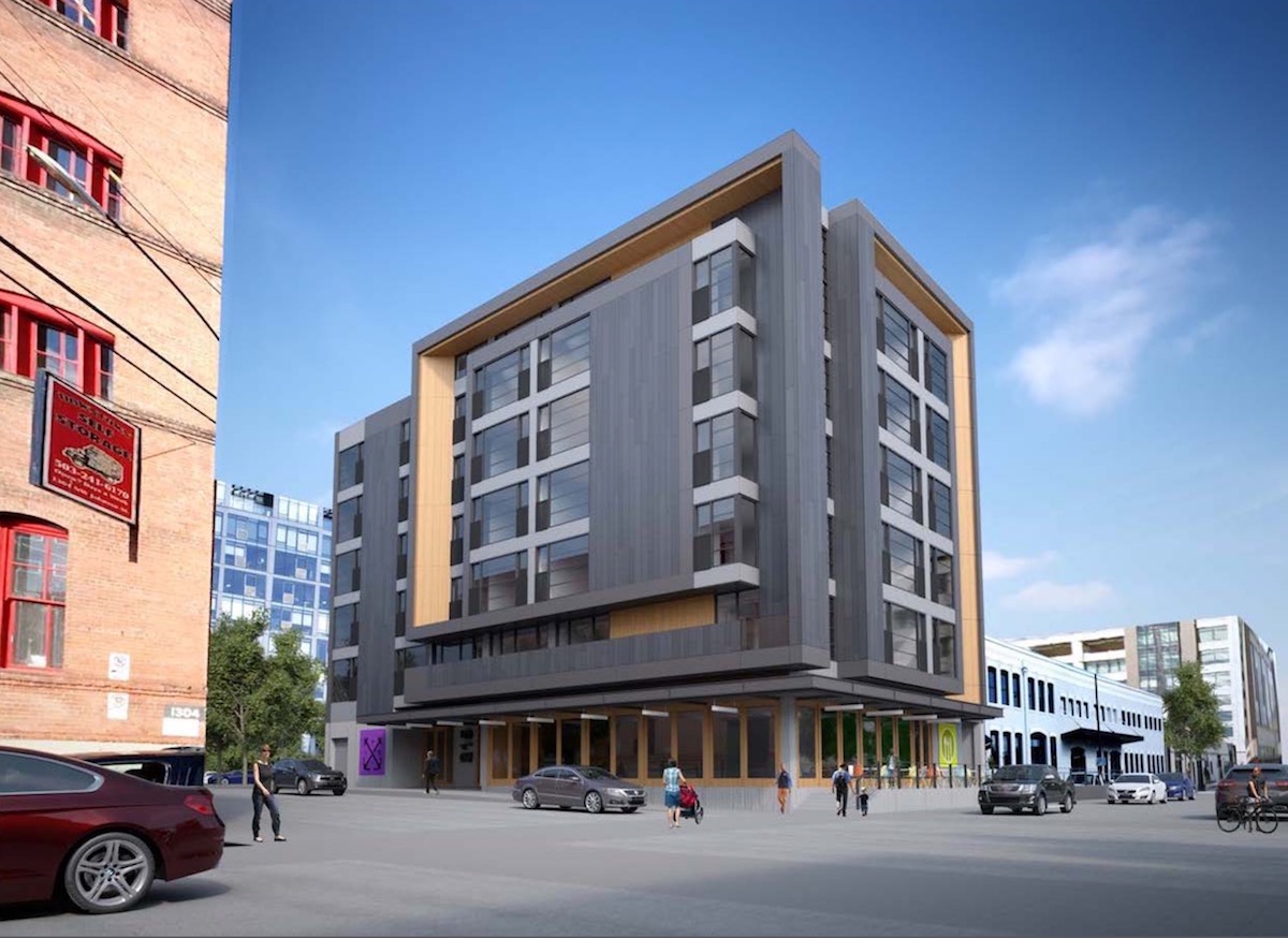
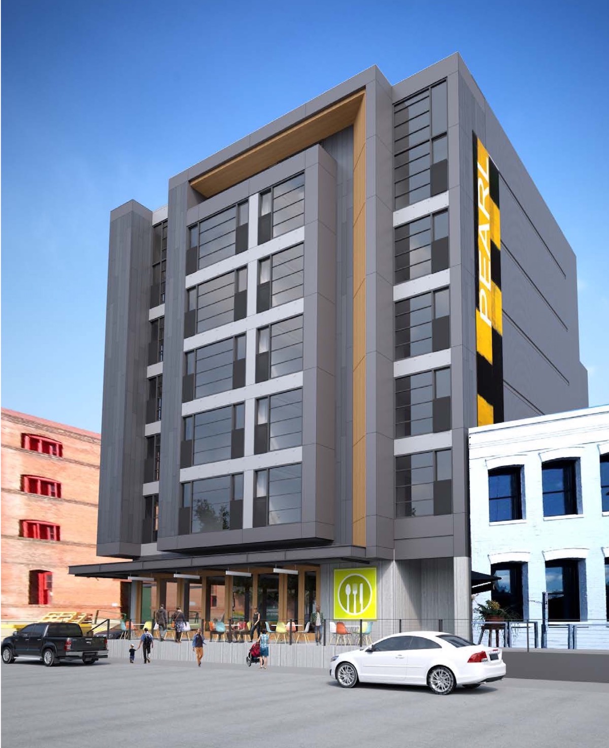
In keeping with the Portland Bureau of Transportation’s River District Right of Way Standards, the building would have a raised dock along NW 13th Ave instead of a traditional sidewalk.
Option B
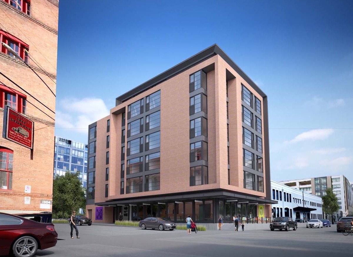
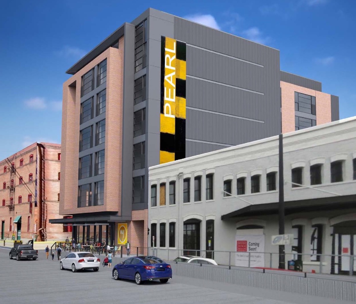
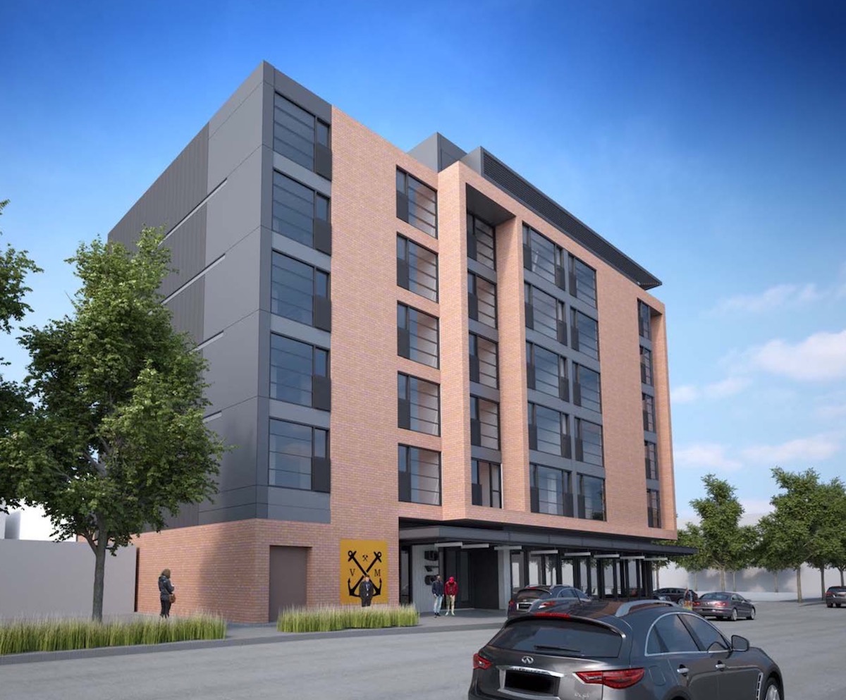
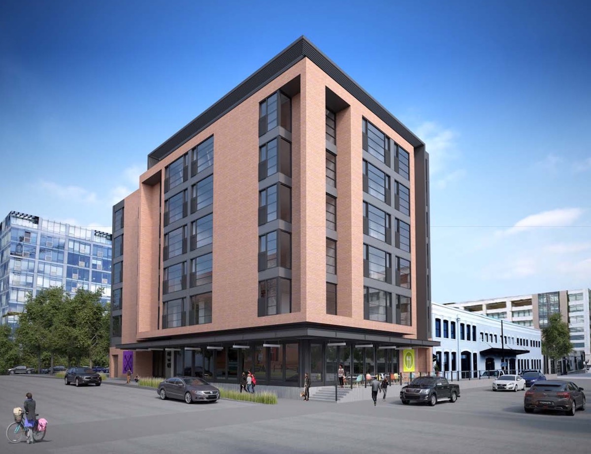
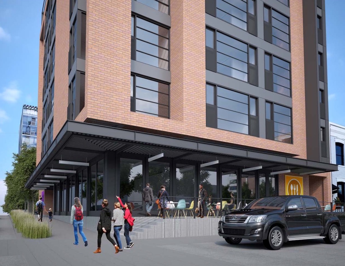
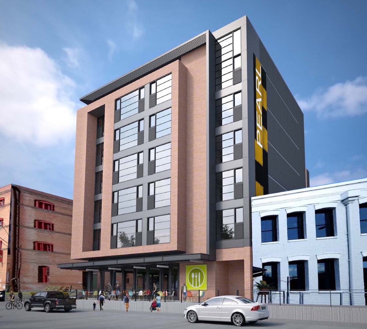
In Option B, the primary material for the building would be a red brick.
Option C
In Option C, the primary material for the building would be a white brick.
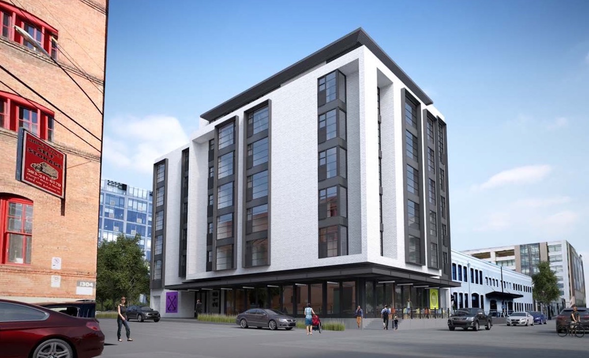
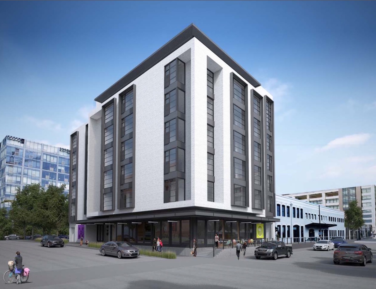
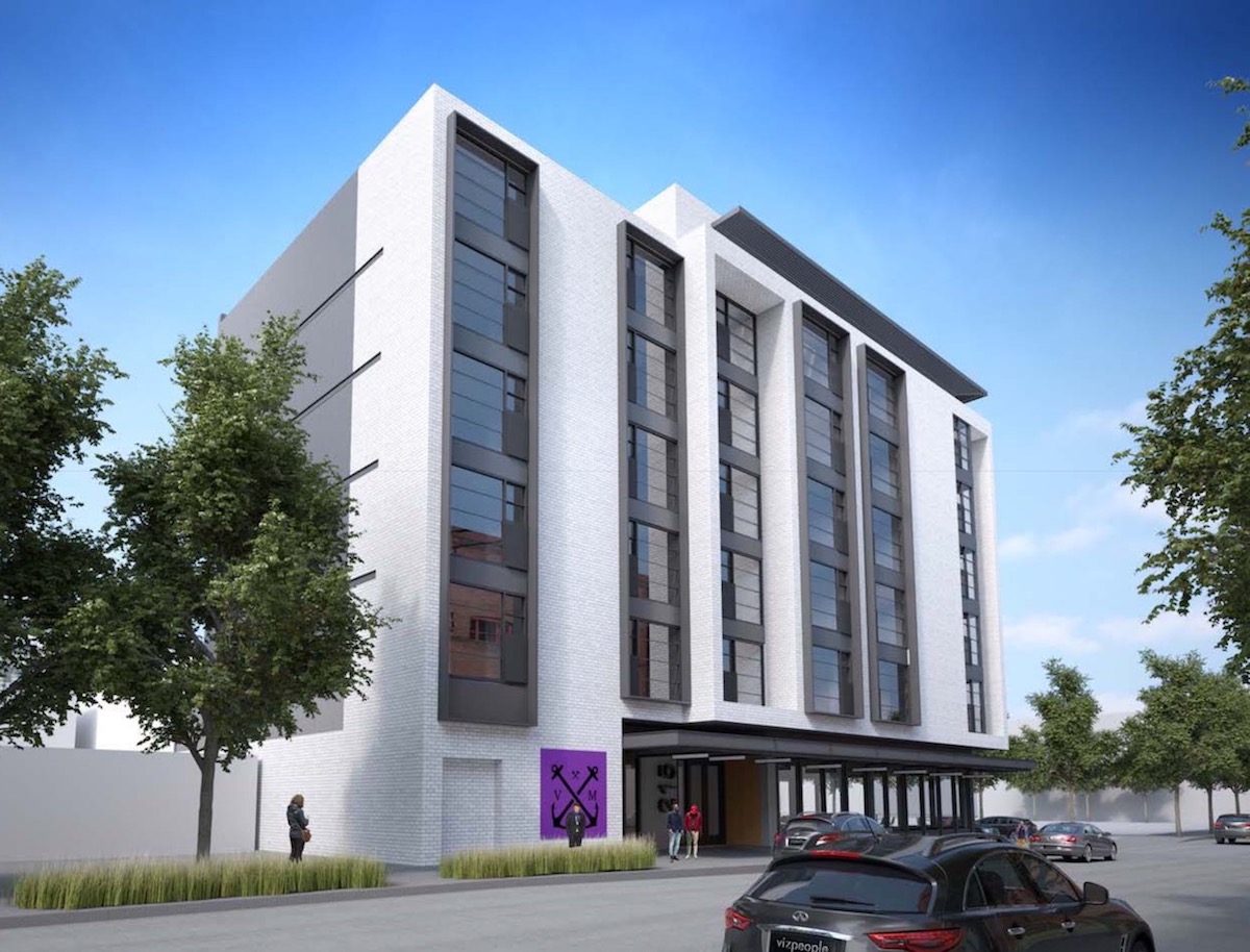
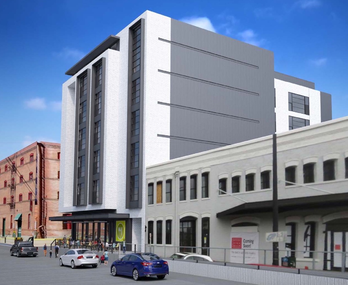
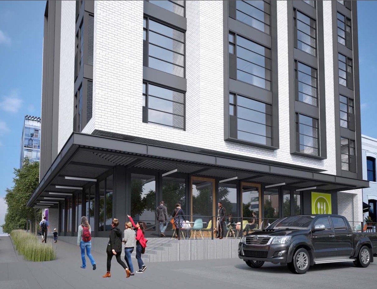
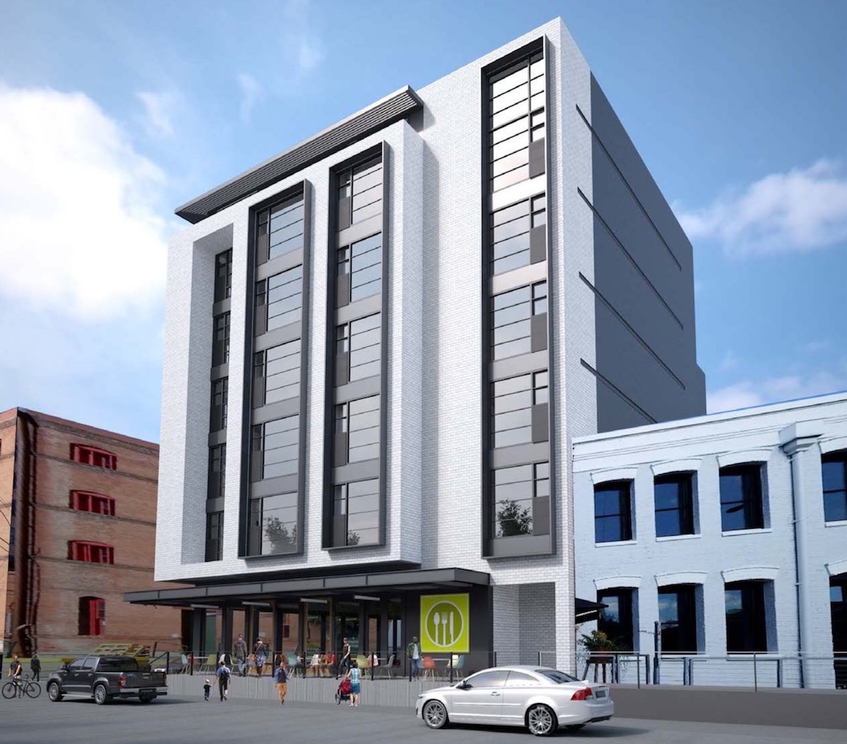
A staff memo to the Design Commission, published before the advisory hearing, outlined potential areas for discussion, including: the massing, scale and design character of the building; the ground floor program and entries; and the materials proposed. A major area of discussion was the massing of the building, and in particular the elements that project over the right-of-way. The Design Commission was in support of the projections over NW Johnson, but not over NW 13th Ave, which—as noted by a member of the Pearl District Neighborhood Association—is the only street in the city where it is typical for buildings to viewed by pedestrians from the center of the street. Newly appointed member of the Commission Sam Rodriguez suggested reducing the massing on NW 13th and increasing the height, by constructing the building with five levels of wood over two levels of concrete (which the Bureau of Development Services Life Safety division has recently started to allow). Commissioner Livingston suggested that if Option A was to move forward the number of materials should be reduced, while Commissioner Vallaster indicated his preference for Option B, though suggested simplification of the massing.
The project is currently scheduled to return in front of the Design Commission for a second Design Advice Request hearing on December 8th. In order to gain approval, the project will be required to go through a Type III Design Review, with public hearings before the Design Commission.
Full disclosure: the author of Next Portland is employed by TVA Architects, however has not been involved with this project.
Drawings
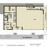
- Plan – Site / Level 01
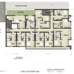
- Plan – Level 02
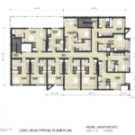
- Plan – Levels 03 to 06
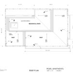
- Plan – Roof
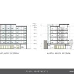
- Sections
Red brick like the McKenzie on 12th & glisan. I don’t like the modern look, should fit in more with the existing street in style
It doesn’t matter what skin you put on this thing. it’s a space ship on 13th avenue. TVA needs to push themselves beyond their signature style and respond to context. 13th is a special street and this site is just past the technical historic district boundary–this is not the place to stand out. They need to simplify the form, provide more fenestration rationally organized and keep it simple. Mithun’s project across the street currently under construction is a great example of respecting context without pandering to faux historic sentimentality.
Take a look at the floor plan. It consists of almost uniform sized spaces which would allow a rational array of large uniform window openings. But instead the designers have ignored the plan to create a random window pattern leaving some units with minimal window exposure. Why? So the residents get less light and view and the public gets a building with less glazing without any justification beyond the designer’s whims? Perhaps cheap windows that don’t provide ample energy ratings? I would love to hear an valid explanation to this decision.
I agree that this building ignores its context completely. The options that include brick only highlight how little this building relates to traditional forms- I hate the hovering brick skin! If the façade can be modified so the brick meets the ground and appears to support itself, then I would appreciate the brick option (I think I prefer the white). With the façade as is, I prefer option 1.
Sort of difficult to polish that turd.
The white brick blends in best with the Stagecraft building. Hate the zinc facade and Option 1.
Isn’t parking planning required? Something like 3 parking spaces per 5 units for development of 50 or greater units?
No parking is required in the Central City Plan District.
I know it’s probably just the effect of the rendering, but the images that show Option C as viewed from the 13th street corner angle look eerily like the Muse building that just completed up on NW 19th & Overton. I know, there are differences in the massing and fenestration, but it just speaks to this oppressive same-sameness that seems to be the state of residential(/mixed-use) architecture in this town anymore. I agree that NW 13th is a lovely stretch and it would be nice to see a continuity of style especially just outside the boundaries of the historic district, but honestly I wouldn’t mind a more modern structure if it were actually innovative and interesting.