The Design Commission has approved a new affordable housing development at NW 14th and Raleigh, designed by Salazar Architect and LRS Architects. The 12 story building, being developed by Innovative Housing, would include 93 units. 40 of the units will be reserved for formerly homeless individuals and families, while the remaining 53 units will be available to those earning between 30 and 60% of Portland’s Median Family Income. The building will also include 661 sq ft of ground floor retail space. 15 vehicular parking spaces are proposed at the ground level. 155 short term bicycle spaces will be provided.
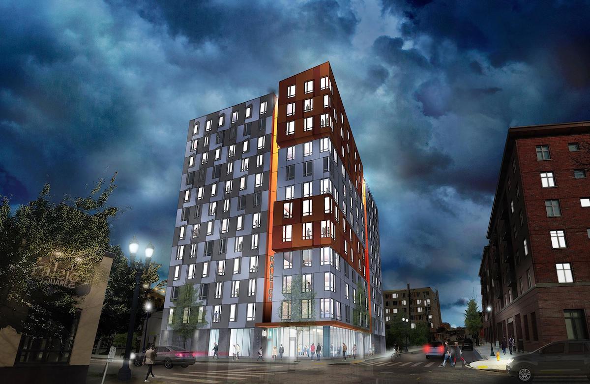
The project will be located on a vacant quarter block site at the northern end of the Pearl District. The Block 26 site is currently owned by the Portland Housing Bureau, who last year purchased the site from Hoyt Street Properties for $1.3 million. The Housing Bureau selected Innovative Housing as the developer for the site in October 2015, at which time the project was conceived as a 6 story, 40 unit development. The proposed building has since expanded in size, partly due to the availability of around $10 million in city subsidy for the project.
The northern end of the Pearl is growing rapidly, with construction about to start or underway on Block 20, Modera Pearl and 1400 NW Raleigh. Construction recently finished on The Abigail (visible in Google Street View above), which is also affordable housing.
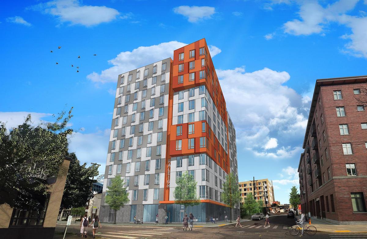
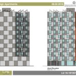
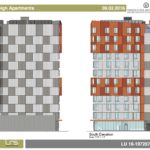
The primary material for the 129′-8″ tall building will be a 12″ wide metal panel, installed vertically. Four different colors of panel are proposed, arranged in a mosaic pattern. Oriel windows, projecting over the right-of-way, are highlighted by the two tones of orange metal panel proposed. Other materials include storefront glazing and brick at the ground floor, as well as vinyl windows at the residential units.
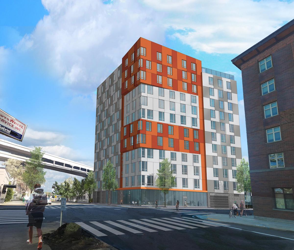
Common areas for the building will be located at the second floor, including an indoor play area, an outdoor play area, a community room and a laundry room. An exterior terrace will also be located at the 12th floor.
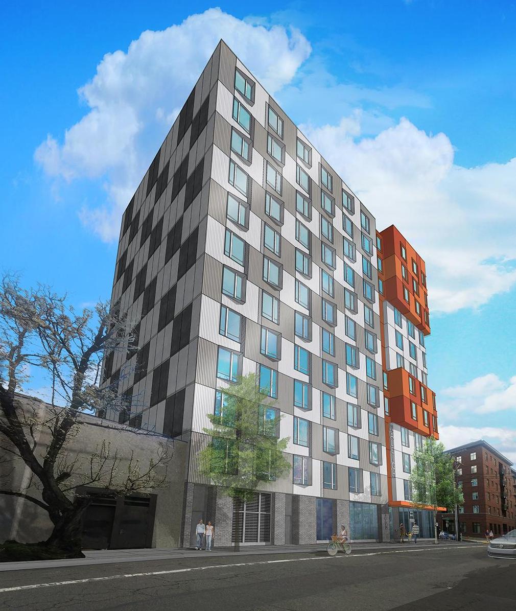
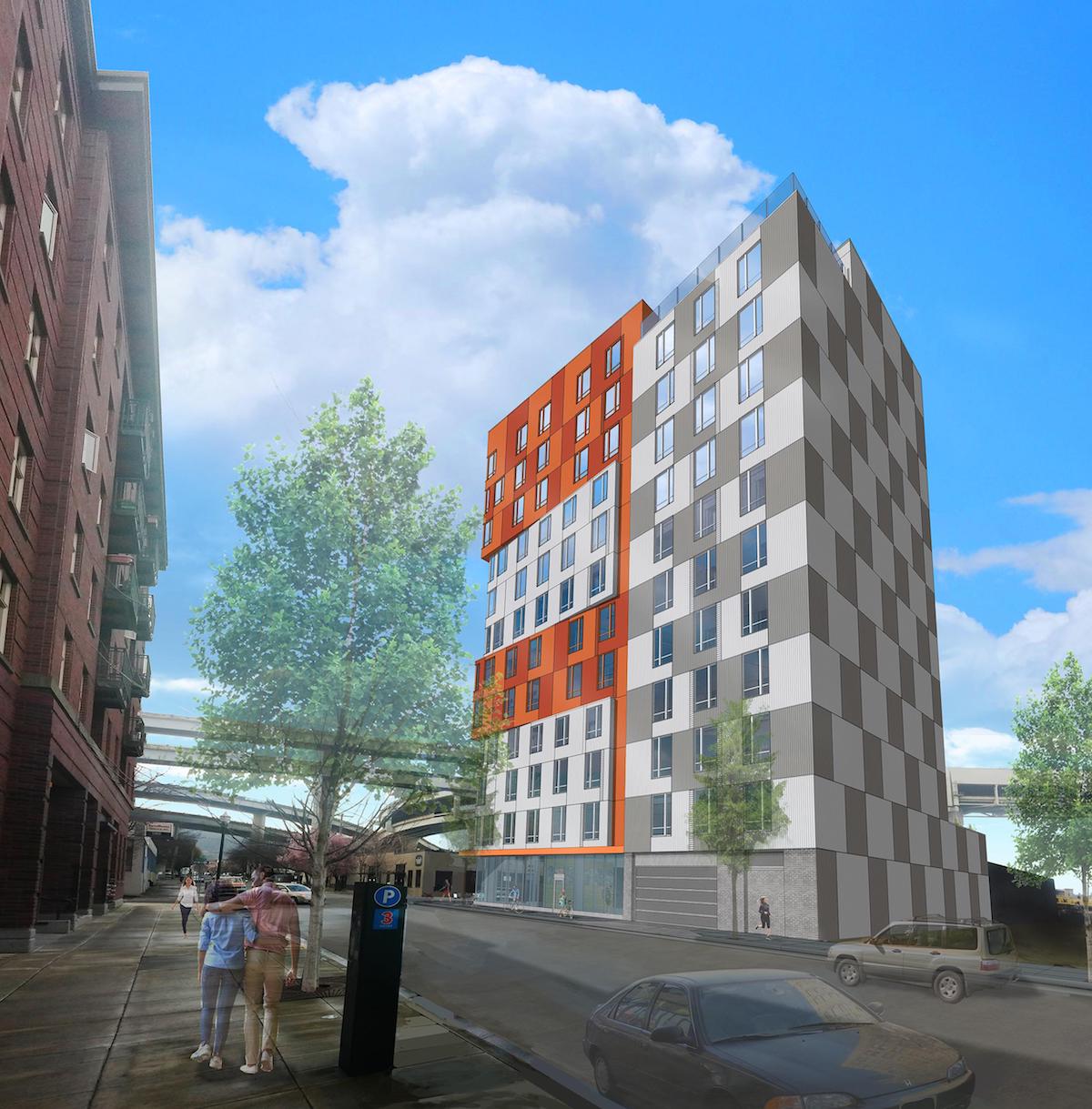
14th & Raleigh was approved by the Design Commission at their September 22nd meeting. The project previously had three Design Advice Request hearings: one held in April 2016; a second hearing in May 2016; and for a special sub-committee meeting of the Design Commission in June 2016. Though eligible to go through a Type II Design Review process, where the decision would have been made by Bureau of Development Services Staff, the applicants chose to go in front of the Design Commission through a Type III process. As noted in the Final Findings and Decision of the Decision Commission, the Design Commission had consistently expressed reservations about the building, as it related to the “Design Coherency Guideline”, stating that “with a small footprint, (1/4 block) there too many large moves and competing elements.” Given the similarity to the design presented at the second Design Advice Hearing, the Design Commission chose to add a condition of approval, that will require the projecting orange “oriel” windows to be grouped into one feature:
C. Conditions C.1-2 relate to the corner building element:
- Move the “lower oriel” up from levels 5 and 6 to levels 8 and 9 to create a singular oriel.
- Change the color of the upper and lower “corner wall” metal panels to match the checkerboard patterning of the “mid-block walls”.
With the added condition, the project was approved unanimously. The Final Findings noted that the project will “create much needed affordable housing”:
The Commission appreciates the team’s efforts to respond to comments and work collaboratively together. The proposed active and cohesive ground floor will create a strong base for the building above, and provide strong connections its emerging urban context. The proposal will create much needed affordable housing and generous amenities for its future occupants. With the conditions of approval noted below, the proposal will meet the applicable design guidelines and modification criteria, and therefore warrants approval.
Building permits will need to be obtained before work can begin on site.
Drawings
- Plan – Site
- Plan – Ground
- Plan – 2nd Floor
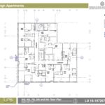
- Plan – 3rd, 4th, 7th, 8th & 9th Floors
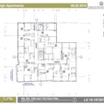
- Plan – 5th, 6th, 10th & 11th Floors
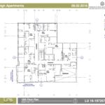
- Plan – 12th Floor
- Elevations – East & West
- Elevations – North & South
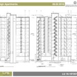
- Section
I rather like this. Obviously not a ton can be spent on embellishments on this kind of project. So it is nice to see something that isn’t all that bad, especially stacked up against stuff that isn’t affordable and is uglier (Grant Park Village anyone?)
This building is disgusting, hands down.
seriously! Such a pile..