The Design Commission has approved the Holst Architecture designed redevelopment of the Lloyd Cinemas parking lot. The project at 1400 NE Multnomah would include 677 apartments, 12 live-work units, and approximately 37,780 sq ft of ground level retail. 536 parking spaces will be located on the site, with 438 spaces dedicated for residents and 98 spaces provided to service the retail uses. 1304 long term and 50 short term bicycle parking spaces will be provided. The project is being developed by a consortium of developers, including California based Bob Bisno and Dan Palmer.
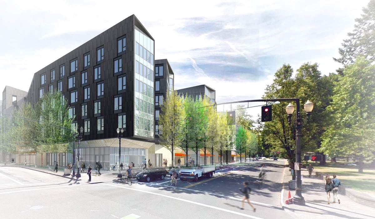
The project will be located on the existing parking lot of the Regal Cinemas Lloyd Center 10 & IMAX. The cinema will remain open in the immediate future, with cinema patrons able to use the existing parking in the Lloyd Center. A future second phase of the redevelopment, which would be constructed on site of the cinema and the parking lot to the north of NE Multnomah, is in the early stages of design and currently has a pending Pre-Application Conference [PDF].
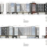
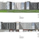
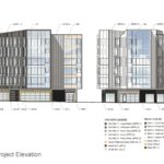
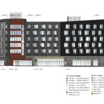
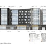
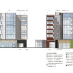
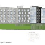
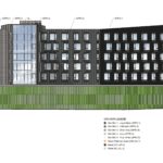
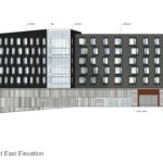
The primary exterior finish materials for the development will be Öko skin concrete panels, in a gradient color scheme. Other materials proposed include brick, metal composite panels, wood, weathering steel, aluminum storefront glazing and vinyl windows.
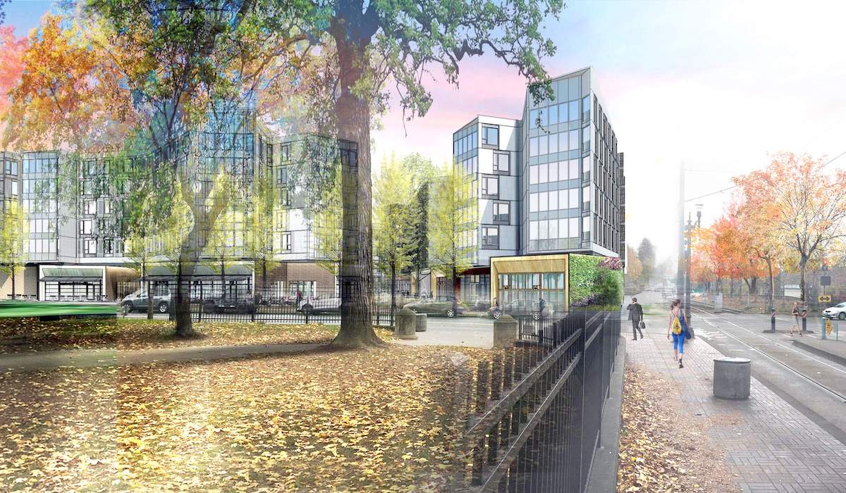
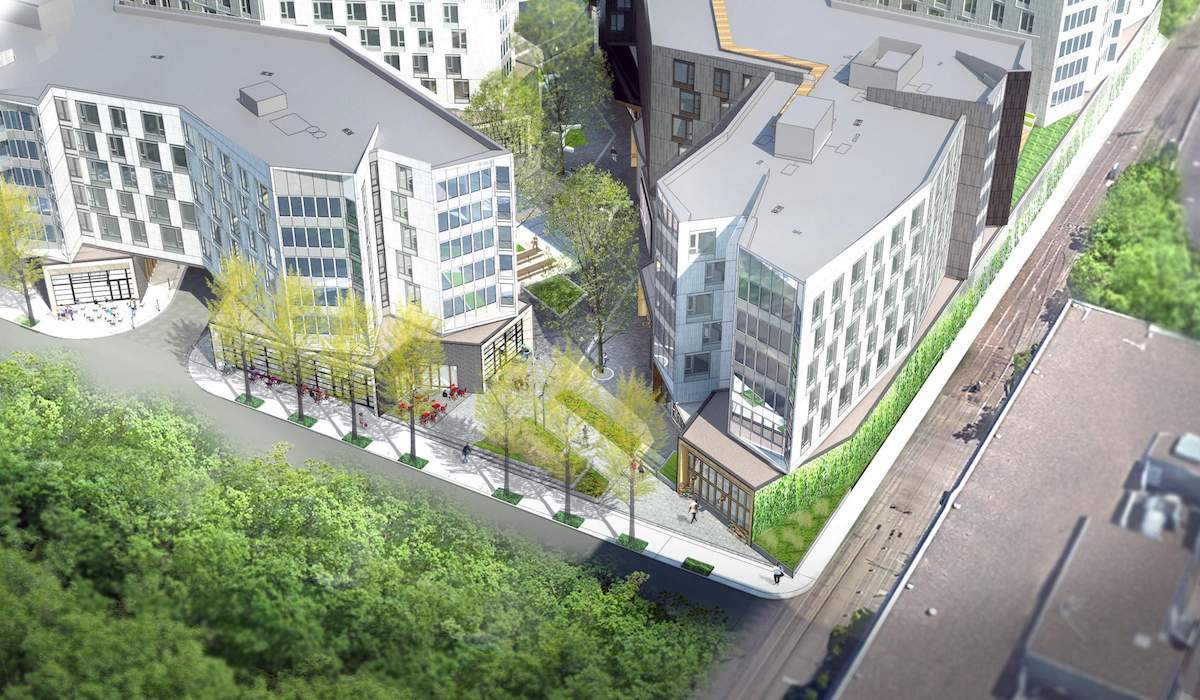
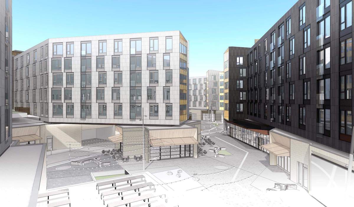
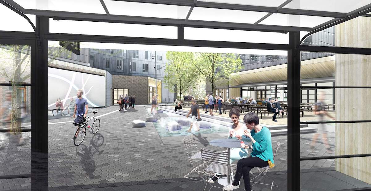
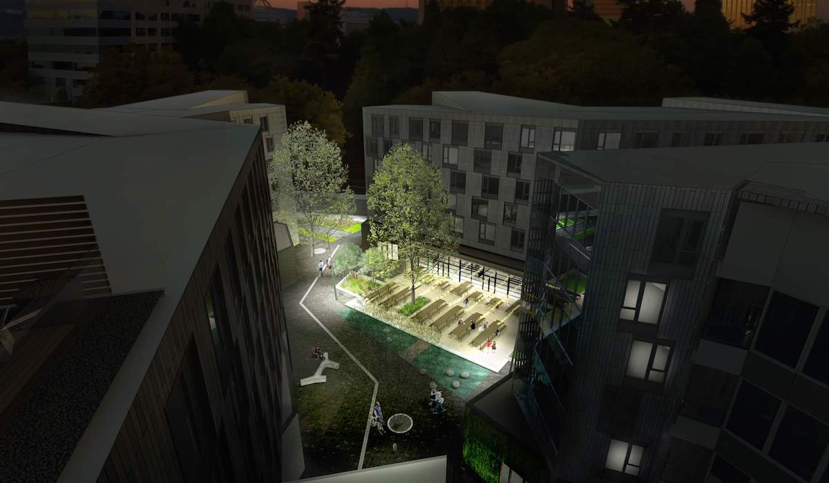
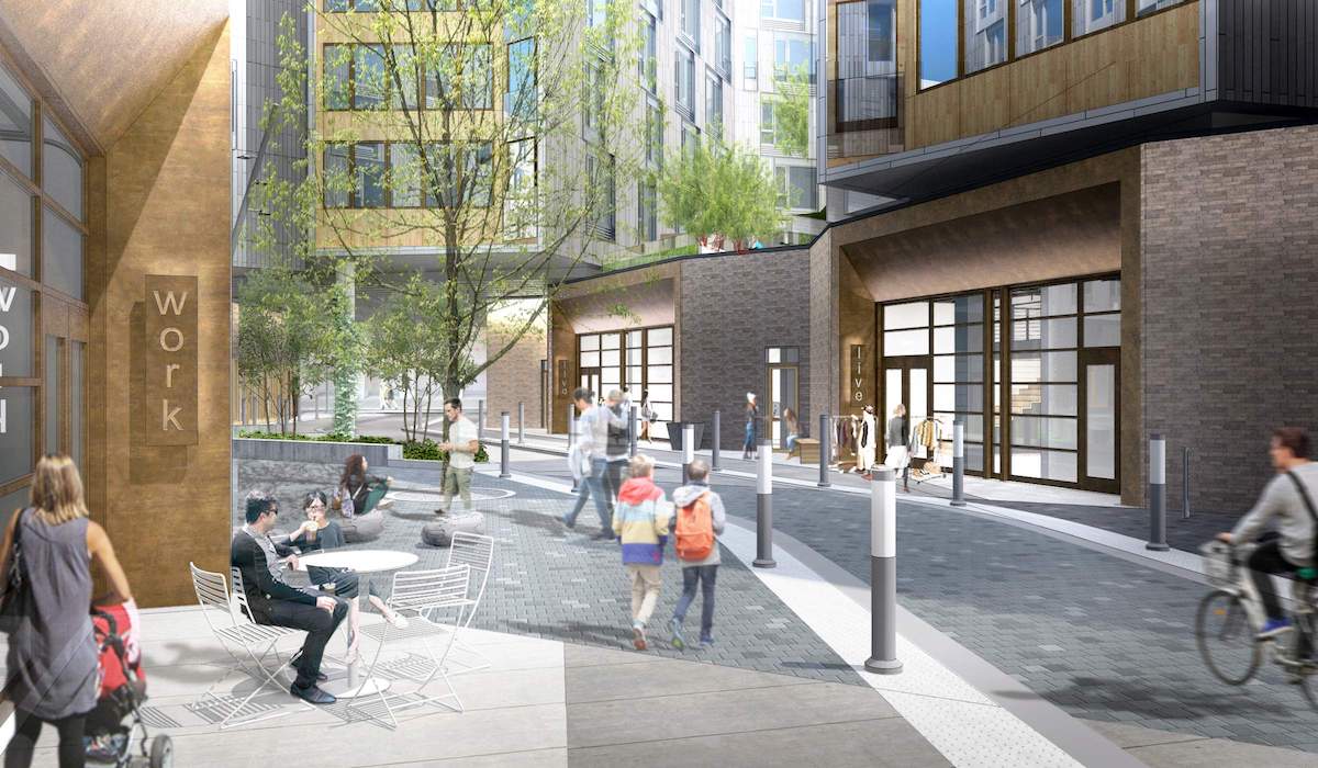
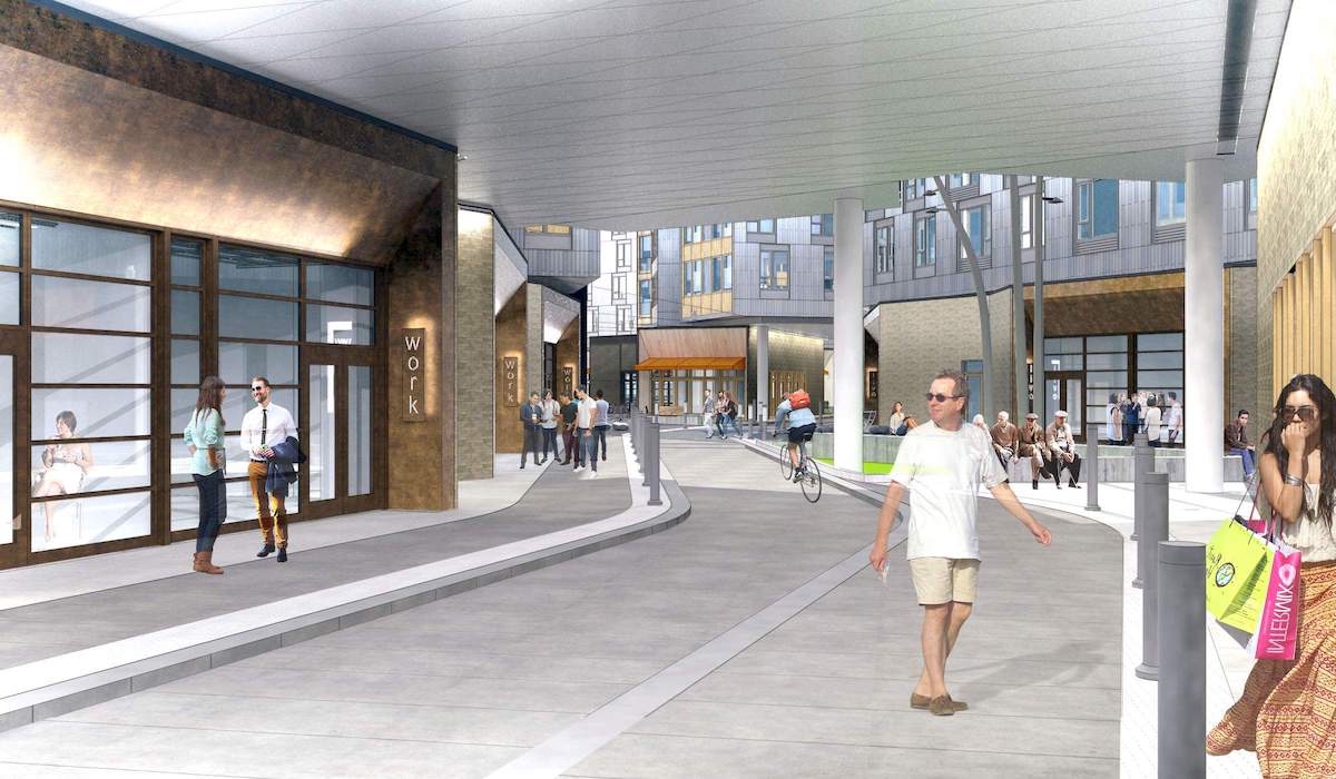
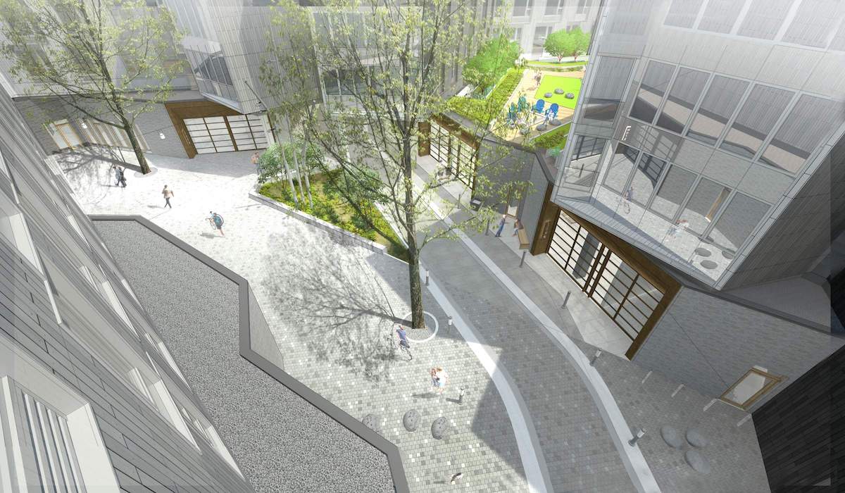
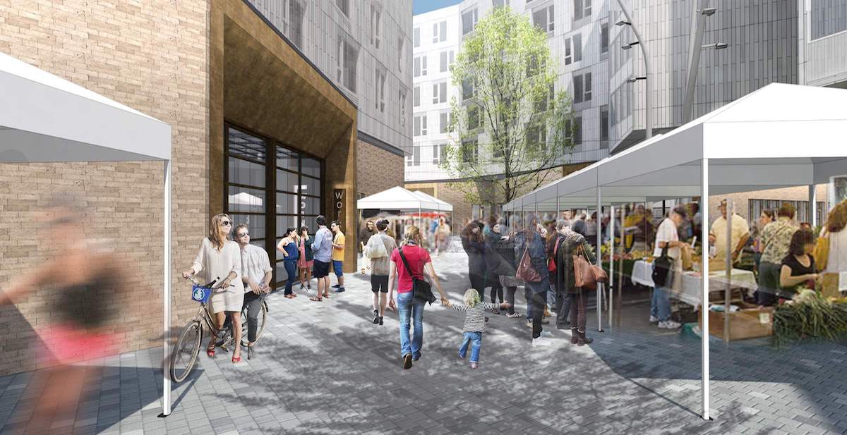
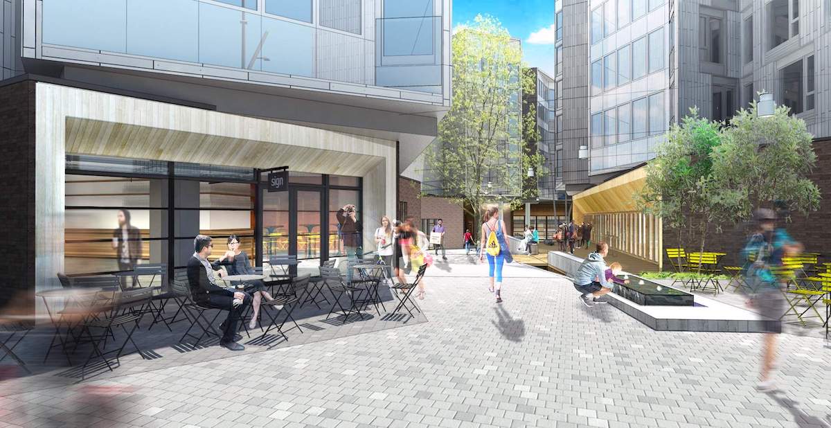
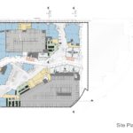
Since the first Design Advice Request hearing, held in July 2015, the project has been arranged with a diagonal pedestrian pathway dividing the site, which would link the MAX stop to the Sullivan’s Gulch neighborhood. Two large sinuous buildings, oriented to the southeast and northwest corners of the site, would be located on either side of the pathway. The architects, working with landscape architecture firm 2.ink Studio, envision a series of distinct moments throughout the development. These include the Park Terrace, the Plaza, a Maker Hub, and the Multnomah Gateway, all of which would be linked by the granite paved pedestrian walkway.
Park Terrace
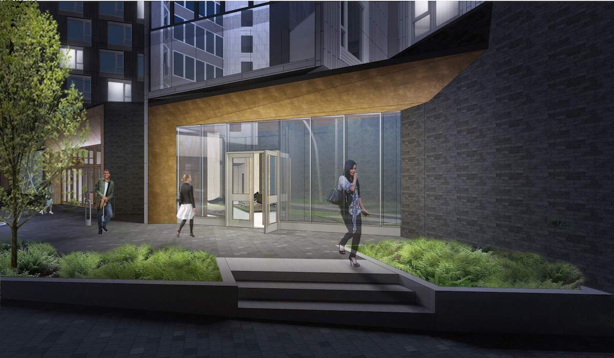
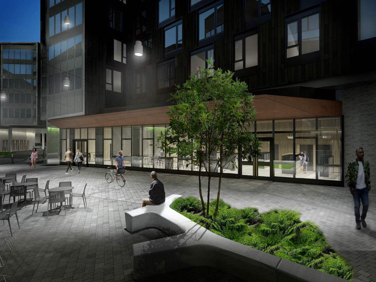
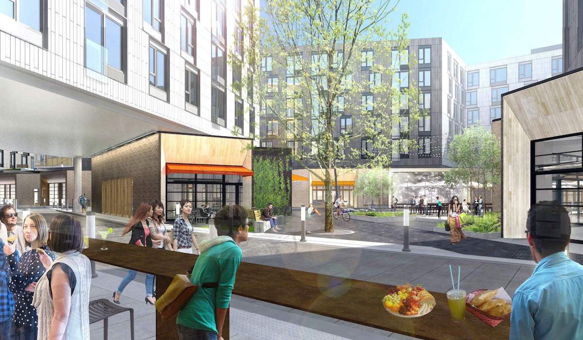
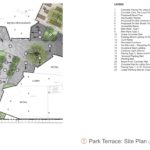
The Park Terrace, fronting onto NE 13th Ave, would be the first space encountered when approaching the development from the MAX. The terrace would be activated by retail spaces, micro restaurants and a secondary entry into the southeast building.
Plaza
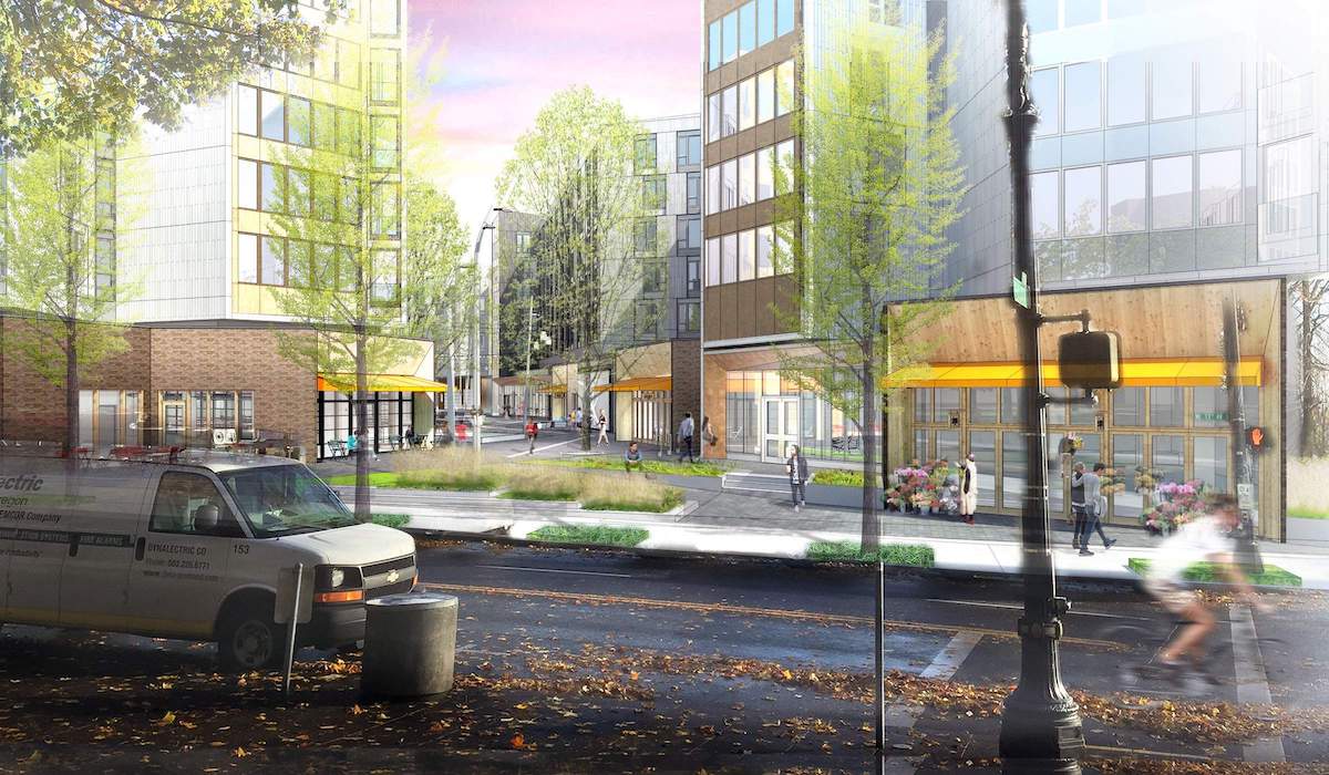
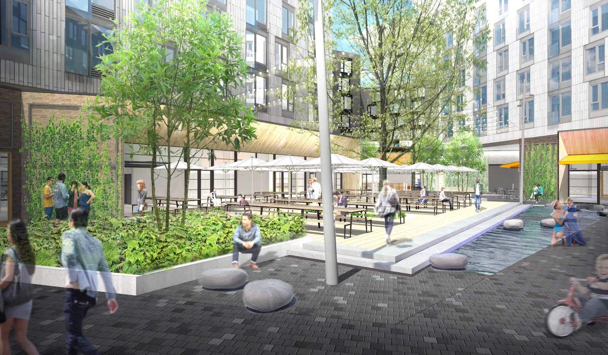
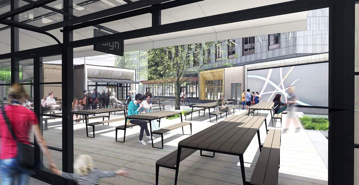
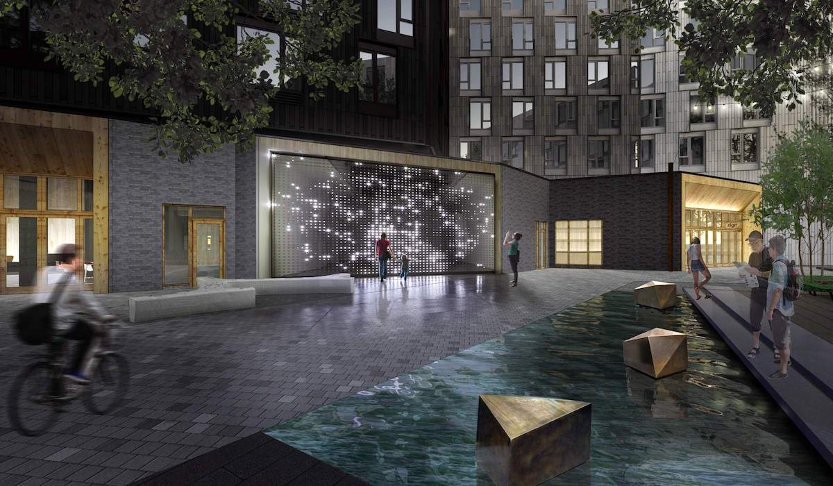
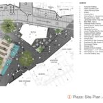
Located at the intersection of the pedestrian way and a private drive aligned with NE Hassalo St, the Plaza would include picnic table style seating for the micro restaurants, a “digital art wall” and a walkable water feature. The main lobby and entry to the southeast building will be located at the plaza.
Podium and Roof Gardens
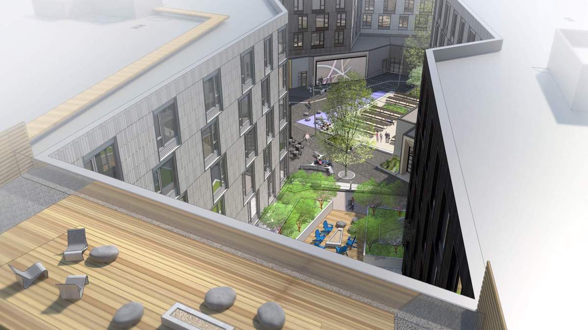
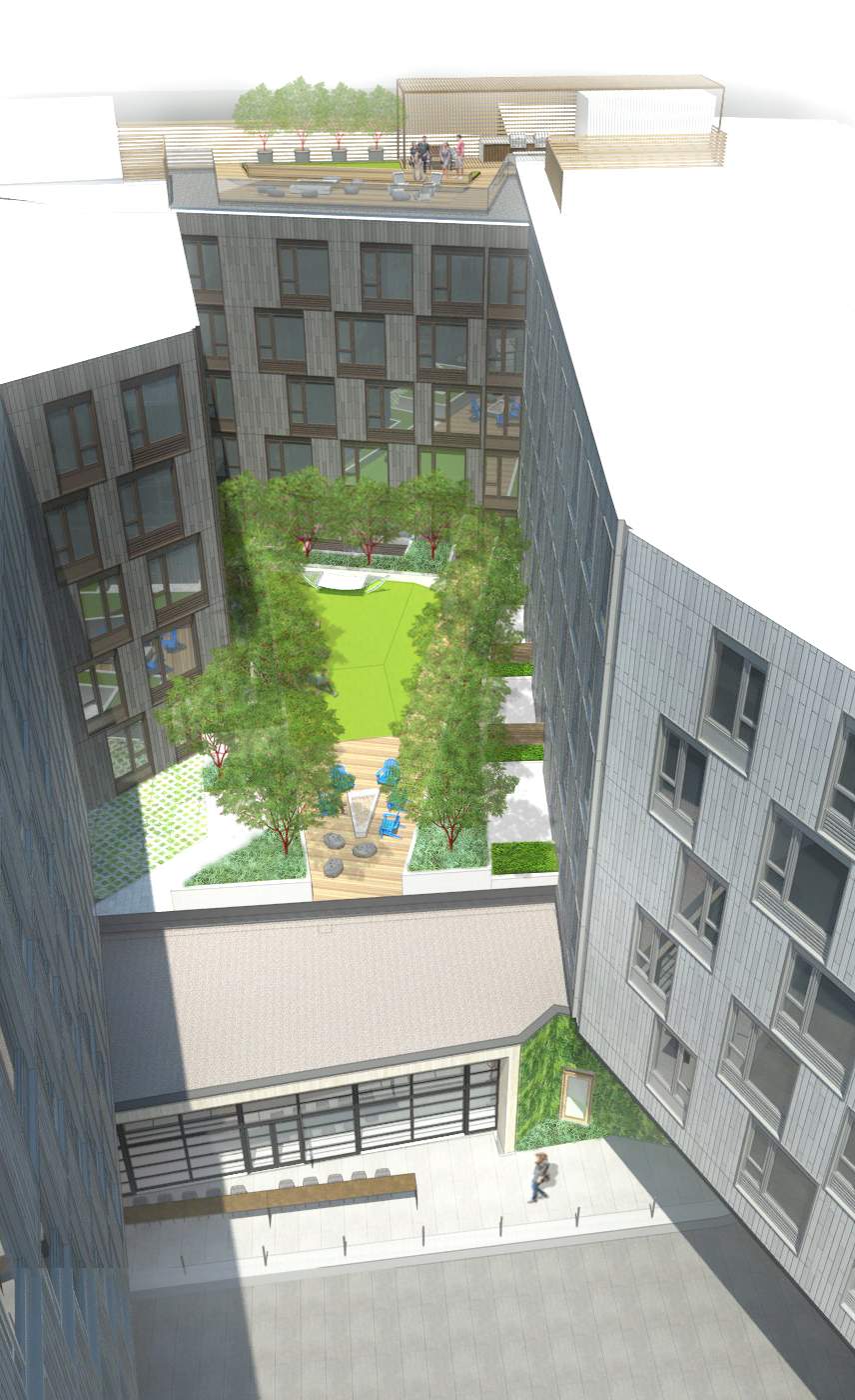
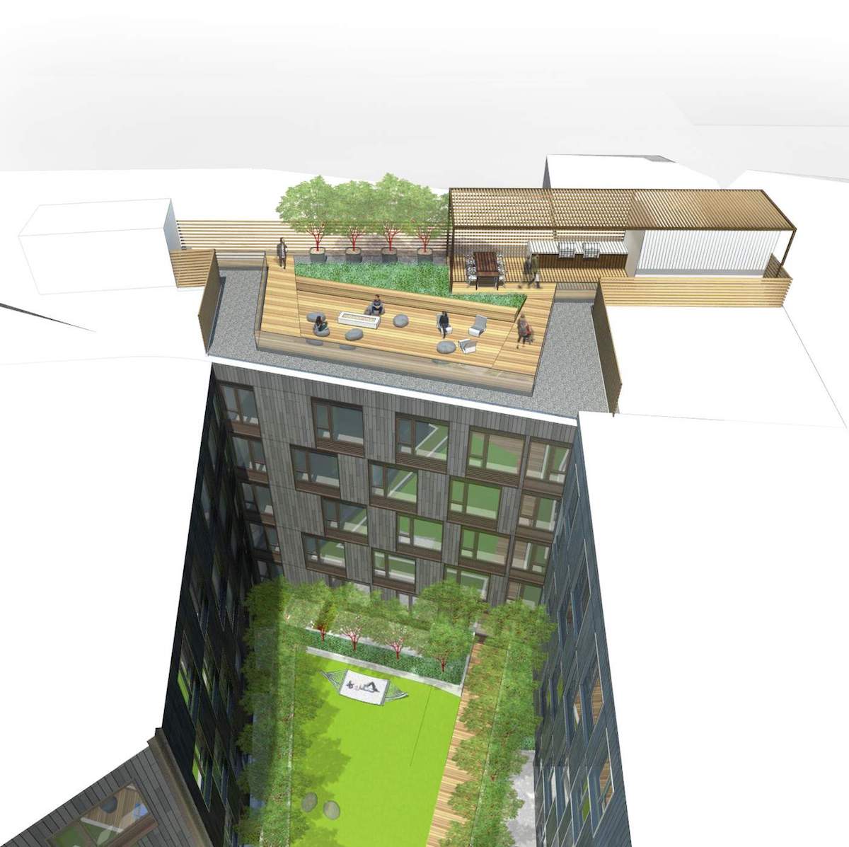
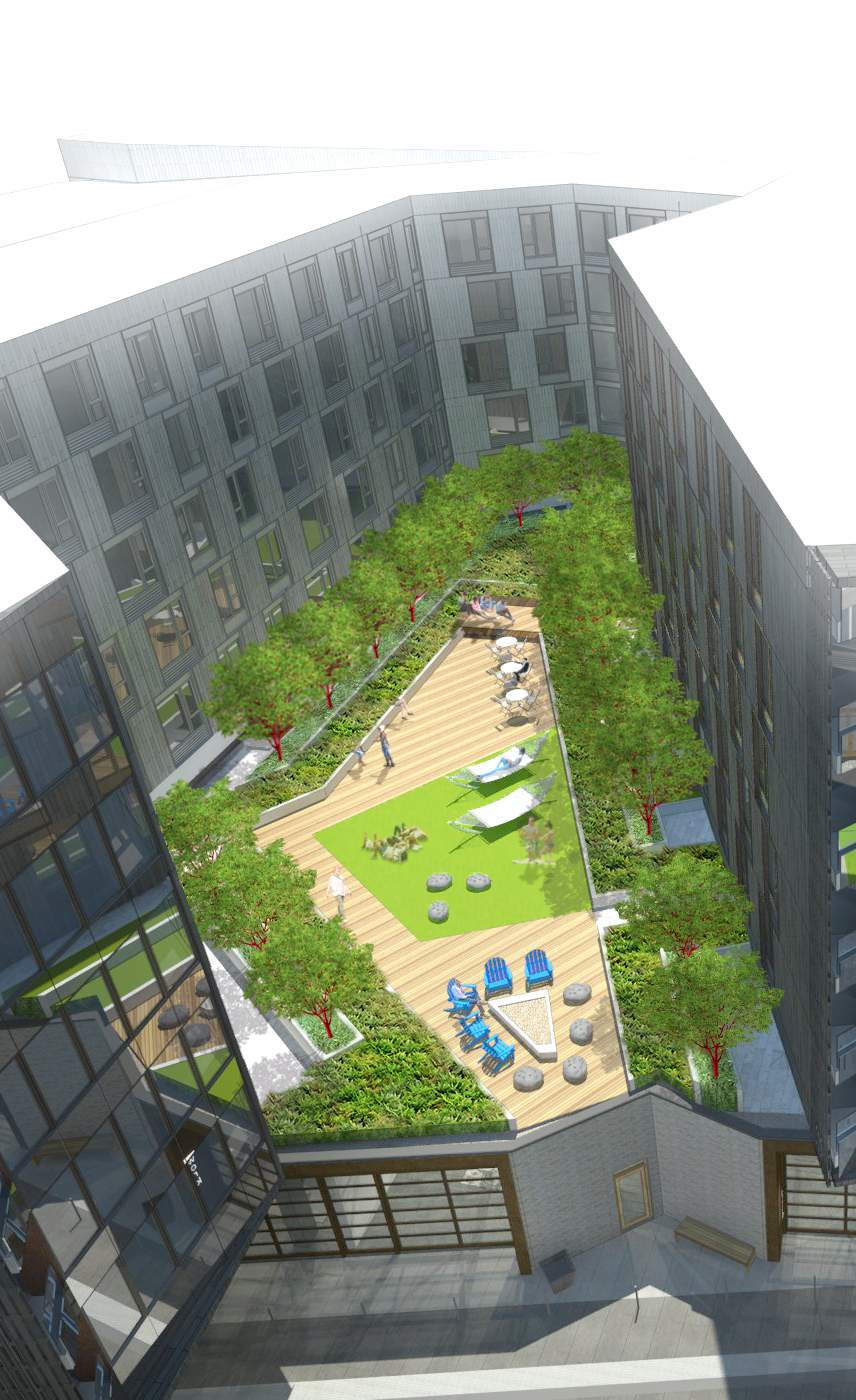
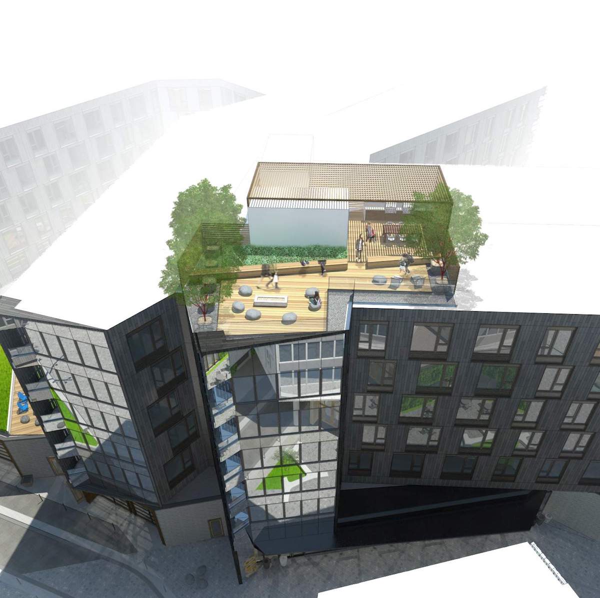
Where the building forms create courtyards on top of the level 1 podium, roof gardens will be provided for the use of the residents. Roof terraces are also provided on portions of the roof above the 6th floor, on both buildings.
Maker Hub
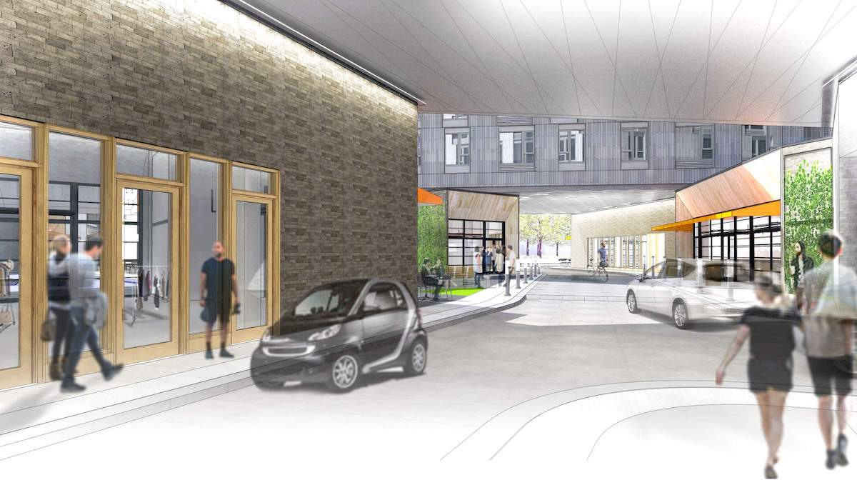
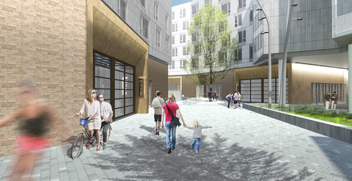
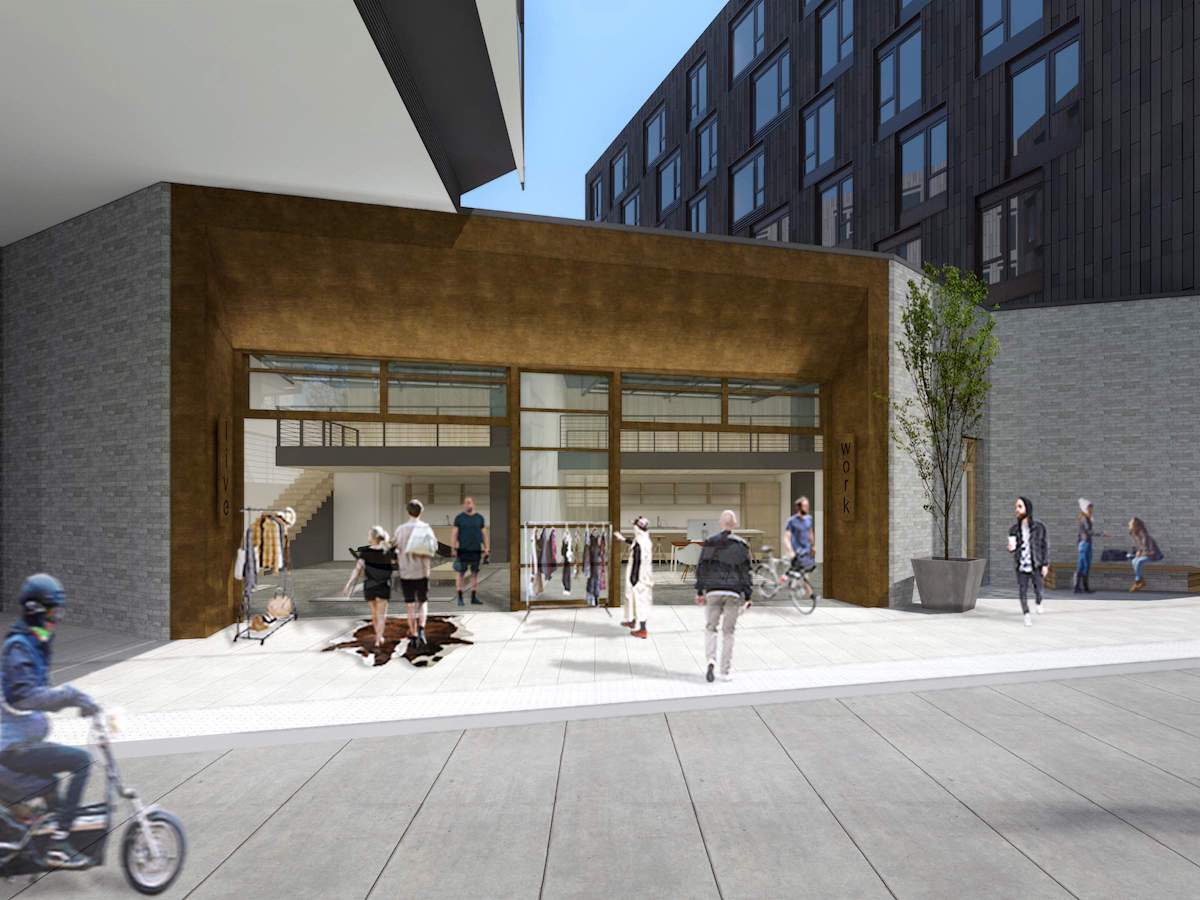
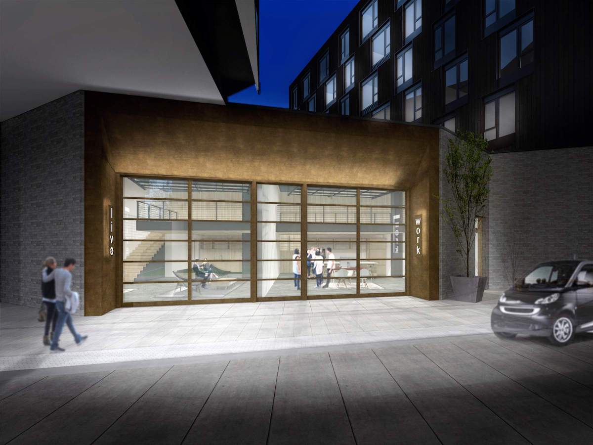
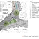
The Maker Hub would be located adjacent to a series of live/work units, which will have large roll up style garage doors facing the pedestrian walk.
Multnomah Gateway
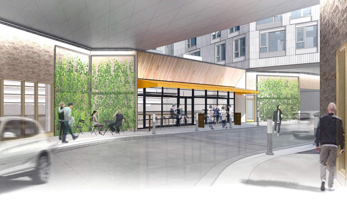
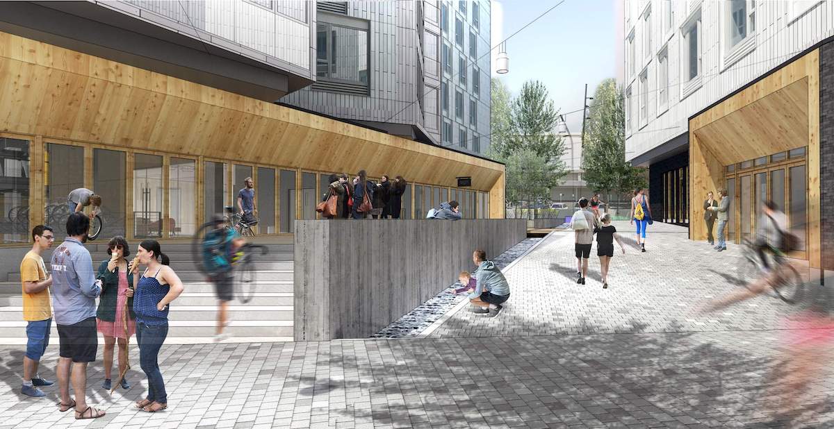
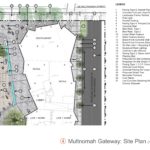
The pedestrian pathway ends at the Multnomah Gateway, near the intersection of NE Multnomah and NE 15th Ave. Retail spaces will flank the termination of the pathway, with movable seating provided between the sidewalk and the commercial spaces. The Gateway will also include a linear water feature.
Street Frontages
Both NE Multnomah and NE 13th will have nearly continuous retail along the block faces. The main entry to the northwest building will face NE Multnomah St. A green wall is proposed at the ground level facing the MAX tracks.
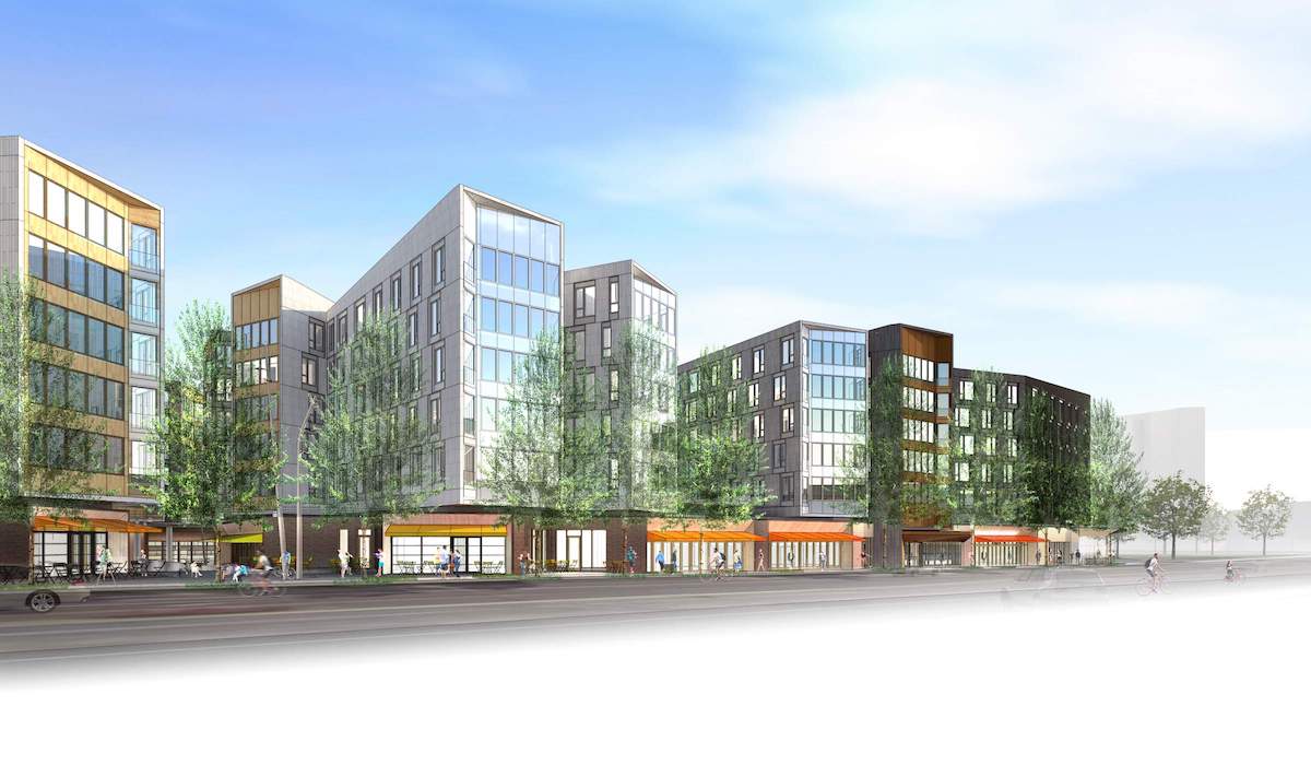
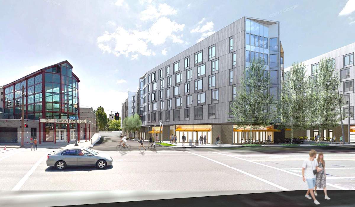
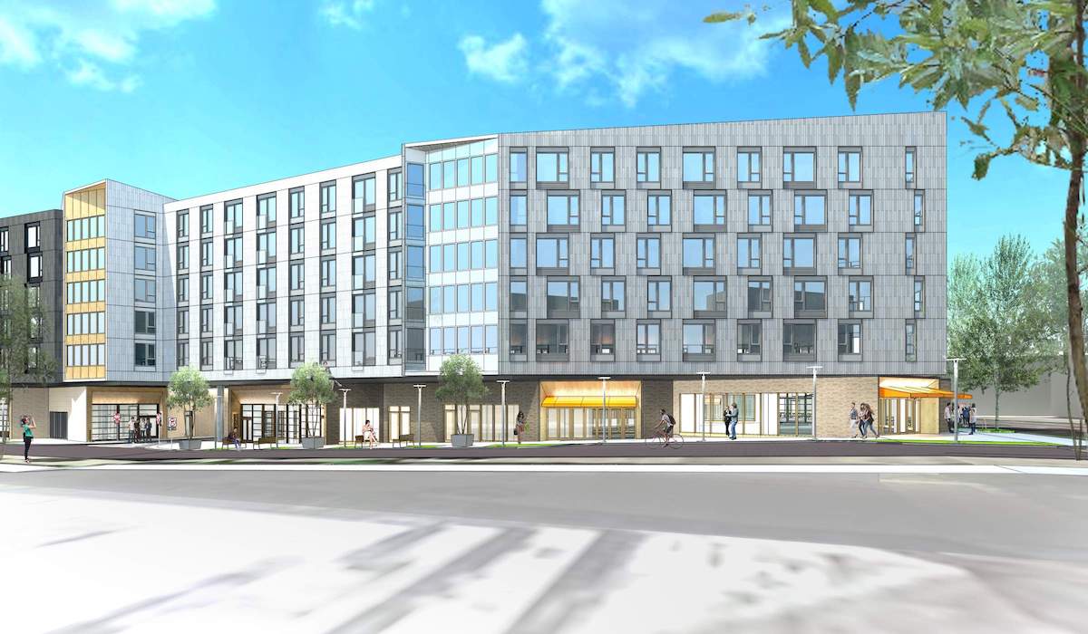
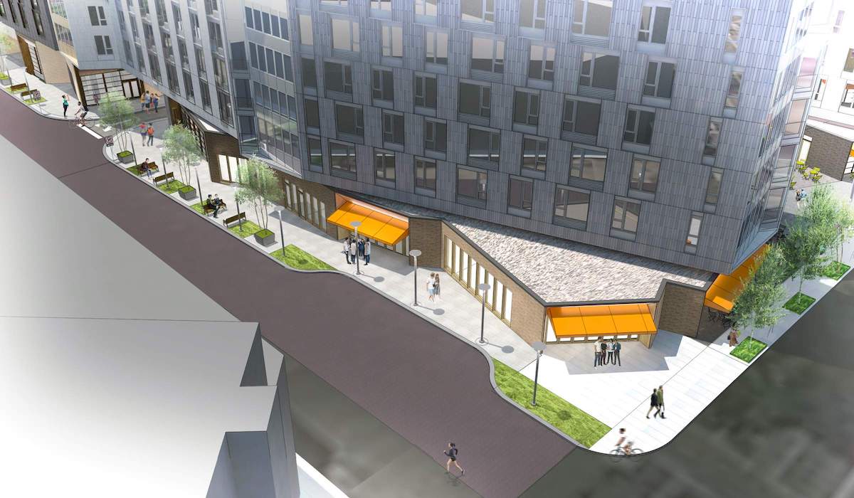
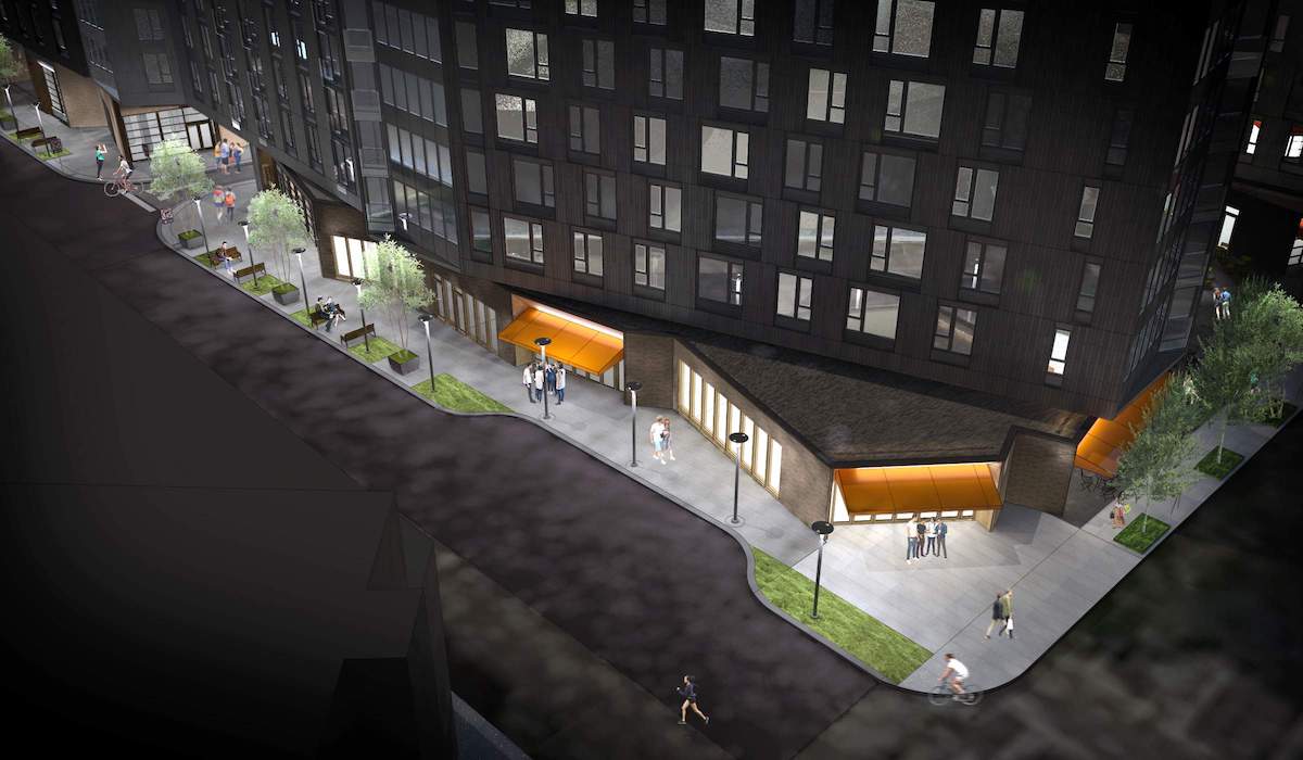
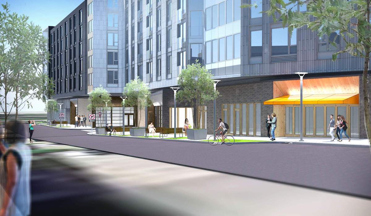
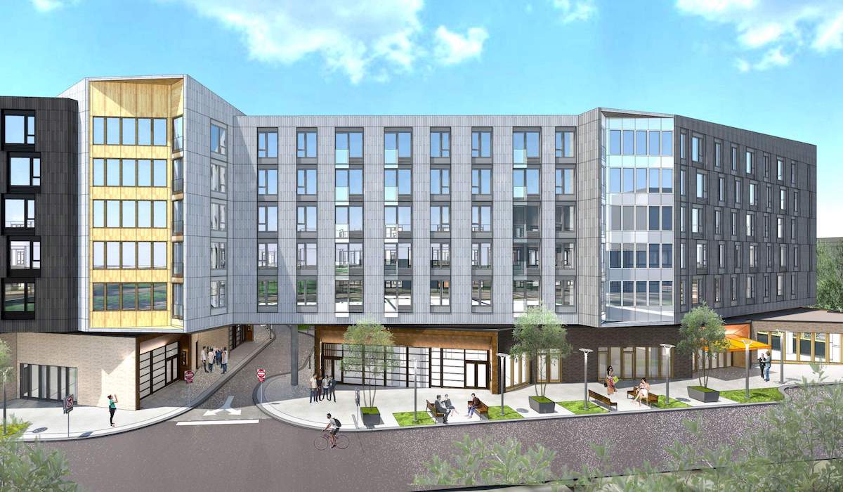
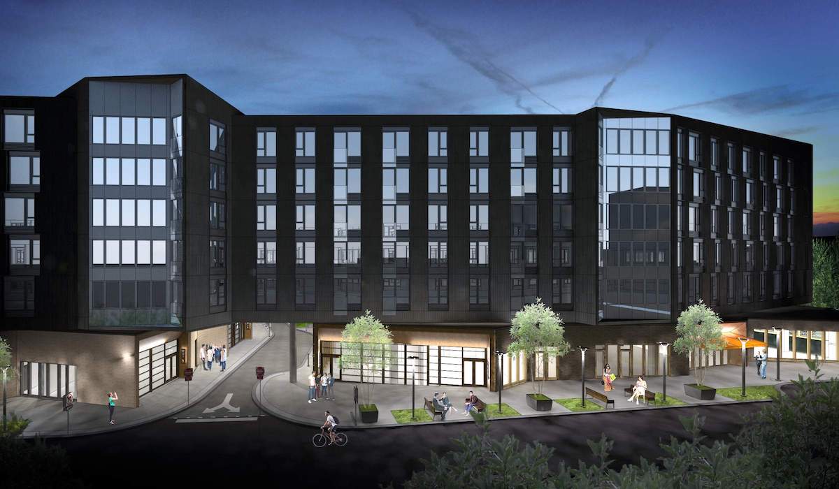
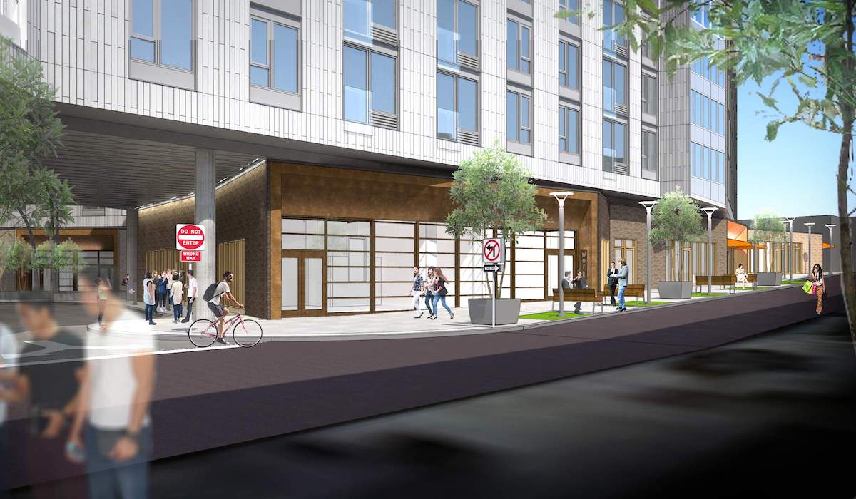
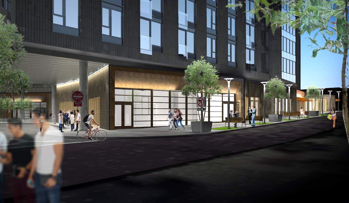
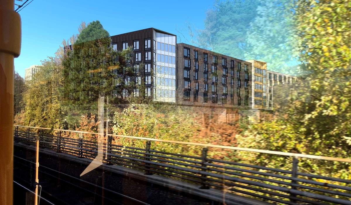
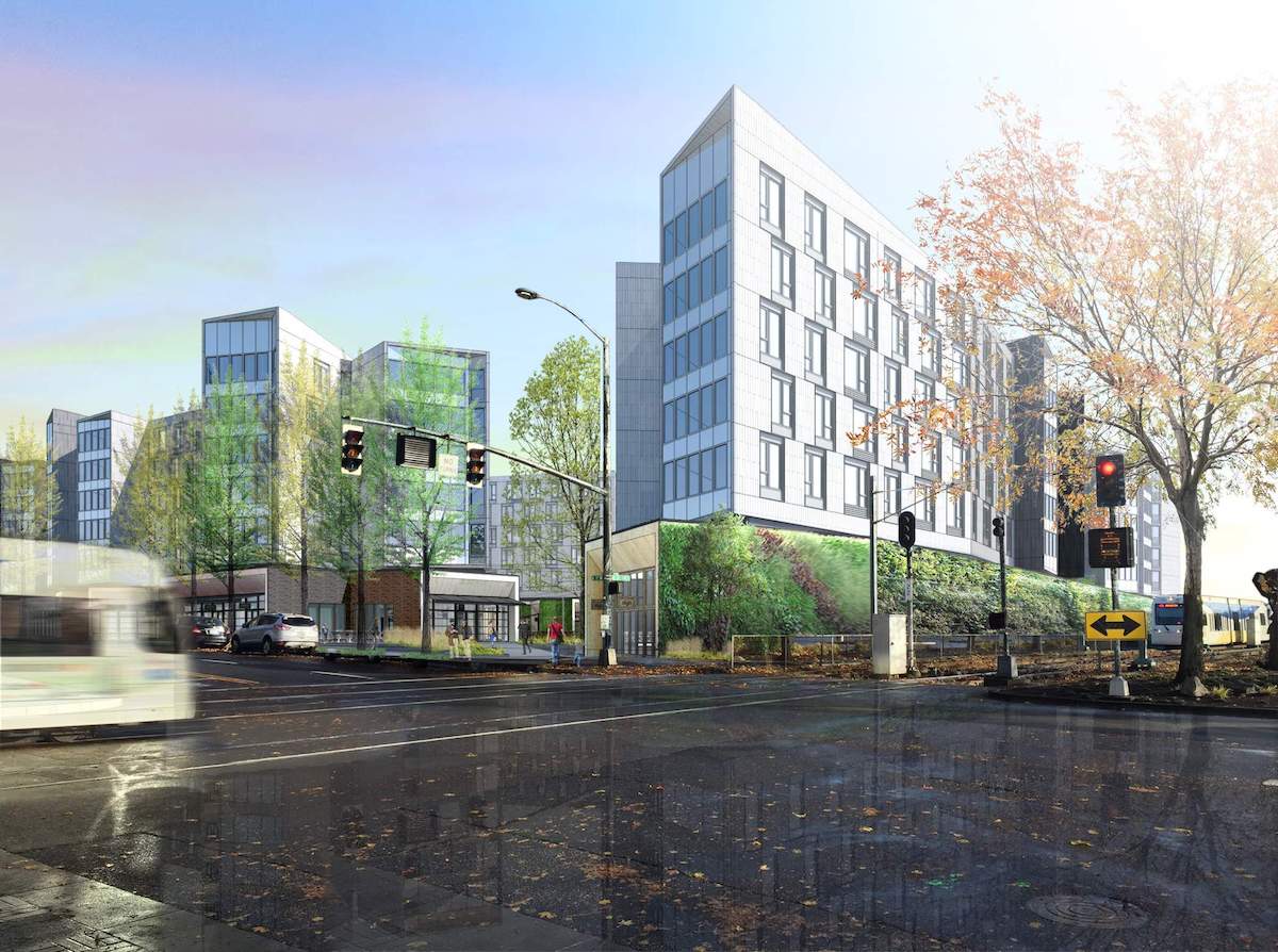
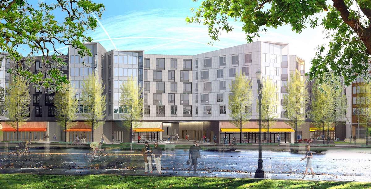
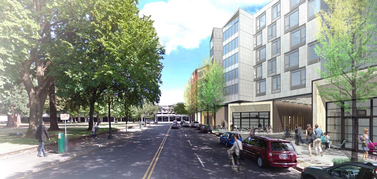
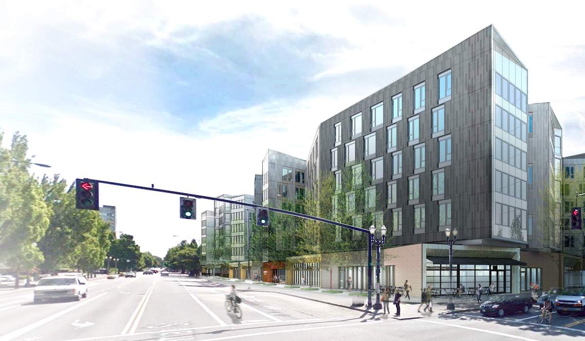
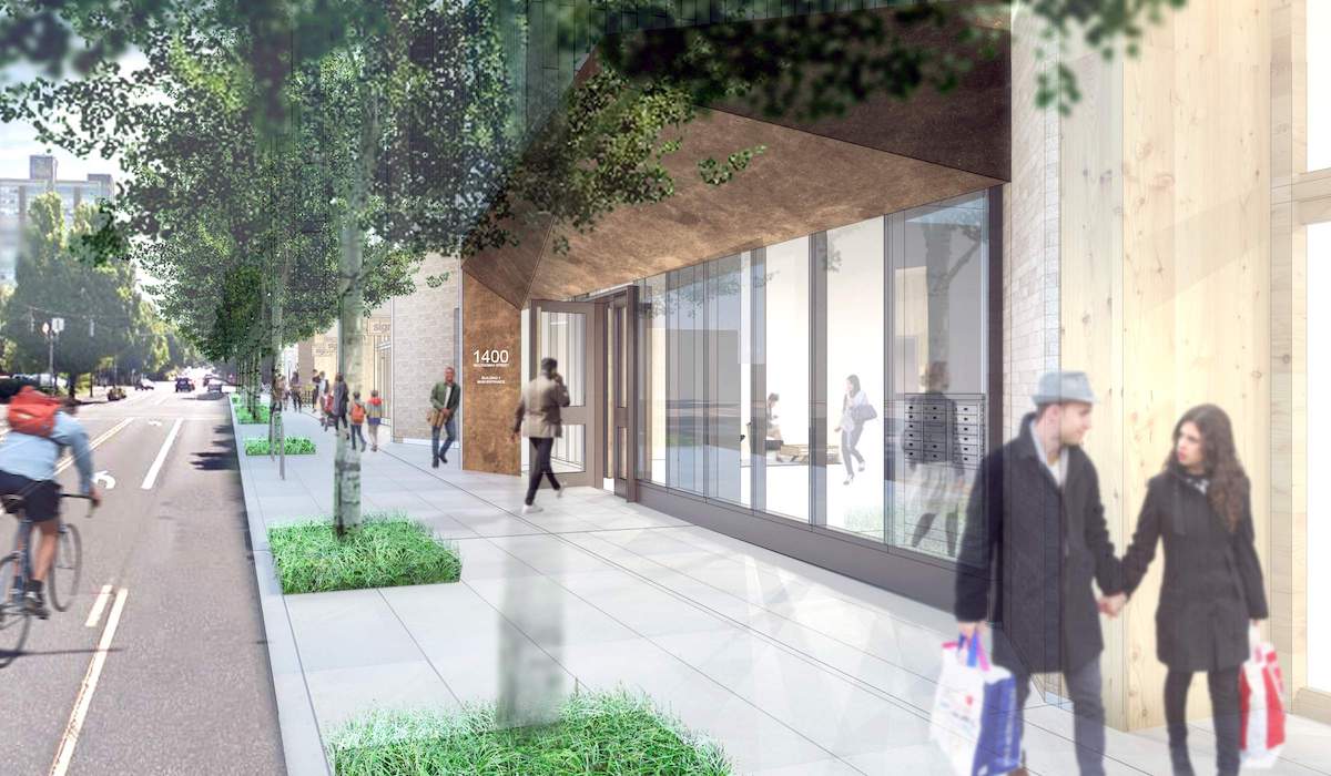
The project went before the Design Commission a total of 6 times: for Design Advice Requests held in July, October and December 2015; and for Design Review hearings held in June, August and September 2016. Changes made since the first Design Review include: the introduction Juliette balconies at the residential units; the introduction pre-weathered steel to mark the residential entries; the introduction of awnings at many of the retail storefronts; changes in materials at the splayed ends to demarcate the site portals; and revisions to the storefront bay at the northwest corner of the site, so that it returns from NE 13th onto NE Multnomah.
The project was approved by a 4-0 vote of the Design Commission on September 8th, 2016. Before casting her vote, Commissioner Livingston—who had been a consistent supporter of the design approach—summed up her feelings about the project:
The project complies with the Design Guidelines very well. I think the modifications that have been made over time are great. It’s a really creative response to a superblock site. I appreciate the fact that it’s not four independent structures, gridded at the four corners of the superblock. The fact that Oregon Square’s public space has been downsized, I think lends this project with its proximity to Holladay Park and the pedestrian path through this site really great opportunities to be one of the more successful urban spaces on the east side of Portland.
The Final Findings And Decision By The Design Commission [PDF] concluded with a similar thought, noting that the project will “transform nearly 5 acres devoted to vehicles into a pedestrian-focused development” and “provide architectural diversity to the eastern edge of the Lloyd District.”
Building permits are currently under review for the project.
Drawings
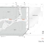
- Plan – Site
- Plan – Site (enlarged Park Terrace)
- Plan – Site (enlarged Plza)
- Plan – Site (enlarged Maker Hub)
- Plan – Site (enlarged Multnomah Gateway)
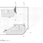
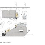
- Plan – Basement
- Plan – Level 01
- Plan – Mezzanine
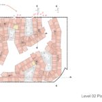
- Plan – Level 02
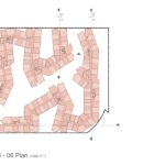
- Plan – Levels 03 to 06
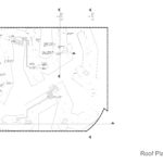
- Plan – Roof
- Elevations – North and West
- Elevations – South and East
- Elevation – Enlarged – North
- Elevation – Enlarged – North
- Elevation – Enlarged – West
- Elevation – Enlarged – West
- Elevation – Enlarged – South
- Elevation – Enlarged – South
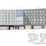
- Elevation – Enlarged – East
- Elevation – Enlarged – East
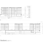
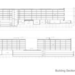
- Section
- Section
Architecture from . . . . .
Portland is doomed to become a city of faceless canyons of dark metal, built around non-functional micro plazas that block out all relationships with natural light and nature.
Portland Native.
And everyone in the early 1900s complained that bungalos were ruining the look of the city as cheapening neighborhoods. In 80 years people will be complaining that we’re tearing down the historical Lloyd Center architecture that was so signature 2010s. Architecture styles and cities change, stop complaining that we’re turning a parking lot into usable space and housing.
What is so nice and charming about upscale urban living in any city in how Architecture relates to it surroundings.
If I recall there is a park to the east of this with views of Downtown and the West hills, to the east Mt. Hood. Would it be asking too much to require a balconies on those units that would connect the tenants to the Park and vista’s to the east and west!
Stay at any apartment or flat in Paris, London or SF and the connection to the street below with a simple balcony works wonders for vitality of the urban experience.
If this development has any, I must have overlooked them.
Portland Native.
I agree with you ; these so called livable units are built up cheap, aggressive, and pack as much people as possible into them, with very little ‘living’ space. NO balconies either. Granted they look nice, but it would be nice if they had balconies. The Fontaine, down the street still looks better than any of these new units going up.
Yes, somebody please preserve the charm and quaintness of the endangered surface parking lot!
My rough count from Google maps is about 620 spaces on the site currently, so that means nearly 100 fewer spaces, and I would guess the 430 residential spaces will be much less trafficky (that’s a technical term, btw) than the existing spaces are, especially if this attracts people who work in Lloyd/downtown and walk or MAX to work.
And we’re trading the two uncontrolled midblock curb cuts on Multnomah for one signalized intersection at the private drive (which will, until the cinema is redeveloped, at least, only have entering traffic since the internal drive is one-way). That should be a net win for those of us who walk and bike on Multnomah to/from Sullivan’s Gulch and points beyond.
I am curious as to how the bus stop will be relocated at the northwest corner. Ideally, this would be an opportunity to implement a floating bus stop that eliminates the bus/bike conflict and the need for the bus to merge back into traffic, but… we’ll see.
Nice to know Portland is keeping with the new architectural design of boring and old before it’s even built. No variation in heights, facades, and claustrophobic common spaces. I’m sure the development will minimize costs and maximize rents. I was hoping a lot of this size would offer something exciting the city could be boast about. I’ve already forgot about it writing this comment.
Let’s try to show a little respect here. As a designer it can be really disheartening to look at this blog and see people flippantly disregarding months of hard work because they perceive a building’s design as boring and not to their personal taste. I actually think the outdoor common spaces feel really good. Also, variation in building height probably required a much more expensive structure and would make the apartments completely unaffordable. Kudos to the developers for wanting to do something different here.
I think most people can appreciate this design. I think it’s different and very exciting. There are always some old (and sometimes young) curmudgeons that hate change, no matter what form it takes, and will take every opportunity to voice their opinion and attempt to elevate it by signing “Portland Native” or whatever.
Change is a good thing. It’s the quality of change and is that change reflective of what we expect as a regional progressive community.
Just a few blocks west of here you have Hassalo on Eighth (657 Apts). On site 100% Waste Water management, On site Organic recycling management, various building heights and a variety of facade materials, balconies with wonderful views of Downtown and Mt. Hood. It over 90% leased.
Maybe this project has one or more of those before mentioned items and I have just overlooked them . . . .
Portland Native.
If it’s a series of mixed-use 6-story buildings with ground-floor commercial with no surface parking lots – which it is — it’s better than what’s currently there, a parking crater. Not every project will be your favorite. I don’t get why it bothers you so much.
I think this development seems pretty chill af. I like the diagonal walkway, the shops and micro restaurants. I’ll probs not be able to afford to live there, but I’ll still stop by there if the shops are cool.
Indeed this is a challenging program and it’s hard to put your head around it because it’s big and complex. But I have tremendous respect for Holst so I am giving them the benefit of the doubt here. This is unlike anything we’ve seen in Portland and it would never be proposed downtown or in areas where the normal fine-grained grid is present. This site is extremely challenging–a superblock (4 normal blocks) with a huge mall on one side, train tracks, and a park on the other sides. What would one propose for this site? a Tower in a park? Reinstate the grid? Not sure that makes sense given the park across the street and absence of positive space nearby and lack of connections with existing streets and paths. Instead Holst has chosen to create a winding street scene with surprises around the bend in this very unfriendly and unsurprising part of the city. By keeping the construction costs lower for the building they have put more into the public and private community spaces. This should be commended. In a way its attempting to create a micro neighborhood of its own but available to anyone passing through, a path that is human scaled in a neighborhood that has been out of scale for too long. Internal retail and restaurant locations are tough to pull off. I wish them success!
I appreciate the attempt to replicate narrow, non-rectilinear-grid, “European” streets. I hope they will feel public enough to encourage wandering.
I wonder if, with all the in-and-out notching of the west façade, it would be possible to preserve three or four of the row of London Plane Trees along NE 13th. This is one of the few remnants of the once-broad application of these trees to the Lloyd District, before columnar or pyramidal trees took over in the 1990s. There’s not underground garage along 13th, so it seems possible, with some judicious pruning.
I too wish there were some balconies, especially along 13th overlooking the park. But the facades have evolved from earlier drawings, and now have some coherence, and don’t seem as contrived. Perhaps it’s just better renderings.
I agree. It would be nice if mature trees could be integrated into the plans. Obviously it isn’t always possible but too often they are not considered because many planners prefer a clean slate. Odd considering they add character and value to the design. In this case they serve to integrate the development with the park across the street.
The site plan is cool. Better than a parking lot? Absolutely! The facades, however, look cheap and bland. Nothing special about them. Six trips thru the Design Commission, really?
So who is going to rent out this retail space? Just across the street is a very large mall. On the south of the Max line that building has ground floor retail that is ridiculously underused. A few blocks over is Hassalo on Eight with for lease signs on most of it’s retail space still a year after it was completed. The public space at that project is woefully underused. In fact, it’s abandoned. I don’t know that I’ve ever seen anyone, outside of the office lunch hour, sit on those huge benches. All the ground floor townhouses that face the walkways have the blinds pulled 24 /7 and all you ever see are the people walking through the project from the max line. You can build public plazas and micro restaurants, but where are the people who will fill the space?
I have the same questions. I would think it would be a good idea to keep the movie theater, because that will bring some traffic to the retail spaces in this project. Otherwise I am afraid it will struggle to retain tenants.
I agree. It’s great to have all this mixed use space in Portland, but there can’t be that many restaurants, dress shops, and coffee houses to fill all the new apartments with first floor retail.
Just three blocks west of here is a new structure that went up in 2016 – Hassalo on Eighth. It’s already 90% leased. If they build it people will come.
actually, they started renting in July 2015. They still have plenty of empty storefronts and what they have filled includes a mortgage company and an h and r block. Major draws for people to wander….. And then there’s AAT’s next project Oregon Square that they not only cut in two pieces to be built separately, but they are beyond dragging their feet to start building the half they downsized to……
Pingback: Metro Reports: 1380 NE Multnomah, 2320 N Vancouver, 3291 SE 122nd, and more - Portland Design Pup