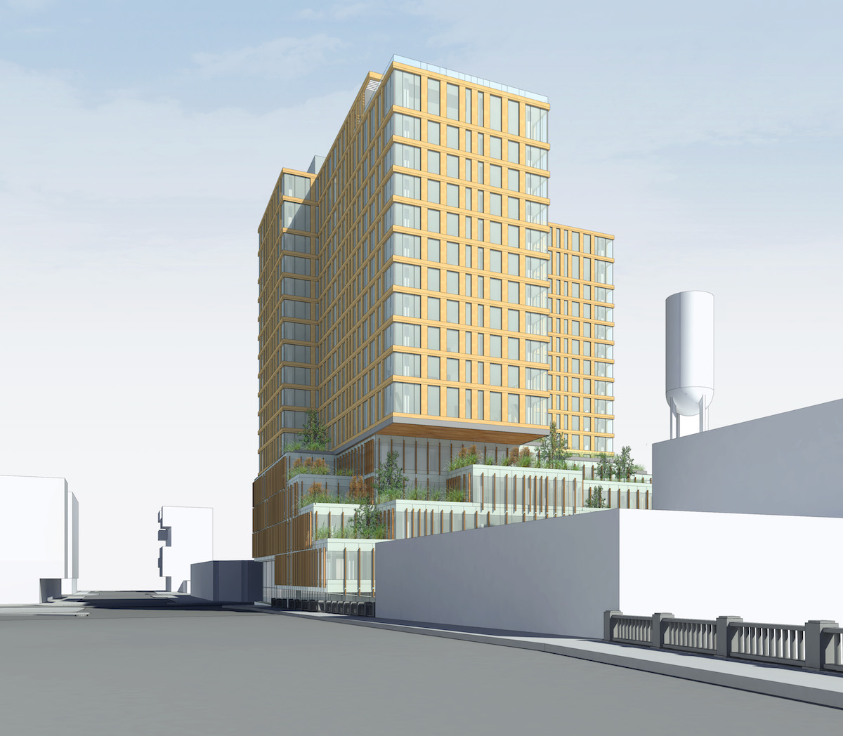
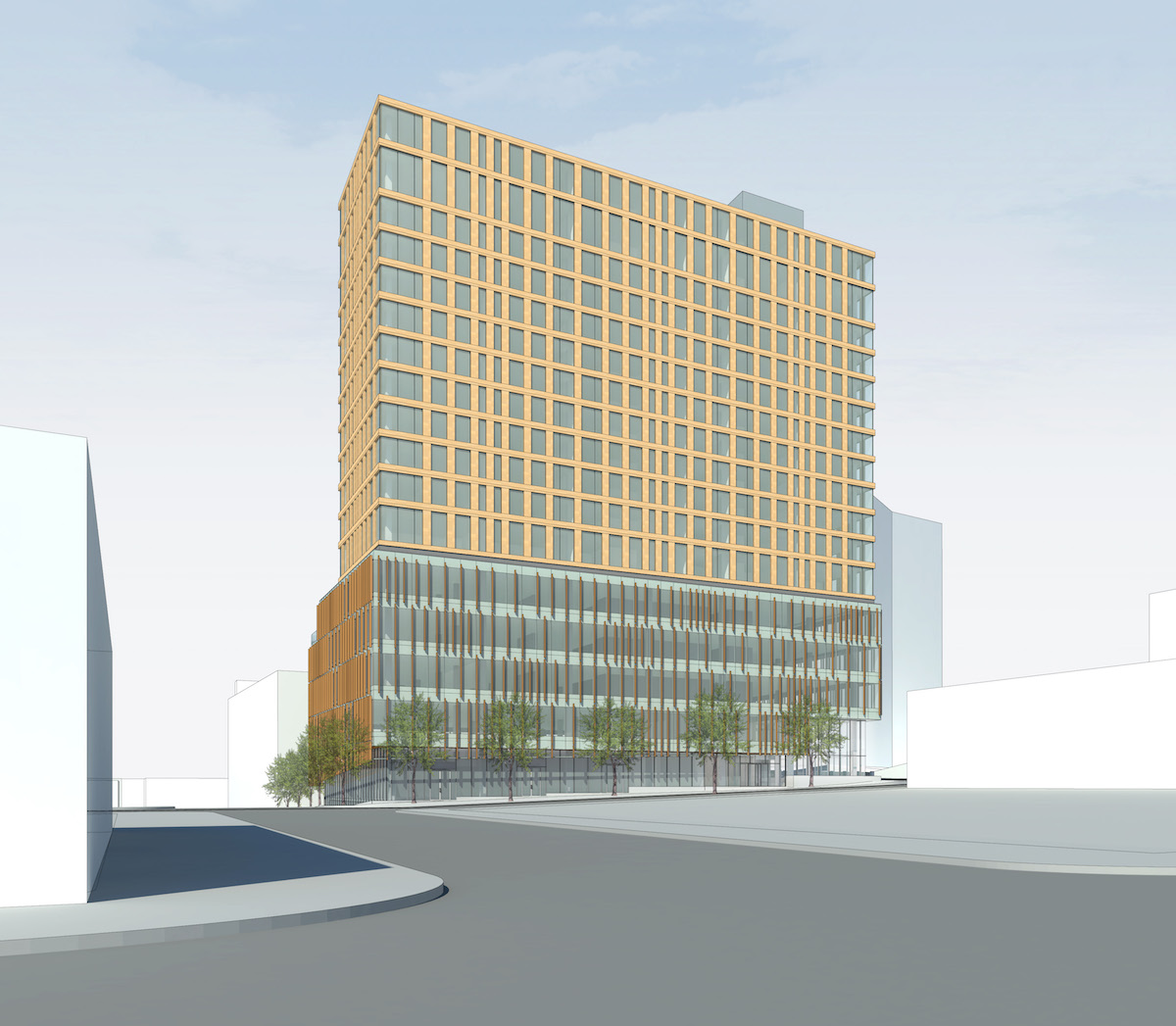
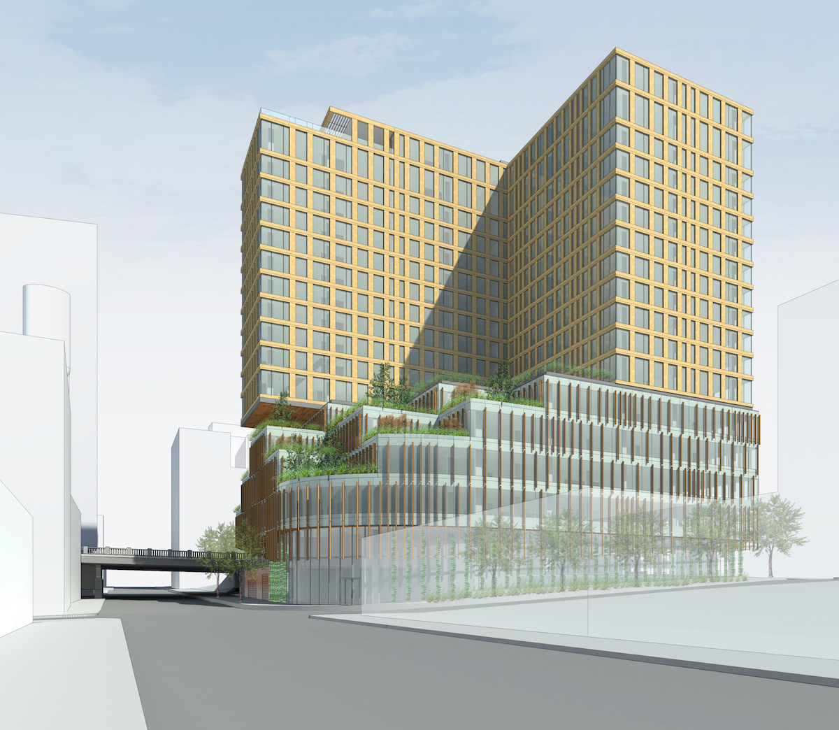
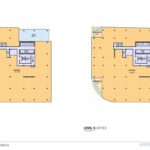
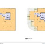
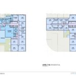
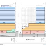
A 17 story tower at the Burnside Bridgehead has gone before the Design Commission to receive Design Advice. The design of 5 MLK is by Chicago based GREC Architects, for Portland based developer Gerding Edlen. The 200′ tall building is arranged as a five story podium, which would contain approximately 100,000 sq ft of office space, 10,000 sq ft of retail space, 160 vehicular parking spaces and a 4,760 sq ft “bike lounge”. Sitting above the podium is a twelve story “T” shaped tower, which would contain approximately 220 residential units. A shared lobby, serving both the residential and office uses, would be located at the corner of E Burnside and SE MLK. A cascading series of landscaped terraces would be located on top of the podium, with landscape design by PLACE.
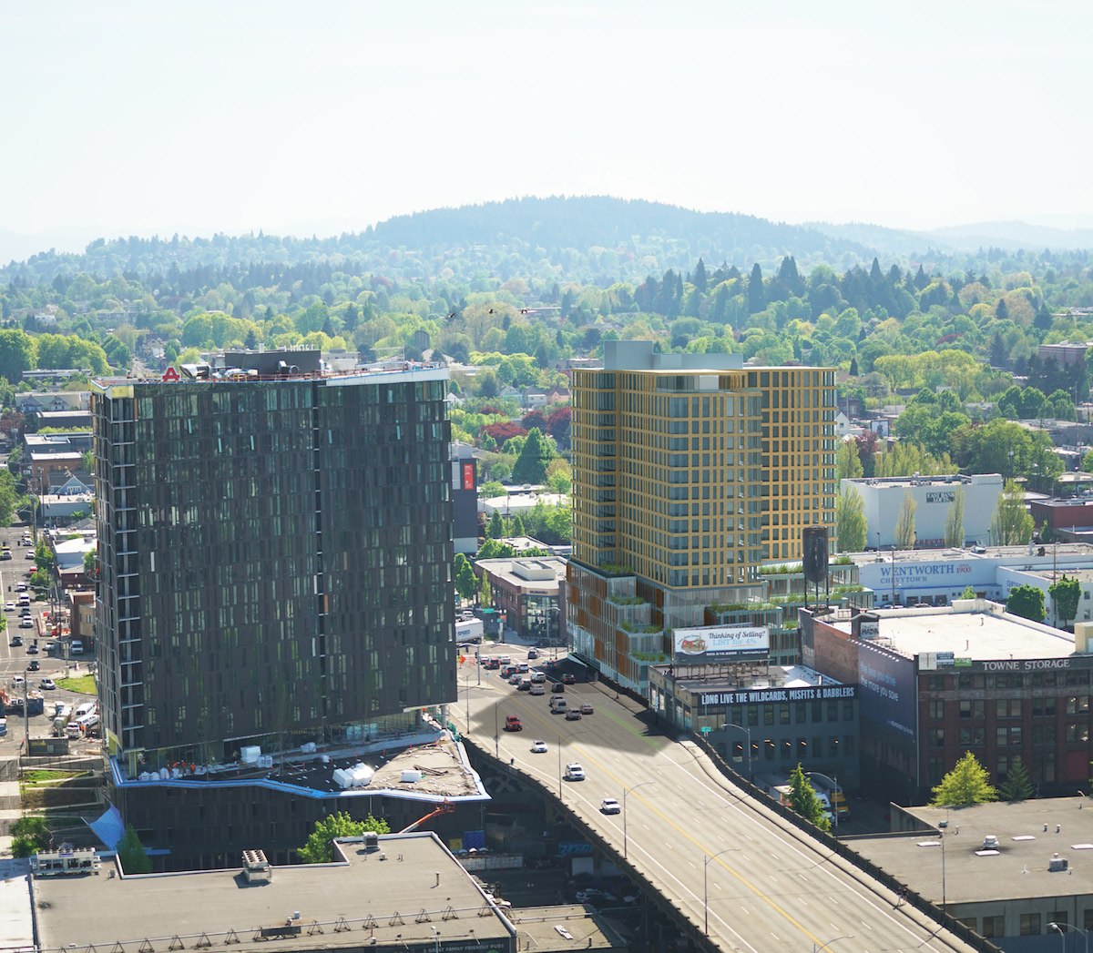
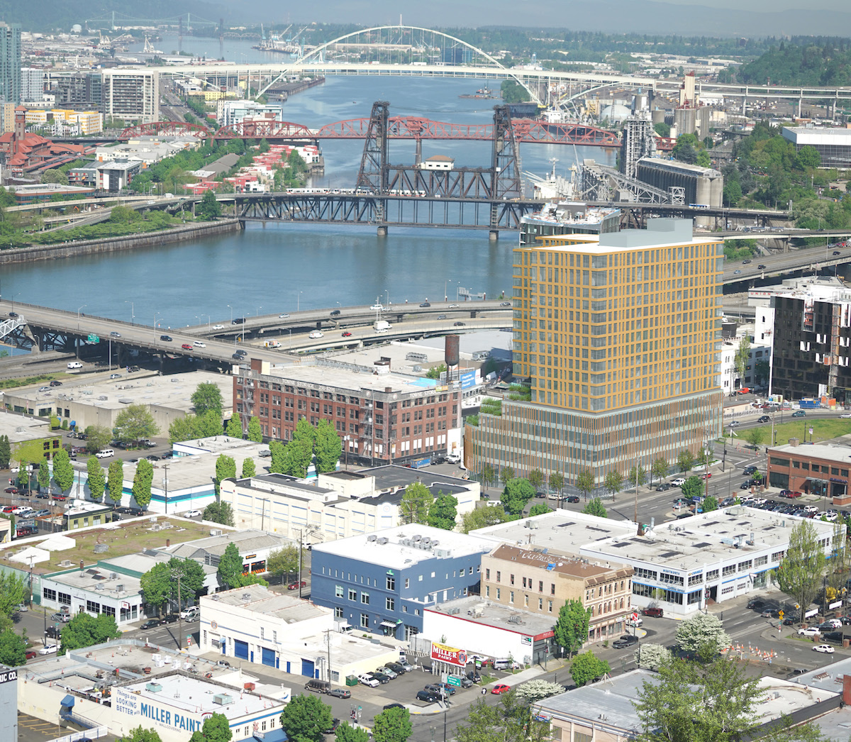
The building will be located at the site that was until recently home to Fishels Furniture. According to a 1988 survey [PDF] the existing quarter block building at 5 SE Martin Luther King Jr Blvd was built circa 1900, to designs by an unknown architect. The building is described as “typical of others of its type which consist of a first floor retail space with offices above”. Other buildings on the same block, also used by Fishels Furniture, are listed on portlandmaps.com as constructed in 1920, 1941 and 1953. Fishels Furniture was founded in 1921, and announced in April 2016 that they would be closing following a liquidation sale.
The surrounding area at the east end of the Burnside Bridge is growing rapidly. Nearby projects under construction include Yard, Slate, 419 E Burnside and the renovation of the Towne Storage Building. Planned buildings in the lower E Burnside area include the Fair Haired Dumbbell, Block 75 Phase II, the Jupiter Hotel Expansion, 710 E Burnside and the Burnside Delta.
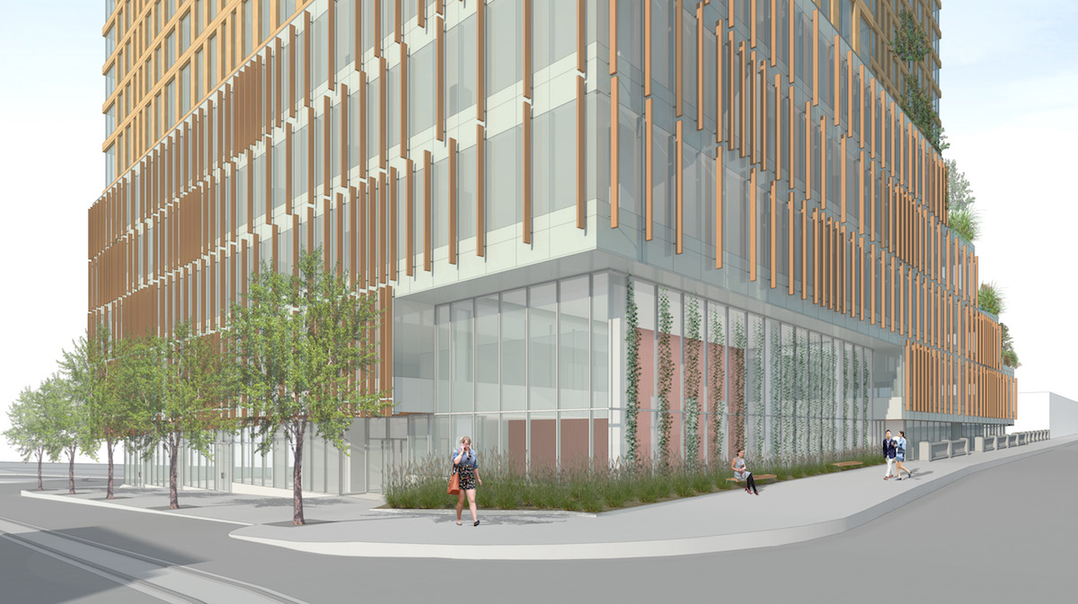
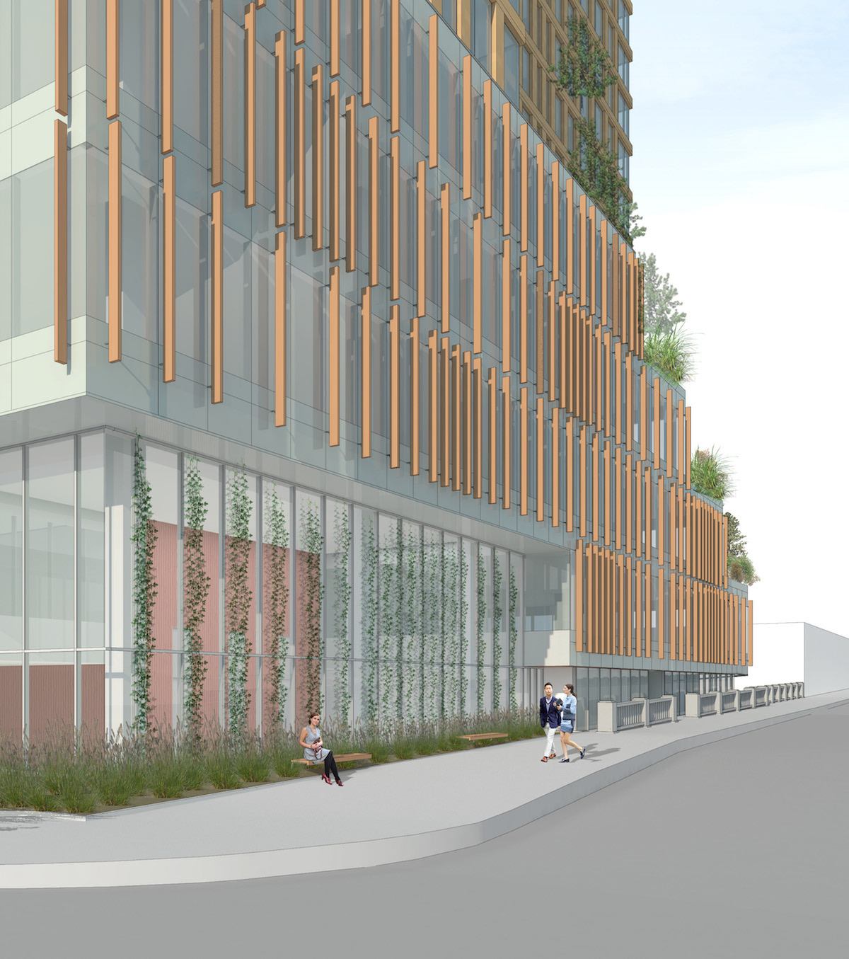
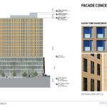
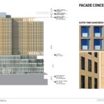
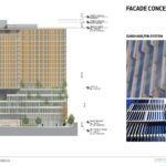
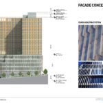
Materials for the building are still to be finalized, however the design advice package indicates that the body of the tower would be clad in an “earth tone” rainscreen panel system, similar to the cementitious panels used on the Casey in the Pearl. At the office podium a sunshade / fin system is proposed over the floor to ceiling glazing.
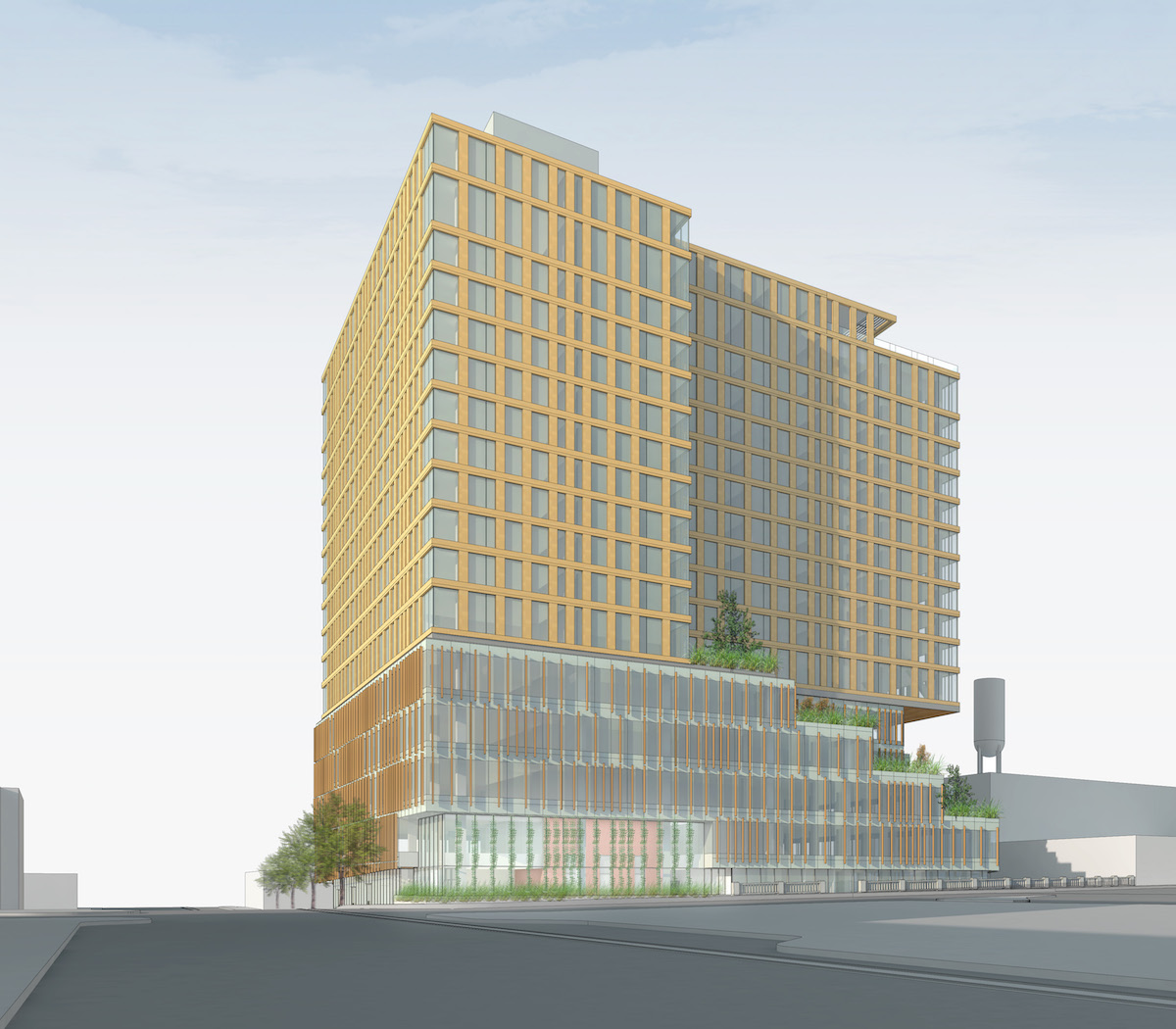
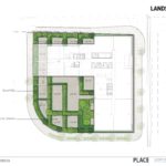
The stepped terraces at the podium roof would be planted with landscaping designed to represent Pacific Northwest landscape typologies: hanging meadows; northwest woodland; riparian forest, and wetlands and rivers. The office floors and levels 3, 4 and 5 would have access to the terraces, as would the residential users at level 6. The 6th level would also contain amenity spaces for the use of both office and residential tenants, including a lounge, fitness room, yoga room and dog play area.
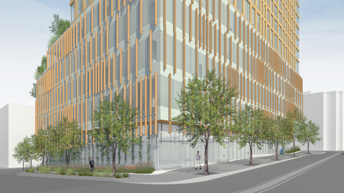
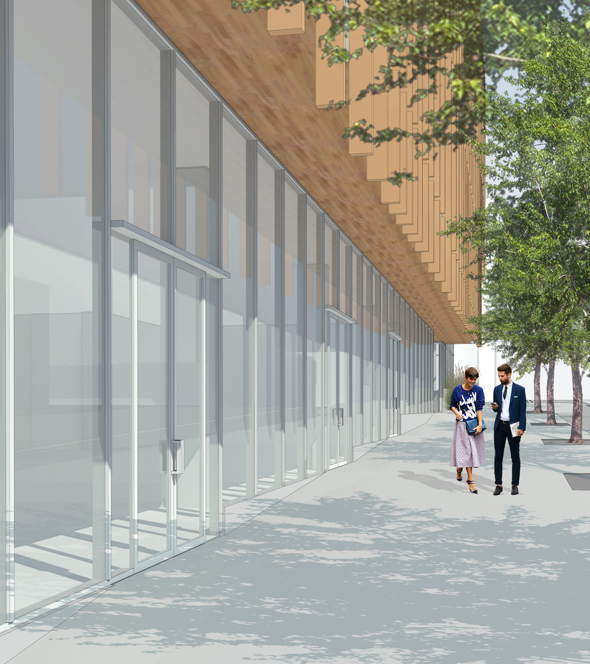
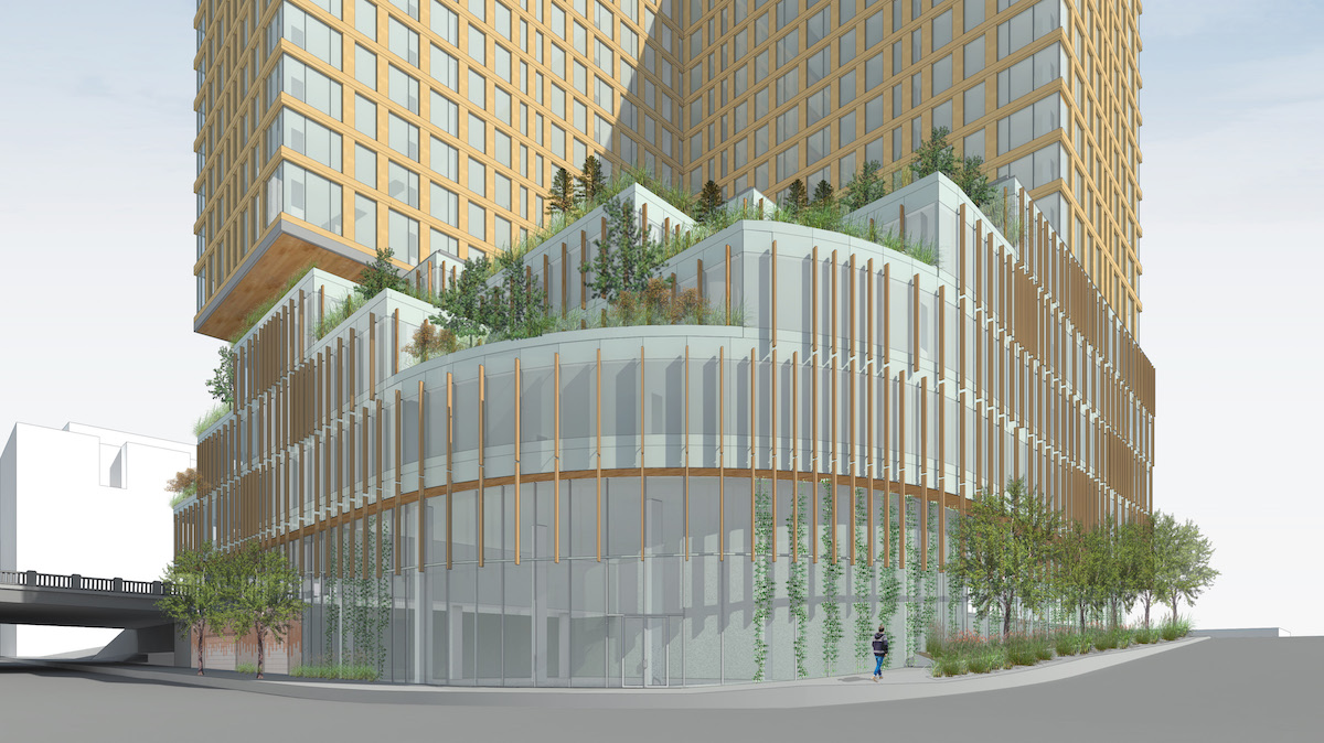
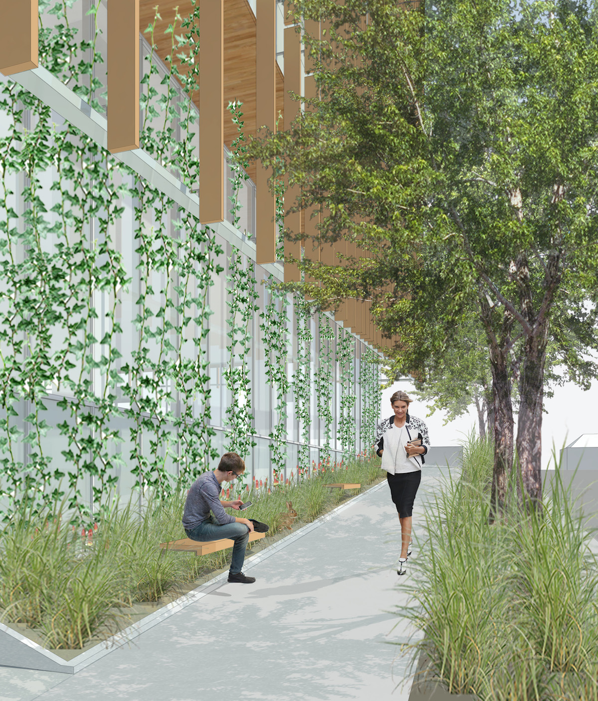
A memo [PDF] to the Design Commission, published before the July 21st advisory hearing, outlined potential areas for discussion, including the concept and massing, as well the ground floor programming. By far the largest area of conversation related to the scale and massing. During the hearing Commissioner Livingston offered her thoughts on the building’s base:
As I was reviewing the package, I really struggled with the massing, because it’s difficult to understand the scale of the building. Given the bulk and girth of the base of the building I would expect the tower to be significantly taller than it is. So I think that the overall massing parti is kind of hampered by the height restriction and the FAR restriction on this site. The base is just very massive. Especially when seen from the southwest, and when seen when you’re traveling south on MLK. The mass of that base is not helping the tower to be elegant.
Later in the hearing Commissioner Wark summed up his feelings on what would need to change in the massing:
For me there’s three things that have to happen: unification [of the podium and tower expression], simplification and moving the mass of the tower to the south. I don’t know what that dimension is, but it can’t be 200′ north-south, to me. It’s just too much of a repeat of what’s across the street. There needs to be some kind of breathing room to Burnside, in my opinion.
The applicants are expected to return for a second Design Advice Request hearing before submitting for the Type III Design Review that will be required.
Drawings
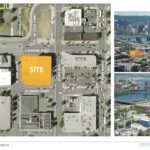
- Plan – Context
- Plan – Landscape
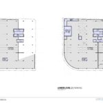
- Plan – LL3 & LL3
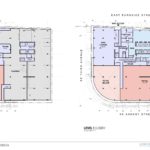
- Plan – LL1 & Level 1
- Plan – Levels 2 & 3
- Plan – Levels 4 & 5
- Plan – Levels 6 & 7-16
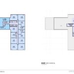
- Plan – Level 17 & Roof
- Elevation – East
- Elevation – North
- Elevation – West
- Elevation – South
- Section
I would love to know why they aren’t asking for a vacation of the rounded corner of Third and Ankeny, which has served no purpose for decades now.
This building is indefensible. Just when it seemed like there was an area of interesting modern architecture forming around the bridgehead, a developer comes and drops this bloated spreadsheet catastrophe of a building at one the most prominent intersections in the city. Why is Gerding Edlen working with a Chicago architect on this? Are there not enough architecture firms in Portland that could handle this site in much more appropriate way?
wow! thats awful.
This building is trying too hard to rise above its location rather than to relate to it.
Aside from the design, which has been criticized repeatedly for being lackluster for such a prominent location, the height limits are the culprit for the awful massing. This isn’t Washington DC where height limits have a historical and cultural rationale or SimCity where everything has to be perfectly overthought, which reduces the variety and unexpected that make great cities. Portland needs to grow up and relax these ridiculous height limits and the let the FARs do their thing.
Will this building have any affordable units? If it doesn’t then everything should be done to stop it.
Looks a hell of a lot better than the Yard…
It’s bland and boring and it’s a shame that the historic Fischel’s building is being razed to put something so banal in it’s place. Last thing; I don’t see any homeless people in the drawings. Where are the shopping carts?
my god that’s ugly.
Ok, this building is a real mixed bag for me. There are aspects of it that I quite like, and aspects of it that I find dreadful. The key is, what can be done to make the building more successful from a design standpoint, and how can its (at times) brutal interface with the developing neighborhood be ameliorated?
I want to start with where I feel the design is successful. I like the massing of the Burnside frontage. I like how the western leg of the tower steps back from the sidewalk and I like the terracing of the podium along Burnside; it gives a welcome hint of breathing room to the corridor. In general, I like the terracing and landscaping of the West and Southwest portions of the podium. I like how the western leg of the tower is cantilevered over the podium; it gives a lightness to a tower that is otherwise markedly stout.
Now the concerns. The eastern elevation along MLK is unrelenting and dreadful. Especially on that eastern elevation, the proportions of the base to the tower makes the building look like a dictionary sitting on top of a DVD player, or a husky man with his pants pulled up too far. In general, the skin treatments of the base and the tower need to be integrated more successfully, or rethought entirely. I’m trying to imagine looking West from E Burnside and seeing the squat, broad masses of 5 MLK, and The Yard hemming in the city’s most vital thoroughfare. It’s not an appealing image. I’m also concerned with how the corner activation at MLK and Burnside – one of the most visible intersections in the city – seems stifled by landscaping and the offset door to the building’s lobby. My last concern is more coming from a prospective tenant viewpoint: why no balconies for the residences?
Now, most importaltly, what might be done to remedy some of the concerns. Since my main concern is the brutality of the MLK elevation, I will address that. The easiest remedy would be to mirror the Burnside massing along MLK. Step the southern two thirds of the tower back from the street and terrace the base, as on Burnside. The tower could also be cantilevered over terracing on the South elevation as it is on the West (a change that would also help the lackluster South elevation). To further break the visual planes of the East and North elevations the treatment (floor to ceiling glass curtain wall with sunscreen/fin treatment) could be carried from the base of the building along the mass of the tower that has not been stepped back from Burnside and from MLK, thus more successfully integrating the base with the rest of the tower, and giving some relief to what would otherwise be the same-same appearance of two blocky 200’x200′ elevations hemming in Burnside.
Unfortunately we allowed Yard take all the “oxygen” in the room. Every adjacent building is likely to be asked to become more slender and elegant. Slabs do not make good buildings and while 5 MLK has a few interesting moves (terracing/cantilever) it really is an L-slab completely out of scale. The Fishels building should remain and the 3/4 block around it should be developed ideally in two separate buildings. This is a significant intersection and it would be preferable to have at least one corner provide some connection to what was here. We need to respect the scale of the area and this proposal would continue a bad precedent. A more nuanced code to guide scale and massing of new development is needed.