North18 has returned in front of the Design Commission, in the form of an 11 story bar tower. The building by YBA Architects previously received Design Advice in January of this year, at which time it consisted of a 6 story building with townhome units at the ground level. As now proposed the 119’-10” tall building would include 168 residential units above ground floor retail. Two levels of underground parking are planned, which allows the building to exceed the 75′ height limit that would otherwise exist on the site.
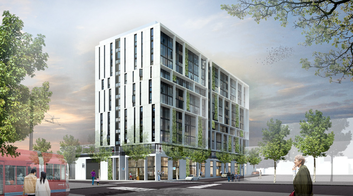
The half block site between NW 17th and 18th Avenues faces onto NW Northrup St. Two low rise buildings, dating from 1947 and 1995, are currently located on the site. The buildings are occupied by the Hirschberger sheet metal company, who are a financial partner in the project.
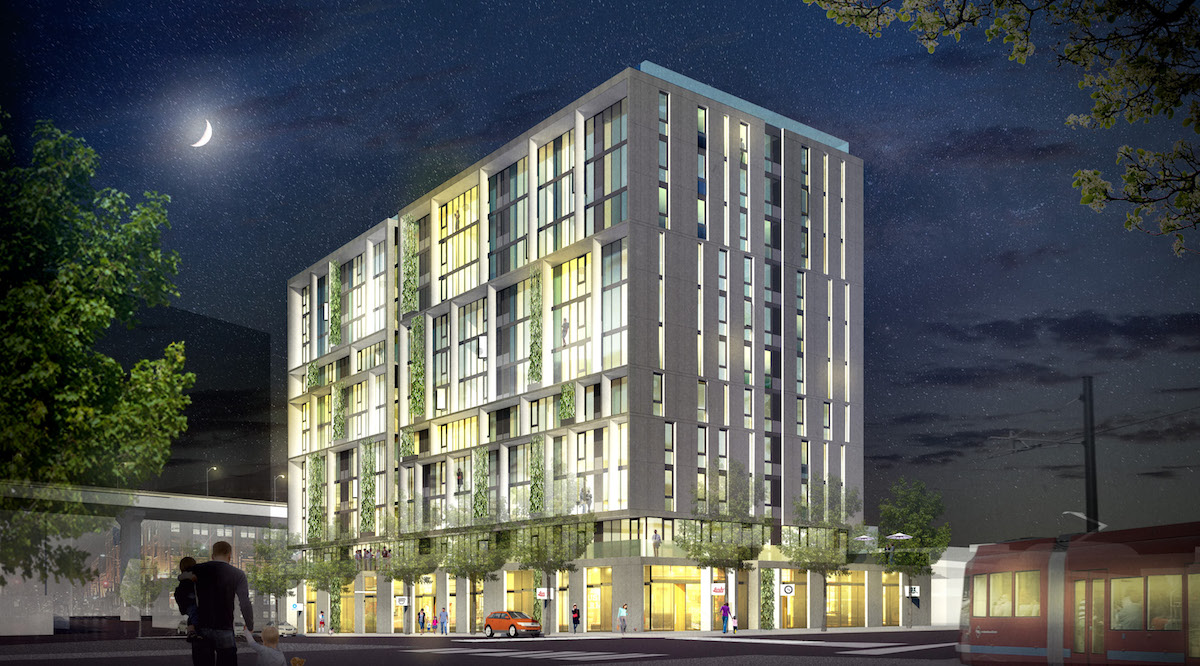
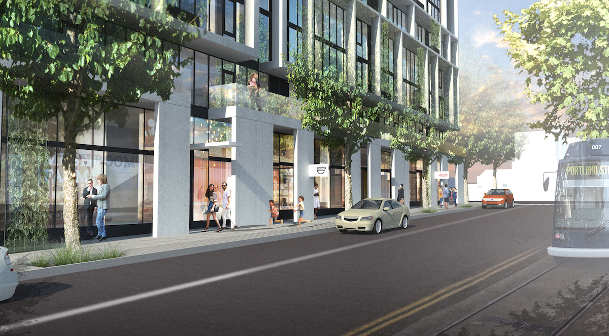
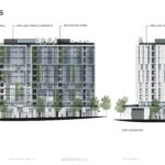
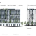
The primary material for the building would be precast concrete panels, with an exposed aggregate finish. Deciduous vines would be trained to grow on stainless steel cables spanning multiple levels. The north and south elevations would be glazed with a window wall system, with a mix of clear and spandrel glazing.
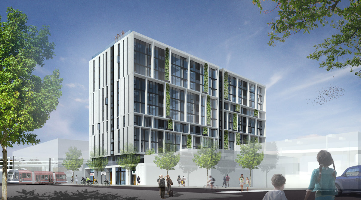
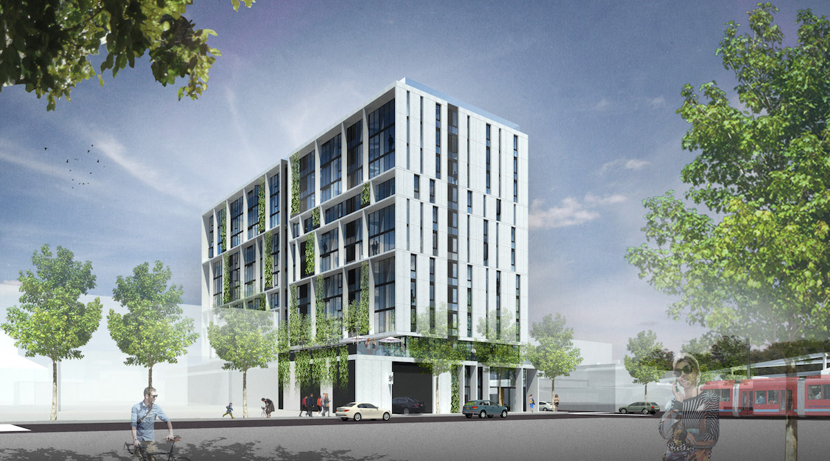
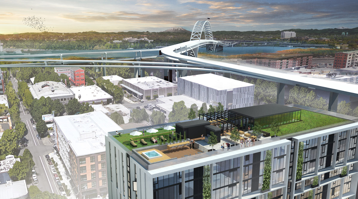
At the roof top an amenity deck is proposed, with landscaping designed by Shapiro Didway. Amenity features would include a barbecue, bocce ball court and a fire table.
A memo [PDF] to the Design Commission, published before the July 7th advisory hearing, identified potential areas for discussion. These included: the ground floor, including whether the large piers proposed create barriers and unsafe conditions; the overall height of the building, including the possible trees and trellis features at the roof; the composition of the building; and the materials proposed. Of the staff issues, the ground floor was of most concern to the Design Commission. Commissioner Livingston said that the piers would create hiding spaces that would make the sidewalk feel unsafe at night, while Commissioner Vallaster pointed out retailers generally want as much visibility as possible. In general though, the project received a lot of praise, including from Commissioner Livingston:
First of all, I think this project is proof that DAR [Design Advice Request] works, because I really like what you’ve got going on here. The taller building, the more resolved proportions: it’s just all so much better than the last proposal you brought in. It’s great. Within that, I really like the composition. I think you need to go the next step and make it that much stronger than it currently is. Right now it seems as if the architecture is just slavishly following the diagram. Maybe it needs to have to have a little more ‘bounce’ to it. It can still follow the diagram, but it just doesn’t need to be quite as slavish as it is.
Other issues discussed were whether the recesses on the south and north elevations could become balconies, and whether the vines would survive that high in the air. To move forward, North18 will be required to go through a Type III Design Review, with public hearings before the Design Commission.
Drawings
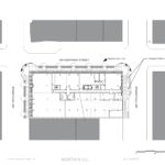
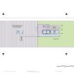
- Plan – Site
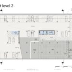
- Plan – Basement Level 2
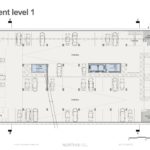
- Plan – Basement Level 1
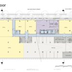
- Plan – Ground
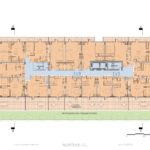
- Plan – Level 2
- Plan – Levels 3 to 10
- Plan – Level 11
- Plan –
- Elevations – North and East
- Elevations – South and West
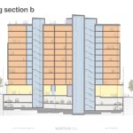
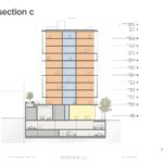
- Section
- Section
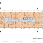
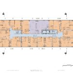
Why do we keep seeing buildings with minimal glazing on the “sides” located on corners? We are blessed in Portland with small blocks and the opportunity to celebrate corners yet many buildings seem to act as though the “side” is a party wall and completely ignore the gift of the corner. I believe “celebrating the corner” is in our design guidelines. Why are we not enforcing it? Yes there are energy requirements that reduce the amount of possible glazing if the developer will not pay for higher quality glass. And yes floor plates designed to maximize rentable units can be problematic for more open facades. Both of these excuses are about money. We need to ask more given the current market demand (the highest rents and cheapest financing in history). In this proposal the floor plate does not prevent more glazing on the “sides”. Take a look at the unit plan sandwiched in the middle of the sides. The main window is one of the narrow slits on the side. So not only are we ignoring the corner with a wall with slits, the poor occupant will have a slit for a main window to the outside. We need to demand better design for the outside and higher quality HOMES for those on the inside. Too often we are not getting either. If we are going to lose the Portland of cheaper rents that allow artists to do art and people who want to take a risk with an idea succeed, the we should at minimum be demanding better outward design and more livable homes for those inside.
You’re absolutely right that architects need to consider experiences from both the exterior and interior when designing, but you’re not noting the hits to occupant comfort and energy performance with east and west glazing. This building’s solar orientation is great, and from a daylighting standpoint, having too many windows can be just as bad as not having enough.
Obviously there are many aspects to occupant comfort, but too much glazing can be just as bad as too little glazing. To get nitpicky, I’d say the the 85% glazing on the south and north sides is too high, and the 15% glazing on the east and west sides is too low if you’re trying to find the perfect balance of energy performance, daylighting, and views offering prospect for each unit.
I’d argue that projects can ‘celebrate the corner’ with equal impact or better by differentiating facades due to context and environmental considerations as they can by wrapping the same language around the whole building.
Ok I understand your general point but do you think this specific building’s North and East façade differentiation celebrate the corner? And can you name a high quality residential building in town that has minimal glazing on East and West due to sun exposure? Again we are really talking about cutting costs at the expense of those inside. Designers who are given appropriate budgets will not willingly chose slits for window openings not matter the direction. Glazing is available to mitigate sun exposure. But current rental pro forma, and even more consequential–short timeframes for return on investment–do not allow quality. Quantity is king. What’s sad about our current state is rents are at levels that should indicate quality building but the market–and our tedious but still weak design review process–is allowing the construction of flawed buildings which charge high rents for poor quality living spaces. The current high demand market may not last here in Portland but these flawed buildings unfortunately will.
The side slits look a lot like the Burnside “Yard” and we’ve heard negative comments on that. And once again there is a modest proposal in keeping with the scale of the area and now it is being doubled? How is this in keeping with the city proposal to address scale in the Historic Alphabet District?