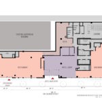
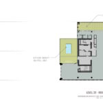
The proposed 20 story hotel at SW 3rd and Salmon by Ankrom Moisan Architects has returned in front of the Design Commission for a second Design Review hearing. The 246′-7″ tall building is being developed by Third & Taylor Development LLC, a partnership between Onder Development and Arthur Mutal. The proposed hotel will have 245 guest rooms, with a rooftop bar and a swimming pool proposed at the 20th floor. The hotel lobby, restaurant and a bar/market are planned for the ground floor, with conference facilities planned for the second floor. One basement level would be used for housekeeping and other back of house functions. No new vehicular parking is proposed.
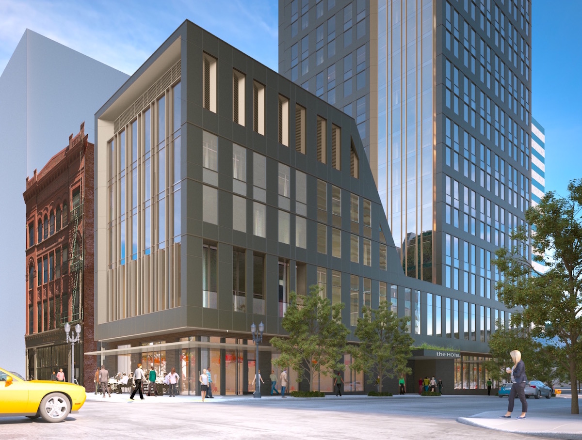
The project site includes the southern three eighths of the block bound by SW 2nd, Salmon, 3rd and Taylor. The site includes the 1906 Hotel Albion building, which has housed the Lotus Cardroom & Cafe at its ground floor since 1924. The building is not listed on the National Register of Historic Places. In the City’s 1984 Historic Resources Inventory the building was given a Rank III designation [PDF], indicating that it may be eligible for listing in the National Register as part of a Historic District. The rest of the site for the hotel is currently occupied by surface parking.
Located on the northern half of the same block is the 1892 Ancient Order Of United Workmen Temple, which is set to be replaced by a 10 story office building. That project is proceeding as a separate Design Review application, and is not part of the hotel application. The National Register listed Auditorium and Music Hall Building is under separate ownership and is not part of either development.
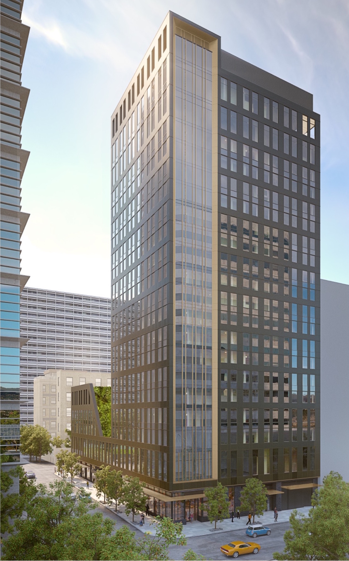
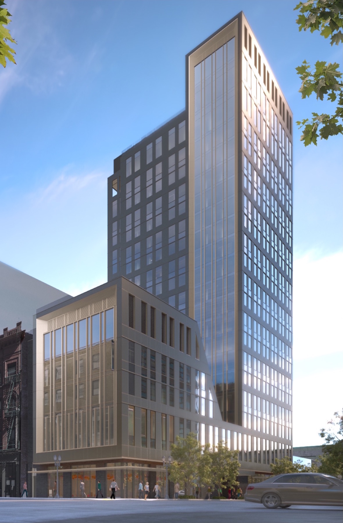
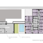
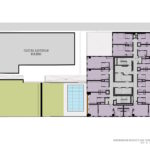
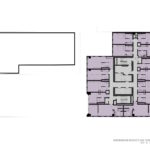
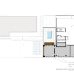
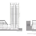
The building is arranged as 20 L-shaped story tower on the southeast quarter of the block. A lower five story volume would be located on the southwest corner of the block, at a scale more similar to the Auditorium building.
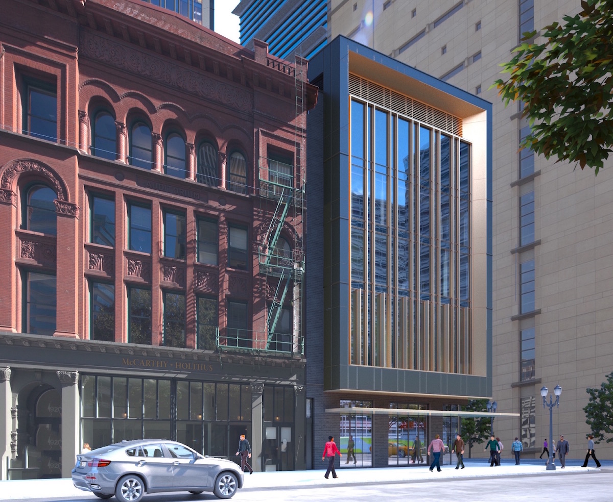
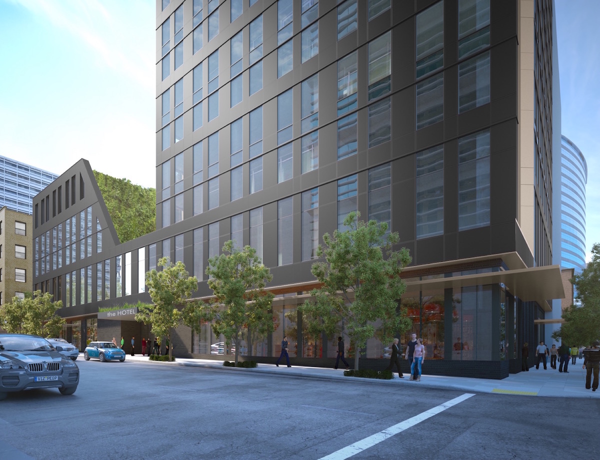
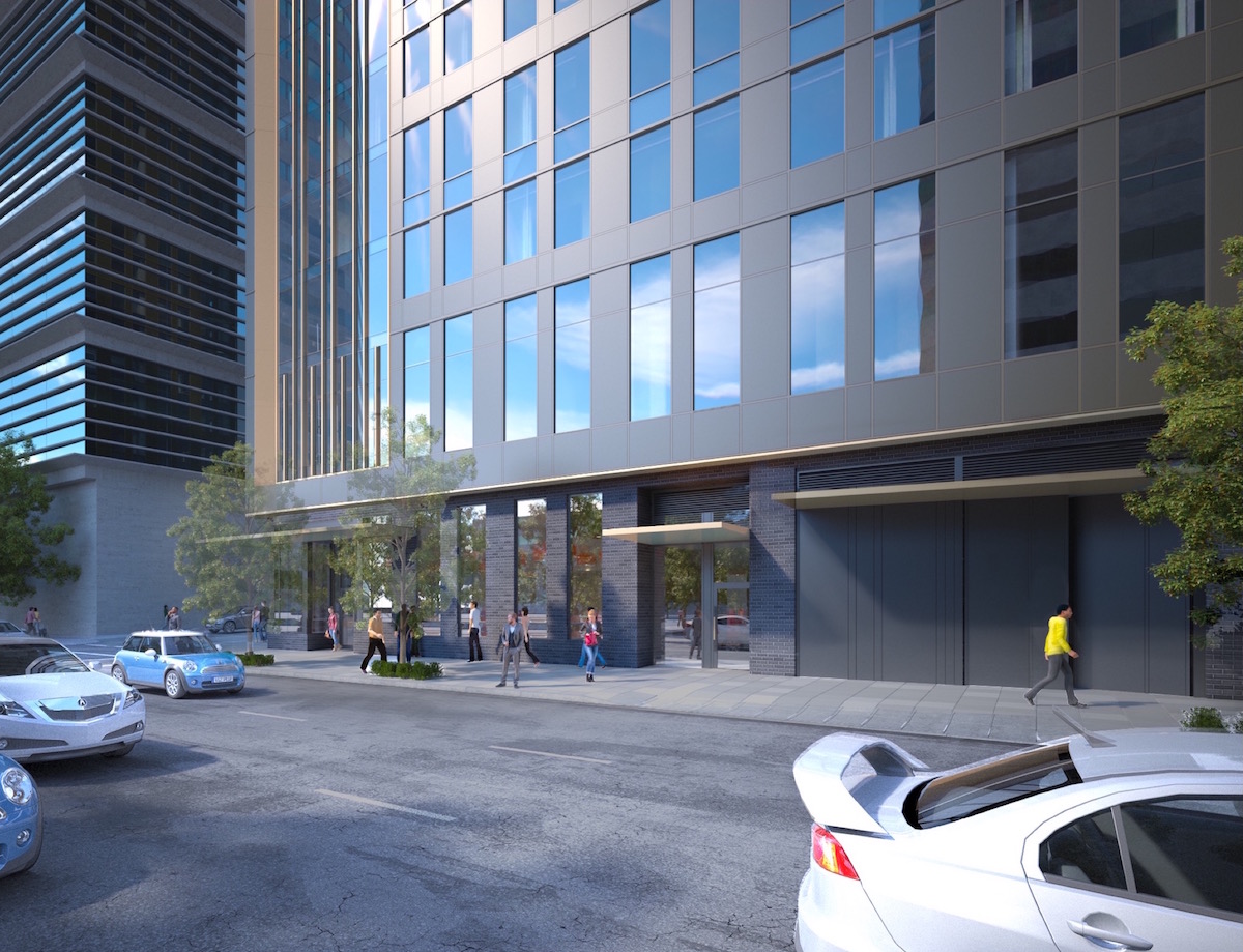
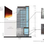
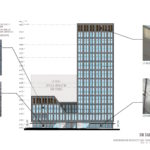
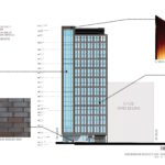
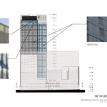
The color scheme of the building has significantly changed since the first Design Review hearing, to a predominantly palette. Exterior materials proposed for the 3rd & Salmon hotel include: dark burgundy brick; window wall with vision glass, spandrel glass and dark gray metal panel; bronze metal panel; and structurally glazed glass curtain wall. Laser-cut metal screen screens that were previously proposed at the ground floor have been eliminated.
Other changes made since the first Design Review hearing included a simplification of the elevations, by utilizing one window wall design throughout the building. The sidecar element also underwent a significant redesign, which introduced a balcony at the second floor ballroom, to create an outdoor connection to Lownsdale Square.
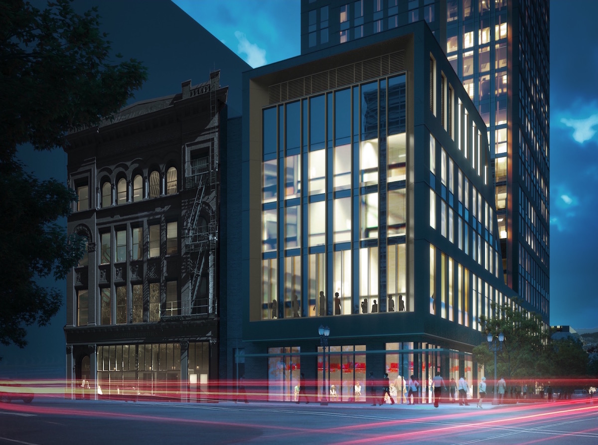
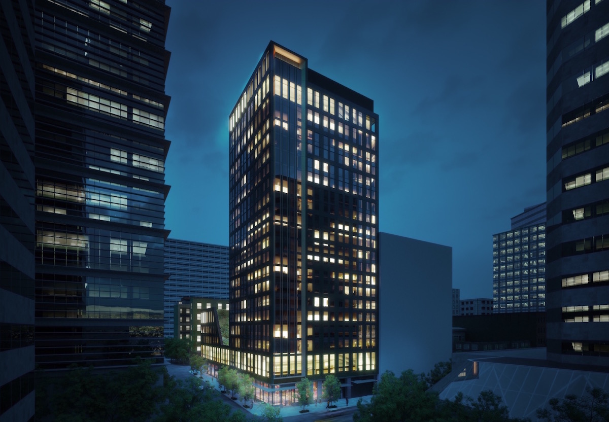
A Revised Staff Report and Recommendation to the Design Commission [PDF], published before the June 16th hearing, recommend full approval for the project. The Commission members present generally welcomed the changes made, although Commissioner Savinar, who had expressed major concerns at the first hearing, continued to have reservations about the design.
Much of the discussion at the second hearing centered around the revisions to the color scheme. The darker color found support from Commissioners Livingston and Molinar, however Commissioners Simpson, Wark and Savinar were less enthusiastic about it. During the hearing Commissioner Wark offered his thoughts on whether the tower should blend in or contrast with the lighter buildings surrounding it:
There are several light buildings around, starting with the Federal Courthouse to the south, and the kind of odd parking garage to the west, and the ’60s / ’70s tower to the southeast. As a grouping… it could be more interesting to have a grouping of light buildings, and then also have a contrast with the Auditorium Building, by doing a lighter building and the Auditorium building being this brighter, richer more traditional building next to this lighter one. Given the fact that we are where we are, and our weather is what it is, and our light quality is what it is, and it will be for the foreseeable future (although it is shifting over time); and given the lessons learned from the Bridgehead project and its smaller cousin to the northeast, I’m much more reticent to just say “dark buildings are the answer”; particularly as they’re taller. Twenty stories of more darkness: I’m just not sure it’s what the city needs at this point.
The project is currently scheduled to return in front of the Design Commission on July 7th.
Drawings
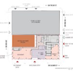
- Plan – Site
- Plan – Basement
- Plan – First
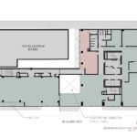
- Plan – Second
- Plan – Third
- Plan – Fourth
- Plan – Fifth
- Plan – Sixth
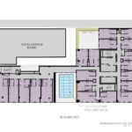
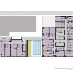
- Plan – Levels 7 to 18
- Plan – Level 20
- Plan – Roof
- Elevation – SW 3rd Ave
- Elevation – SW Salmon
- Elevation – SW 2nd Ave
- Elevation – SW Taylor
- Section
I am so glad I only read this stuff for enjoyment. Trying to appease commissioners with their sense of color tones would drive me f***ing bananas.
Agreed. I think this is a nice looking building and a significant upgrade to that block. I can only imagine the change orders required for out of town architects who are unfamiliar with our Design Commission’s fussiness.