Polyphon Architecture & Design have returned in front of the the Design Commission with revised designs for a mixed use tower at SE 7th & Burnside. As now proposed the 12 story, 132’-10” tall building would include 20,066 sq ft of office space and 62 residential units. Two retail units would front onto E Burnside. Parking for 53 cars would be provided, in a below grade parking garage.
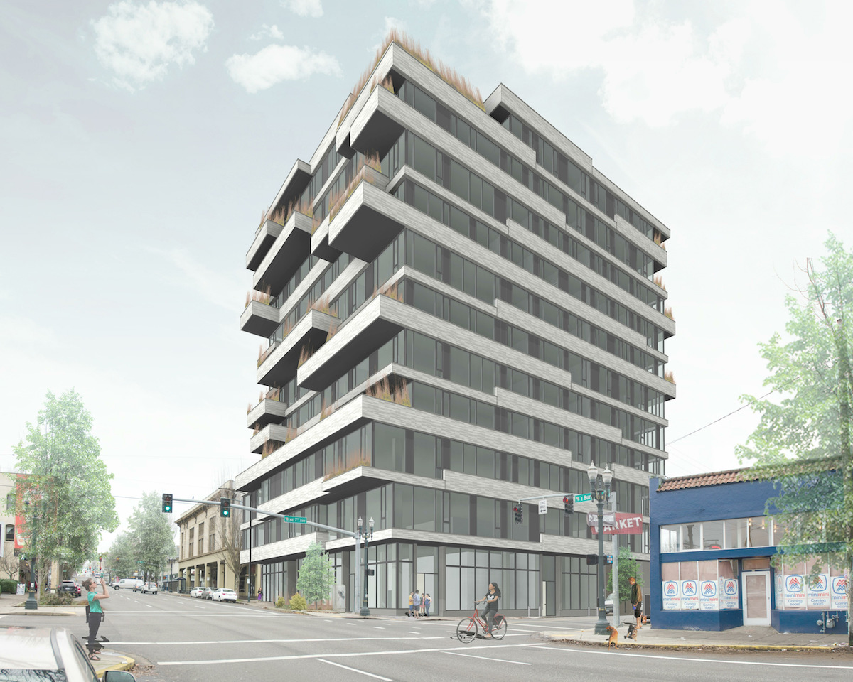
Most of the roughly quarter block site is currently used for surface parking. The site also includes a residential style structure built in 1900, which was most recently home to the Farm cafe. The restaurant closed at the end of 2015. Other nearby developments include 419 E Burnside, the Burnside Delta and the Jupiter Hotel.
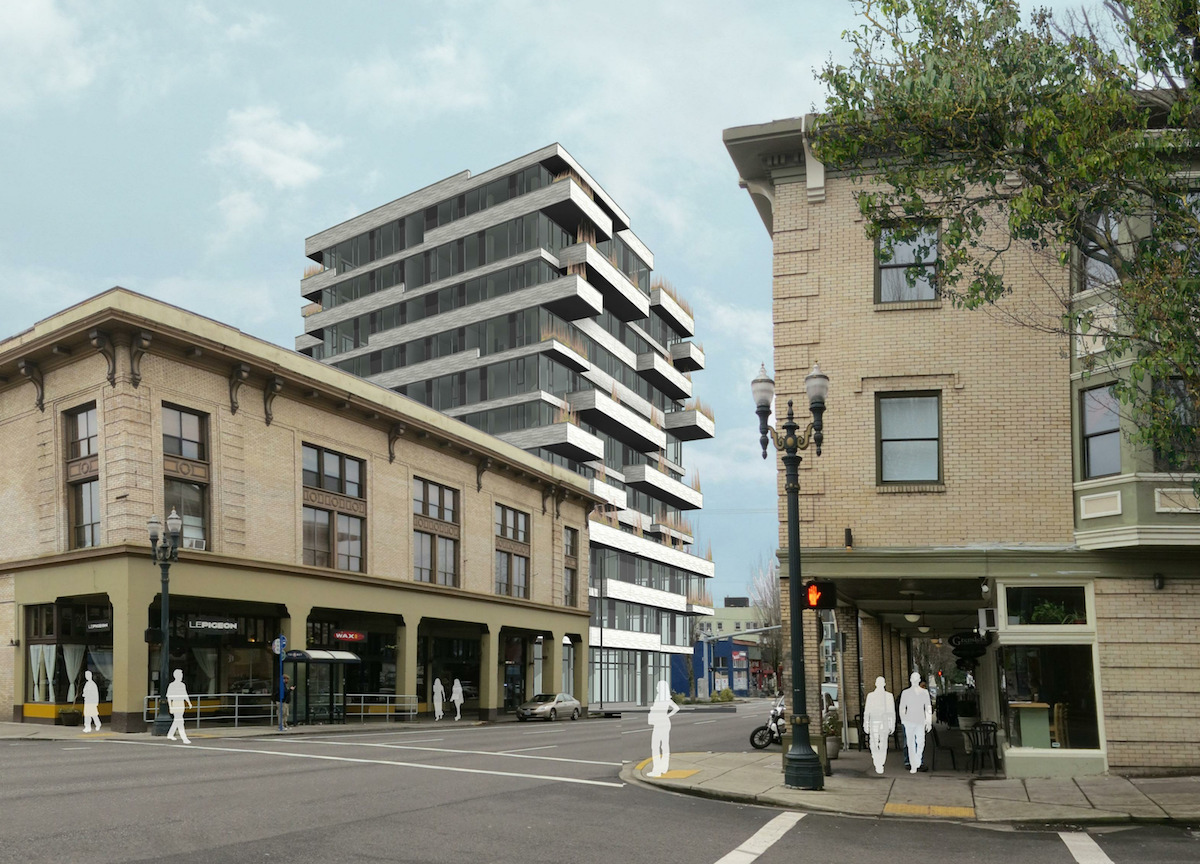
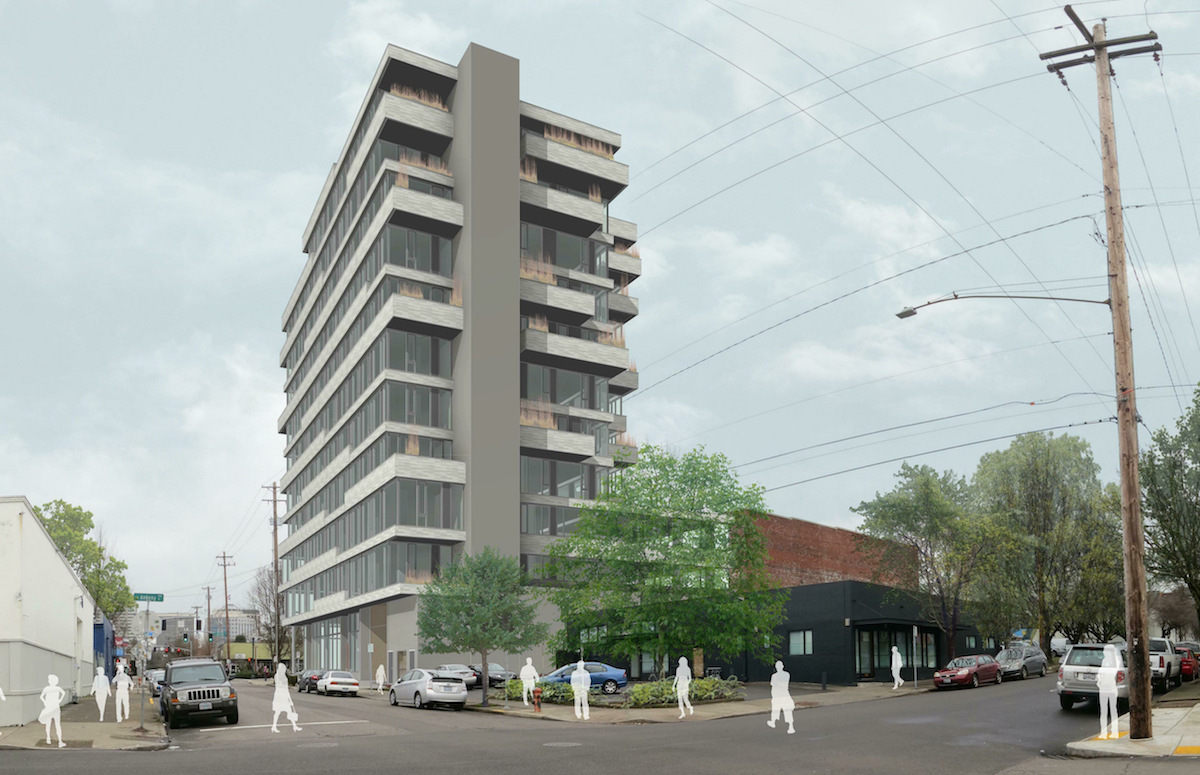
The revised building massing is based around a concept of “strata” found in geological features. This is expressed in the horizontal ribbon window / wall / balcony design. As encouraged by the Design Guidelines for lower Burnside, the building includes projections over the right-of-way, that create an arcade effect at the sidewalk level.
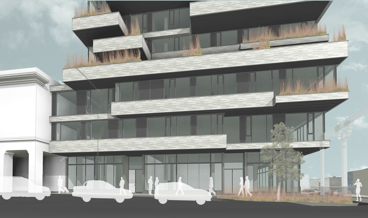
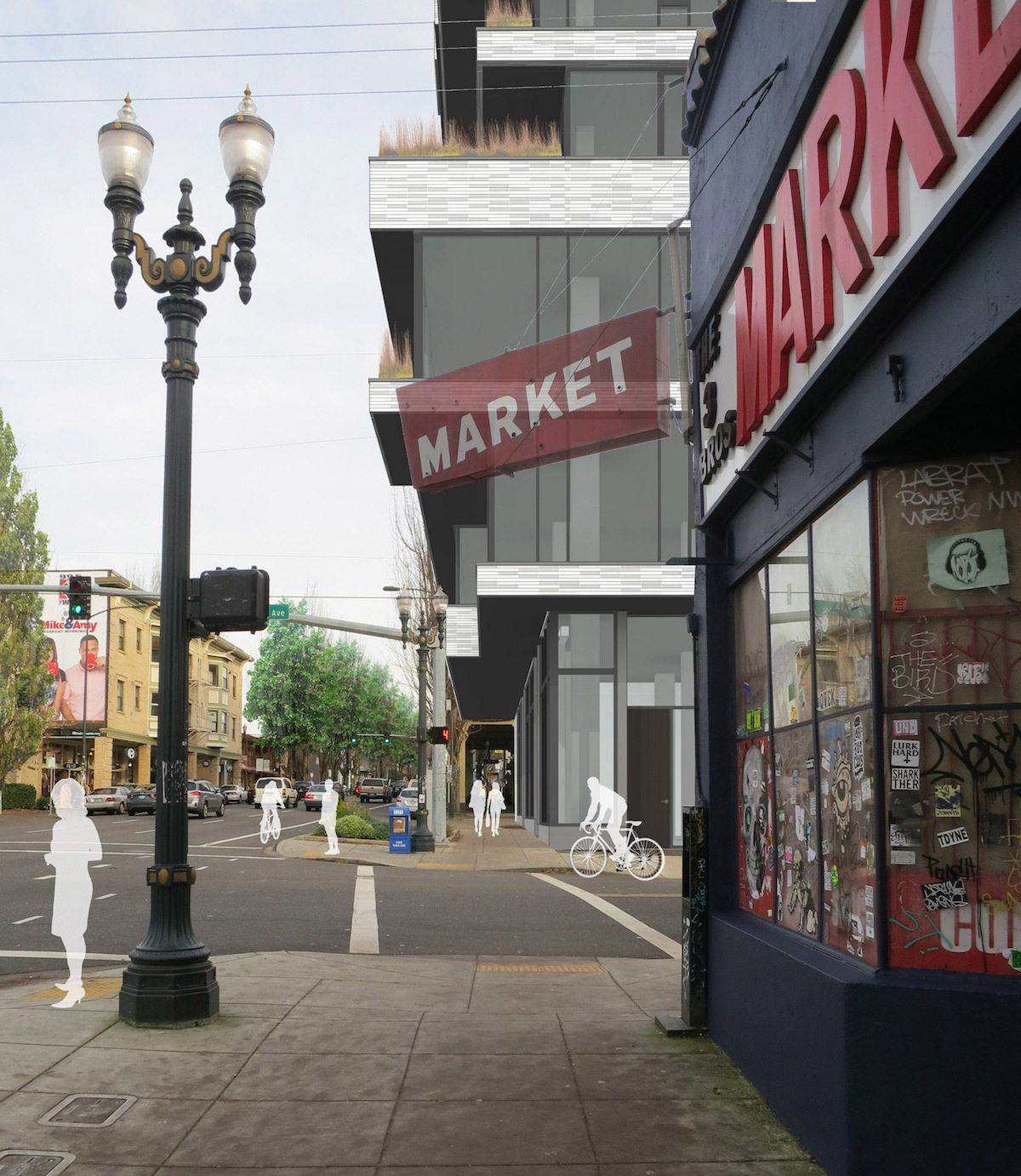
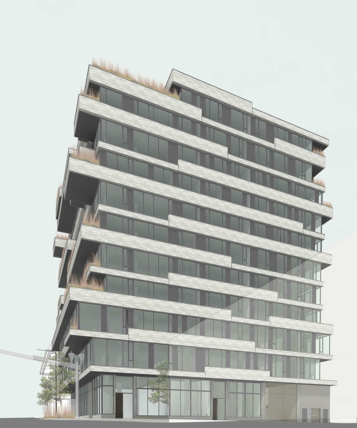
The primary materials proposed for the building are white emperor brick, glazing, dark metal spandrel panels, and concrete. As an alternative to the brick Okoskin and ribbed metal panels were also presented to the Design Commission. Plantings at the balconies have yet to be determined, however the architects discussed using native grasses, which would be both low maintenance and relatively uniform in appearance.
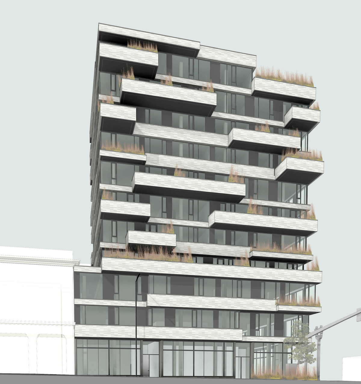
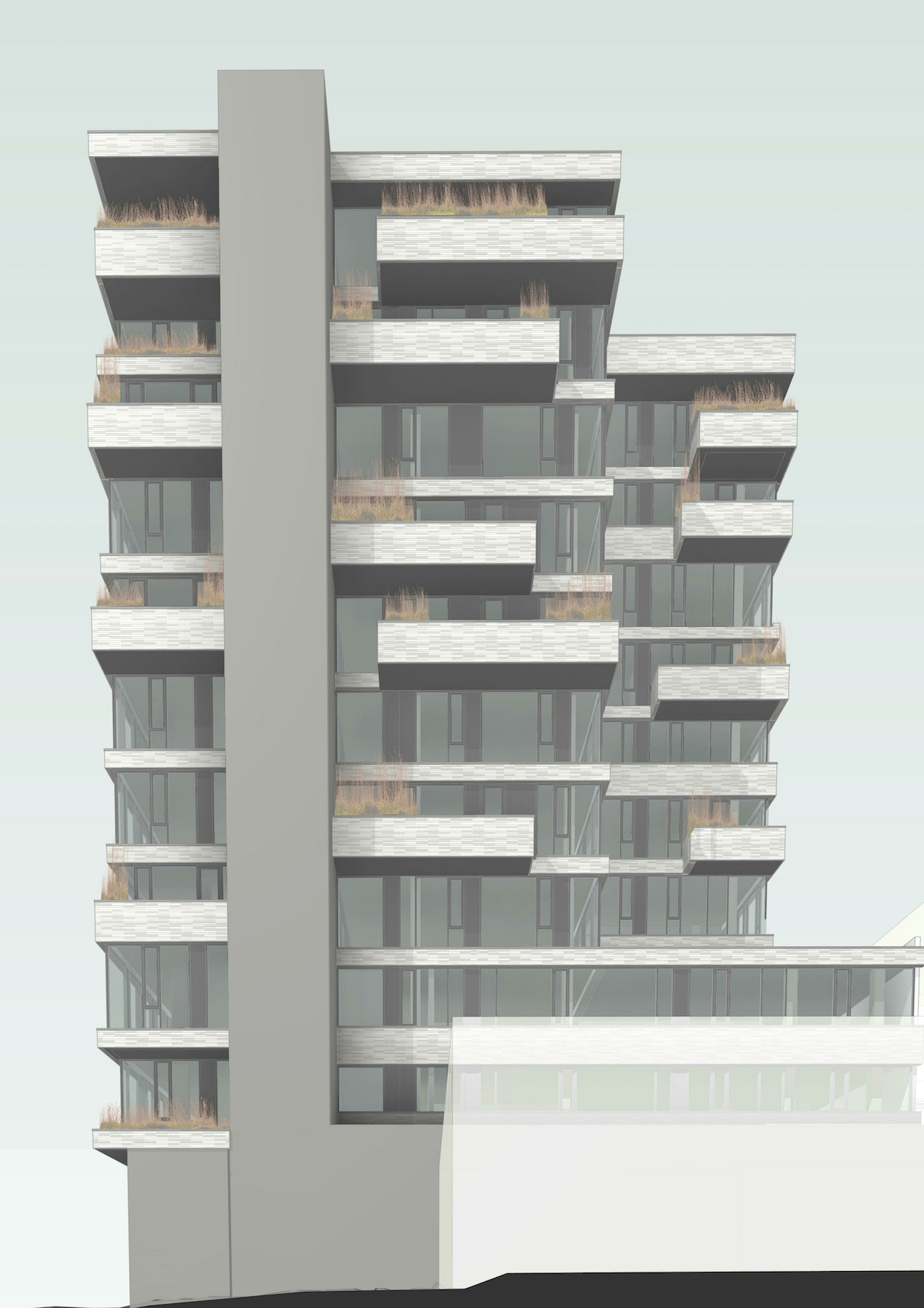
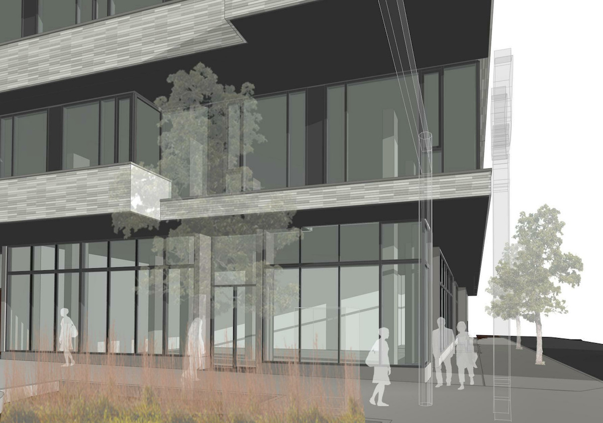
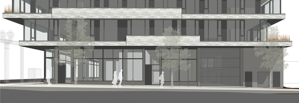
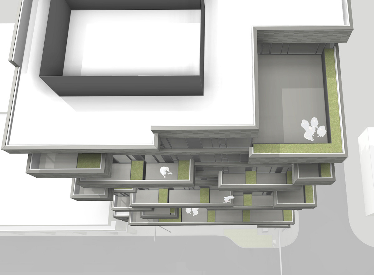
The project was previously presented to the Design Commission on March 24th, at which time the Commission had reservations about the above grade parking and the overall massing of the building. Before the second (and optional) Design Advice hearing on May 12th a memo [PDF] to the Design Commission was published, outlining potential areas for discussion. These included: the building design, massing & arcade projections; the ground floor & parking garage; and the materials proposed as options.
The Commission reacted much more favorably the revised design. Commissioner Livingston, who had previously expressed criticisms of the building, was not present at the hearing but provided written comments. These were read into the record by Commissioner Wark:
A big thanks to the applicant for really taking the criticisms from the first DAR to heart. The revisions are extensive and meaningful… a very respectable response to the Design Guidelines. The direction this building is headed in is appropriate for lower Burnside and the Arcade District. I hope the applicant doesn’t stop here, but continues to the develop the strong architectural ideas in this scheme. The Jenga like quality and the tension the push-pull creates are exciting. Ideally some of the energy on Burnside would turn the corner onto 7th. That said, I can see why the projections are limited to the north and south facades. Provided both north and south are legible from the pedestrian’s perspective at 7th & Burnside, and along the sidewalk at the west of 7th, the parti works as proposed. It gives new meaning to the phrase ‘slice of life’, and I’m not using the phrase pejoratively. The proportion of the emperor brick does a nice job of emphasizing the architectural parti. Good work on the following guidelines: A5 – Enhance, Embellish and Identify Areas; A5-1 – Reinforce the Effect of Arcaded Buildings; A8 – Contribute to a Vibrant Streetscape; C2 – Promote Permanence and Quality in Development; C5 – Design for Coherency (provide more information on the soffits); C7- Design Corners that build Active Intersections (a door into the retail from 7th doesn’t have to be used, but it would provide flexibility for the tenant [Wark: which is what you’re proposing]). I feel as if I should add a bunch of smiling emotions.
In order to gain approval the project will be required to go through a Type III Design Review, with public hearings before the Design Commission.
Drawings
- Plan – Site
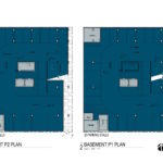
- Plan – Basement P2 and P1
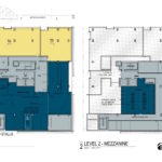
- Plan – Levels 1 and 2
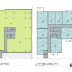
- Plan – Levels 3/4 and 5-11
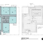
- Plan – Level 12 and Roof
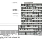
- Elevation – North (E Burnside)
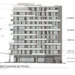
- Elevation – West (SE 7th)
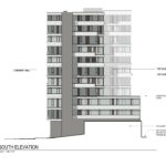
- Elevation – South
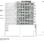
- Elevation – East
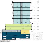
- Section – North / South
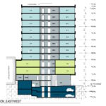
- Section – East / West
Holy crap that’s a dramatic change.. for the better. Much better.
The brick is fine. Okoskin would be nice. Even better would be some sort of textured concrete panel, which would probably be less affordable. Kudos to the design team!
I’m digging the nod towards Juan Sordo Madaleno’s Edificio Palmas 555 in Mexico City. It’s great to see such an elegant and interesting integration of the balcony into the façade. This is a big leap forward from the original proposal. I hope we will see more in this direction.
Tip of the hat to the project team and the portland design review process here. The first design wasn’t that bad, but this one is much more exciting.
I’m generally of the opinion that our design review system prevents horrible things from happening, but also includes a negative side effect that limits creativity and leads to a more homogeneous built environment.
This project isn’t approved yet, but so far it feels like an example of the system’s benefits.
Nice job team.
This is great! I’m not familiar with this firm but I’m excited to see more of their work. I do wish the overhang over the sidewalk extended further though, since that is the point of the arcade district. This neighborhood is shaping up to have a lot of interesting projects.