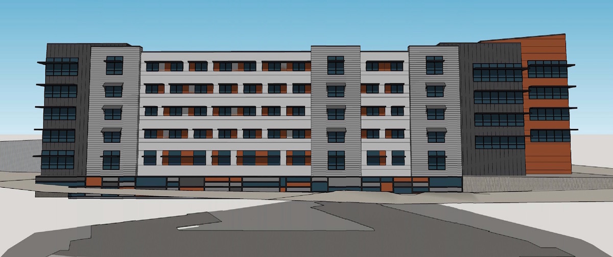
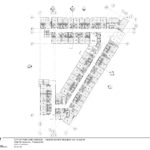
The Design Commission has offered Design Advice on Grant Park Village Phase III, a proposed memory care and assisted living building. The five story building by Lenity Architecture of Salem, OR will cater to residents who need assistance with their daily routine and for persons afflicted with Alzheimer’s, dementia, and other memory‐related issues. In contrast to the suburban locations typically chosen for elder care facilities, the architects state that the project is intended to bring “diversity to the City of Portland’s housing needs by providing quality housing for elderly residents in a centrally‐located urban environment.” 70 vehicular parking spaces and 40 bicycle parking spaces are proposed.
The proposed building would be the third and final phase of the Grant Park Village development, located on the former site of the Albina Fuel Co in the Sullivan’s Gulch neighborhood. The first phase was approved by the Design Commission in 2013 and completed in late 2014. A future second phase was recently approved the Design Commission. The project will be located where NE 32nd Ave dead ends near the Banfield Expressway.
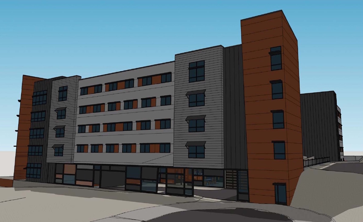
Materials proposed for the building include stucco in two colors, vertical metal panel, horizontal metal panel, exposed concrete, vinyl windows and storefront glazing.
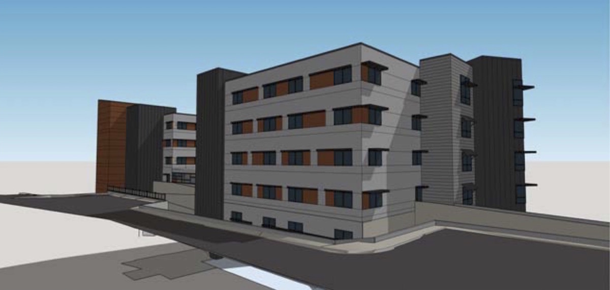
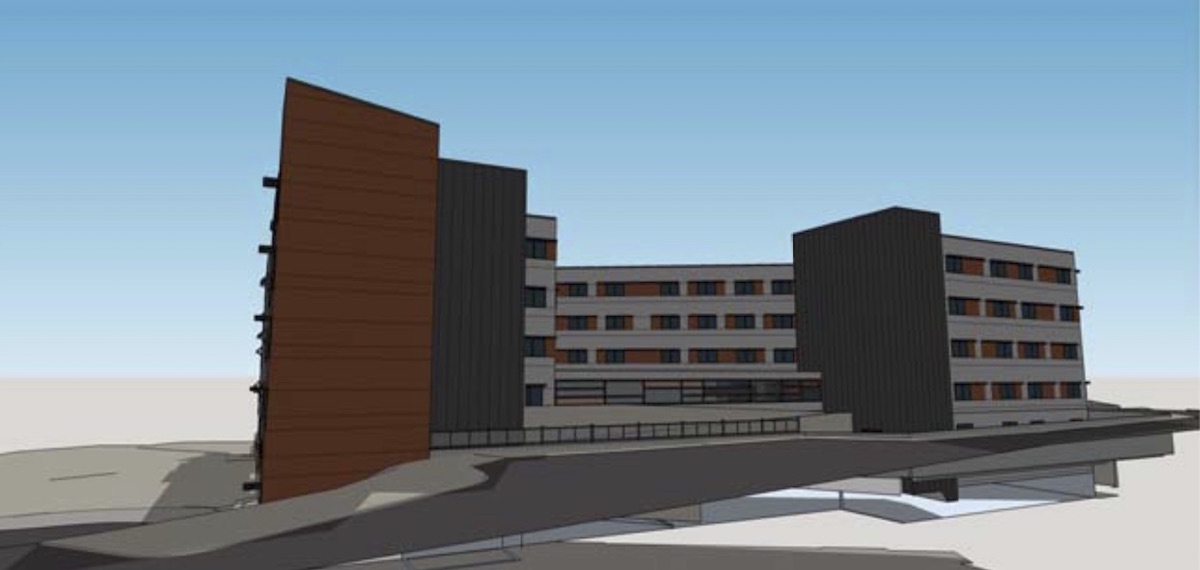
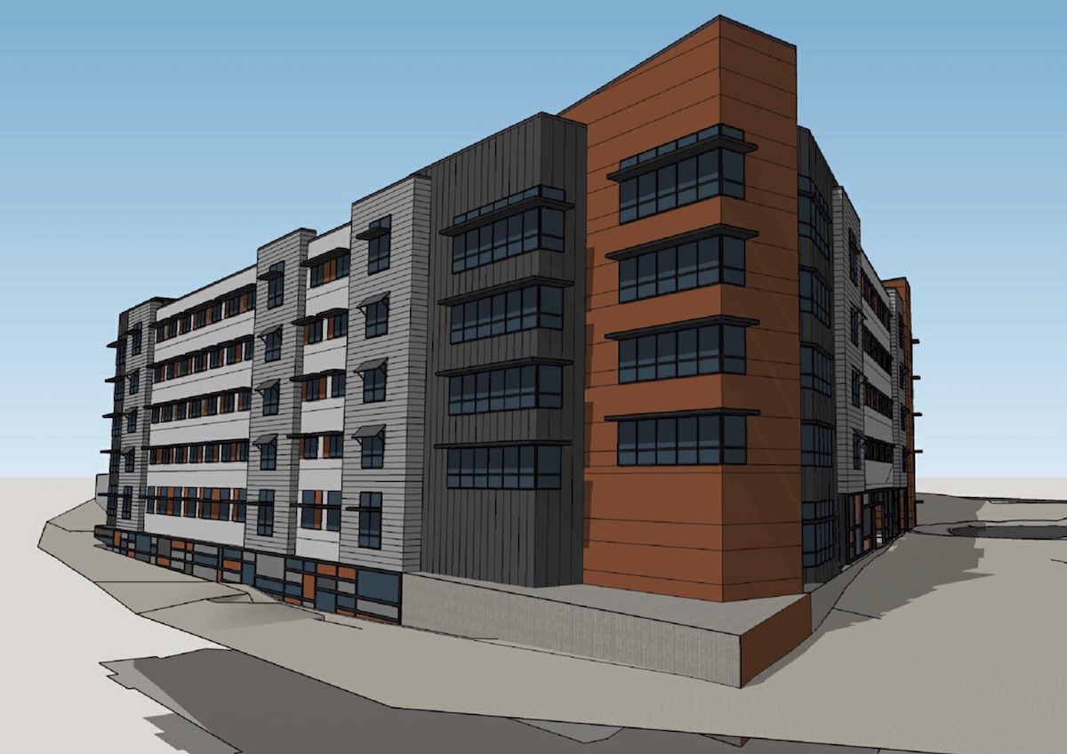
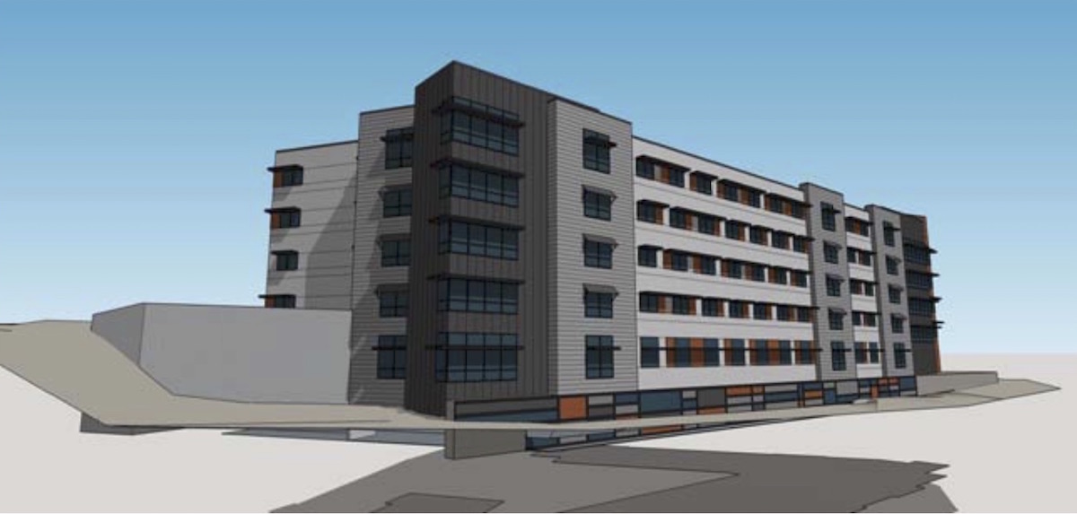
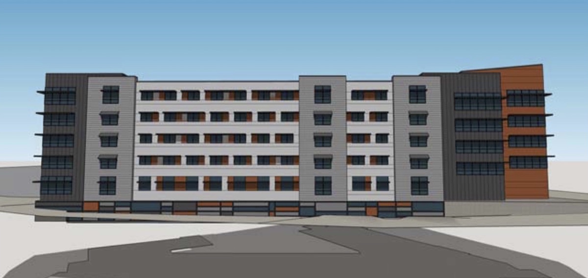
A memo [PDF] to the Design Commission, published before the April 14th advisory hearing, outlined potential areas for discussion. These included: ground floor active uses, with a staff suggestion that the building be set back along the private street at NE Halsey, in order to allow pedestrians to access the future Sullivan’s Gulch Trail; the building materials in general; and the parking areas, which dominate the building’s only public frontage at the site’s northwest corner. Much of the Commission’s discussion was focused on the ground floor, and how the building could be a better neighbor to the recently approved Grant Park Village Phase II building. During the hearing Commissioner Vallaster offered his thoughts on the project:
I’m having a hard time with the layout on site. It doesn’t seem like it’s doing much for the neighborhood, or the building across the street, or even the community that you are describing and incorporating in this building. I’m having difficulty with that. The forms seem pretty arbitrary to me. I’m not sure where they came from, or what they’re referencing. They don’t seem to reference any of the buildings around, in close proximity, and I’m not sure how they relate to the tenant base either. Is there something specific specific about that particular user group that would generate a form like this, and the stucco, and all these materials in the tower, etc? Or is it just something that could happen in any location, to any population?
The project is currently scheduled to return in front of the Design Commission for a second Design Advice Request on June 2nd, 2016. The project will be required to go through a Type III Design Review, with public hearings before the Design Commission. In addition, the project will have to go through a Type III Conditional Use Review, with a decision by a Hearings Officer, due to the fact that “Group Living” facilities are a Conditional Use Review in the RX zone.
Drawings
- Plan – Site
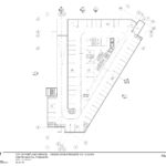
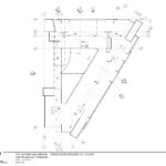
- Plan – Parking
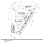
- Plan – First Floor
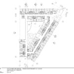
- Plan – Second Floor
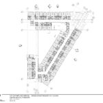
- Plan – Third Floor
- Plan – Fourth Floor
- Plan – Fifth Floor
- Plan – Roof
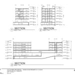
- Sections
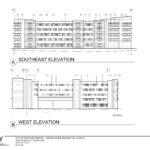
- Elevations – Southeast and West
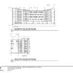
- Elevations – North and South

This whole “Village” is something of a design disaster. The design seems actively antithetical to being “livable” and wouldn’t feel out of place in a business park in Arizona.
I agree with Johann. This design wouldn’t get a passing grade from a second year design studio. Why do the architects think this is worth spending millions of dollars on and burdening our city with? There are way too many competing forms, materials and design moves. Further, it is depressing – I can’t imagine anyone wanting to live there. Why would the developers hire this firm? Especially since they are out of town – maybe that is why it doesn’t relate to the context? Projects like this are the only reason why I think Design Review isn’t a complete disaster. They prevent bad architects from having free reign to create awful buildings.
I agree with the two earlier posters. This looks like a parking garage and the rest of Grant Park isn’t much better.
Just when you thought bad was as good as it was going to get…this looks a whole lot worse. And for the architects don’t put that drab image out there for everyone to hate on. I am sure it could look a little bit better if more thoughtful.
This is one instance where design can take a back seat. The stated goal of bring “diversity to the City of Portland’s housing needs by providing quality housing for elderly residents in a centrally‐located urban environment” is downright saintly in our current real estate market. Providing assisted living for people with Alzheimer’s and dementia is not a profitable business compared to market rate and luxury housing, yet this project carries an immense amount of value for the people of Portland. Kudos to the architects and developer on this project.
And honestly, compared to a lot of elderly housing projects, this is not a terrible design. Y’all need to pick on a project that deserves it.
This is absolutely the worst type of project for design to take a back seat. Design should not just be for the wealthy, and quality design has a direct impact on health and happiness. The goal of the project is admirable. The design is awful. This doesn’t provide “quality housing for elderly residents,” this sticks elderly residents with Alzheimers and dementia in a shitty building that looks like a bad student design for suburban office park. Seriously, if a first year architecture student came up with a design like this they wouldn’t pass their studio course.
Sam, would you want to live in a place that looks like that, tucked behind another ugly development and sandwiched by the highway? If not, why should elderly people with Alzheimer’s and dementia have to live in a substandard designed building? Where is the greenery? Heck, where is the front door? Why does the street presence look like a jail? Why are there so many competing facade materials? What was the purpose for imposing so many random forms that collide with no reasoning? If this project was simplified it would probably be cheaper, more elegant, and calming. Right now it seems a bit schizophrenic – not what you want for people living with mental illnesses.
The real issues is that there are plenty of good architects in Portland who could deliver a much better design for the same cost. Good design doesn’t have to cost more and there should be no excuse for a developer to move forward with a project like this proposal, regardless of what the end use is.
I agree with Sam that this is a much needed concept for the many seniors who have spent their lives living in the Grant Park area and wish to stay in the area although they will need assisted living. The location is the most important thing in their lives.