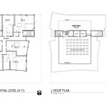
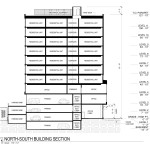
Polyphon Architecture & Design have gone before the Design Commission to receive advice on a proposed 11-story mixed use building at SE 7th & E Burnside. The 121’-10” tall building would include a 10,628 sq ft of office space and 49 residential units. Two retail units would front onto E Burnside. Parking for 55 vehicles and 78 bicycles is proposed.
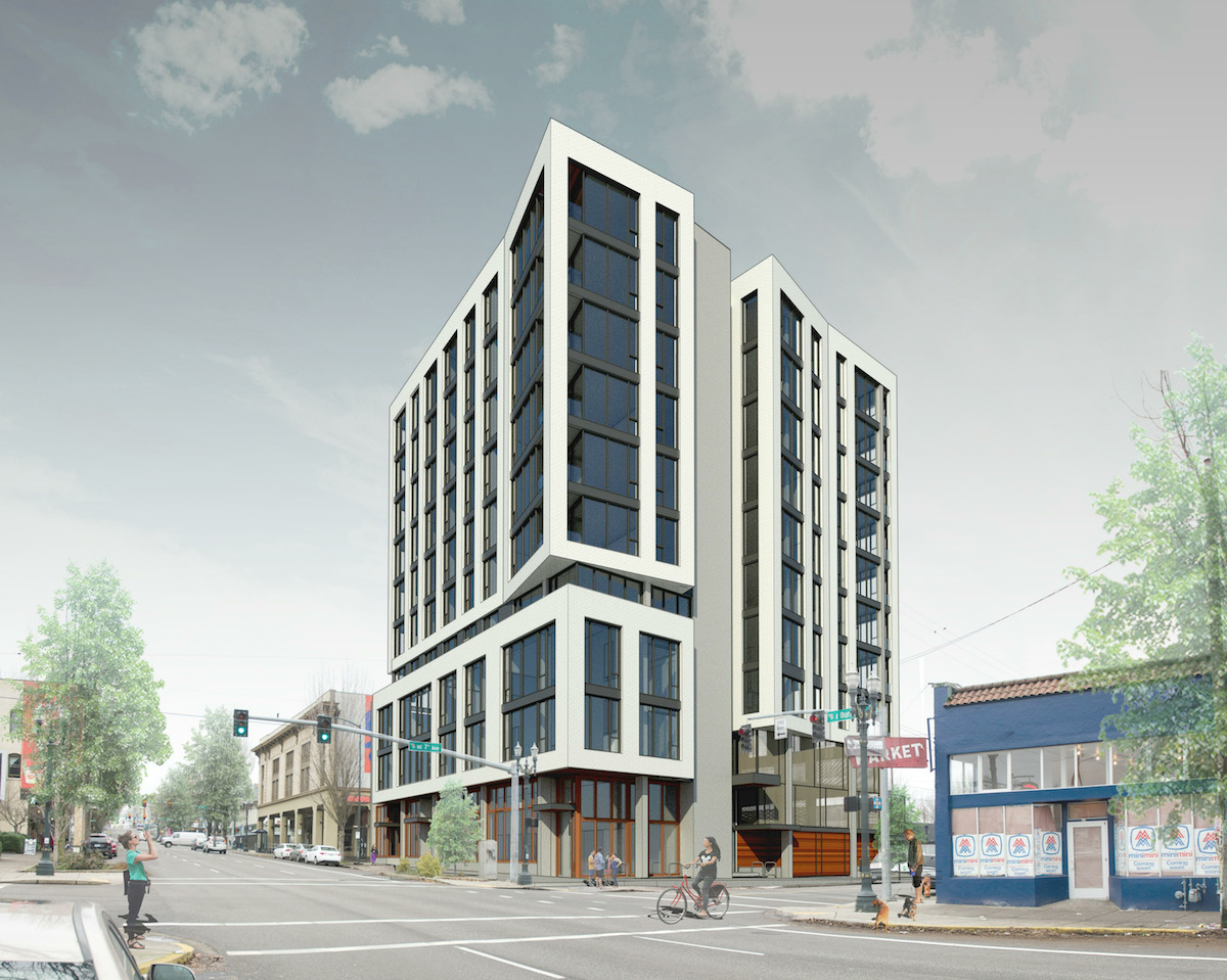
Most of the roughly quarter block site is currently used for surface parking. The site also includes a residential style structure built in 1900, which was most recently home to the Farm cafe. The restaurant closed at the end of 2015.
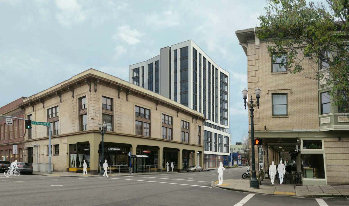
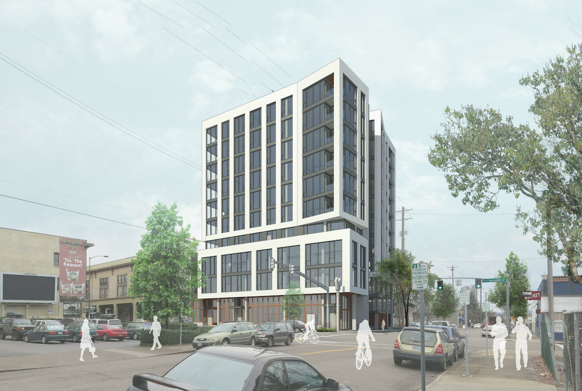
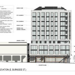
The primary material proposed for the building is a cream colored brick in a running bond pattern. Other materials proposed include metal panel, meranti wood and expanded metal mesh. Wood storefront windows would be used at the ground level, with aluminum storefront windows used on the body of the tower.
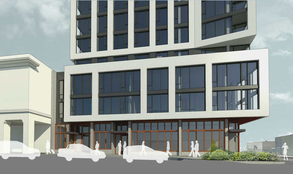
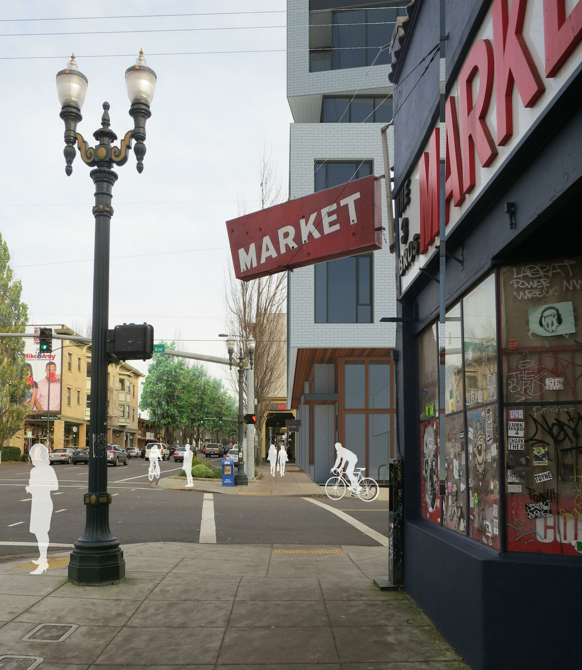
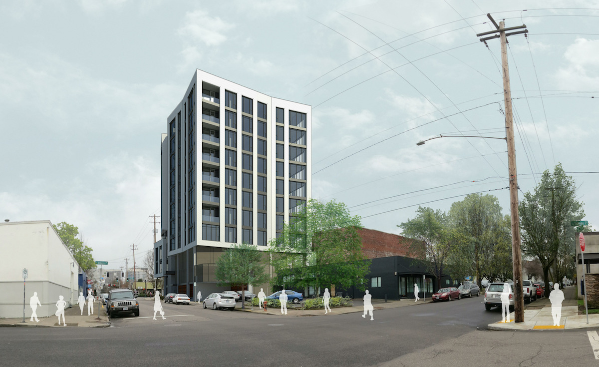
Arcade Option
The primary design option shown to the Design Commission (above) has a 4′ projection building projection over E Burnside. The applicants also showed an alternative design, where floors 3 and 4 of the building fully project over the sidewalk, in response to the Design Guideline that states buildings should “reinforce the effect of sidewalk arcaded buildings fronting on East Burnside Street”. Although presented as an option, the architects explained that the full projection was their original design. Part of the reason for reducing the depth of the projection was that building area in the right-of-way needs to be leased from the Bureau of Transportation, and that this is of concern to the bank that is financing the project.
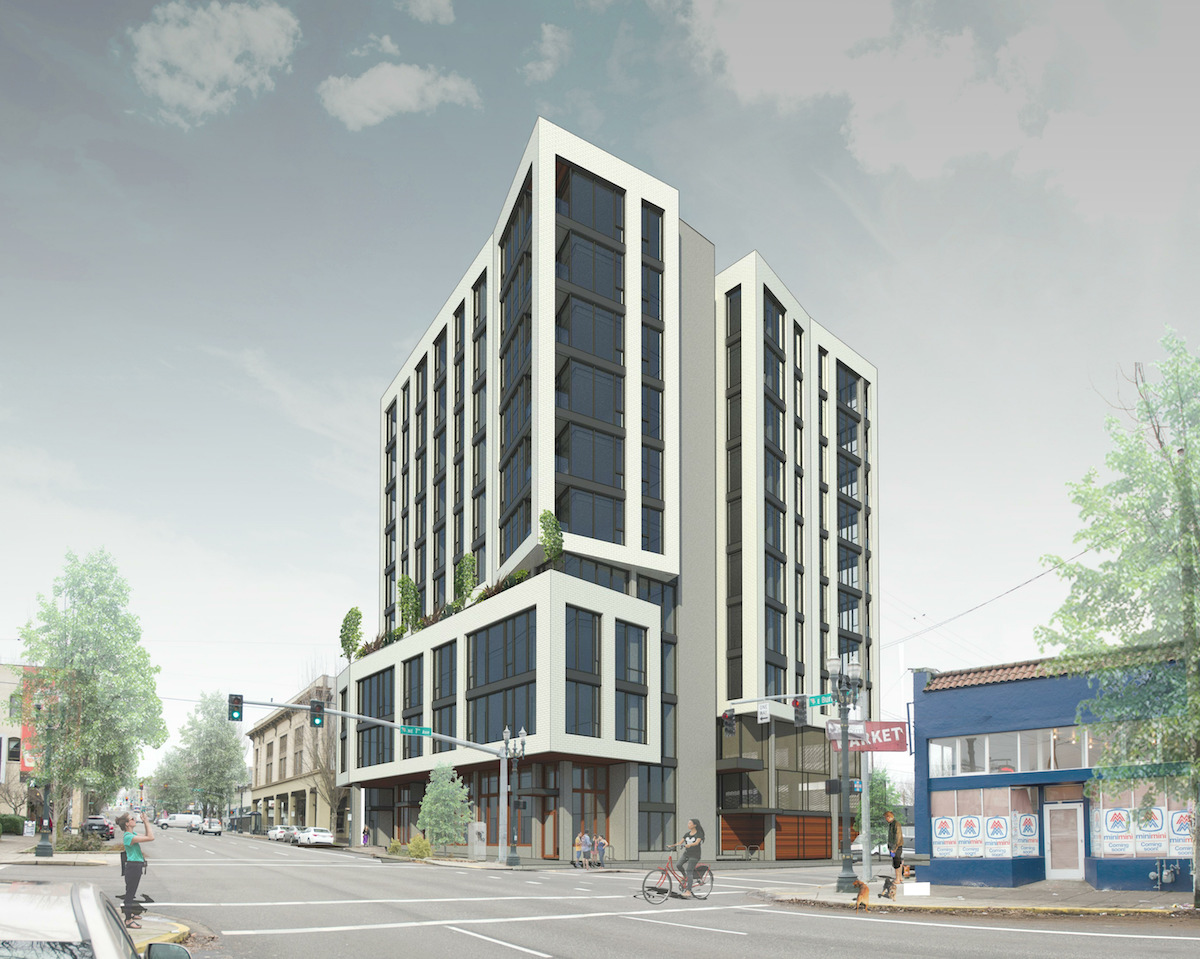
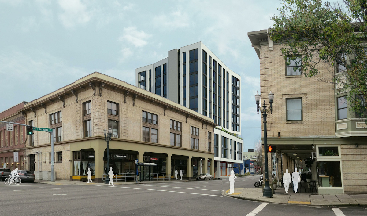
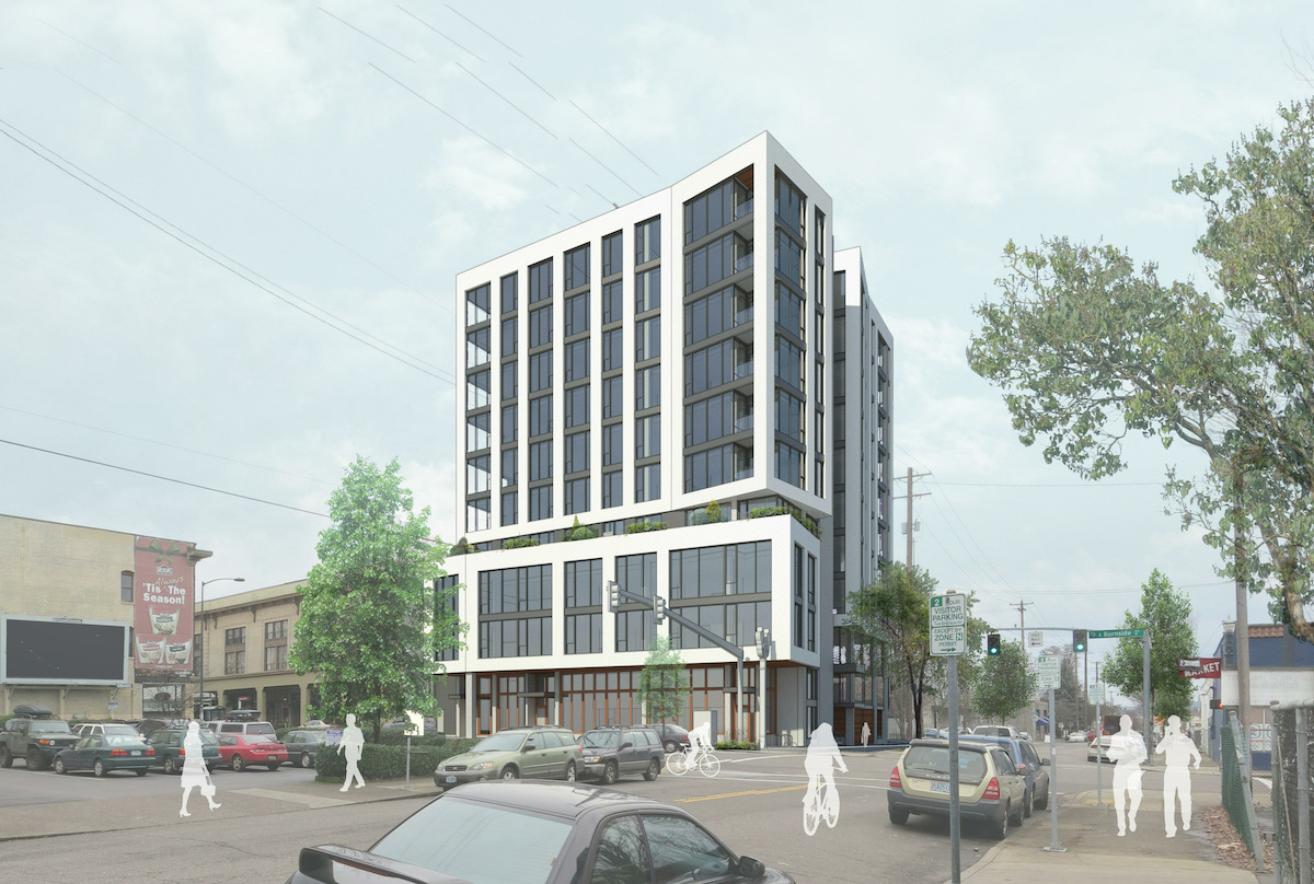
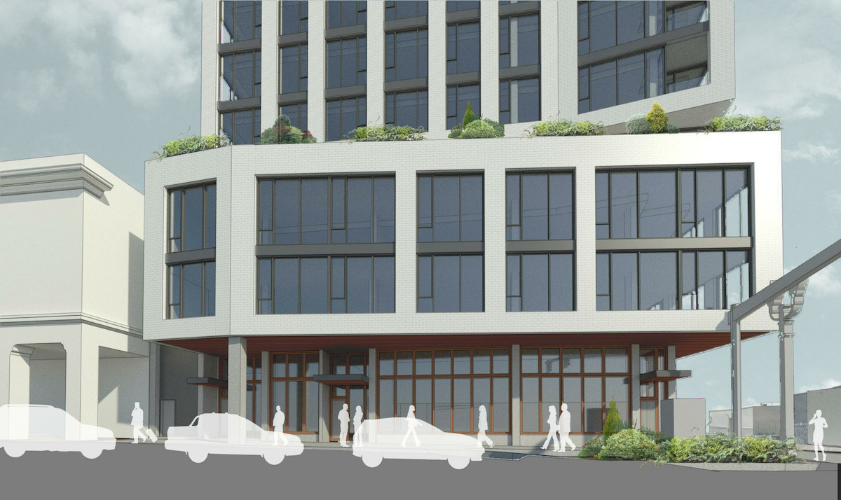
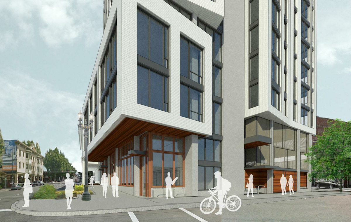
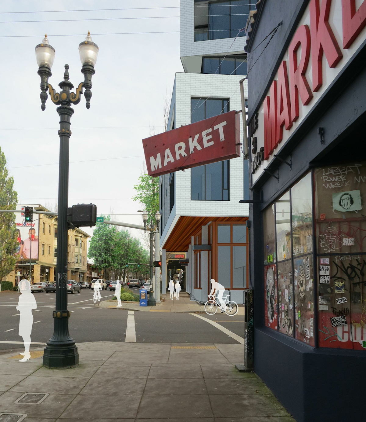
A memo [PDF] to the Design Commission, published before the March 24th advisory hearing, outlined potential areas for discussion. These included: the building massing, and the choice between an arcade or an oriel window; the ground floor, and the impact the parking garage has on it; the elevations and composition; and the exterior materials. A large part of the Design Commission’s discussion was based around the degree to which parking negatively is negatively affecting the building’s elevations along SE 7th Ave. Direction was given to consolidate the two parking entrances into one, and not to use expand metal mesh on the facade as a way of ventilating the garage. The applicants were also encouraged to respond to the arcade guideline in a meaningful way, instead of a token projection over the sidewalk.
Near the end of the hearing Commissioner Livingston offered her thoughts on the massing of the building:
I think it’s really nice that you are respecting the height of the arcade. I think the volume that you propose at the lower levels on Burnside, looking at that in elevation, works pretty well. Looking at the larger massing picture, the three boxes that are defined by the white brick are very conservative, and I don’t think that sits well in this district. I would like to see the exterior design, the envelope design, be more reflective of what’s happening in plan. You’ve got some nice corners and ins and outs. There’s a lot here to play with. But the schizophrenic quality of those boxes and what’s happening at the lower levels, especially at the southwest corner of the building: it’s just not all pulling together yet. My sense of it is that you really have to push the architecture of it a little bit harder to have it merge into the neighborhood more cohesively.
The applicants have the option of returning for a second Design Advice Request hearing, but are not required to do so. In order to gain approval the project will have to go through a Type III Design Review, with public hearings before the Design Commission.
Drawings
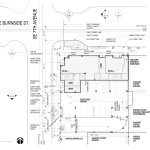
- Plan – Site
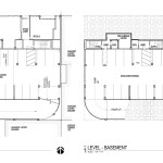
- Plan – Level 1 & Basement
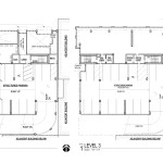
- Plan – Levels 2 & 3
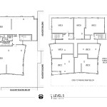
- Plan – Levels 4 & 5
- Plan – Level 6-11 & Roof
- Section – North / South
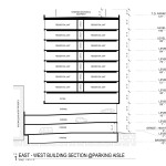
- Section – East / West
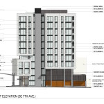
- Elevation –
- Elevation – West
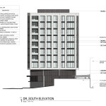
- Elevation – South
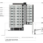
- Elevation – East
This is the one project in that area that I’ve actually liked. It’s amazing that the committee has approved so much garbage in that area, but this project is considered not good enough. The white brick would be a welcome reprieve from the black monoliths that pollute the district now.
I like this! At least, I like the front half a great deal. The full arcade is essential. The back half looks like its sitting atop a waste-transfer station. :/ Perhaps rather appropriate considering they’re giving up that much space to store cars, but we don’t need buildings to be quite that literal.