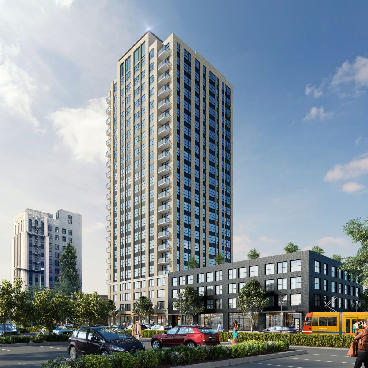
Grand Belmont, the project by Urban Assets Advisors whose height was of significant concern to the Historic Landmarks Commission last year, has returned in front of the Commission as a 23 story point tower. As now proposed the Vallaster Corl designed building would reach 240′ and include 214 residential units. A rooftop common room and exterior terrace are proposed for the top floor. Three ground floor retail spaces totalling 6,500 sq ft would open onto SE Grand Avenue. Parking for 102 vehicles would be provided in the podium portion of the tower.
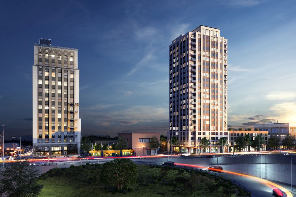
The site for the project is at 514 SE Belmont St, and is currently used as surface parking. A Dutch Brothers coffee stand is located at the corner of the lot. Because the project is located in the East Portland Grand Avenue Historic District the building design is reviewed by the Historic Landmarks Commission, instead of the Design Commission. The historic district is located at the core of the once separate city of East Portland. The lone high rise building in the district is the 175′ tall Weatherly Building, which was completed one year before the start of the Great Depression.
In the revised scheme the tower would occupy slightly less than one quarter of a block. The walls would be pulled far enough back from the property line to allow windows on all four sides of the building. The architect’s narrative states that the architectural language of the tower is “of it’s time, but establishes a dialog with the Weatherly Building, through the use of a strong vertical expression.”
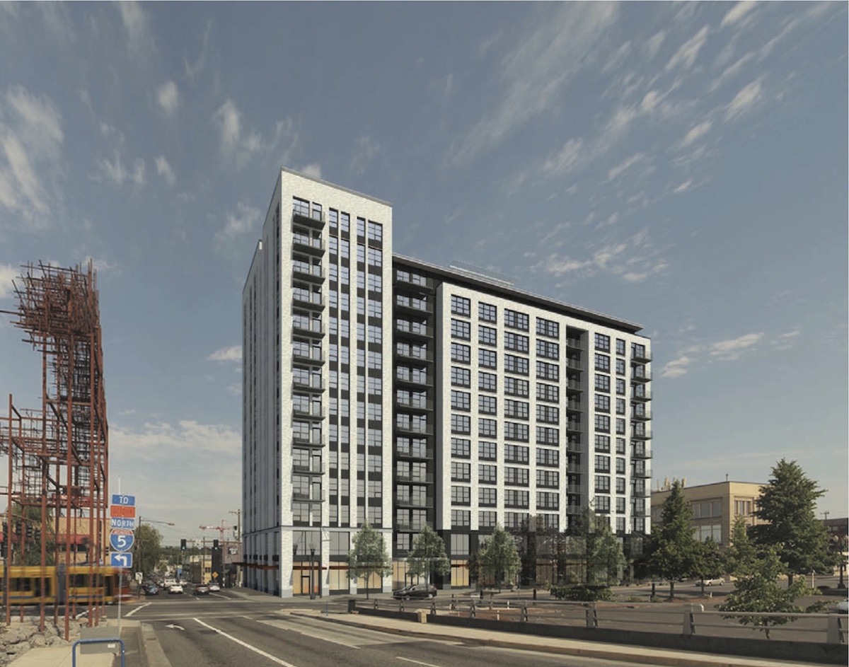
While the point tower was presented as the preferred option, Vallaster Corl also showed an option for a 14 floor bar scheme, which is a modified version of the scheme presented at the previous Design Advice Request. The bar scheme would achieve the same 12:1 Floor Area Ratio as the tower scheme, but would only rise to 150′.
A memo [PDF] to the Historic Landmarks Commission was published before the March 7th Design Advice hearing, outlining potential areas for discussion. These included massing, the above grade parking and architectural detailing. The memo raised the point that should the project not be supported by the Landmarks Commission there is a high likelihood that their decision would be overturned by City Council, resulting in an approval:
The applicant has indicated that they do not intend to significantly reduce the floor area ratio from the proposed 12:1, which is the maximum that is noted as potentially attainable in the Central City Plan District through the use of bonuses and/or transfers. As such, staff notes that the applicant is likely to return to the Landmarks Commission for a Type III Historic Resource Review which, if not supported by the Commission, could be ultimately approved by City Council on appeal. As such, staff requests that the Commission offer comments as to how the proposed building could be refined to be more compatible other than the scale in the event that that the proposal is denied and approved on appeal.
Though not unanimous, a majority of the Commissioners expressed support for the taller but more slender scheme. Commissioner Minor suggested that the tower should perhaps reduce slightly in height, with tapers at the top, and grow by one story at the podium to match the height of the U.S. Laundry Building to the south. Much of the discussion however focused on the exterior skin of the building, and how it can be designed to complement the larger Historic District and the adjacent Weatherly Building. Commissioner Chair Ranzetta described the trade off that the Landmarks Commission may ultimately be willing to make:
I think that we’re willing to make several concessions in terms of the height of the tower and other components, but it really is going to be contingent on the level and quality of the materials you use in the building, and how they speak to the larger district: the fenestrations patterns, the type of windows, the proportions and how those work with some of the neighboring contributing resources.
The project will be required to return in front of the Historic Landmarks Commission for a Type III Historic Resource Review in order to gain approval.
Drawings
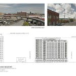
- Plan – Context
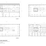
- Plans – Level 1, 2, 3 & 4
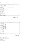
- Plans – Levels 5 to 22, 23
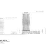
- Elevation (Tower Option)
- Elevation (Bar Option)
this is great! Every time I see the Weatherly Building I think about the Oriental Theatre, which must have been impressive. I think it’ll look good to have more height nearby.
tedderp, I agree. It looks like the proposed building offers some symmetry with the nearby Weatherly building. I think the emerging CEID in SE Portland needs some height without having too much mass that looks monolithic or creates too much shade. I think the Design Committee should approve some taller buildings like this so long as the materials used in construction are of a better grade and offer some significant connection to the historical context of the existing structures in the neighborhood.
I’ve been watching this design process unfold with great trepidation, and I think this tower design is lovely. I commend Vallaster Corl for not conceding height to the most reactionary impulses of the HLC. Now if they can just set aside the horrible bar tower idea and focus their energies on making the point tower the best it can be, they will be doing everyone a service.
Now, given that I feel the new tower design is an amiable companion to the Weatherly building; and, if exterior materials and fenestrations are well considered, a thoughtful addition to the current reality and past aspirations of the East Portland Historic District, I have some concerns over the North quarter lot of the podium, as rendered. It’s blank, beastly, and disrespects not only the district, but the fine tower rising above. As there is one more design review meeting, I would strongly urge the architects at Vallaster Corl to reassess (or perhaps, from the looks of it, simply assess for the first time) that aspect of an otherwise very fine design.
Ian- I couldn’t agree more- the bar tower concept needs to be put to rest. The tower massing is much better however the current proposed fenestration/skin is akin to much of the mimic stuff Ankrom Moisan has done (and is currently doing) in the Pearl. I suppose VC felt pushing the height with the HLC was enough of a stretch without pushing the design. Its a shame because if you look at the Weatherly building it has a starkness that works well with contemporary aesthetics. In addition this is a key site at the foot of a major bridgehead. It deserves distinctive architecture. It would be great if we could build on the precedence of bridgehead “gateway” buildings: Big Pink, Yard, (hopefully) Mult. Co. Courthouse and the 2035 CC plan allowing for great heights at bridgeheads ( i.e. proposed James Beard Public Market, etc.) We really need to push for great design at these key sites. I also agree with you the base of the tower needs much work. I’m not sure if VC is up to this task. I believe the tallest building for them is Couch 9 and the results of it are TBD…