Grant Park Village Phase II has gone before the Design Commission for its first Design Review hearing. The 5 story building by LRS Architects for developer Capstone Partners is proposed to include 163 residential units and 107 vehicular parking spaces. The landscape design for the project is by Lango Hansen.
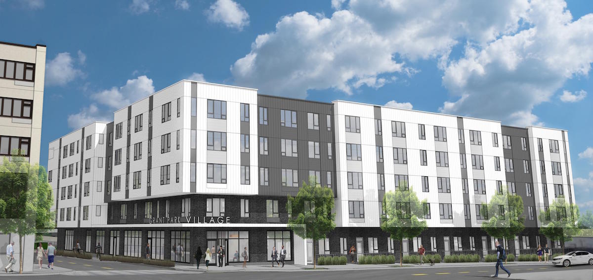
The building would be the second phase in the development of Grant Park Village, located on the former site of the Albina Fuel Co in the Sullivan’s Gulch neighborhood. The first phase was approved by the Design Commission in 2013, and completed in late 2014. The project site is adjacent to the future Sullivan’s Gulch Trail, and the project will include an access easement that connects NE 32nd Ave to the trail alignment.
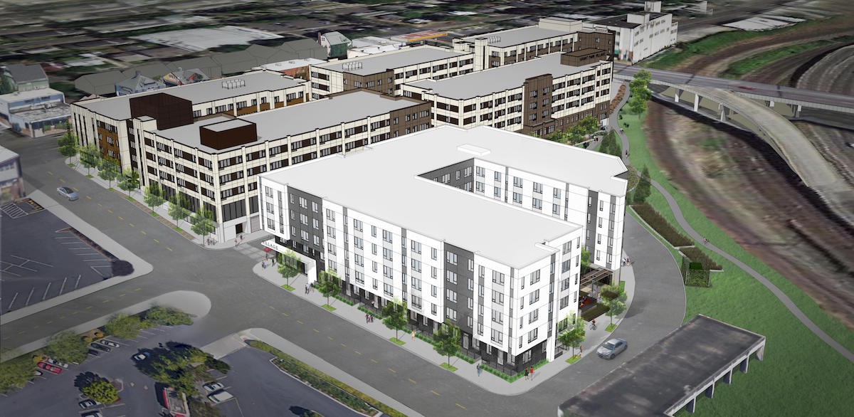
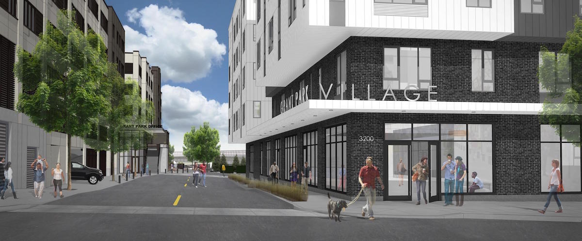
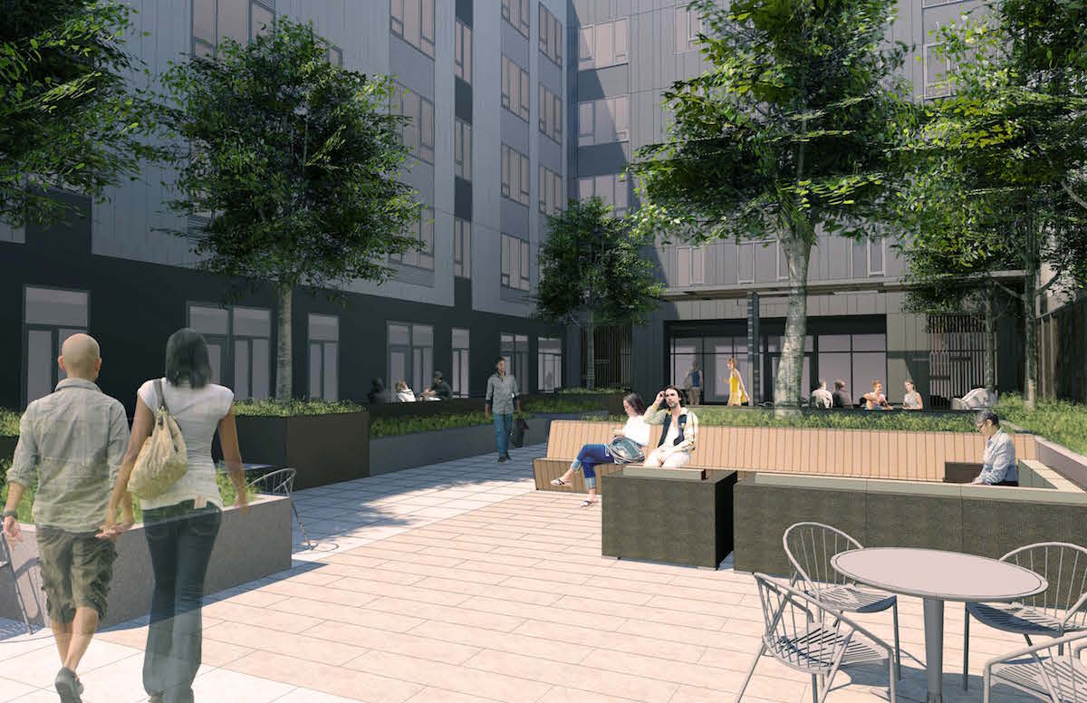
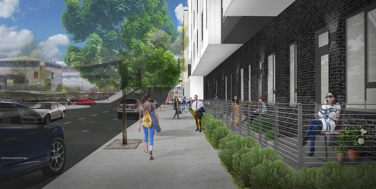
The U-shaped building is oriented with a courtyard facing south. The main entry to the building is proposed for the corner of NE 32nd Ave and a private street in alignment with NE Weidler St. Ground level units with entries directly to the street would face NE 32nd Ave.
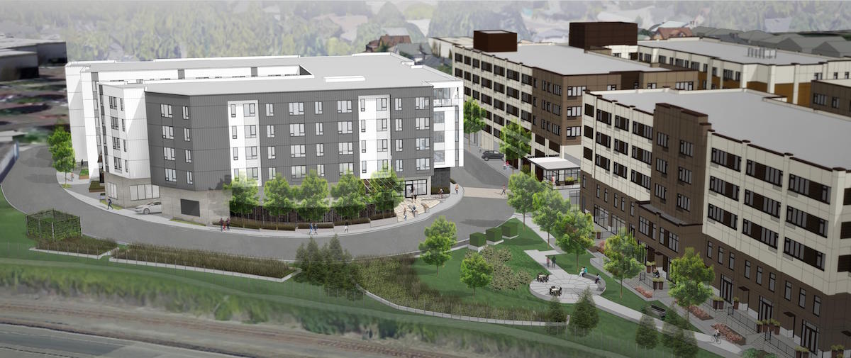
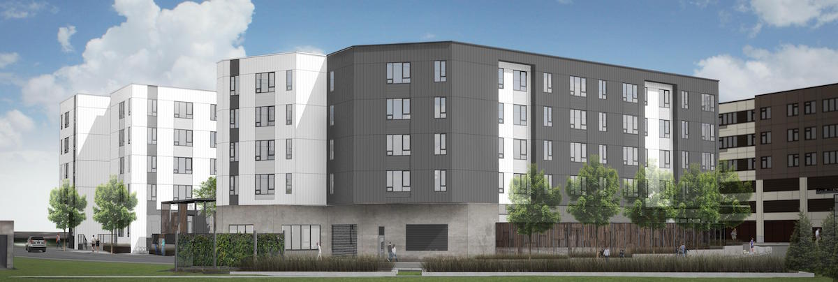
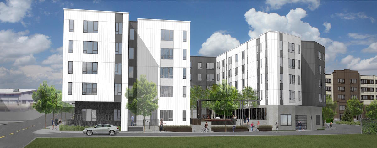
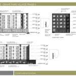
The primary materials proposed for the project are metal panel and fiber cement panel. Dark colored brick and cast in place concrete would be used at the ground level. Vinyl windows would be used at the residential units and aluminum storefront at the ground level active use areas.
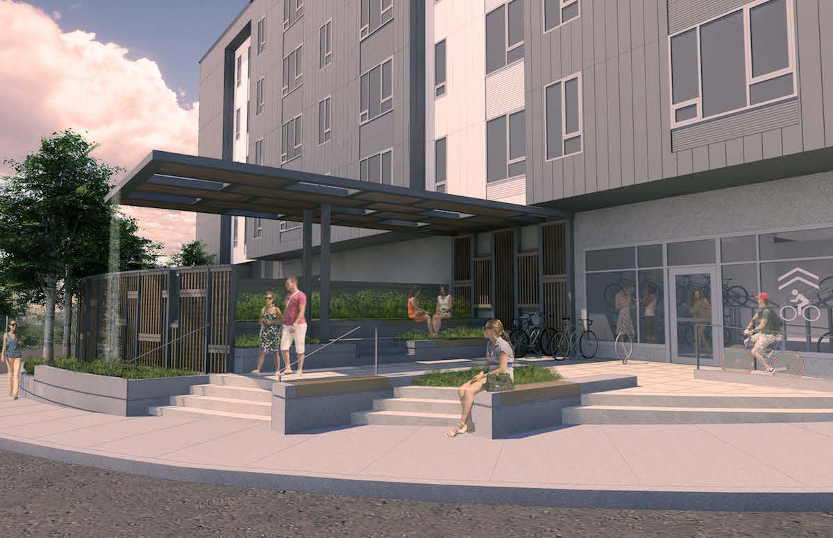
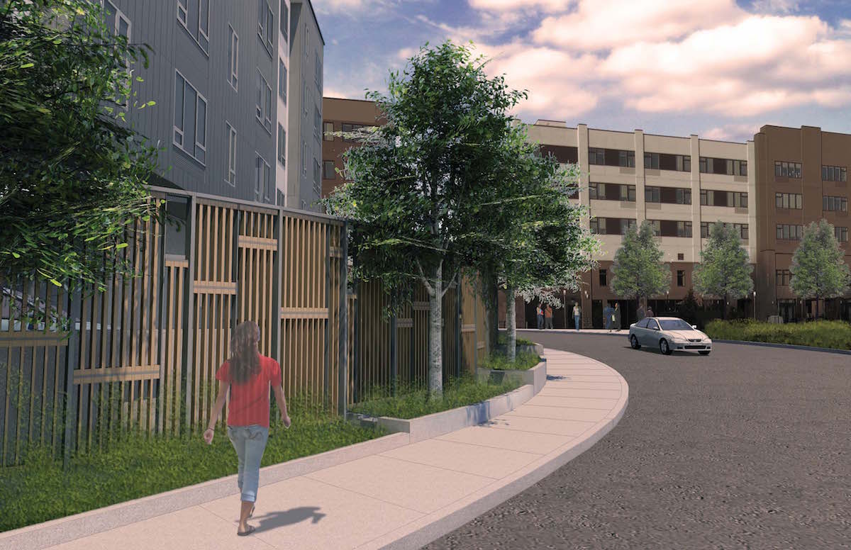
A Staff Report and Recommendation to the Design Commission [PDF], published before the February 4th hearing, did not yet recommend approval. Issues cited as unresolved included the lack of active ground floor uses on the south and east elevations and the excessive ground floor program dedicated to parking and circulation; the exposed parking deck at the east elevation and abutting the central courtyard; the lack of design detail to ensure the metal panel will be resistant to oil canning; and insufficient vertical and/or horizontal setback and buffering of ground floor residential units. These concerns were shared by the Design Commission, especially as they relate to the south and east corners of the building. Near the end of the hearing Commissioner Savinar shared his thoughts about how the project needs to evolve:
I’m going to say something that you guys already know, but I’m going to put it out in the room. Which is that this site is accessed by a dead-end street; part of the parcel faces a loading dock; another part of the parcel faces a parking lot; another part of the parcel faces a freeway, a railroad and a soon to come trail, which is currently used for the homeless to camp on. This is a very very difficult site, not to mention the grade separation to Broadway. Marginal sites, with marginal buildings, encourage marginal behavior. I would encourage you to protect your investment in this site by using high quality materials, high quality designs and high quality details. I would encourage you to keep it simple and elegant, because that’s what this place is going to need. It all feels like back-of-house to me. The whole thing: the convoluted shapes, the access in, the materials, the whole thing. There is nothing elegant about this building. I think you have to really step back and think about where the front door is, how people enter this thing, how they get their car in. It has to be seamless and simple. Right now it’s extremely convoluted.
The project is currently scheduled to return for a second Design Review hearing on April 7th.
Drawings
- Plan – Vicinity
- Plan – Site
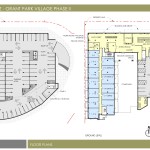
- Plan – Parking / Ground
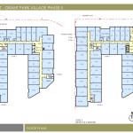
- Plan – Levels 2 and 5
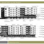
- Elevations – North and West
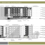
- Elevations – East and South
- Elevations – Courtyard
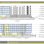
- Sections
Eww trash looking concept
Best quote: “Marginal sites, with marginal buildings, encourage marginal behavior” . In other words future slums. I am glad the design commission is calling it like it is! Portland deserves better.