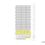
Works Partnership have gone before the Design Commission with a design for a 19 story tower on Block 75 of the Burnside Bridgehead. The proposed building would include 85 to 90 to residential units above commercial space. Parking is planned at 1:1 ratio in a mechanical parking system with storage at levels 3 and 4.
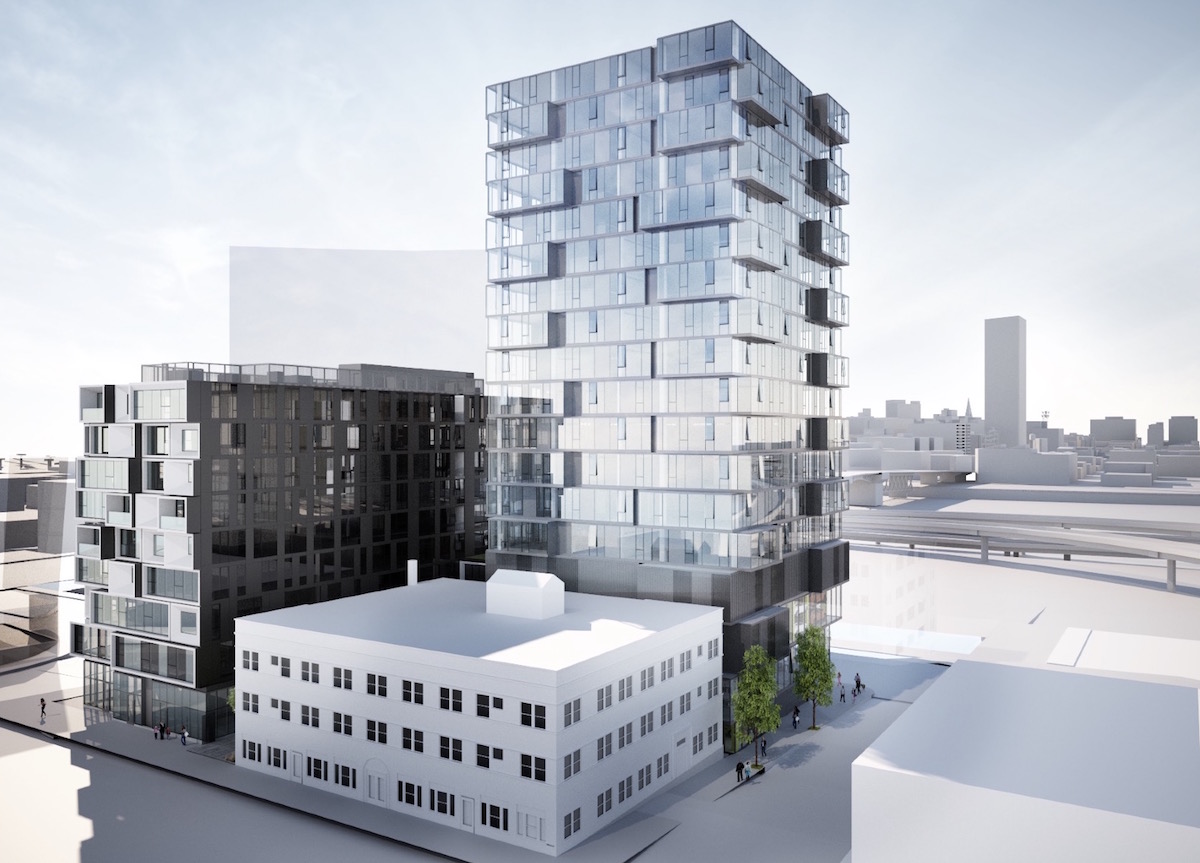
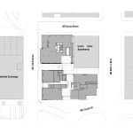
The site for the tower is the quarter block at the corner of NE Davis St and 3rd Ave. The project would be the second phase of development on Block 75, following on from the under-construction Slate mixed use building. The Union Arms, a 1908 apartment building located on the same block, will remain.
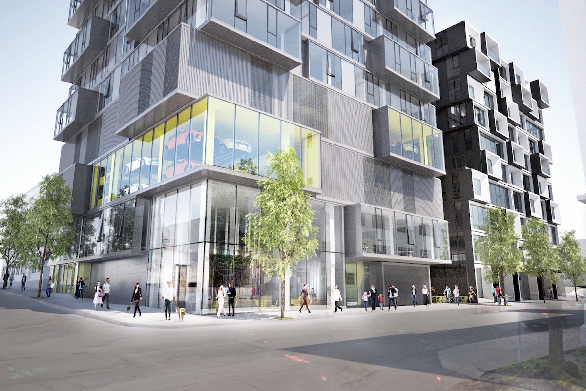
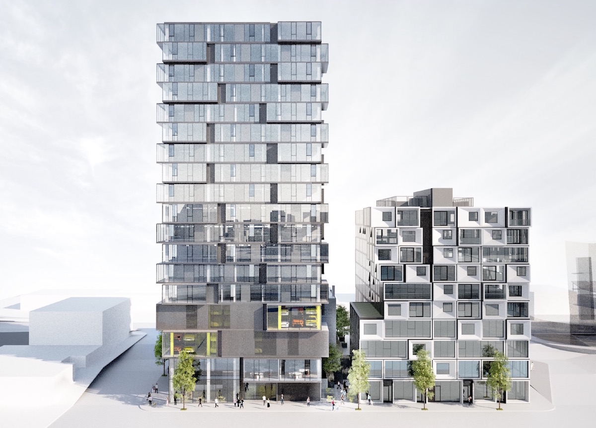
The primary material for the tower would be a clear window wall, with opaque metal panels integrated into the system. Although the architects were investigating the use of cross-laminated timber early on in the design process it is now planned to use post-tensioned concrete for building’s structural frame.
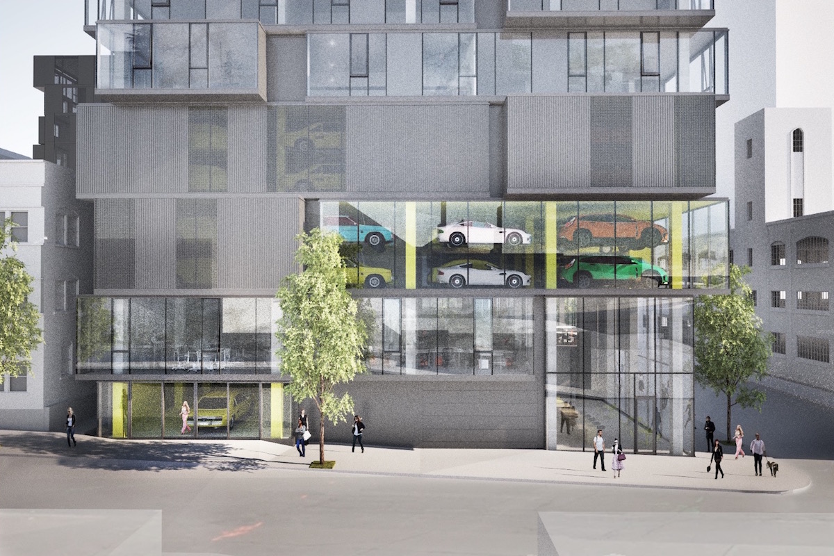
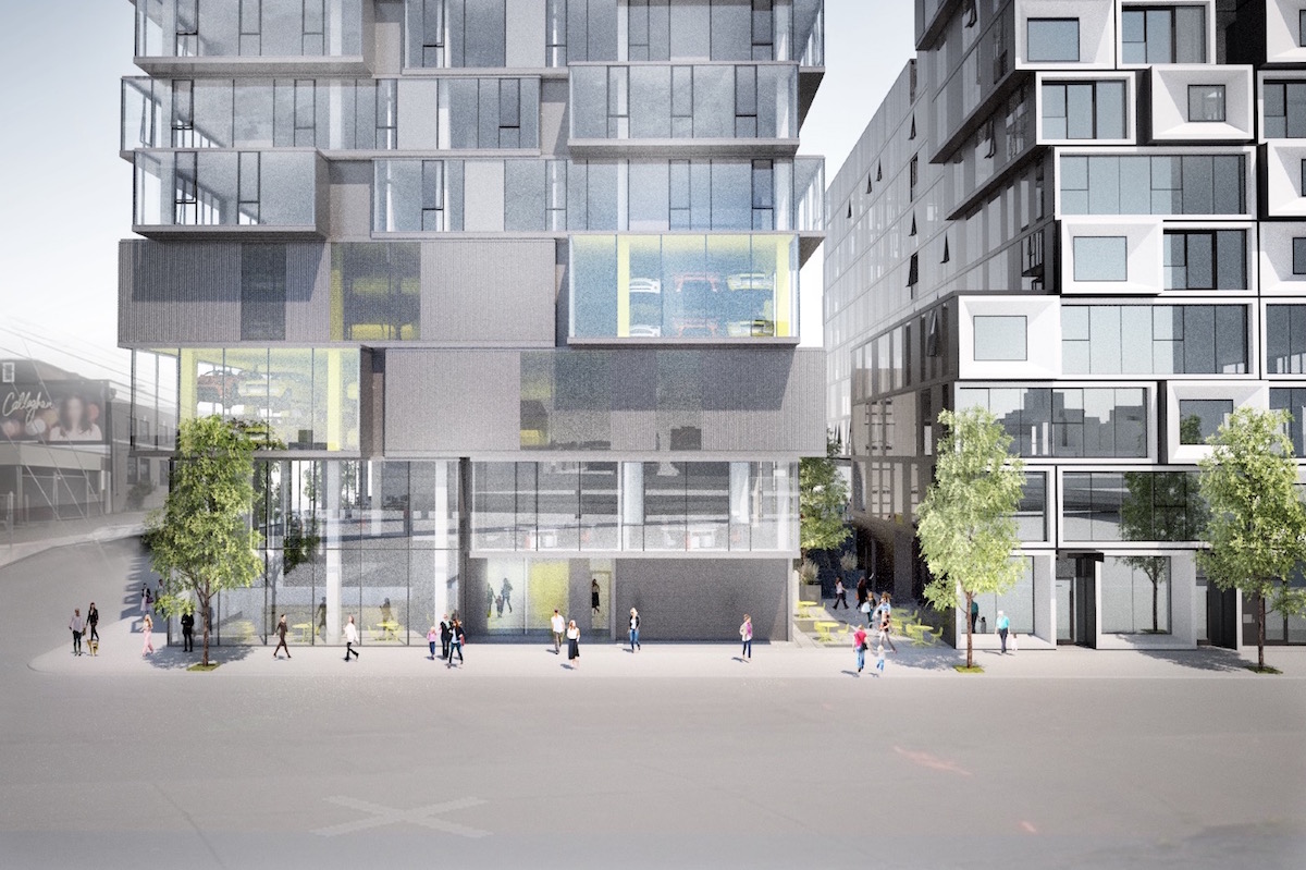
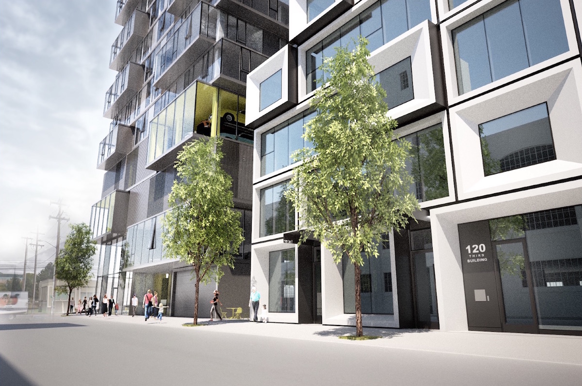
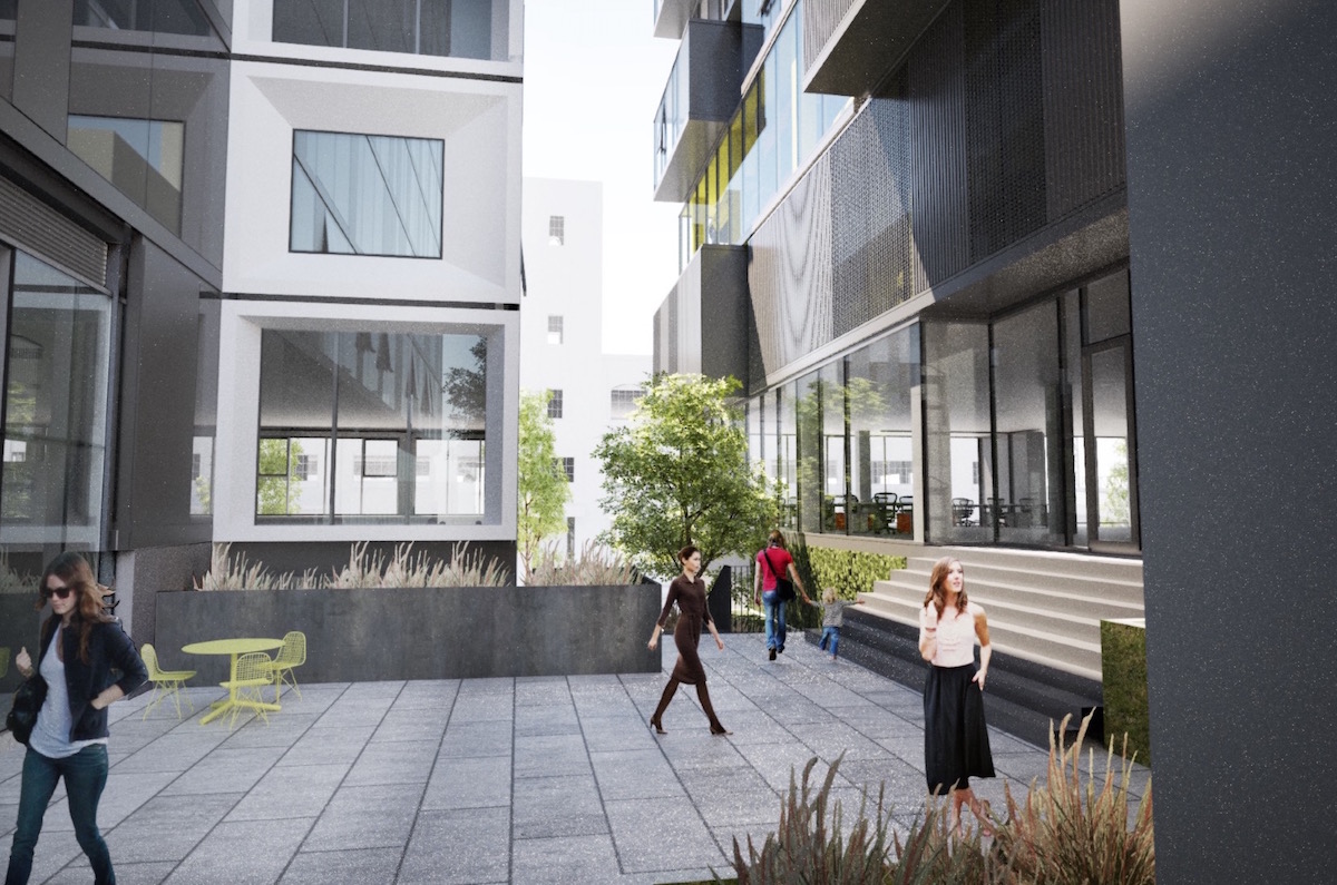
The tower will complete the northern edge of a new alleyway that will connect NE MLK to 3rd Ave, on axis with the main entry to the Eastside Exchange building. The uppermost of the two commercial levels will include entries directly onto the landscaped passage.
A memo [PDF] to the Design Commission was published prior to the January 28th Design Advice Request hearing, outlining potential areas for discussion including: massing; ground floor activation; potential oriel window modification; building materials; and rooftop mechanical equipment. In general the project was very well received, with the conversation focussing on the ground level activation given that a significant amount of the lower floor is taken up by parking and loading functions. The applicants were encouraged to further study whether it would be possible to use the ramp built for the first phase to access the second phase mechanical parking system. Summing up her comments on the project was Commissioner Livingston:
I think the parti is really strong. I like the building, and I hope that you continue to push it in this direction. I think that it will be very well viewed from the west side of the river. I like the way that this pops up above the Eastside Exchange, and I think that it’s a really nice compliment to phase I… next time you’re in I hope that you bring views from across the river that have all of the current construction in them…. I think that most of the challenges of the building are at the ground floor. You do need to address canopies, even though there’s a lot of overhang. There’s not enough overhang close to the street in some areas to provide good [pedestrian] protection. Understanding that it may impact costs, it seems like you need to change the program on Davis St. If you can shift the parking access and eliminate the loading you would just have a ground floor that works really really well.
The applicants have the option to return for a second Design Advice Request, though are not required to do so. The project will be required to go through a Type III Design Review with public hearings before the Design Commission.
Drawings
- Plan – Vicinity
- Plan – Site
- Plan – Basement
- Plan – Ground
- Plan – Level 2 Commercial
- Plan – Levels 3 & 4 Parking
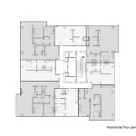
- Plan – Typical Residential
- Section
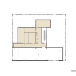
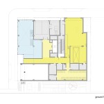
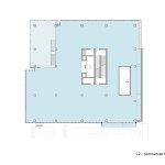
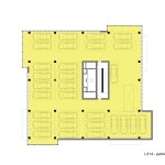
“a significant amount of the lower floor is taken up by parking and loading functions.” No kidding. That’s the biggest problem here. The parking on levels 3 and 4 looks bad from high up, but from street level nearby it won’t be as obvious. On the other hand, the blank walls and parking garage entrance along 2/3rds of the sidewalk is no good for pedestrians. I hope they can fix this.
I’m also surprised it was more cost-effective to use up two above-ground levels for parking, which could otherwise be an additional 16 residential units, rather than digging a 2-level basement. Then again, I’ve read that basement parking is about twice as expensive as above-ground in a structure.
We need to keep the pedestrian activation requirement in perspective. This is only a quarter block and Davis at this site is one block long that ends in a private drive bordering the I-84 canyon–this street will never be a major pedestrian route. The NW corner is significantly active and WPA is providing an excellent pedestrian amenity with the corridor mid block that aligns with the entrance of the Eastside Exchange and near the adjacent cascade walk down to 2nd avenue. If the Design Commission would focus on the larger issues we might be getting better results than Skylab’s Yard. I’m not just speaking of the current storm over the reduction in glazing. The skin and lack of depth of fenestration for such a prominent building should never have been approved. A few more windows at the top cannot mask the obvious lack of quality material and execution. Speaking of…
I can’t help but think what a missed opportunity it was to not award WPA the entire Burnside Bridgehead project. I normally would support a mix of designers but after seeing the mess Skylab has left us with Yard and the cartoon FFA and Guerilla are giving us with the Faired Haired Dumbbell one yearns for more from WPA. Not only in superior design AND fit and finish execution but perhaps a more coordinated scheme for the overall project site. My fear is PDC will do the same at the Pearl Post Office by selling off incremental pieces resulting in a disjointed result. We certainly do not want what Boora has done in the North Pearl: the sterile hue of sameness not to mention banal designs. GBD’s Oregon Square is not much better. But in the right hands both diversity and harmony can coexist in a larger project and contribute to richly textured urban fabric. Getting this right is more important than ever for our challenged city. Looking around much of our recent additions are looking far too much like anywhere, USA.
Very nicely stated.
I feel Boora’s effort on the Cosmopolitan is actually better than you perceive it, but to each his or her own. Mine is but another opinion.
I appreciate what WPA is bringing to the table from a design perspective. So long as they continue to push their adaptation of a modern expression without falling into a trap of trying overly hard to be ‘clever’ in each instance. Architects can certainly be guilty of that, when they try to separate themselves aesthetically in their theory and practice. WPA seems to hold in high regard, concepts where a modicum of restraint is mixed with a clear, bold tectonic idea, and an acknowledgement that their aesthetic direction is not modern in the impossible sense (Miesian)… but rather unadorned and tectonic, yet sensitive to context.
As for Joseph’s parking observtaion: Basement parking is almost ALWAYS considerably more money. Many cities are fine with well screened above-ground parking. They don’t penalize the project’s bottom line by counting above ground parking towards max F.A.R. like Portland does. It’s quite a statement that robotic parking above grade, clad in expensive curtainwall, plus the loss of F.A.R./Density and the units/revenue that would’ve gone there, is a better solution economically than. below grade. But, that’s how much it costs to go ‘down’.
I follow your concern for “clever” design efforts. I might however suggest we are suffering far more at the hands of the common than the clever. I do not find WPA work to be either. I do find their work refreshing in its attempt to refine a thematic language both respectful to the lineage of rational design yet quite aware of our current culture of diffidence and inability to delineate clear boundaries of domains; a language at play with the very idea of compartments shifting and blurring.
Nice! Reminds me of 56 Leonard, an apartment by Herzog & De Meuron, going up in Tribeca.
http://56leonardtribeca.com/home/
And, the parking is right where it should be.
The size of these units, plus the 1:1 parking ratio suggest this building might be a condominium. This would be great for the area and Portland in general. We need more owner occupied units coming on the market in this deluge of rentals.
Is this really canceled now? Does anyone know why?