The Fair-Haired Dumbbell has gained final approval from the Design Commission, after four Design Review hearings. The project by FFA Architecture and Interiors for Guerrilla Development will include 64,700 sq ft office and retail space. The Burnside Bridgehead building will be entirely covered in a hand painted mural, the design of which has not yet been chosen.
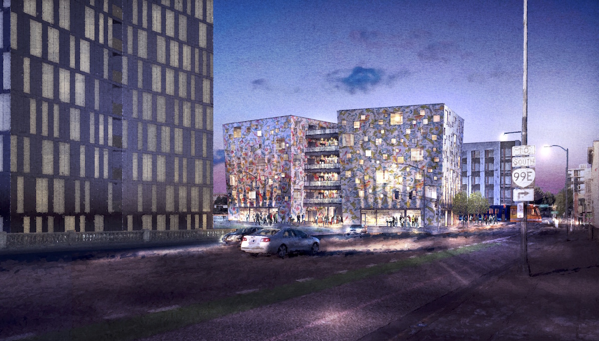
The proposed building will be located at the intersection of E Burnside and NE Martin Luther King Jr Blvd, on the eastern half of Block 76. The block is one of a number of blocks at the Burnside Bridgehead acquired by the Portland Development Commission in the 2000s, who at the time were looking to build a single large development on the multi-block site. After a number of attempts to develop the site failed, they sold off the individual blocks to different development groups. Nearby projects under construction at the Bridgehead include Yard by Skylab Architecture and Block 75 by Works Partnership.
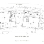
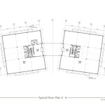
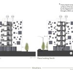
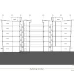
The proposed building is arranged as two linked boxes, from where it gets the “Dumbell” name. Each of the boxes will include 5 floors of office space over ground floor retail. In between the two boxes a roughly 2,000 sq ft plaza is proposed, while a 1,200 sq ft plaza will front onto NE Couch St. No vehicular parking is proposed, but secure parking for 44 bikes will be provided.
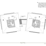
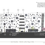
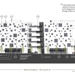
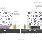
The primary exterior material will be a synthetic stucco system, with a Keim Silicate Mineral paint applied to the surface. The pattern will continue over the parapet and onto the TPO roofing membrane. The patterns for the building were originally proposed as two different florentine wrapping paper designs, which Guerrilla Development had already purchased the rights to use. The fact that the patterns were non-original and copyrighted created a concern that an approval could set a precedent that would allow large scale advertising on the sides of buildings, which is currently prohibited by Portland city code. The mural will now be required to be an original work of art, approved through a Regional Arts & Culture Council (RACC) process.
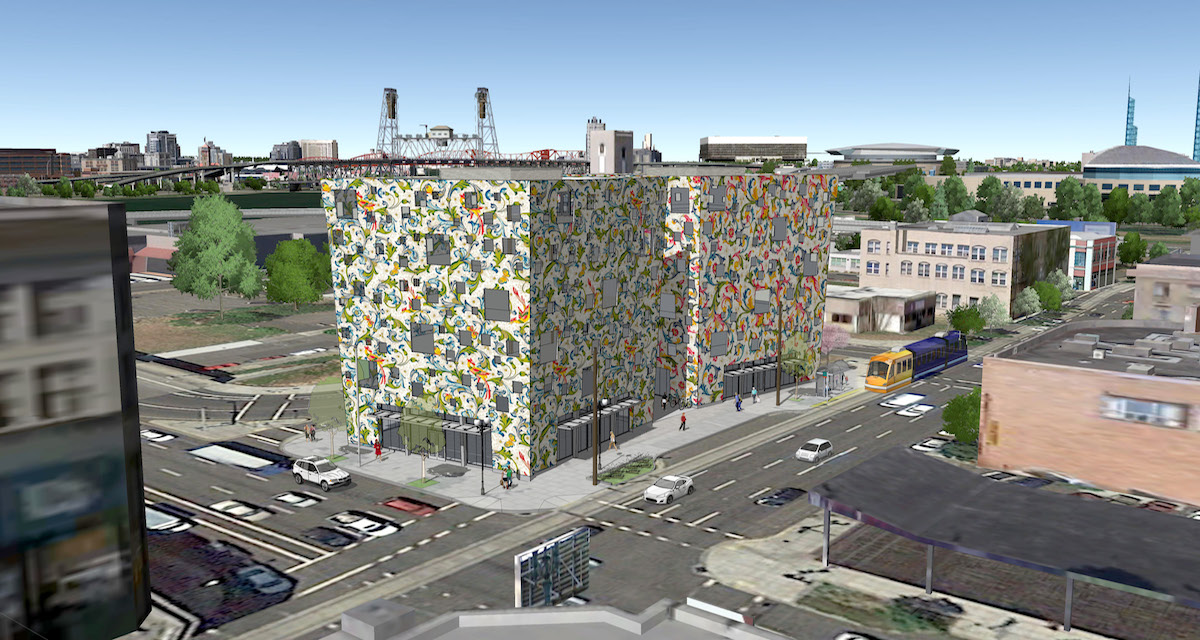
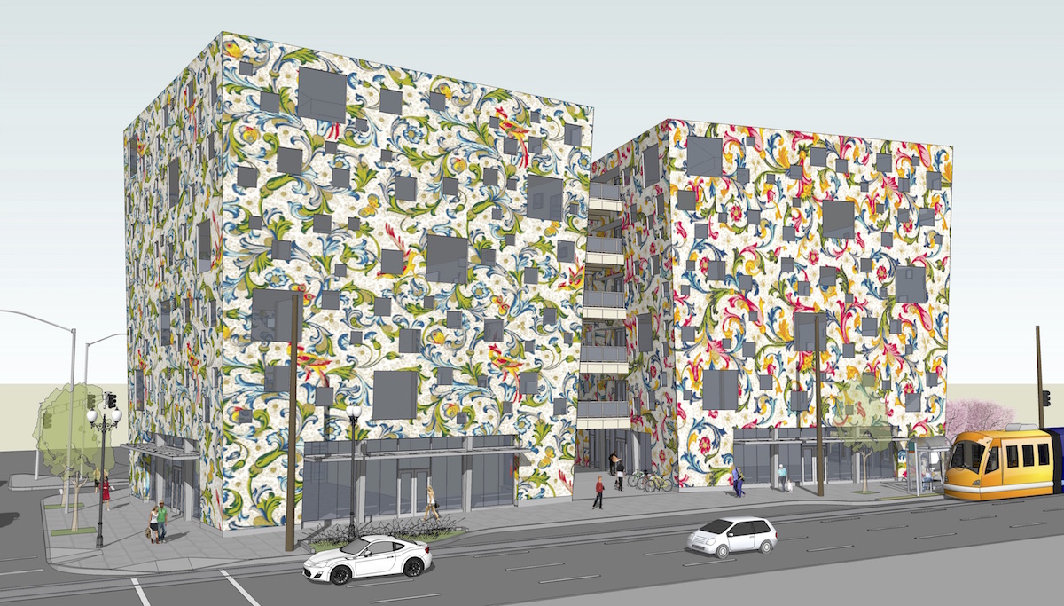
After an October 1st hearing at which the project did not have the votes to gain approval, an unaltered design for Fair-Haired Dumbbell was approved by a 3-1 vote on October 15th. Commissioners Livingston, Savinar and Simpson voted to approve the project, while Commissioner Kaiser voted to deny it. The Final Findings And Decision By The Design Commission [PDF] added conditions which included requiring that the mural be approved through a RACC process, be hand painted, and be maintained in perpetuity with regular inspections.
The project will now need to obtain building permits before construction can start.
Plans, Elevations and Sections
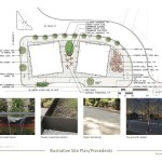
- Plan – Site / Landscaping
- Plan – Level 1
- Plan – Levels 2 to 6
- Plan – Roof
- Elevation – East (NE MLK)
- Elevation – West (NE Couch)
- Elevations – North & South (NE Couch & E Burnside)
- Elevations – Plaza North & South
- Building Section
I have never liked this design… I think it’s fairly terrible in fact. This design nowhere near the level of the rest of the bridgehead buildings. It’s all whimsy. Strip away the florentine and you just have a box with random windows (with an interior possibly gloomier than the Portland Building) that reads more as a solid. Totally inappropriate for a site that calls for something delicate and transparent (preserving the view to the bridge instead of blocking it). I do not see how the design community can think this is good.
I can’t believe such a prominent site is being wasted on this hacky joke on the city. Burnside has already been cursed with this firm’s Rocket Building, which no one wants anything to do with. This site is the most visible gateway to the east side and deserved something spectacular. This just looks like the Portland Building’s cousin.
It’s too bad that the design commission ultimately was not able to make significant progress on this terrible gimmick of a building. Mr. Cavenaugh is a developer and should stick to that side of the business – there is more than enough design talent in Portland that he could use to design buildings for him. This will seriously degrade this part of the city that is otherwise showing an impressive amount of commendable design. All of his projects seem unrefined, oddly designed (but not in a charming way) and low budget.
It is amazing that even a Design Commission still can’t please everybody.
This project is simply retched! What an incredible waste of prime real estate. While most of us are striving for form, function, density, beauty and responsibility this eyesore is anything but. Way to go design commission! I guess we can add this looser to the list of poor oversight.
This building is absolutely terrible. Waste of a prime location and completely not thought out or resolved. Very sad that the design review could not prevent this from being built.