The Lloyd Cinemas redevelopment has returned in front of the Design Commission for a second Design Advice Request hearing. The project by Holst Architecture and 2.ink Studio is now proposed to be developed in two phases. The first phase on the western portion of the site would include 680 residential units and 650 parking spaces. A future second phase would include a high rise tower, and a total of 570 residential units and 440 parking spaces. Both phases would include active uses at the ground level, including restaurants, retail, maker space, micro restaurant and residential amenity spaces.
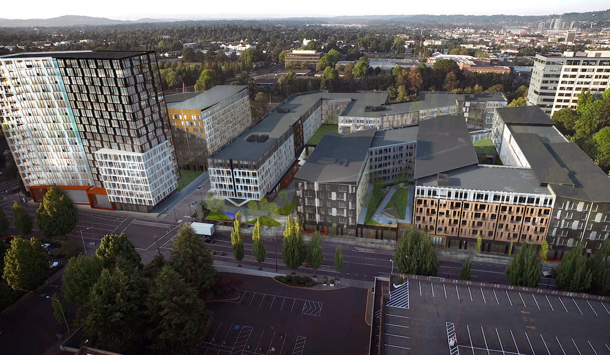
The project at 1510 NE Multnomah St will replace the Regal Cinemas Lloyd Center 10 & IMAX, as well the associated parking lot. The cinema was built in 1987 on a previously vacant site. The parking lot has never been developed with buildings. News broke in May 2015 that the owners of the Lloyd Center had agreed to sell the property to a consortium of developers, who include California based Bob Bisno and Dan Palmer.
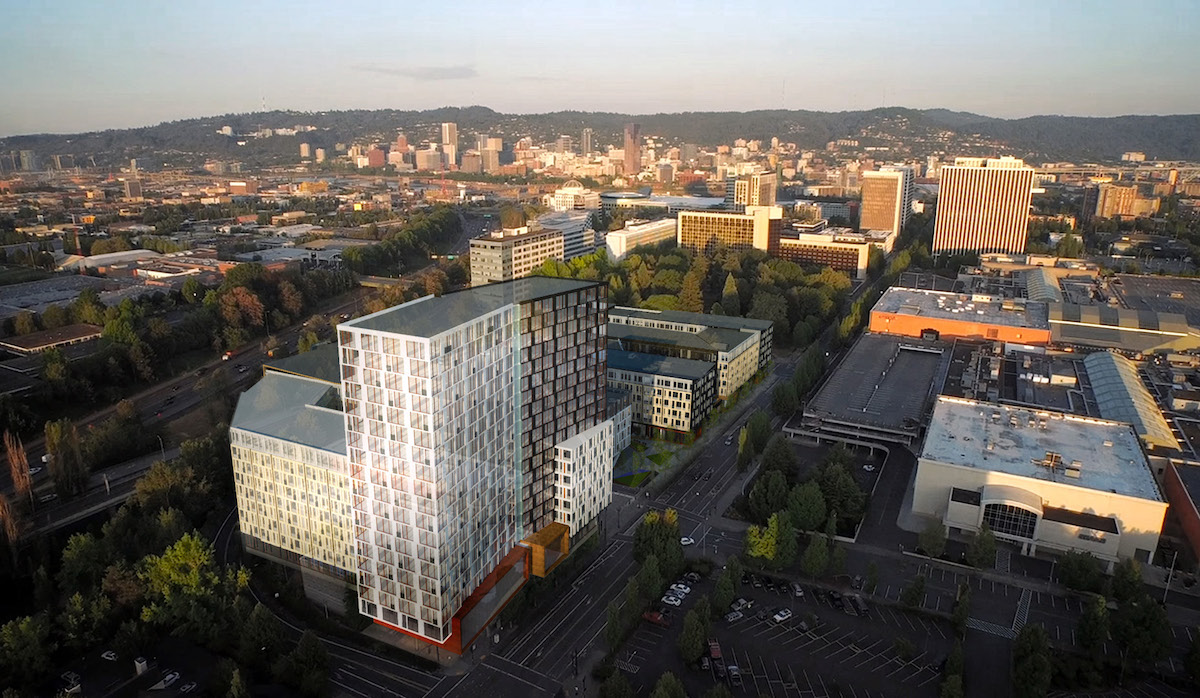
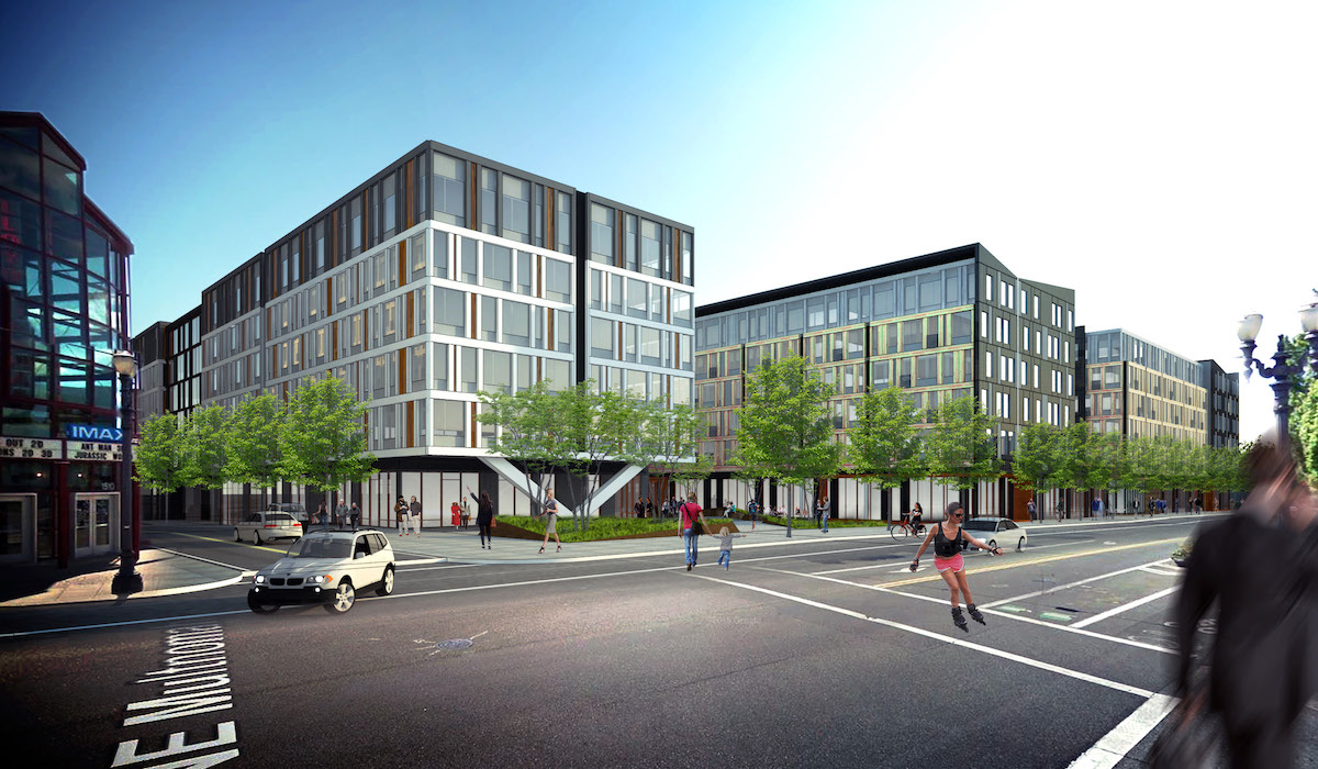
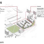
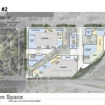
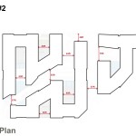
As with the first iteration of the design presented, the major move of the project is a diagonal pedestrian path across the site, intended to link the Sullivan’s Gulch neighborhood to the Lloyd Center / NE 11th Ave MAX stop. This move was well received by the Design Commission at the first Design Advice hearing, though the Commission had made comments about how the path could wind up feeling relentless given its 500′ length. In response the open space has been reconfigured into a series of more meandering nodes, with small plazas at center and each end of the diagonal.
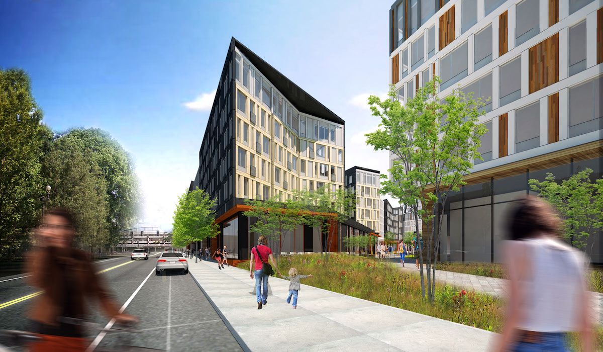
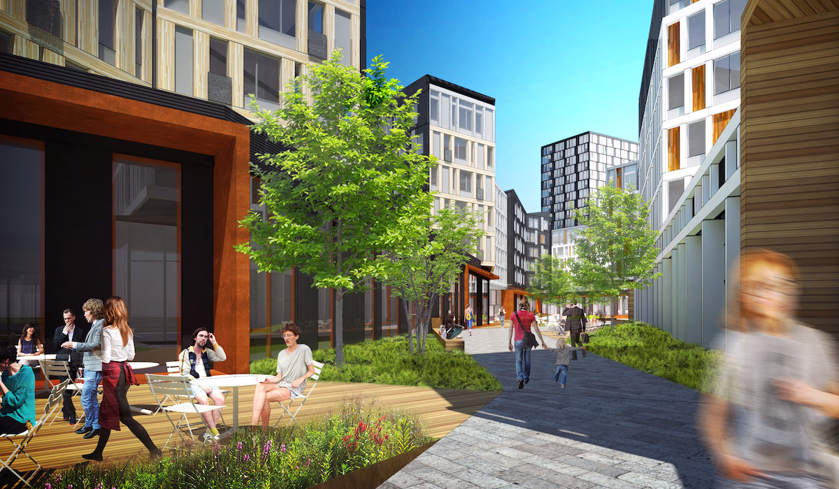
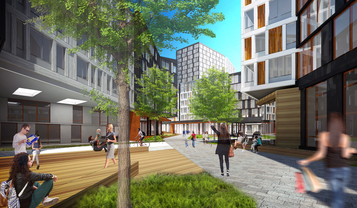
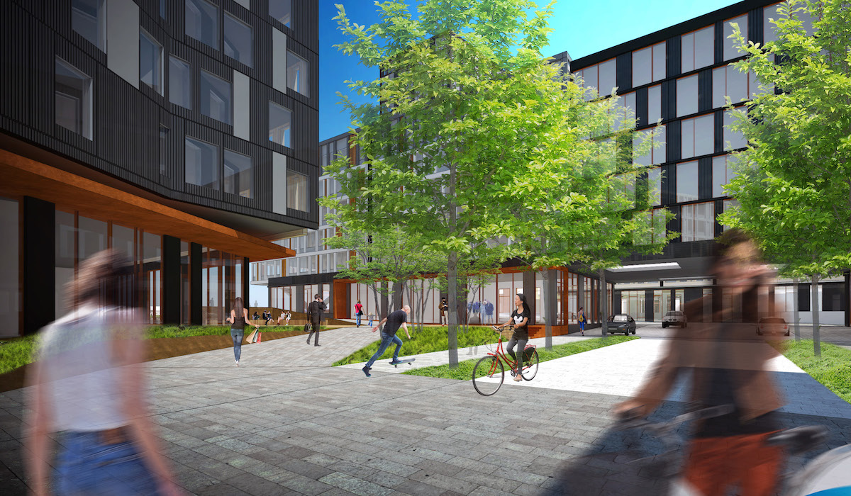
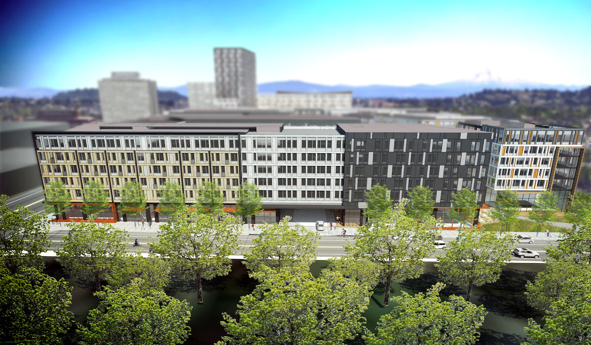
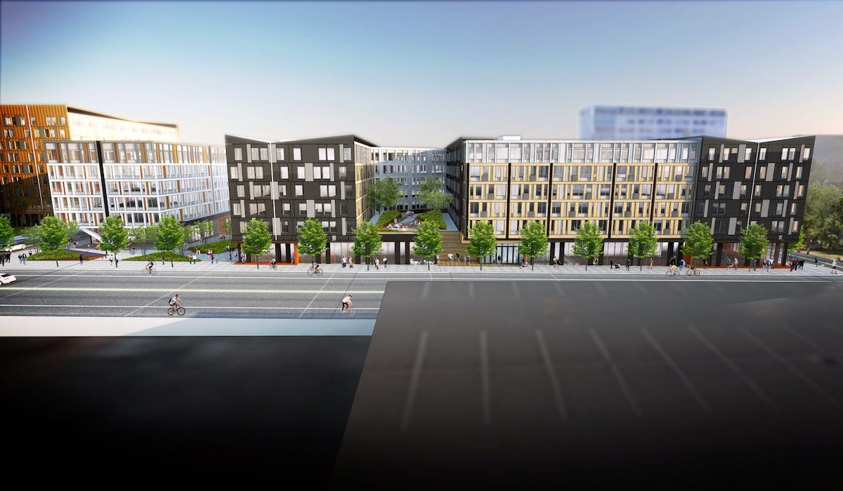
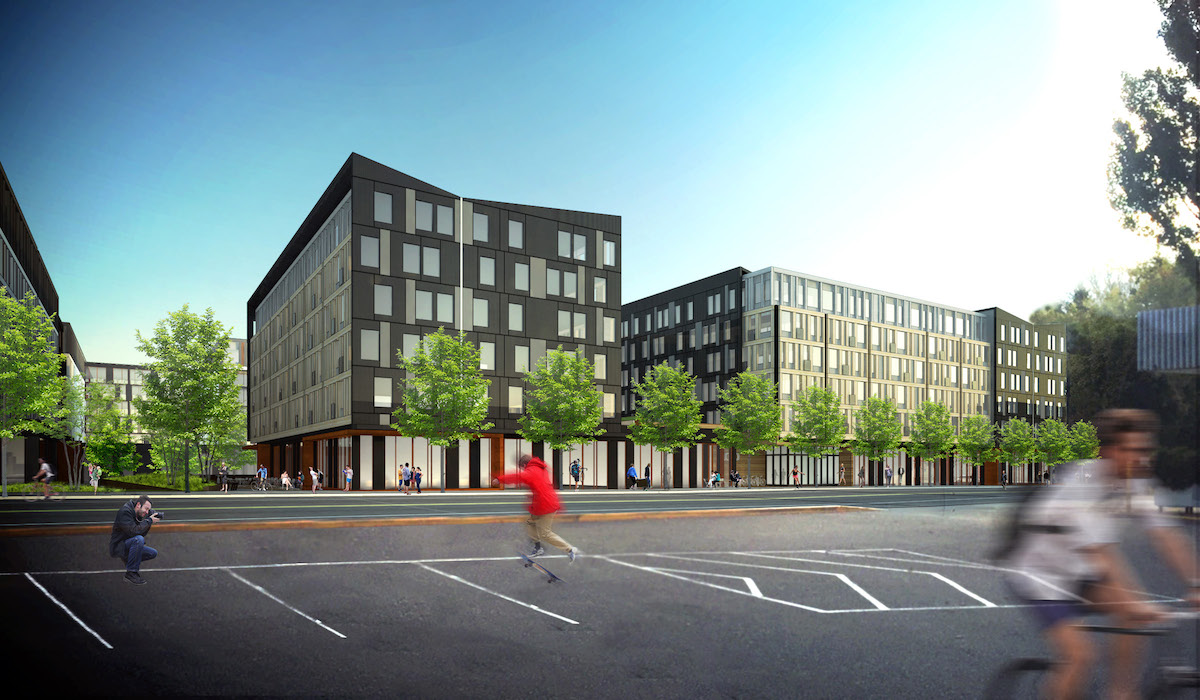
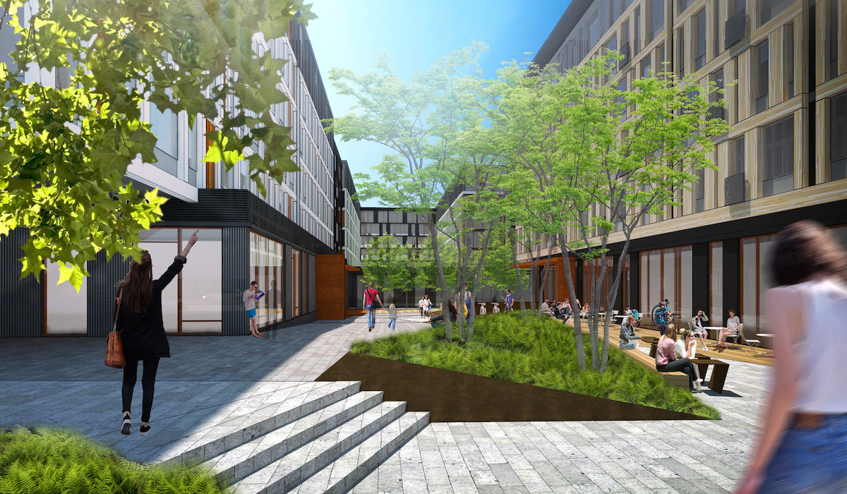
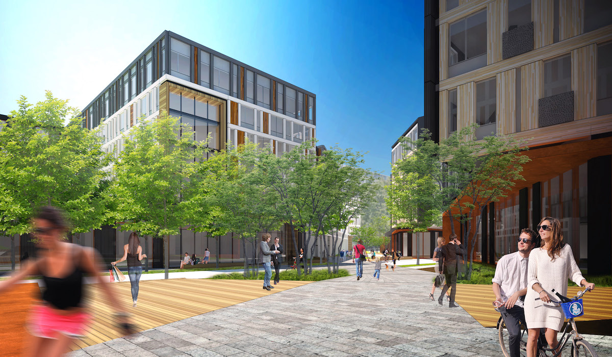
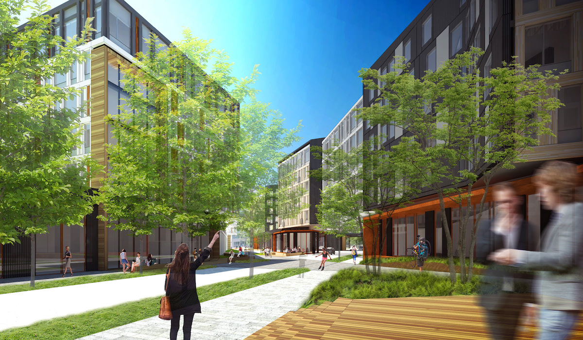
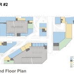
Though no pubic streets will extend through the site, private drives will be created on the axes of NE Hassalo St and NE 15th. With a reconfiguration of the building forms, the number of locations where the buildings will span over the private streets has been reduced from four to three.
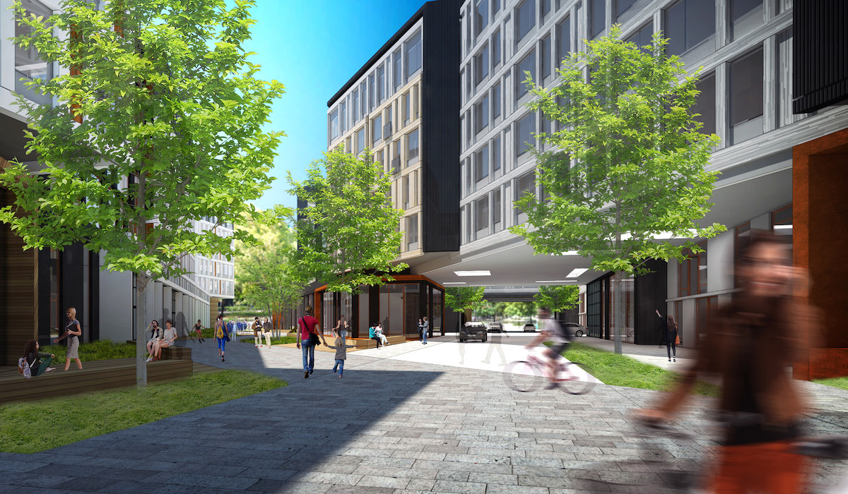
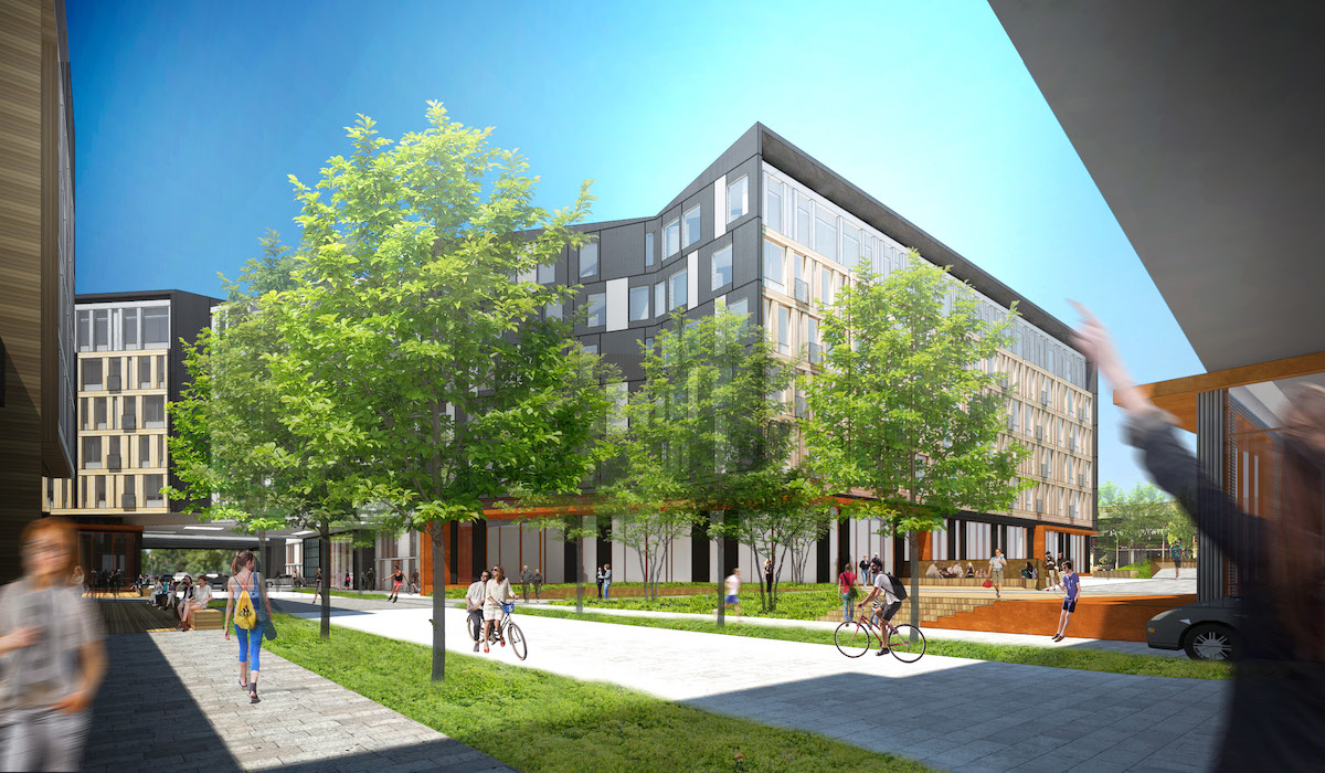
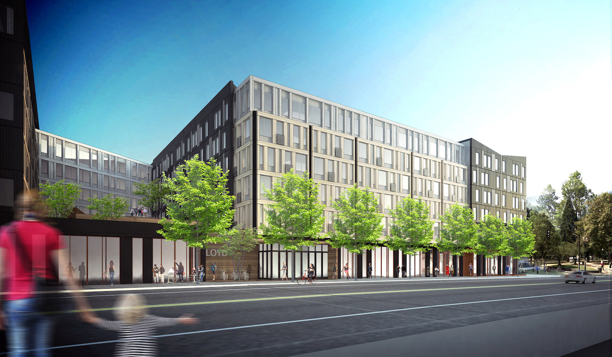
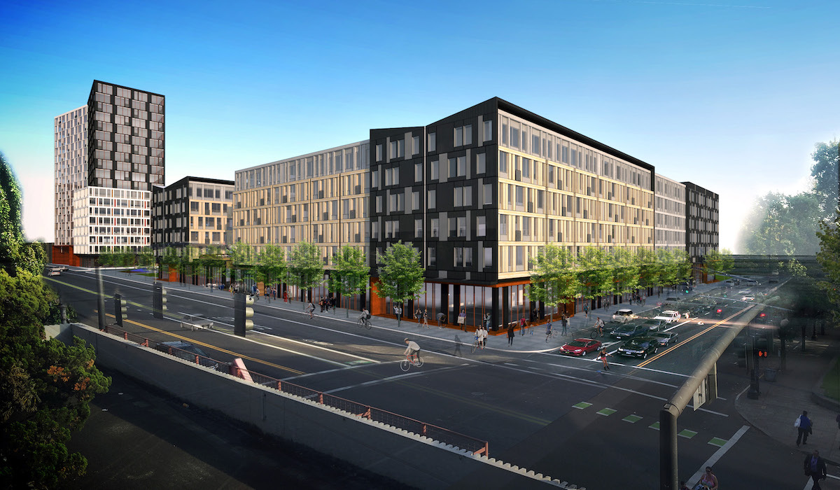
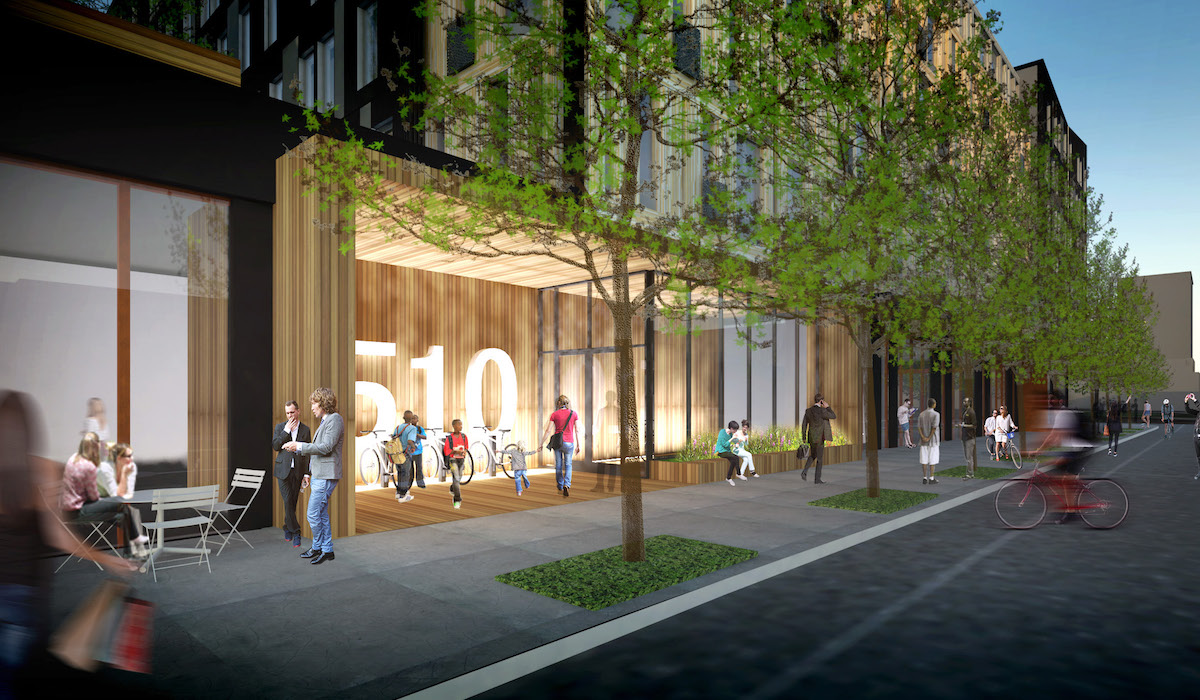
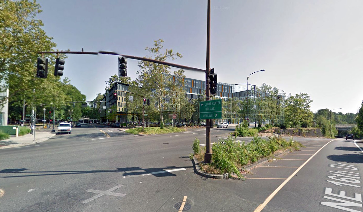
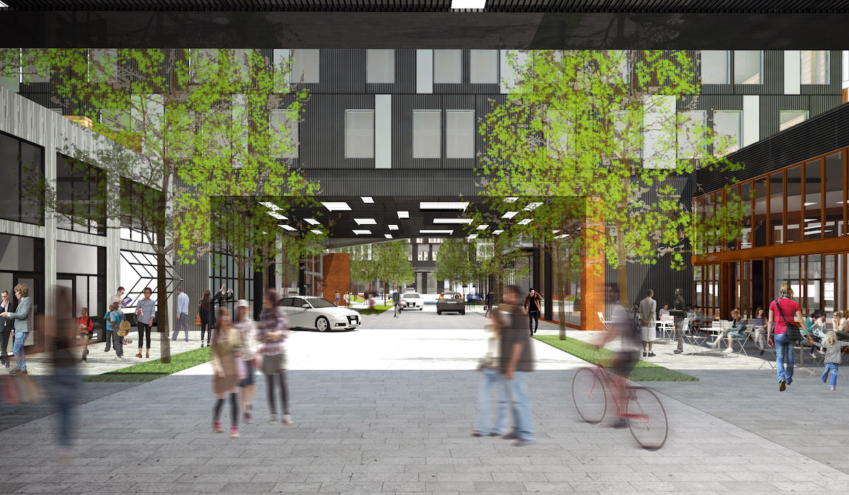
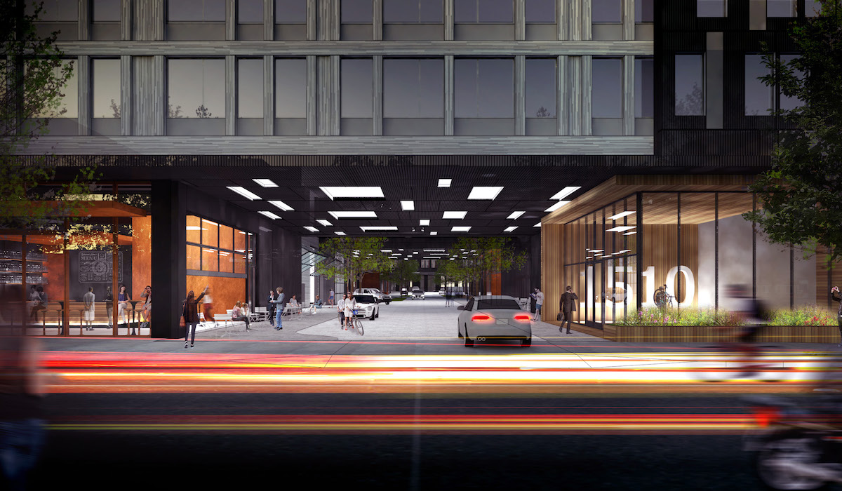
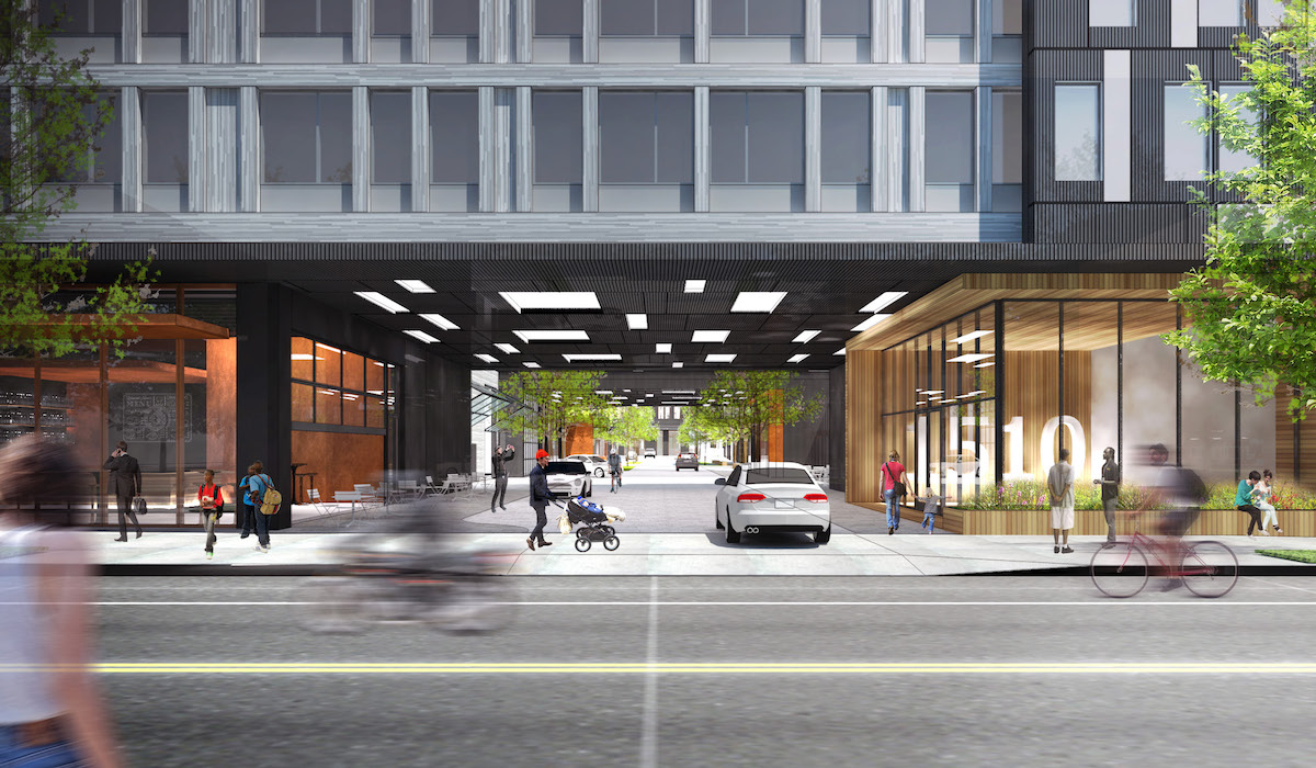
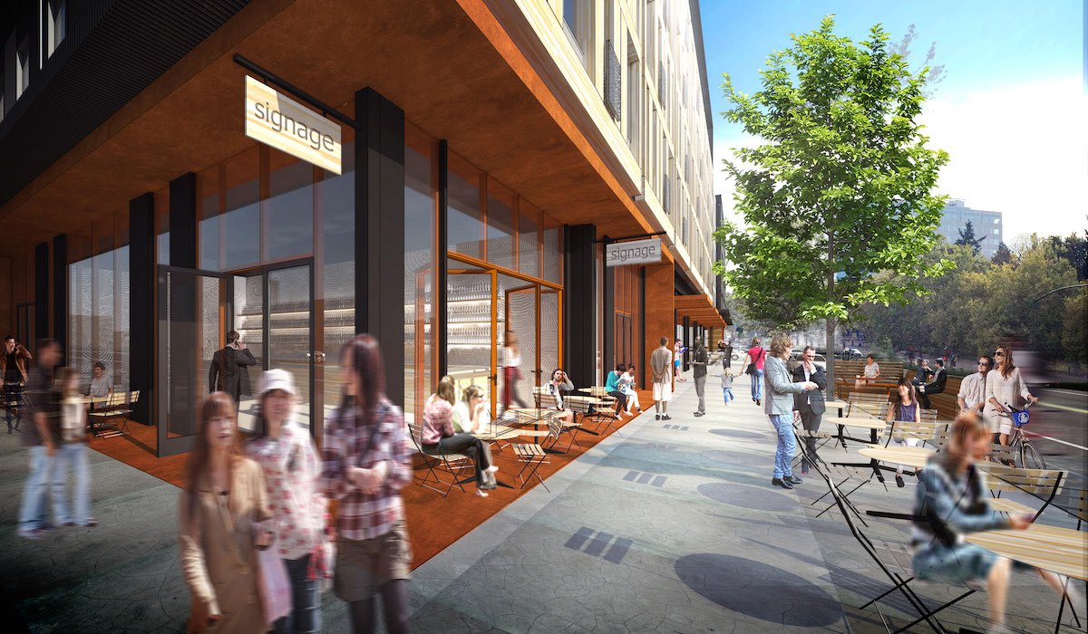
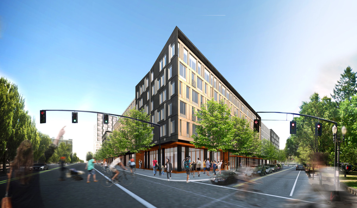
A memo [PDF] to the Design Commission, published before the October 22nd hearing, outlined potential areas of discussion, including: massing and form; quality of public and private outdoor spaces; façade design & materials; and the NE 13th Avenue frontage. The revised designs drew a mixed response from the Design Commission, who continued to support the diagonal organization, but had strong concerns about the bridges over the private drives and the length of the facades on NE 13th Ave an NE Multnomah St. Commissioner Livingston was strongest in her support for the project, though had some reservations:
I think the diagonal is great, and I think that the revisions you have made to the diagonal and the way you have shifted the walls of the buildings since the last DAR… I think it’s very very successful. The connection of the two plazas at either end of that diagonal works really well. I want to get to a point where I really understand and support the overhead along Hassalo, but I’m kind of with David [Wark] right now, and for me I think it’s really just that turn from 13th onto Hassalo. I agree, it kind of feels like the entrance to a hotel valet service.
Less complementary was Commissioner Savinar, who described the project as “lifestyle architect”, and who pushed for public art as a way for the project to find its “soul”. In summing up his feelings about the architecture, Commissioner Wark said:
It seems like a little bit here, a little bit there, a little bit more over here, alternating back and forth. It doesn’t have that connective concept yet, that grounding concept… at least, it doesn’t read. There’s a lot of things going on… Where are the restful moments in this thing? Because if everything’s equal, nothing stands out.
Having now had two Design Advice Requests, the design team now intends to submit the project for a full Type III Design Review.
Plans
- Program
- Plan – Green Space
- Plan – Ground Floor
- Plan – Typical Upper
- Plan Roof
That looks really good — a huge improvement on the last design. Together with Oregon Square and Hassalo, this should completely transform the neighborhood.
It’s a bit of a drag that they probably won’t start construction until about a year from now, and if the construction time of Hassalo is any indication, it will take approximately two years to build. I wish the process of approving and building housing were more streamlined. We need more units fast, and getting them just takes far too long.
Obviously a huge improvement over what is currently there and great style (as expected) from Holst but I think its unfortunate that these massive sites in the Lloyd District are not having a Portland-scale street grid implemented. Sure, they have some sort of way for a pedestrian or maybe bicycle to meander through them around the ziggy baggy building footprints but its not an obvious path and often feels like private property or it is unclear where it leads.
A real street grid would prove immensely more flexible in the future and could even allow different architects to design different buildings on the site. We’re going to have an entire neighborhood of GBD 2015 and an entire neighborhood of Holst 2017 and it feels inauthentic. Variety and many actors manipulating the same space is what makes an urban space interesting – I fear this part of the city is going to feel way too controlled.
I think David’s “inauthentic” is a perfect way to describe this.
I find it a remarkably unattractive project. I am willing to shift some of that onto the bad renderings, but it is also totally uninspiring. They’ve taken a huge site with tremendous potential, and proposed turning it into what looks like a parking garage combined with a mid-century government housing project. No amount of blurry scale people is going to fix that.
“Marginal sites, with marginal buildings, encourage marginal behavior”
I’m very excited to see housing and retail in place of surface parking lots! (and I have to admit my defense of Lloyd Center mall as an interesting place gets weaker with each new proposed development)
As far as I can tell no one is likely to drive to Hassalo right there unless they are residents of the development, so I guess I don’t care about it looking like a parking garage entrance (since that is, in effect, what it is), but I would really like to see pedestrians prioritized.
The problem with the “meandering” through the superblock is that we all just walk straight across the parking lot to get the MAX stop. The sidewalk that got put in across the lot a year back is a great improvement, and does reflect the actual pedestrian usage of the space. I prefer either putting the Portland grid back in place for pedestrians or giving pedestrians a straight blast through the superblock. We have already had to endure cute-sy meandering of NE 16th/15th, and we finally just got a cross walk to cut across 16th roughly in alignment with Wasco after years (decades?) of darting across the street — wandering paths are lovely and all for Sunriver, but I just want to get the MAX station. (that being said, it’s not the worst meandering in the current design)
And also, I’m really, really hoping for a library.
Two thoughts from my first visit with these pictures: these projects remind me of cold war era, Eastern Europe housing, with only slightly better design and I don’t see any home where a person can wake up, open a door and step outside to enjoy a coffee and those beautiful Portland mornings we have in spring, summer and autumn. No balconies. Are these the same designers who removed front porches from all houses in the 50’s?
Aggree 100%. I thought The Yards on east end of the Burnside Bridge had a East Berlin post WWII feel.
This is just as bad.
I wish it looked more European, ala Berlin. More distinctive built-to-last buildings, etc.
Agree 100%
Actually, many of the newer buildings in Berlin more or less look like this.
I have a couple of immediate concerns with phase one of this development.
First, the hulking and unrelenting face it presents to Holladay Park. The two blocks of unbroken 6-story imposition – especially with the not especially welcoming face of the Lloyd Center to the North – would love to be broken up by something other than the cosmetic skin treatment currently offered. Whether that be the re-establishment of the Hassalo right of way, and/or adding some variation to the hights of the buildings facing the park. Holladay Park is the primary public space of the district and deserves more respect from the developments surrounding it. As for the monotony of height of the buildings in phase one, is there a flood reason for that? It’s not like we can’t use the housing units that would be added with some extra elevation.
Second, although the meandering pathways through the superblock will seem really cozy until the folks who currently use Holladay Park for low-level illicit behavior realize the the poor sightlines in the pass-through make it a more ideal place to conduct commerce. An issue that could perhaps be ameliorated by the addition of balconies to bring residents out and keep eyes on the common spaces.