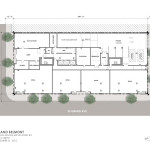
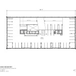
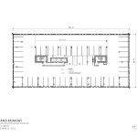
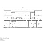
Vallaster Corl Architects and Urban Assets Advisors have returned in front of the Historic Landmarks Commission with revised designs for the Grand Belmont. As proposed at the second Design Advice hearing the project would be one floor shorter than in its previous iteration, and would reach a height of 146′. The project continues to consist of one floor of ground level retails, two floors of parking above, and residential apartments at the upper floors. A rooftop deck and clubroom are proposed for the top floor.
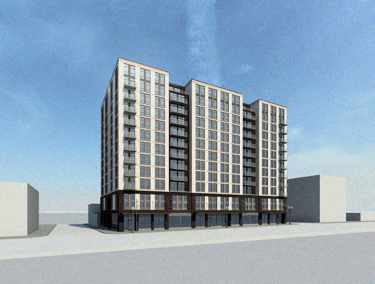
The site for the project is at 514 SE Belmont St, and is currently used as surface parking. A Dutch Brothers coffee stand is located at the corner of the lot. Because the project is located in the East Portland Grand Avenue Historic District the building design is reviewed by the Historic Landmarks Commission, instead of the Design Commission. The historic district is located at the core of the once separate city of East Portland. The lone high rise building in the district is the 175′ tall Weatherly Building, which was completed one year before the start of the Great Depression.
Responding to feedback given at the first Design Advice hearing, the project has become much less contemporary in its architectural expression. The fenestration is more regular and suggestive of a traditional load bearing masonry building. Balconies are attached rather than recessed into the building. The parti of a floating tower above a base has been eliminated, and the base and tower are now more integrated.
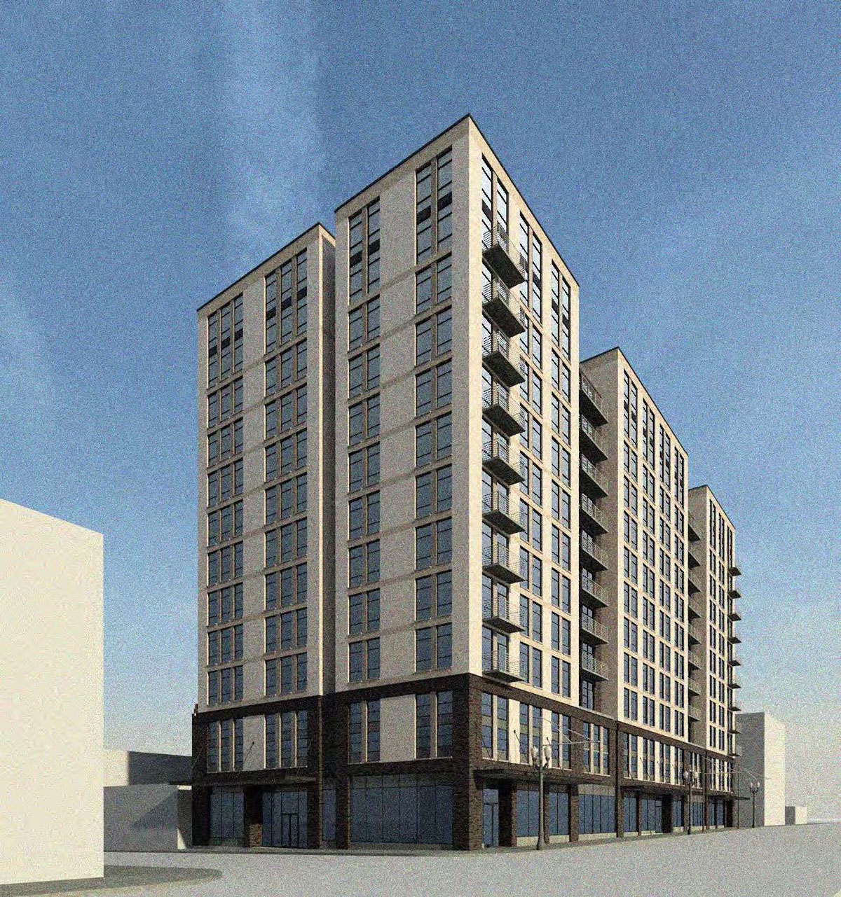
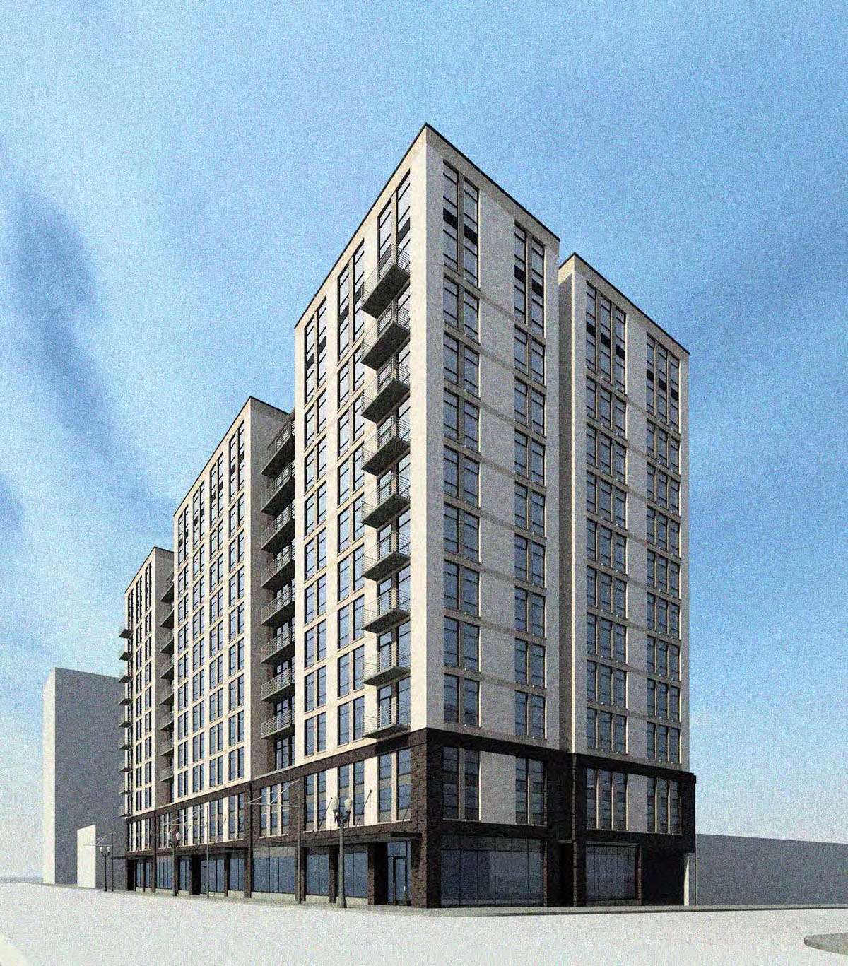
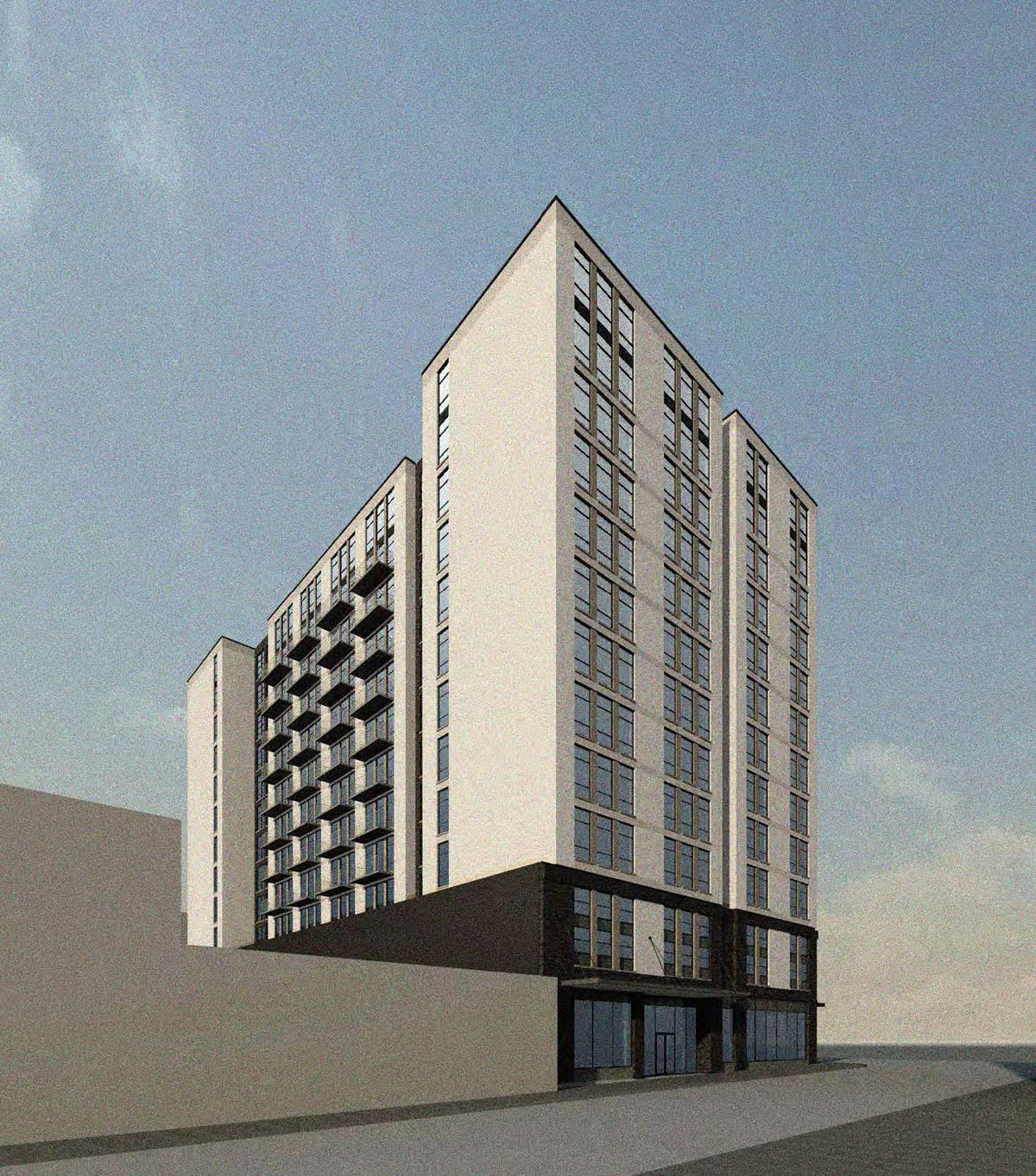
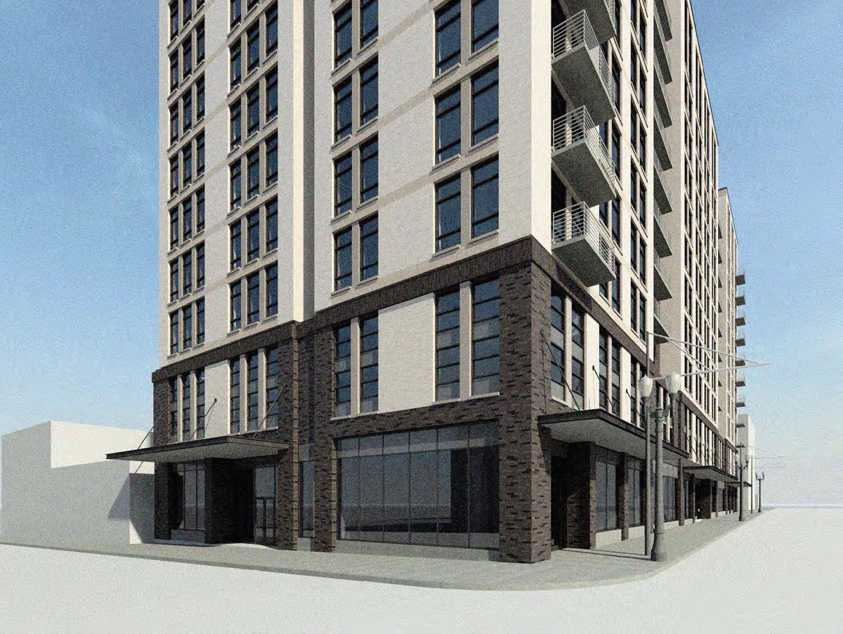
In response to concerns about the material palette originally proposed, two options were presented: a scheme that primarily uses a tan brick with a darker base; and a red brick, also with a darker base.
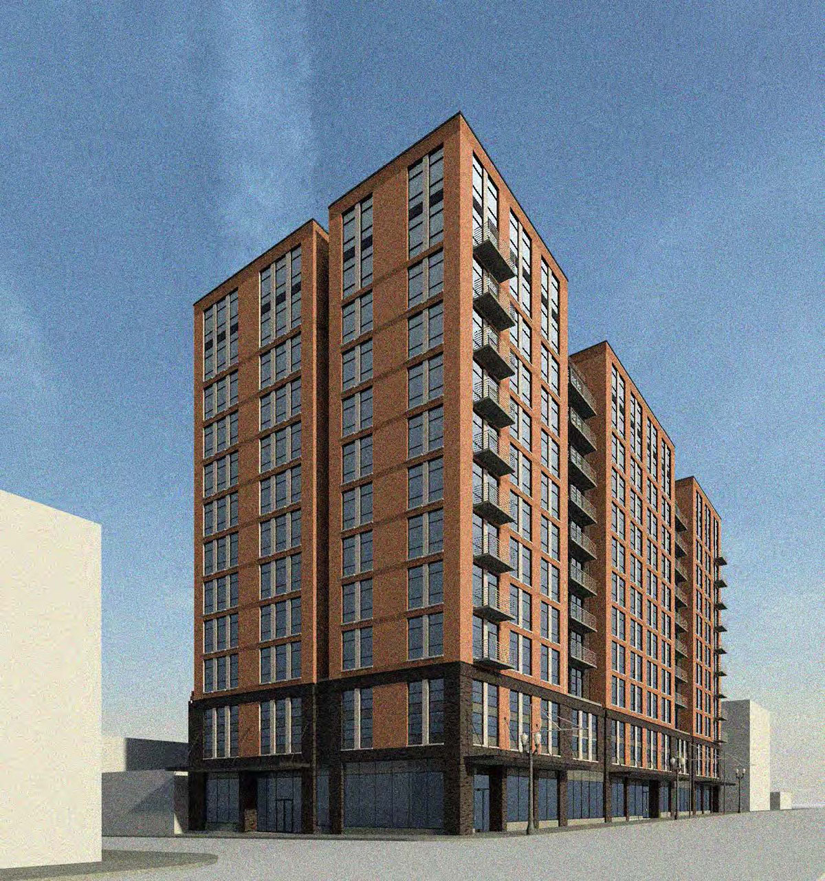
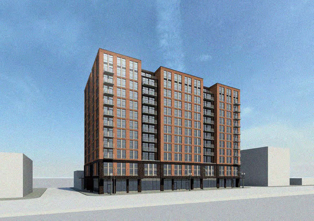
At the advisory hearing held on September 28th the Historic Landmarks Commission generally welcomed the changes made to the architectural expression of the project. Of the two color schems presented there was a preference expressed for the lighter option. Height however continued to be a significant point of discussion, with 5 out of 6 Commissioners present strongly opposed to height as shown. Having consulted with the City Attorney, the applicants questioned whether the Historic Landmarks Commission has the authority to reduce the allowable height on the site. The Zoning Code allows up to 200′ of base height on the site, and up to 275′ with bonuses. Members of the Commission countered that they are responsible for reviewing the project against a set of Design Guidelines, which call for “compatibility” with district, amongst other standards.
The project will be required to go through a Type III Historic Resource Review prior to the issuance of any building permits. Should the Grand Belmont ultimately be rejected by the Historic Landmarks Commission due to its height, the applicants have the option to appeal the decision to the City Council.
Plans, Elevations and Sections
- Plan – Context
- Plan – Site / Level 1
- Plan – Level 2
- Plan – Level 3
- Plan – Level 4
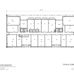
- Plan – Levels 5 to 13
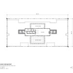
- Plan – Roof
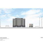
- Elevation – West
This is too bad. The first design was much more interesting. This makes me lose even more faith in the historic review board. Buildings don’t have to look traditional to be in an historic district. Look at Europe and how they blend contemporary and historic in creative and beautiful ways!
I agree 100 percent. The original design and height was a better concept. The new design has no character. What wrong with the Historic Landmarks Commission. The old design reflects the theme of the Multnomah County building a few blocks north of this site.
This building sure got dumbed-down, along with the fabric of the city. This commission degrades neighborhoods with their primitive ideas.
this is really depressing. it is unfortunate that the design got pressed so hard that it made such an out of character change for VCA…perhaps the commission will see the ill of their ways and agree that the previous design was much better and more compelling.
Sad news. At this point I’d prefer no building at all if it’s going to be this bland and characterless thing. If the City Council overrules the HLC, they should send it to the design commission for review. They would provide some actual insight, and hopefully advise them to return to something closer to the original design.
The Histotic Landmarks Commision seems incapable of seeing beyond a very simplistic view of architecture. Just look at what they did to block 8L and what they’re pushing for with the Restoration Hardware project. Portland deserves better. That being said, I think VCA is doing as best as they can given the cards they’ve been dealt.
This is an incredible important property for inner eastside. Its perfectly central and replaces a huge eyesore while connecting block as a walking retail streetscape. I think the HLC is terrible, without much idea of what its supposed to do, but a building needs to get built. If they kill this proposal there should be hell to pay.
What I don’t like about this particular building is that it will block the view of Mt Hood as you come across the Morrison bridge or exit I5 on 300B
Can’t they just tell the historical commission to get lost? This is an industrial area — there’s nothing charming or quaint about it worth preserving. Okay, maybe a couple of buildings like Towne Storage and Shleifer furniture should be designated historical landmarks, but the location for this proposed building currently hosts a Scientology billboard and a parking lot with a Dutch Bros. Does *that* fit into this completely synthetic “historical” aesthetic that they want to promote?
Yes the Landmarks Commission has been responsible for “dumbing down” many designs. But if I may suggest VCA is not a firm of distinguished design credentials. Please provide an example within their portfolio to hold up as an enduring urban contribution. Perhaps that’s too high a bar–how about a building over 5 stories. We are in a critical phase of transition for Portland. The two major buildings–one under construction and the subject proposal–that will define the skyline of the emerging Central Eastside are in the hands of firms not up for the task (Skylab and VCA). Portland is–for now–a hot commodity. We should be demanding much much more from those building this new “Portland”. Designers who succumb to the fetishization of the “now” must be tempered–or at minimum not allowed to remake our skylines.
No, the last thing we need is some Bureau of Aesthetics passing down arbitrary judgment upon what can and can’t be built. Let’s just build. If a few ugly buildings slip in, let’s build them anyway.
Unfortunately Chris it is the inverse that is true. We get lucky when a few non-ugly buildings slip in. Designers are not the real determinants in our built environment. Pro-forma spreadsheets are.
I suppose that’s partly subjective. I like the look of most of our new buildings, especially in comparison to the vacant lots, surface parking lots or strip mall style buildings that they replace.
The irony is both the original proposal and the new more Landmarks friendly proposal equally resemble low budget dormitories. Shouldn’t we expect more of such a significant location?
VAC has tried to follow the HLCs direction, but the result is bland as a result of mimicking the fenestration of the historic buildings, but failing to add any distinguishing features. The historic buildings avoided blandness by two details that seem lacking here: A distinctive treatment at the building entrance (in this case that would be on Belmont), and a “Top” of a tri-partite scheme. There’s a slight hint in the fenestration change in the upper floors, but more differentiation, and perhaps a difference in the three “towers” could help this design, if this is the required direction. The red brick is more distinctive, while certainly as “historic” as the tan.
I am so glad to read that I am not the only person who feels that HLC guidance has turned a reasonably attractive modern design into an undistinguished box.
I also have no issue with adding taller buildings to the historic district. It seems ridiculous, given the sheer number of non-contributing structures and surface lots in the district, and compounding that with the need to accommodate new businesses and residents that the HLC should be quibbling about zoning compliant height – especially with the lovely Weatherly Building a mere block away.
I will say that it would be disappointing to lose the view of Mt. Hood from the Morrison Bridge; but in keeping with my previous statement, I suspect that concern could be ameliorated – without substantial loss of rental revenue by shortening the northern “tower” and adding height (to the current height of the Weatherly) to the two southern “towers.”
All said, I don’t think it serves the historic district to require new buildings to conform to some pastiche of historicallity. Save the buildings that are historically contrbuting, and honor the historical ambitions of old East Portland by allowing the district to grow where it can.