Design Advice has been offered to Holst Architecture and 2.ink Studio for their planned redevelopment of the Regal Cinemas Lloyd Center 10 site. The project on a nearly 6 block site will include 980 residential units in three buildings, with 41,260 sq ft of retail space and 13,950 sq ft of community space. Parking for 873 vehicles is proposed.
The project site at 1510 NE Multnomah St includes both the existing theater, and the associated parking lot. The cinema was built in 1987 on a previously vacant site. The parking lot has never been developed with buildings. News broke in May 2015 that the owners of the Lloyd Center had agreed to sell the property to a consortium of developers including California based Bob Bisno. The cinema will be demolished for the project, however a recent Willamette Week story indicated that Regal intend to find a new location in the district
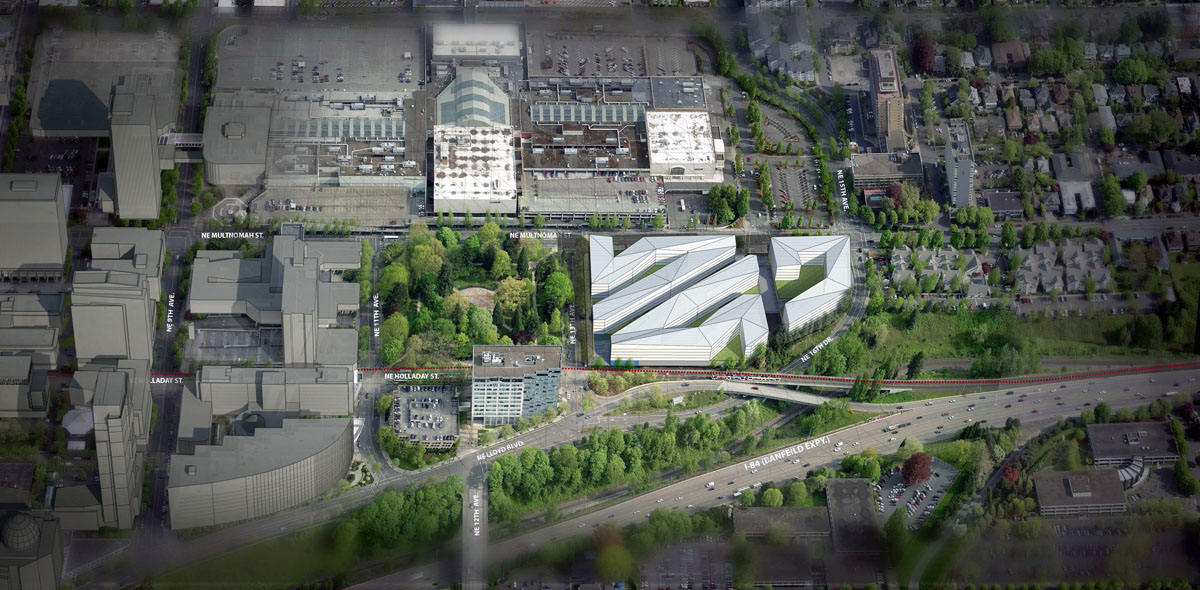
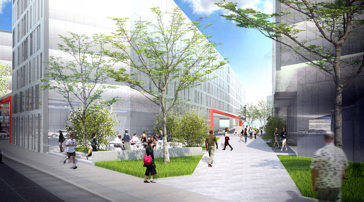
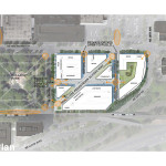
The Lloyd District is notable for having a large number of superblocks, city blocks much larger than the standar Portland 200′ x 200′ block. The Portland Zoning Code requires that when superblocks are redeveloped new walkways be installed, providing “approximately the same connections for pedestrians” as would be provided by public streets. In looking at how to satisfy this requirement the architects concluded that extending the grid through the site would provide limited utility, given that connections beyond the site are blocked by NE 16th drive, the MAX tracks and I-84. The site is instead by transected by a diagonal pedestrian way, intended to link the Sullivan’s Gulch neighborhood to the Lloyd Center / NE 11th Ave MAX stop.
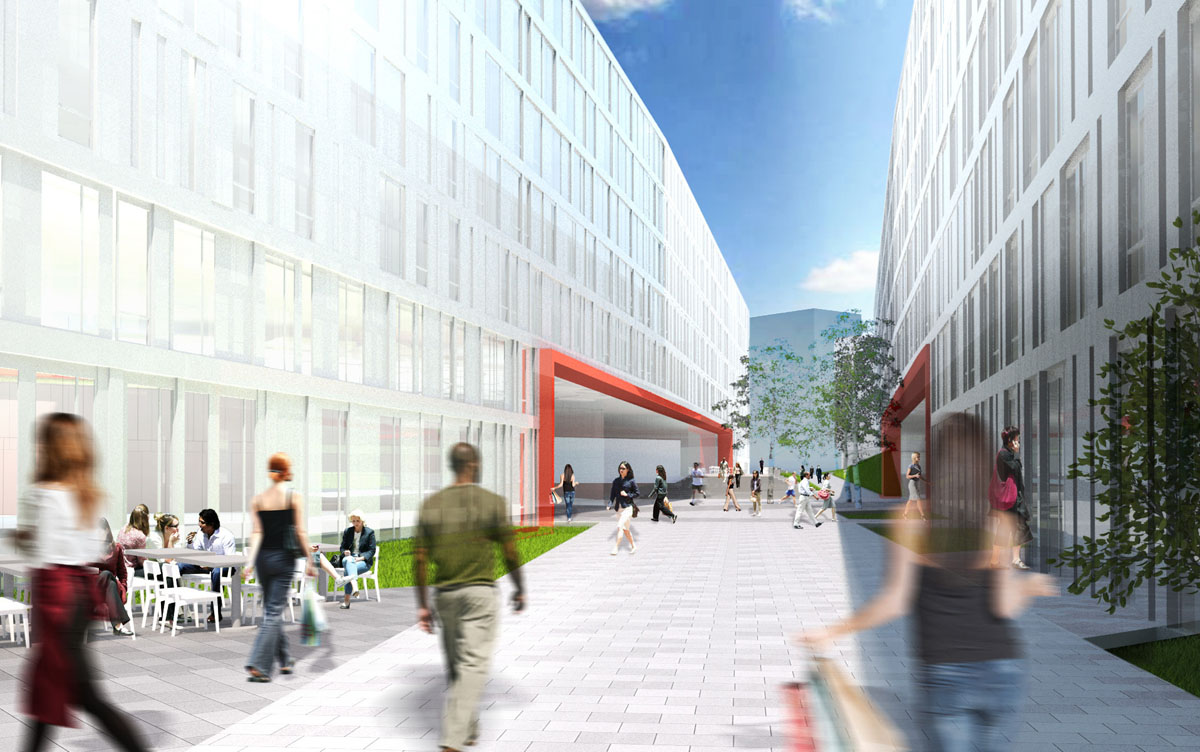
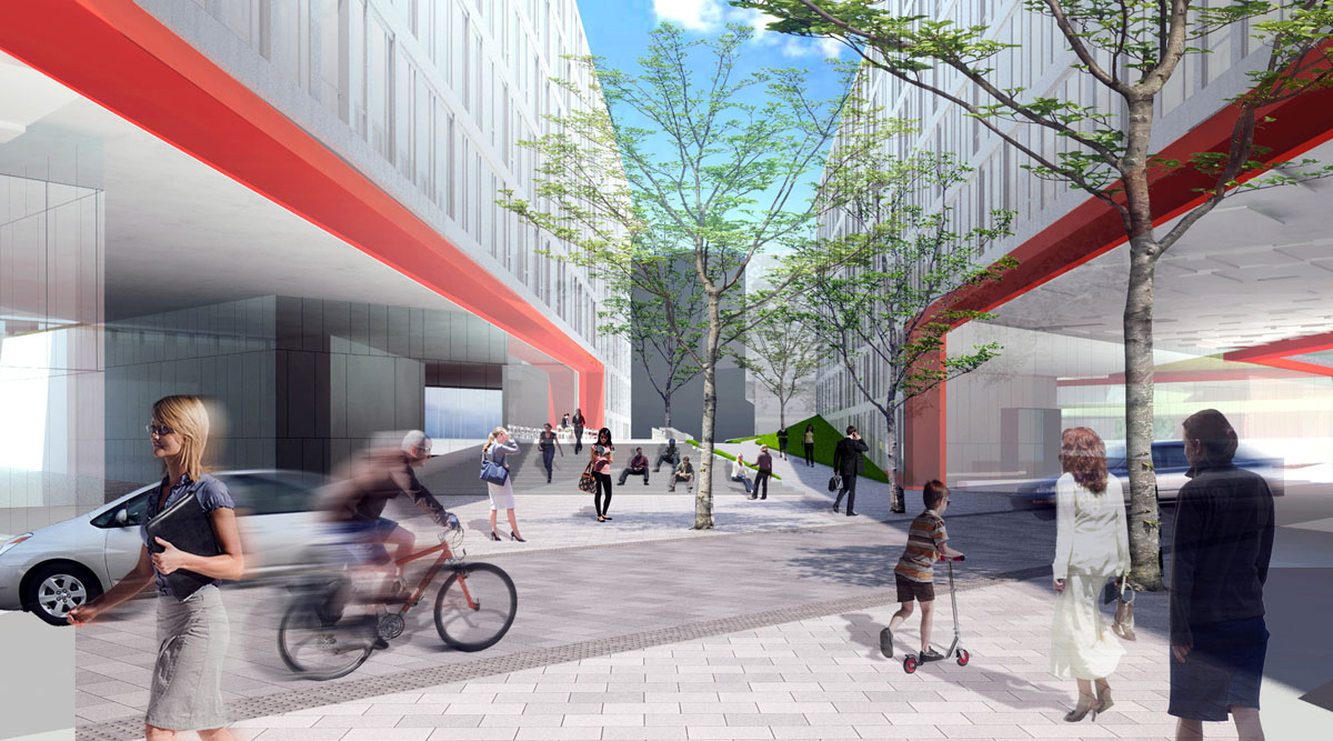
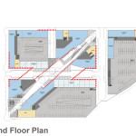
In imaging the the experience for pedestrians in the accessway the design team has looked at precedents around the world, including pedestrian streets in Copenhagen, Sydney, Brighton and Vienna. Where vehicular access crosses the pedestrian street the landscape architects are considering a curbless surface where the road level is flush with the pedestrian level, similar to Director Park in Downtown Portland.
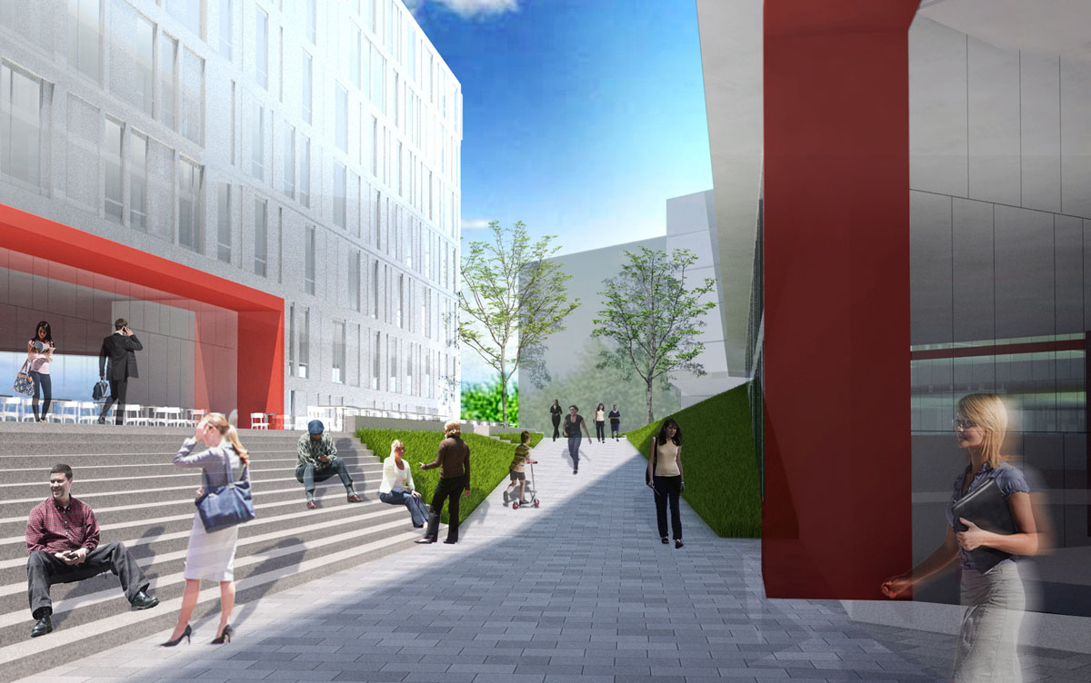
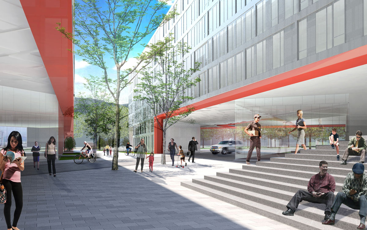
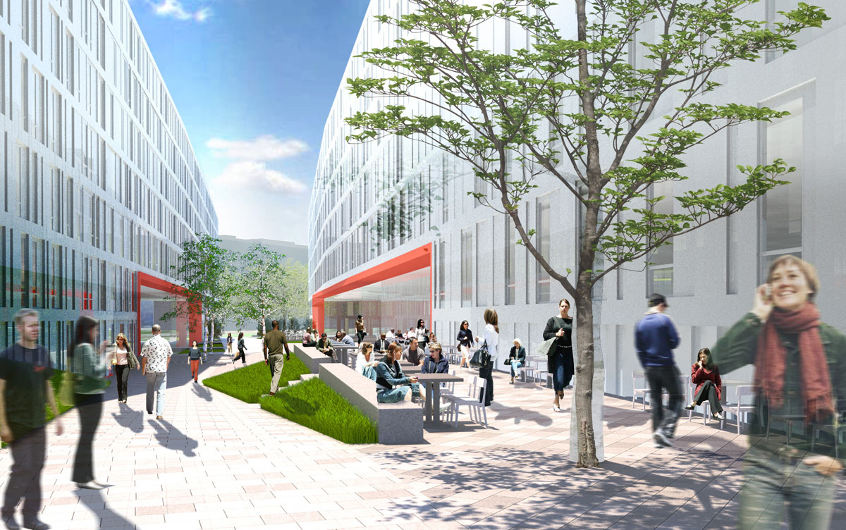
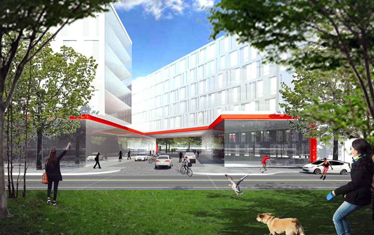
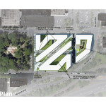
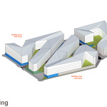
A memo [PDF] to the Design Commission, published before the hearing, outlined areas of possible discussion. The Design Commission expressed strong support for the diagonal path through the site, but noted that it creates problems that may prove challenging to resolve, including how a 500′ long facade would be designed. There was a general direction to the design team that they needed to open up the massing on the site, which may mean fewer units; or if they wish to stay with the same number of units they should investigate creating taller building with concrete or steel construction. Though the facades have yet to be designed, the Commission made it clear that they expect a high quality material palette. Other areas of discussion included whether the elevated open space would feel sufficiently inviting for the public to enter it, and what needed to be done at the central plaza to make it an inviting destination. One Commissioner suggested that the applicants investigate a district parking solution that would reduce the complexity of the vehicular access through the site.
The project will be required to go through a Type III Design Review with hearings before the Design Commission. The architects expect to return for a couple more Design Advice Requests prior to the submission of a full set of Design Review drawings.
Plans
- Plan – Site
- Plan – Roof
- Plan – Ground
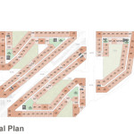
- Plan – Typical
- Massing
- Parking Diagram
- Parking Diagram
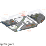
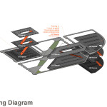
“extending the grid through the site would provide limited utility” for pedestrians, but they seem to have no problem cutting three streets into the site for cars? they’re looking to replace a parking lot with a complicated parking garage with a thin veneer of active use and some apartments perched on top.