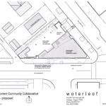
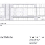
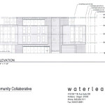
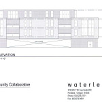
A Pre-Application Conference has been scheduled to discuss the Seven Corners Community Collaborative, a proposed office building at SE Division St and SE Ladd Ave. The design for the building is by Waterleaf Architecture. Drawings submitted to the Bureau of Development show a 4 story building with 3 stories of offices above ground floor retail. 9 vehicular parking spaces are proposed at the ground level.

The site at 1949 SE Division St is currently vacant.
The Pre-Application Conference [PDF] is scheduled for Jun 11th 2015 at 10:30am. Due to the project’s location in the Ladd’s Addition Historic District a Type III Historic Resource Review with hearings before the Historic Landmarks Commission will be required.
Plans and Elevations
- Site Plan
- Elevation – South
- Elevation – East
- Elevation – North


Looks like they’ll need some changes through the historic resource review. Interesting that they include a “transit bench” notched into the building, possible as a way to get the existing transit shelter removed from it’s prominent location on the sidewalk. Like others before them (45th and Division, the large stucco project on inner Barbur), architects seem to not understand that a key feature of a transit stop is being able to see down the street to watch for the bus. Notched-in benches rarely provide that, and won’t be used. Not to mention Trimet’s proclivity for moving stops from time to time. I hope Trimet is not enticed with the “free” shelter, and keeps the current, usable shelter.
Architects understand everything. They just don’t give a crap as they are too busy figuring out loop holes for the sleezy developers that pays their fee….or in many cases….that don’t pay their fees.
This tall structure, built out to the sidewalks, blocks the views at “7 corners”; which is already a turning traffic nightmare. Pedestrians+bicycles+cars+limited view=collisions.
This is a signalized intersection, visibility around corners is not a fundamental safety feature.
The idea that this building should be smaller for visibility is a suburban design principle that has no place in the center of Portland. We want drivers to be driving slowly and cautiously when they pass through this important place.
Do you or have you lived in the neighborhood? Do you have any real-life experience at this intersection? Have you waited there at different times of day, of the year; during different traffic and weather conditions?
Spouting traffic engineer-isms doesn’t reflect the site specific, real-world situation at 7-Corners. They are just generalizations based on data collected over a large geographic sampling (probably not even in Portland).
Now, I definitely do not live in the suburbs so I wouldn’t know a suburban design principle even if it got up and waved at me.
I have lived in this neighborhood for 30 years. I care about the school children who walk and cycle to and from school, pedestrians who are running to catch the #4 or #10 bus, shoppers turning into or out of the New Season’s parking lot, and all the others: dog walkers, skateboarders, cyclists, bikers and motorists who do not always travel in predictable or cautious manners. Accidents and many near misses happen at 7-Corner now without a four story building blocking the view. With a building built out to the sidewalk they will only increase in number.
And VISIBILITY IS ALWAYS AN ESSENTIAL SAFETY FEATURE!
9 parking spaces? 9???? For how many tenants and customers?
Ladd’s Addition Historic Designation doesn’t seem to apply to this project. I remember when 7-Eleven Corporation had to jump through major hoops with many design reviews to meet the requirement that the new building (replacing a small 1920’s gas station) had to fit into the historic character of the neighborhood.
I do not understand how a 4 story building that reflects nothing of the architectural character of it’s surrounding made it through the city’s historic design review? The stretches on this page give you no idea of the finishing materials or color. It looks like unfinished masonry, glass and maybe stucco??
I certainly will be able to see this structure from my front porch but I never received a copy of the current design with the ability to make comment like I have with building/remodeling projects for my neighbors and St Phillip Neri (when they put in a new skylight that I can’t even see).
So much for our historic district. This is the first new building that hasn’t had to comply. Just wonder who got paid off.
As stated in the post, the project will be required to go through a Historic Resource Review. This has not yet happened.
Are you honestly arguing that there’s something “historic” about a vacant lot that’s worth preserving? Whatever historic building might have once been there has long been demolished. I don’t feel much sentimentality about a vacant lot being replaced with a modern mixed use office or apartment. I say do it. It’s a better use of valuable space than what’s currently there.
Landmarks Commission design review of a new building on a vacant lot in a historic district has nothing to do with the empty lot or its previous building. It is simply the design process to assure that the new building will conform better with the character and scale of the historic district.