This post is the second in a series on the developments at the Burnside Bridgehead. See also Part I about Block 75.
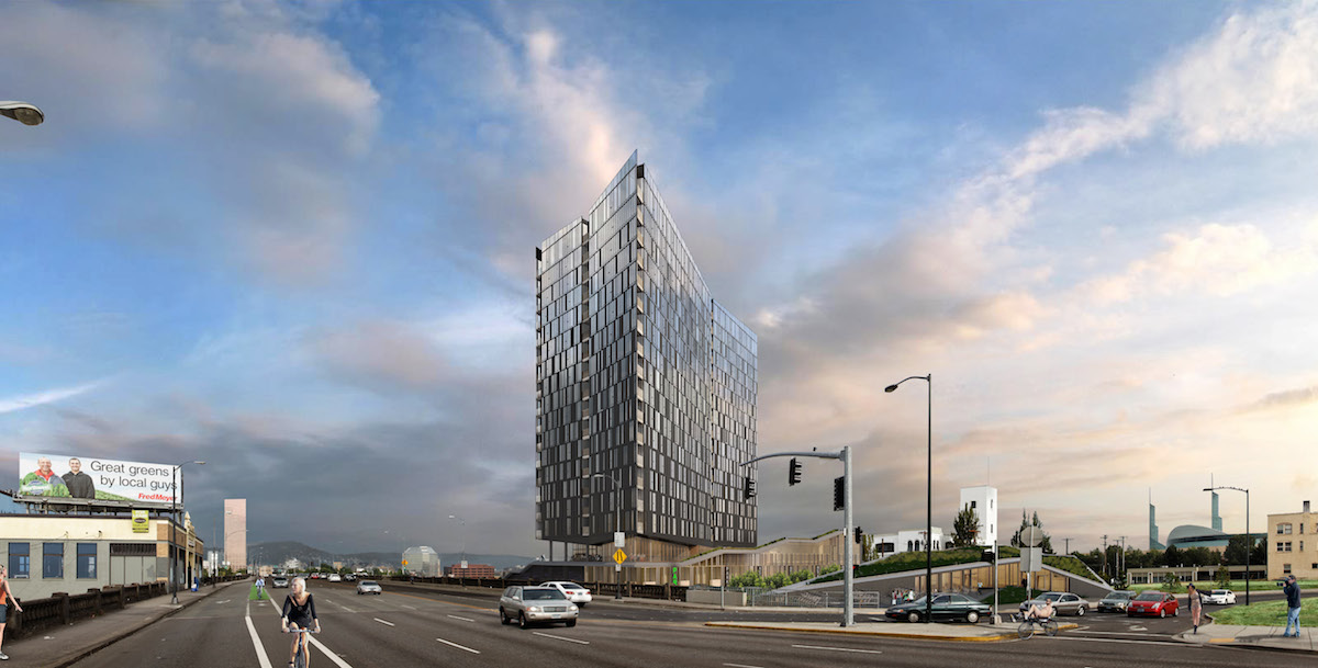
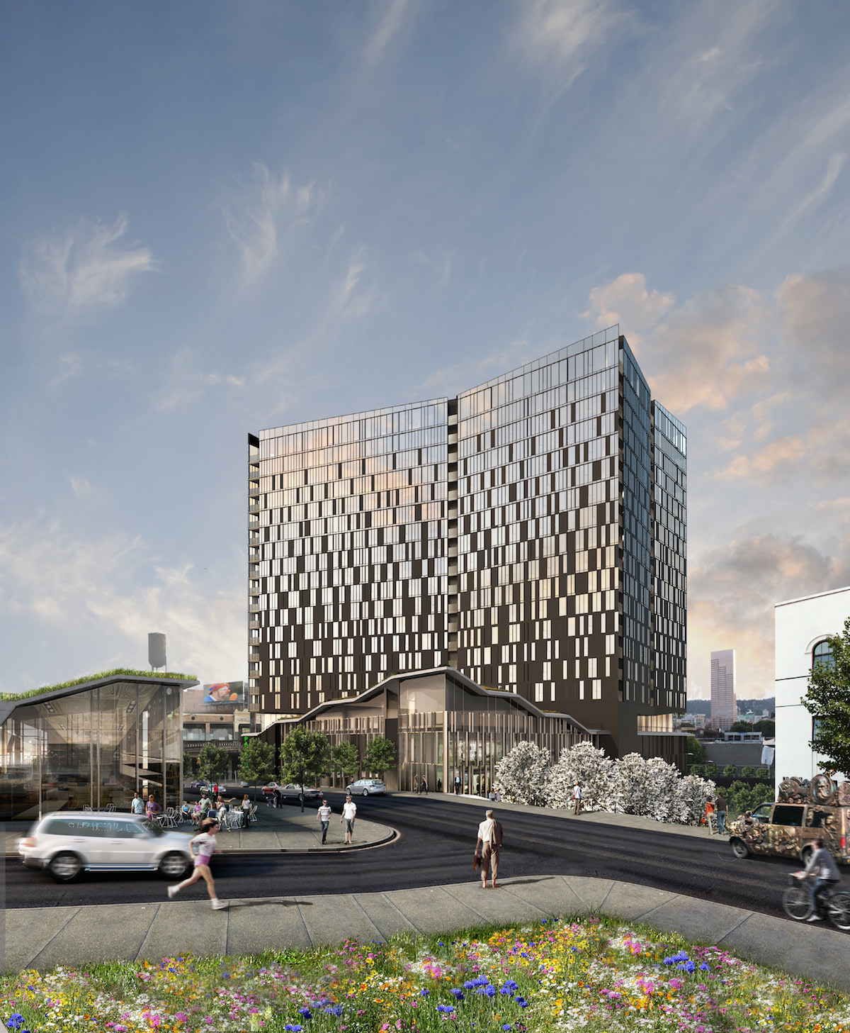
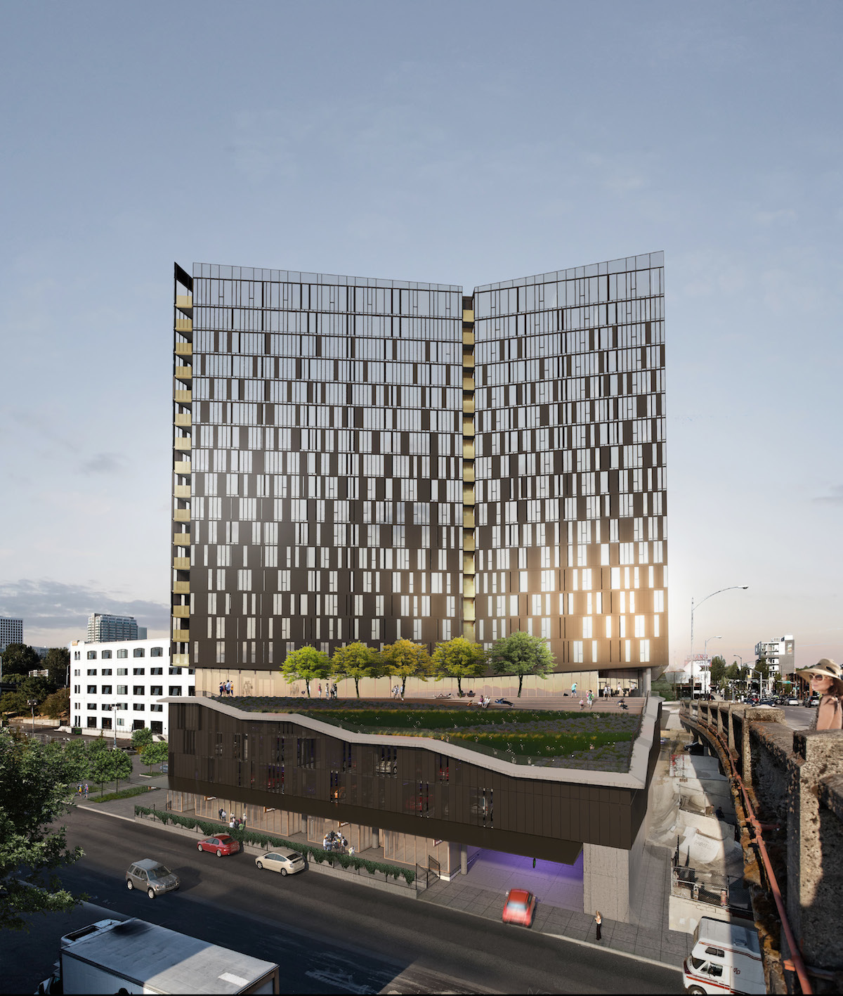
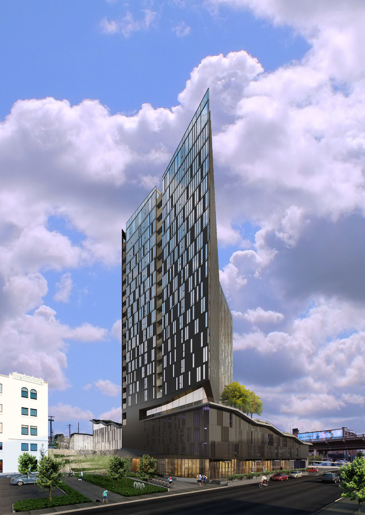
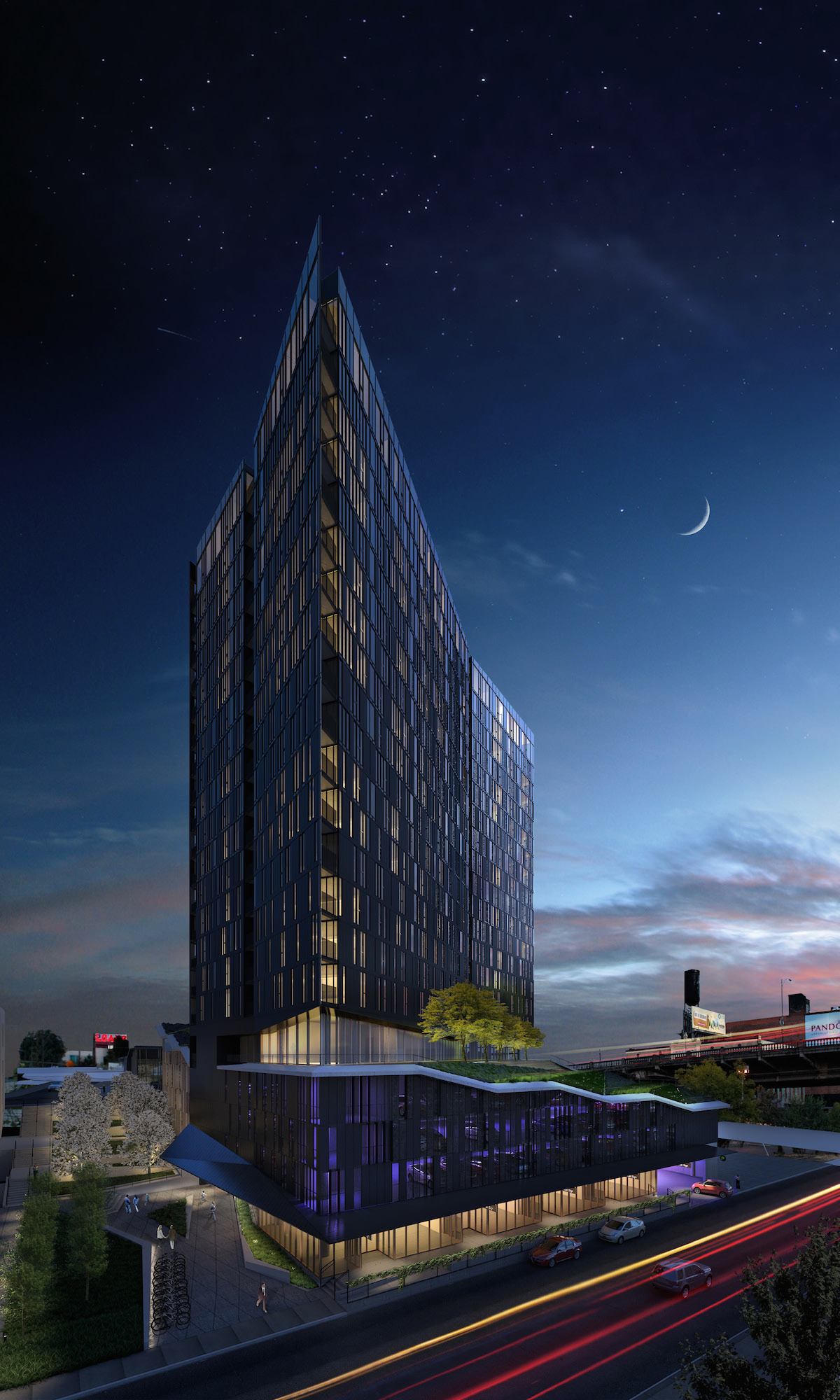
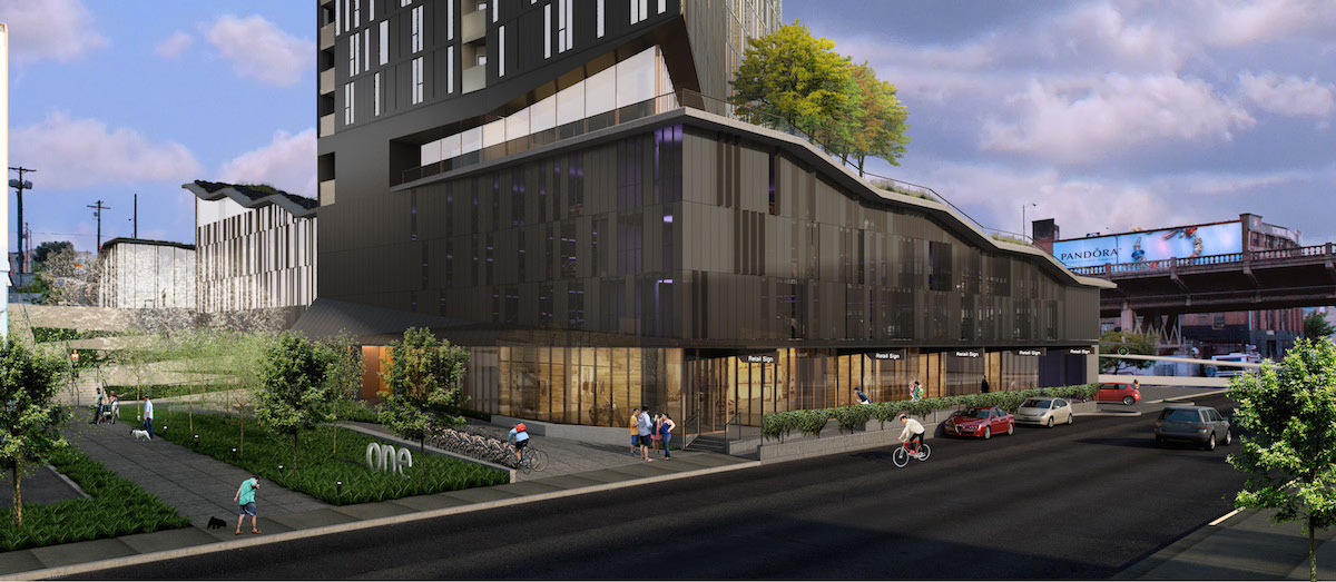
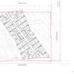
Block 67, a 21 story tower designed by Skylab in partnership with LRS Architects, is under construction at the east end of the Burnside Bridge. The building is composed of a 5 story podium with a 16 story tower over it. The tower is a parallelogram in plan, set at an angle diagonal to the street grid, giving it a knife-edge appearance in the NW/SE axis. The tower will include 276 residential apartment units, while the podium includes room for 200 car parking spaces and 19,709 sq ft of retail/office space. 416 bicycle parking spaces will be included in the podium and in individual units.
The developers behind the project are Hood River based Key Development and Portland based Guardian Real Estate Services. A Multiple-Unit Limited Tax Exemption was approved [PDF] by the Portland Housing Bureau, which will allow the developers to offer 20% of the apartments at rents affordable to people making 60% or lower of median family income, for at least 10 years.
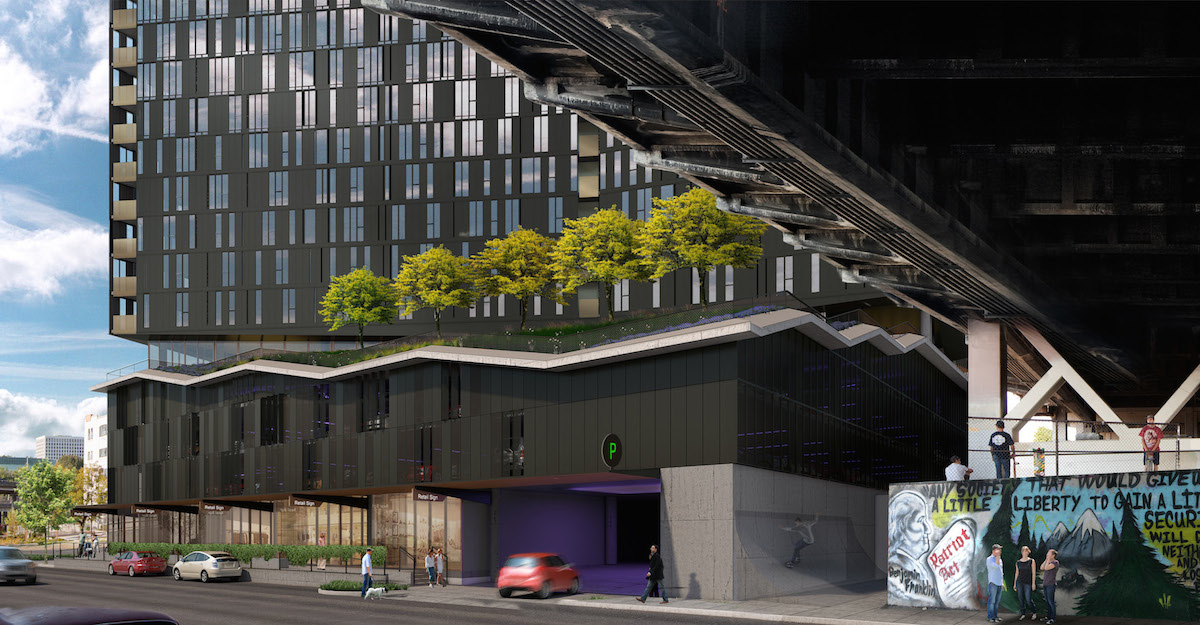
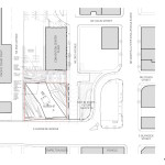
The project is being built on a previously vacant piece of land bound by the Burnside Bridge, NE 3rd Ave, the Couch Street Pedestrian Plaza and NE 2nd Ave. On its south side, the building will directly abut the Burnside Skatepark.
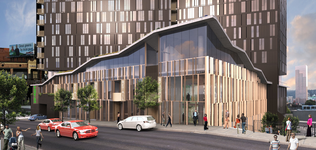
The tower will be clad in an aluminum window wall system, with a gradated pattern of glass and metal panels that grows progressively more transparent at the higher floors. Materials used on the podium include board formed concrete, aluminum windows and perforated metal panels.
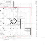
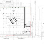
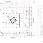
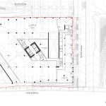
Entrances to the parking garage will be located on both NE 2nd Ave and NE 3rd Ave. The primary residential access will from the Couch Street Pedestrian Plaza, on Level 1. Commercial / retail units are proposed on Level 1, fronting onto NE 2nd Ave, and on Level 3, fronting onto NE 3rd Ave.
Amenity spaces for the residents and a 6,700 sq ft commercial space on the 5th level will open onto a roof terrace over the podium. An ecoroof will be planted with honey locust trees and a mix of wild flowers that includes black-eyed Susans, purple coneflowers and Oregon irises.
The project was approved through a Type III Design Review in December 2013. The project drew strong praise from the Design Commission, which found in their Final Findings [PDF] that the project would make a “significant contribution” to the area:
The design review process exists to promote the conservation, enhancement, and continued vitality of areas of the City with special scenic, architectural, or cultural value. The Block 67 development will be a significant contribution to the Central Eastside District and the Burnside Bridgehead. The design, material expression and scale of the tower and podium are sensitive to the residential scale of the project while establishing a visual identity that anchors the project in this critically important urban gateway of this historically light industrial area.
In September 2014 it was reported that a $72 million construction loan had been secured for the building. The first construction permit was issued in October 2014, and work on site began shortly afterwards. Completion is scheduled for summer 2016.
Plans, Elevations and Sections
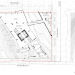
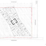
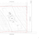
- Plan – Site
- Plan – Level 01
- Plan – Level 02
- Plan – Level 03
- Plan – Level 04
- Plan – Level 05
- Plan – Typical Residential
- Plan – Penthouse
- Plan – Roof
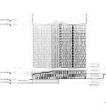
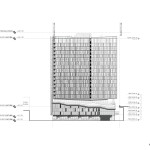
- Elevation – North
- Elevation – East
- Elevation – South
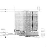
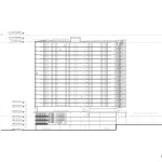
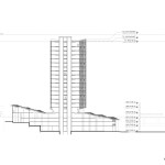
- Section – North/South
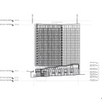
- Section – East/West
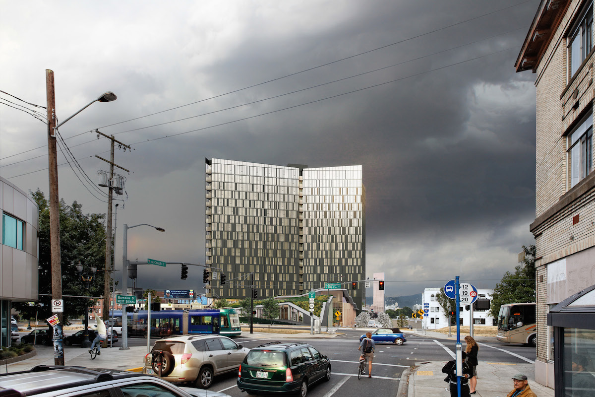
Is it just me or does the black monolith rising from the east end of Burnside Bridge look significantly different than what was rendered in the Yards elevations presented to the design commission? There seems to be fewer windows and the glazing is so dark as to make them almost indistinguishable from the solid black metal panels. I’ll try to keep an open mind but so far the building is very disappointing compared to what I was hoping for. Is this an example of where the daylight reflecting off of the windows in the renderings made the tower look much more translucent and interesting visually than the actual reality?
The finish materials, just do not match the renderings. Even on a sunny the metal skin looks out of place for the site and for Portland.
Looks like you were onto something @ Brian Newman….
http://www.oregonlive.com/business/index.ssf/2016/01/portland_misses_design_changes.html
Its not just you Brian. The tower look very dark and fortress like at this point and not much at all like the renderings that I have seen. Skylab Architecture’s designs typically deliver though, so I remain hopeful.
Something happened because people on the street are calling it The Berlin Wall Building. Dividing East and West Portland.
Looking more closely at the renderings, I notice that the ones depicting the daytime building always show the windows reflecting fairly direct sun. In even the one showing a decidedly dark, wintry Portland sky, the structure seems to have fortuitously caught sunbeams. Hm.
Now that they’ve abandoned the “shatter” motif, it just looks like rundown housing projects. I hope Skylab is fined into bankruptcy for lying to the city and the public just to win the proposal. This is the Portland Building of the 21st century.
Your are so correct Jeremy, they have abandoned the “shatter” motif.
We now have a building that would would look good in East Berlin instead of East Portland. To add fuel to the fire the Design Commission just approved another dark metal structure for the west side near front avenue. Not a fan of this trendy dark metal panel Architecture.
https://www.nextportland.com/2015/12/18/field-office-2/
Portland Native.
On a cloudy day this building looks like where Darth Vader’s penthouse would be. Hopefully he will be just as disgusted looking at the somehow cheery Big Pink as the people in Big Pink will be looking at the Vader Berlin Wall building.
Huge, dark and looming. Oblitherates the view toward downtown from the East side. Wall was exactly what came to mind. That or tombstone for a human scale city named “Portland “. Worst of all,imagine the tenants who will want to be in that thing: Not the businesses and people I want attracted here. Design Commission gets an “F” for this one.
I want to building this in Whitby Canada